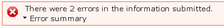
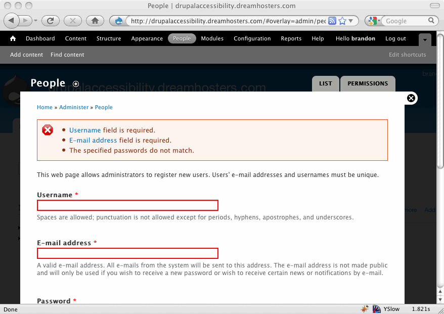
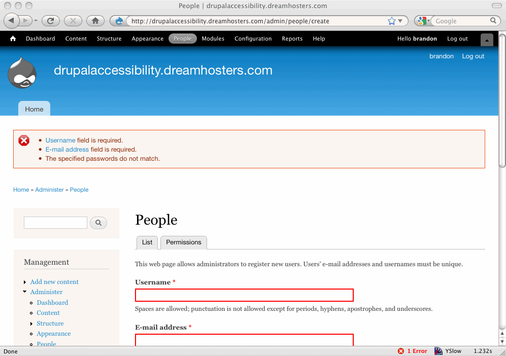
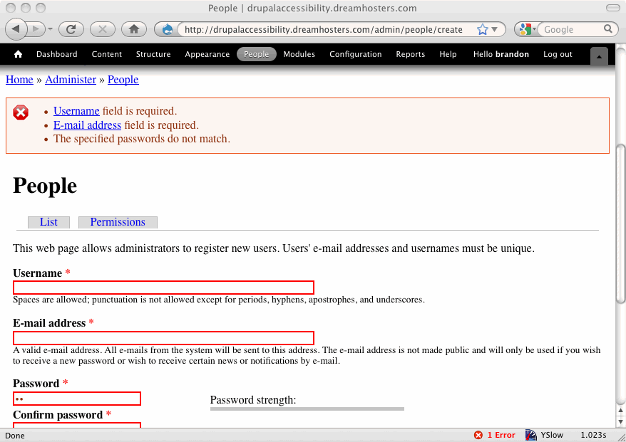
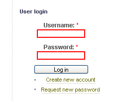
Problem: Use of red color to indicate a field which is required and was left blank or not filled out properly is not accessible
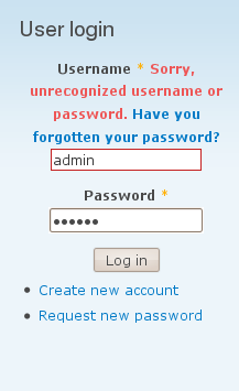
Use Case: Jo opens a Drupal site using a screen reader and is required to login to edit a node. Jo mistypes her password and is presented with the user login box again, this time with the password field highlighted in red.
Jo doesn't know the field is highlighted in red, because she is using a screen reader.
When the accessibility team here did an assessment of a Drupal site they noted the following:
"If the login was not successful (name or password wrong) you outline the box in red. If you are conveying information by color, you need to provide an alternative for screenreaders."
This pertains to Section 508 guidelines, portion (c):
"(c) Web pages shall be designed so that all information conveyed with color is also available without color, for example from context or markup."
The highlighting of those boxes in red after an unsuccessful attempt is not accessible because an alternative to color is not provided for screen readers. We should convey this information in another way if possible. I'm not sure of what the best way to do this is, but here is one suggestion.
jQuery's validation plugin can place text next to form fields when they have failed validation. This has been run by the accessibility team and tested on screen readers and shown to be accessible. We could do something similar.
The patch would be a bit complicated, but would basically involve including the jQuery validation plugin on pages with a form and setting a default message to return such as "Please re-enter this field" or something such like that. If this idea seems the way to go I can create a patch.
Thanks.
NOTE: There's a good summary down at comment 260.


Comments
Comment #1
yched commentedThis is for the form system, not field API.
Comment #2
coderintherye commentedJust as an additional detail, the red color is set in css via the system.css file.
.form-item input.error, .form-item textarea.error, .form-item select.error { border:2px solid red;}
Sorry we posted at the same time which reset it back, so I reset it again below to forms system. Sorry that was where I originally meant it to be.
Comment #3
coderintherye commentedComment #4
mohammed76hi.
I agree on the inaccessibility of conveying information only by color change. a big plus to that.
Comment #5
coderintherye commentedJust another thought that we could use drupal's form api to do the validation without needing to add in the jQuery validation plugin, but then I think we would have to make the Form API a little more robust to handle that case.
Comment #6
Everett Zufelt commentedThis is definitely a serious accessibility concern, however, from my knowledge of the forms API the solution will not be simple. As I understand it the current workflow is that during validation the class for the form field (label) is set to "error".
This provides themers an opportunity to visually style the form label, but does not provide for additional non-visual markup to be applied that would provide any indication to assistive technology users that their input was invalid.
I believe that providing the functionality to semantically mark a field as having invalid data should be a core functionality which should be handled at the point of the form being rendered into a markup language.
I currently do not have any recommendations for exactly how this should be best accomplished, if someone can point me to an overview of the forms API workflow then I can do some additional research and brainstorming.
Comment #7
owen barton commentedThis is an interesting issue - I think that (at least in Drupal core) form errors are always described by an error notification message at the top of the page, so for example with a password error you get the message "Sorry, unrecognized username or password. Have you forgotten your password?".
Of course, this does not always make it clear enough which field (or fields) the error concerns, hence the red border - and of course this information is not available to screen readers (and probably some people with low vision). I would suggest that we add markup to the form as part of the default form element theming (not via javascript). This should be straightforward enough - the question is what should this be, and where.
My sense is that the word "error" would be sufficient if we linked it to an anchor for the notification message that added it (for bonus points we could somehow emphasize the message when you follow this link, so that it is clearer if there happen to be several messages). My sense is that by default placement of the word "error" could be above the form item, or perhaps to the right of it. To the left would probably cause indentation issues, although perhaps we could experiment.
Comment #8
brianV commentedAre there any other projects besides jQuery's validation project which have done accessible form errors? What's worked for them?
Comment #9
Everett Zufelt commentedI like the idea of using a link in the error message to allow users to easily jump to the invalid field. It may be helpful to also provide more information about what input is expected.
However, it is also necessary that the message container be easily identified by users, see #290343: Add icons to status messages., and #515236: theme_status_messages needs additional markup to be more apparent to assistive technology users.
Resources:
G85: Providing a text description when user input falls outside the required format or values | Techniques for WCAG 2.0
- http://www.w3.org/TR/WCAG-TECHS/G85.html
Comment #10
Anonymous (not verified) commentedCurious, why do the required fields have to indicated? When I go to fill out a form (say, for renting a car), I assume I have to fill out all fields and expect to be told what is optional. Why don't we indicate optional fields instead of required?
Comment #11
bowersox commented+1
@Everett I agree that semantically marking fields as having an error should be part of core, in addition to just changing their class.
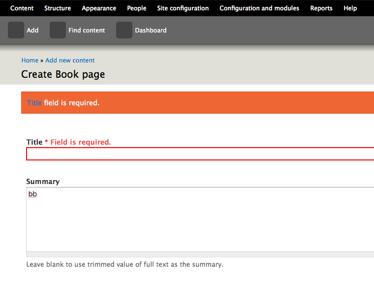
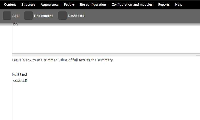
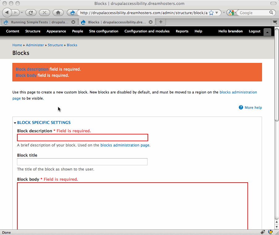
This is what Drupal 6 currently does for a required Title field that was left blank (it adds a class=error):
Here is one way to add an error into the label to make it more accessible:
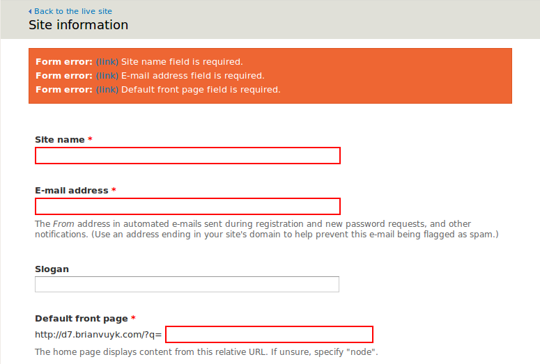
An additional recommendation from our accessibility evaluation of Drupal 6 was to provide error messages at the top of the page in an ordered list and link them to the form fields where each error occurred. It was also recommended to precede that top error with an h2 heading such as
<h2>Error</h2>.Comment #12
brianV commentedHere is a small patch and screenshot which may help make the form_set_error() messages more accessible. I realise this doesn't address the other details brought up in this issue, and only intend it to be a part of the solution that is figured out here. Feedback?
edit: This conflicts with the toolbar module. This is a bug with Toolbar in my opinion, and I've filed a bug against it at #546126: Toolbar interferes with anchor links.
Comment #13
bowersox commented@brianV
Yes, I support the idea of links in the messages to each field with an error. I believe the anchors that you are linked to are not currently created. So part of this patch would need to be the code to create the anchors (eg,
<a name="edit-field-id"></a>). That would be an addition to theme_form_element() inside includes/form.inc.Does that fit with your plans? Thanks for this important addition.
Comment #14
brianV commented@brandonojc
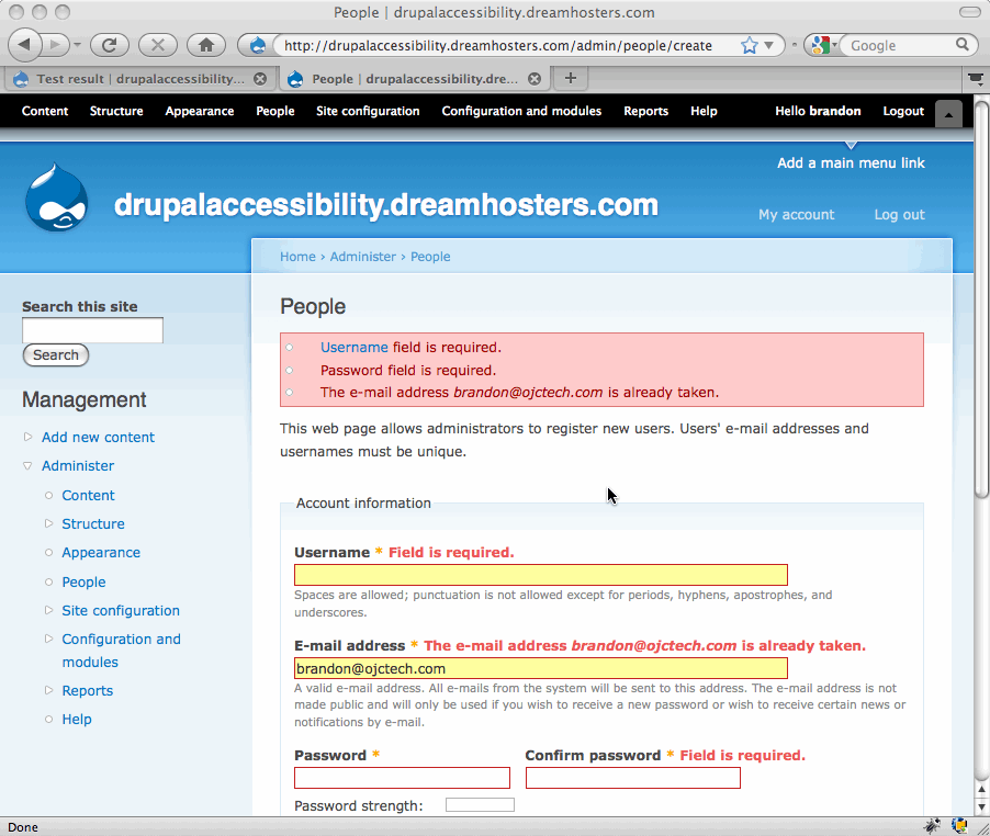
Can you clarify what you mean by 'the anchors that you are linked to are not currently created'?
The links point to the form element ids that the error is tied to. For instance, the 'Email Address' form element in the above screenshot has the ID of edit-site-mail:
The anchor link generated in the patch points to the ID for the form elements they are tied to.
Comment #15
bowersox commented@brianV
Yes, you're correct. The links work perfectly.
One possible hurdle: drupal_set_message() requires that $message begin with a capital letter and basically be a brief sentence without HTML inside. So I don't know whether this patch would be accepted. Anybody know?
I think this is a very valuable usability feature. We should find a way to make it happen. There are currently 267 calls to drupal_set_message() in core and many more in contrib, so let's not change the drupal_set_message API. Maybe we can simply get agreement on allowing the message itself to contain HTML with links. You might want to open a new issue just for this. I'm interested in doing what I can to help.
Comment #16
bowersox commented@brianV
Turns out roughly 20 drupal_set_message() calls in core actually contain a link. Here's an example from modules/system/system.admin.inc:
Grep helped find them (
grep -ri "drupal_set_message.*href=" .). They all do start with a capital letter and end with a period.Comment #17
bowersox commentedHere's a suggested patch and a screenshot. I'd appreciate feedback. A few notes:
'<a href="!field_id">!name</a> field is required.'in place of'!name field is required.'.Comment #18
Everett Zufelt commentedSetting to Needs Review to run the patch through testbot.
Comment #20
bowersox commentedPlease review this updated patch. It is the same as before in 17, but it modifies the corresponding tests to use assertText() instead of assertRaw(). This is because the message now contains markup, but please let me know if another approach is better.
Comment #21
dries commentedI would love to get a list of 1-3 forms that are considered to be great references in the accessibility world, and that work and look stunning for other people too. Instead of inventing solutions, I'd also like to see what others are doing and if we can learn from them.
Personally, I'd think these links in a dsm() are a pain. If you failed to fill out 5 fields correctly, the user would have to go back to the top of the page after every form field, to figure out the next form field that was wrong. There should be better solutions so I'm tempted to mark this 'needs work'.
Comment #22
Everett Zufelt commented@Dries
G139: Creating a mechanism that allows users to jump to errors | Techniques for WCAG 2.0
Comment #23
bowersox commented@Dries and @Everett
Here's an example of a form that uses best practices:
http://collaborate.athenpro.org/accounts/register/
Try submitting the form without the required fields filled out. The error message contains links to each of the effected fields. It uses Javascript to put the focus inside of each field. We could do that in Drupal as an enhancement for users with Javascript. For users without Javascript, the normal anchor link as shown in patch 20 would still be used.
Note that the example has a visual display for sighted users that is not as nice as Drupal's, so we would of course retain Drupal's good looks.
(P.S. Regarding h1 and h3, I asked why this form uses h3 on the error message when it follows h1 and they said this was actually an error per the W3C WCAG that there are going to work on fixing.)
Comment #24
mgiffordThat's a very nice example. Great that you can just click on the error and get right to the form element in question. Think that this is something that will benefit all users!
+1
Comment #25
Everett Zufelt commentedTwo functions worth investigating for further improvements to form validation accessibility are form_error() and form_set_error().
Also, all elements with an error should have their #error property set to TRUE.
Comment #27
bowersox commentedPlease review this new patch. It now includes:
<span class="error">.Let me know if you have any suggestions or feedback. This could be a big accessibility improvement for Drupal 7, and I'll do whatever I can to get this working in time.
Comment #28
bowersox commentedHere are screenshots of how the form errors appear visually in Seven and Garland too!
Comment #29
owen barton commentedWow, I think this looks wonderful! I think this is (as is common) a significant usability enhancement, in addition to being an accessibility enhancement.
I have added a tag to request review from one of the UX guys, just in case there is something we might be missing here, but otherwise I think we are on a great track here.
Comment #30
mgiffordOk, I di really like this patch.
It applies well and I've got it up here with other accessibility patches for testing http://drupal7.dev.openconcept.ca/
Problem I found with Seven is that if you click on it you go too far. You click on the title and believe you're going to the form element, but it's under the menu bar on the top.
Pictures attached.
Comment #31
Everett Zufelt commented@brandon
I'm not sure if the checkbox, radio and fieldset form elements can have their #error property set to TRUE, but, if they can, this patch will need to modify theme_fieldset, theme_radio and theme_checkbox in the same way that it has modified theme_form_element.
Comment #32
mohammed76hello.
I love the patch. it works very nicely on the test site above. this has to go to core asap. very nice solution indeed! tried with a screen reader, of course.
thanks
Mohammed,
Comment #33
bowersox commented@mgifford
Regarding things scrolling under the Seven toolbar, that is a problem elsewhere in Seven with other things that scroll into view. After this patch is in I would like to refine this with a Javascript enhancement by actually using
.focus()so that the cursor goes inside the relevant form fields which will help.@Everett
You are correct that this patch only adds nice visual error messages for elements that use theme_form_element(). In a future patch I would be interested in doing the same with theme_fieldset, theme_radio and theme_checkbox.
Thanks for all the feedback!
Comment #34
brianV commented@mgifford
I filed an issue about this some time ago #546126: Toolbar interferes with anchor links.
Feel free to comment on it / exand it if you have more to contribute. I think that this is going to be a real problem with Seven.
Comment #35
Everett Zufelt commentedThis is looking good to me on http://drupal7.dev.openconcept.ca
Comment #36
Bojhan commentedSorry, I find it somewhat strange that is is marked RTBC - when nothing of Dries his concern rightfully so, has been addressed.
Do we really want to follow G139 in this case? I am not sure, it impacts the UI considerably and I hoped we didn't have to do that. If we chose to go down the path, adding stuff to the UI for every accessibility issue, its going to be though to review this.
Comment #37
bowersox commented@Bojhan
I feel like Dries' concerns and questions were addressed. He asked to see references and good examples of this technique, and he pointed out that sighted users like himself would not find the links useful. The community responded by providing the W3C WCAG guidelines explicitly recommending these links, and by providing a working example of other software using this best practice. In the end, I believe the visual indicators in this patch will benefit all users, while the links themselves will primarily benefit assistive technology users.
Comment #38
Everett Zufelt commented@bojhan
Can you point out a concern that Dries had that was not addressed in the comments?
Also, not every accessibility issue requires a change to the UI, but some do. I see the UI change as worthwhile if it means that a greater number of users will be able to comfortably consume the information on a drupal site.
Comment #39
owen barton commentedDries comment applies equally to the status quo:
Lets look at the current user experience here (assuming a long form and non-trivial error messages):
1. Read an error message from top of page.
2. Scroll down the page until you find a form field that has a red border.
3. Fix the issue.
4. Scroll back up to top for the next error.
5. Go to 1 and repeat.
This patch improves on this in several areas - you still get a summary of the errors at the top of the page, and you still get for items with a red border. However, you can now click on links to get directly to the form field with an error, rather than having to scroll up and down the page trying to figure out which form field that error applies to (difficult if there are many errors and/or similarly named fields).
In addition you actually get the error messages next to each form field, so you don't need to remember the error message you read previously (which is off-screen on long forms) and can also proceed directly down the page after fixing an error, rather than having to scroll up each time as you do now. This was not present in the patch that Dries looked at and directly addresses his second point.
Hence, I think this patch addresses Dries issue directly, because this is an issue with our current interface and is improved by this patch.
Comment #40
dries commentedIn general, I think this is a good idea. The only thing I'm uncertain about is the duplication of the error messages. I wonder if we should have a single, generic message at the top, but present the details errors next to the individual form elements? Would that still be helpful?
Comment #41
bowersox commented@Dries
Maybe we can get some usability input on that question. It would theoretically be possible to say "3 form fields have errors" at the top and have the detailed errors next to each field. That might be harder to code reliably because some parts of the form might set an error but don't provide a visual display of the error (including fieldset, checkbox, and radio).
Personally I could imagine some users who would want to see the detailed errors both places, so they could look in the red box at the top and succinctly see what all the problems are without scrolling. Whatever we end up deciding, I think this is an important advancement for accessibility and usability.
Comment #42
alexanderpas commented-1 for "3 form fields have errors"
I like to know which errors they have, that way, i know beforehand how much time it is going to cost me to do it again. (was it a mistake i made, or was it the captcha again??? do i need to re-enter my password??? is my name already taken and need i think of another one??? didn't it accept my SVG image???)
if you say "3 form fields have errors" the first question you ask is "which ones?" and "why do scroll trough the form to know which ones?"
Comment #43
Everett Zufelt commented@Dries
I think that it is valuable to have an explanation of the errors all in one place, and agree with the reasons given in comments #41 and #42 regarding this. I don't see a problem with repeating error messages once in summary and once with each field that has an error.
Comment #44
mgifford@Dries
I'm for leaving the patch as it is. I do think it may look a bit unusual when you've got a short form (like the login form for instance). However, for longer forms I can see it being critical to be able to see a summary on the top of the page and then individual messages near the fields with the errors.
I suppose one could create an form attribute to display the errors in an alternate way for shorter forms, but not sure it would give you much in terms of extra usability.
Comment #45
coderintherye commented+1 I like the patch. I'm going to run it by our accessibility team to see what they think of it. I'm really happy to see all the work behind this, and disappointed that I have been working out at sea for the past three months and thus wasn't able to join in on it.
Comment #46
coderintherye commentedOriginal comment here was meant for another thread. In response to #11, this issue wasn't about needing to indicate required fields, but rather that if we did indicate required fields then we needed to do so in an accessible way.
Comment #47
webchickSounds like this still needs review.
Comment #48
bowersox commented@anarchman, did you mean that you are waiting on feedback from an accessibility team in your organization? If so, can they send feedback in the next few days?
I'm trying to understand why this is tagged as awaiting accessibility review. In comments #27-35 we got a variety of feedback and positive agreement from users with screenreaders and different tools. Accessibility-wise, this patch is a big step forward for form error feedback.
Comment #49
coderintherye commentedYes, waiting on feedback from them, but I personally agree with the patch as is, and I think they will too, so I see no reason not to commit, I just want to add a more 'weighty' opinion. I'm setting back to Reviewed & Tested and will add the feedback when it comes. Please feel free to change back if others feel this needs more eyes/review.
Comment #50
bowersox commentedOkay, sounds good. We can always accept any more feedback and input if others have ideas...I think most people will find this is a big step forward.
Comment #52
bowersox commentedThere are 2 exceptions that suddenly popped up in tests for "Content language settings" and "Translation functionality". Does anyone know if this was a temporary unrelated problem or if there's truly anything wrong?
Switched to 'needs review' to see if the bot gives the same result on re-test.
Comment #53
mgiffordIn my testing of this patch http://drupal.org/node/447816#comment-1979412 I wasn't able to duplicate the exceptions the bot was complaining about. So hopefully a retest is all that's required.
Would be great to get this in core though so that there is less fuzz about.
Comment #54
bowersox commented@mgifford Okay, I just requested a retest from the bot. I totally agree about the fuzz.
Comment #55
bowersox commentedSetting back to RTBC. The same patch (above in #27) passes the bot again. I believe the errors were temporary and unrelated.
Comment #56
dries commentedCoding style errors: else and else if need to start on a new line.
Comment #57
mgiffordCleaned up the fuzz, added the line breaks and re-uploaded the patch.
Sorry we busted the style guide. Old habits.
Comment #58
bowersox commentedThis newest patch looks good to me too. Thanks, Dries and mgifford, for catching that and making it better.
Comment #59
mgiffordThis was first RTBC now over two months ago. - Bump!
Comment #60
chx commentedUm. You want to special case
if ($element['#type'] == 'password' && $element['#name'] == 'pass[pass1]')this into theme_form_element ?????? That's a big big no. Can't you instead introduce a generic property and set it in the password element process function?Comment #61
bowersox commentedPlease review the updated patch. It is identical to the prior patch but it removes 3 lines of code for the special case that @chx mentioned.
@chx, I agree. Thanks for reviewing this and pointing this out. I hope you get a chance to review this again and also take a look at the other handful of accessibility patches that have been RTBC for a while.
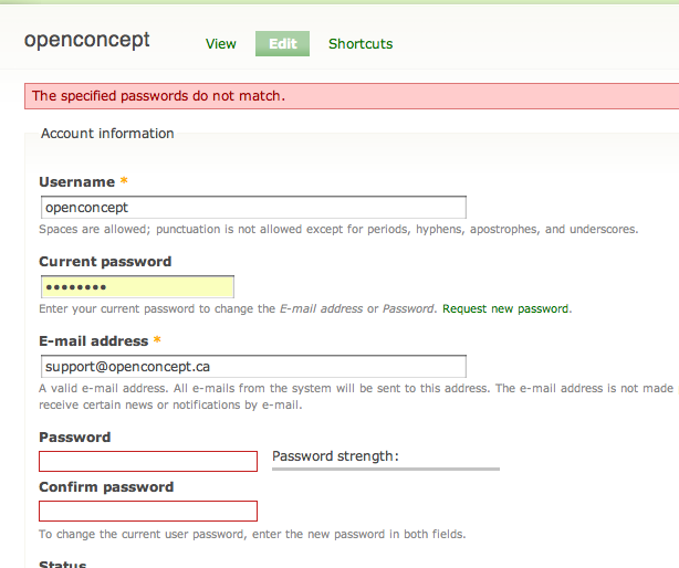
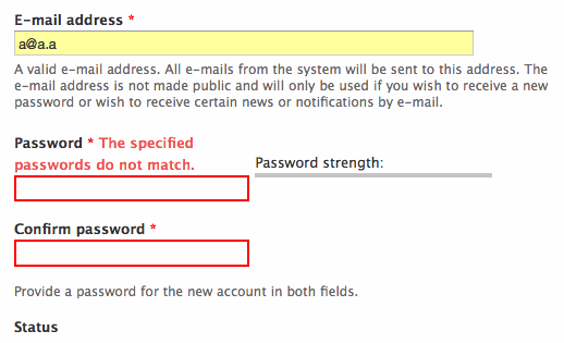
What is the impact of removing the special case? The original idea of the special case was that with password fields, which have a pass1 and pass2 for users to type the password twice, we would suppress display of errors on pass1 because often the same error is also set on pass2 (eg, "The specified passwords do not match.") Now that this special case is removed, we will simply display the respective errors for pass1 and pass2 as normal, even if sometimes the errors are the same.
I considered ways to use a generic property to otherwise suppress errors on pass1, but no good API for that exists. The form element labeling issue, #558928: Form element labeling is inconsistent, inflexible and bad for accessibility, might change that some day. But even so, it is probably better to display any errors on either password field. Because if the passwords don't match, it is just as likely that the first is mis-typed as the second. Similarly, if the passwords are too weak to be acceptable, the user will want to change the first and the second. So actually from a usability and accessibility perspective I believe it is better to simply show these errors in either case.
Comment #62
mgiffordThere was a change I think in form.inc that affects this patch that caused it to fail when I applied it.
Just rerolled it against the latest CVS.
Works fine on my local install. Just have the outstanding questions raised by @brandonojc to @chx that would be good to get addressed before I'd be fine with this being RTBC again.
Comment #64
mgiffordBad bot?
Comment #65
bowersox commented@mgifford, I think it was just a bad bot. Let's try again. Just for good measure I re-rolled. This patch is exactly the same but applies more cleanly (without a hunk offset -18 lines).
Comment #67
bowersox commentedIt appears this patch is not compatible with #582584: form_required_marker() isn't passed the form element (theme_hook definition is wrong). Is anyone familiar with what changes we'll need to make?
Comment #68
mgiffordYup. patch applied nicely.
Local tests of the Required field validation within the Form API in Simpletest worked just fine too.
bad, bad bot!
Comment #69
bowersox commentedPlease review this updated patch.
The only change is a 2-character tweak to a new test that was introduced by #582584: form_required_marker() isn't passed the form element (theme_hook definition is wrong) in modules/simpletest/tests/form.test:
We need the added
.*because our patch adds new markup after the span class=form-required but before the</label>. This one change fixes the 37 failing tests because this preg string is used inside a loop for multiple tests.Comment #70
mgiffordNo idea why when trying the prior patch in comment #68 it worked for me. Thanks for catching is and re-rolling the patch.
This one works well and the bot likes it.
Rolling this back to RTBC and giving a +1 to #69
Comment #71
brianV commented+2 let's get this in!
Comment #72
fei commentedI was slightly lost with the current title (which was quickly remedied by the crystal clear intro to the issue!). Thanks for working on this!
Comment #73
webchickFor those coming late into this issue, there are screenshots at at #28 that show how various screens look when there's a validation error of some kind. When displaying a form initially, without any validation error, it's exactly the same as before; just a red star next to a field to indicate its requiredness. Overall, this looks like a massive improvement, both for blind and sighted users.
The one exception to the screenshots above is the password validation which, because the special-casing in theme_element() was removed per chx (rightly so), now looks like this: http://img.skitch.com/20091108-qakwq32395emmdiba9j6iq4hr9.png Which... ick. :)
I hate to hold up a patch on a cosmetic issue like this, but I think this is more than a cosmetic issue. '#type' => 'password' is just one example of a field that gets expanded into multiple fields through the Form API. Contrib could also make one that is '#type' => 'address' which is a combination of between 5-7 fields, depending on configuration options. "State is not valid" x 5-7 fields would not be remotely pretty, and would also be bad for accessibility, from what I can see.
Brandon, could you clarify what you mean by "I considered ways to use a generic property to otherwise suppress errors on pass1, but no good API for that exists."? It seems to me as though we need to make modifications if that's true. As chx pointed out in #60, this should be a simple change, or at least it would seem so on the surface. Maybe ping one of the smarties in IRC like chx or DamZ or sun and see if you can work through this.
My second question is what happens if a field ends up with multiple errors about it? For example, it's both too short and not a number? Is everything smooshed together on one line next to the field, or does it get displayed above it in a bulleted list, or..?
Comment #74
Bojhan commentedCan anyone explain me, why we need two indicators?
Comment #75
bowersox commented@webchick: It appears the patch in 69 was committed by Dries: http://drupal.org/cvs?commit=285916. So I'll address the questions posed and roll a follow-up patch to improve the password fields as suggested.
Re: @webchick #73 question 1) You are totally right about the "ick" factor. In the follow-up patch attached I've introduced a new form property #no_error_label. It is used by theme_form_element to skip adding the error message inside the label for that element. So to get rid of the duplicate "ick" we change form_process_password_confirm() to set #no_error_label=TRUE for pass2 but not pass1. That is safe because pass1 and pass2 both have errors set in password_confirm_validate(). I think this accomplishes what you want and I've attached an updated screenshot for comparison.
Re: @webchick #73 question 2) It appears that form_set_error() only allows 1 error message to be set on any single field. The
if (!isset($form[$name]))test means only the first error is really set. Let me know if I misunderstood or if you know of an example of two errors set on one field.@Bojhan: The best explanation was from @grugnog in #39 and by #44 it looked like most people felt that displaying the error in this location would be helpful for both accessibility and usability.
Comment #76
mgiffordI'm pretty sure this patch addresses the concerns of the previous reviewers. I've confirmed that it works with the password error & added in a screen-shot with multiple fields with missing required data.
So I'm setting it back to RTBC.
Comment #77
dries commentedIn the screenshot, edit summary seems to be glued to the error message.
Comment #78
damien tournoud commentedThis needs a little bit more work.
From the original patch (in #69):
Could we please fix that? The code flow is ugly, there are unneeded repetitions of HTML code and form_get_error() is called twice on the same line?
No, password_confirm_validate() only sets the error for the parent field, but because of a logic block that I don't understand (and is undocumented) in form_get_error(), this error also apply to the childs because the password element you are testing this with is top level. This doesn't seem like the intended behavior. It should be the job of the password element to choose where to output the error (by calling form_error() on the correct field).
As such, #no_error_label seems completely unnecessary to me.
Comment #79
yched commentedI'm new to this thread. I'm not sure how this pattern of linking to the form field from the error message can be applied to Field API.
Field values are validated, and error messages generated, in hook_field_validate(). This function explicitly doesn't assume a Form context (to allow validation during programmatic save). At this point, we have no form or elements ids, and we want no links in the message. The errors and messages are then passed to widgets, that simply tag the error on the right form element in their hook_field_widget_error().
Comment #80
brianV commentedThis just doesn't look right on fields in blocks.
As an example (in the attached screenshot), I entered an invalid password in the login block. The result was a relatively large wall of text above the password field.
Perhaps it's just me, but the aesthetics of this are horrible. I don't have a better solution, but this is just bad!
Comment #81
bowersox commented@brianV: Good point. I can't think of an easy clean solution because theme_form_element() doesn't know if the element will end up rendered in a block.
There could be a CSS solution like this:
(In other words, with CSS we could hide the form errors from appearing within a block.)
Comment #82
mgiffordOk, I think this patch incorporates a space to address the issue that @Dries pointed out, Reduces the repetition in function calls identified by @Damien Tournoud and pulls in @brandonojc's patch at #75 & suggested CSS at #81
Not sure how to deal with @yched's concerns. By centralizing the error messages here it would seem to me that we'd be introducing the least amount of code. Introducing it later might be possible would would require a bunch of duplication I would think.
Comment #83
mgiffordDrat, want the bot to check it.
Comment #84
Bojhan commentedThis is clearly a wrong commit, can't see that - it wasn't rerolled already.
Please remove the error next to the label, I do not see any reason to do this. After reading all the arguments it seems like we are choosing to go for no trade-off because we can't make a decision (so we do it both?). Lets keep it at the messages on top, it should be fine. Within the ascetics of Garland or Seven, this really doesn't fit well.
I understand the UX arguments that http://drupal.org/node/447816#comment-1985400 outlines, but that really favors one approach over the other and does not include the ascetic arguments. It assumes a whole lot about user behavior and cognition which doesn't correlate to any user research I have done on forms, sure it reduces the cognitive load somewhat - but it also creates a whole lot of ascetic in-balance.
I think - we need to roll this back, so that we can put people to find a proper design solution.
Comment #85
dries commentedOops, I committed this by accident indeed. I was testing this patch, got distracted, and forgot to undo the patch before starting to review the next patch. Rolled back until we figured out a better solution.
Comment #86
mgifford@Bojhan, do you have any better usability suggestions to convey more than color to indicate field validation errors?
I just want to see that this important accessibility issue keeps moving forward. Usability is important but if this idea isn't good enough we need to start brainstorming alternatives that work.
Comment #87
valante commentedJust taking an unpracticed stab at this, but as a user, I would have liked to see:
1) A detailed, linked list of errors at the top
2) Next to each field, a graphic element or a textual sign (like "?") that, upon clicking, toggles the complete error message next to the field.
Another option would be to have the by-the-field error as a tooltip - since this issue targets screen readers etc., won't that get read out loud and solve the problem?
Comment #88
Bojhan commentedSo to set the scope of this issue right, there are two things we want to achieve.
1. Set a error message at top [already completed]
2. Provide error indicator per field
Can we perhaps already move on 1. and or provide more examples of other sites on 2?
Comment #89
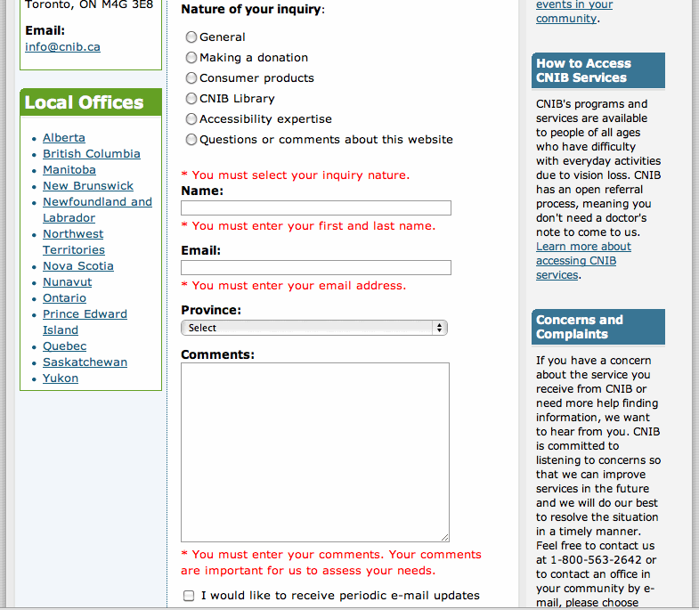
bowersox commentedA few examples of error indicators on sites that were designed to be accessible (screenshots attached):
CNIB Contact Us Form - errors follow each field, none at top
CNIB (Canadian National Institute for the Blind) is where Drupal's own @EverettZufelt works.
NFB Donate Form - errors follow each field, with one error notice at top
AFB Donate Form - each field gets a star (*) to signal an error, with a list of all errors at top of form
I haven't seen an example of errors that use tooltips. None of these are aesthetically great, so I think Drupal can do better and balance accessibility and usable interface design.
Comment #90
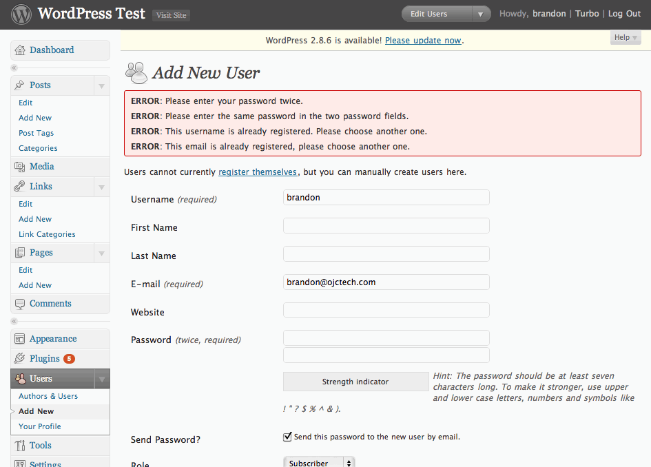
bowersox commentedAttached are screenshots from Wordpress and Joomla. Both of them simply list all the errors at the top and do not flag the effected fields.
This probably makes Wordpress and Joomla less usable in addition to being less accessible.
So this is an opportunity for Drupal to top Wordpress and Joomla--to be an accessibility leader, to build sites that millions more people can access, and to comply with accessibility laws that will allow Drupal to be adopted by the public sector.
Comment #91
bowersox commentedPlease review this updated patch. It creates an error indicator "!" that has a tool-tip containing the error message. I have removed the on-screen error message.
The patch makes theme_form_error_marker() theme-able, so folks can override for their own tastes. For example, they could choose to display the errors on screen like earlier patches did.
I've included screenshots of a few scenarios: errors in a block, errors on a long form, errors on required and non-required fields, etc.
I've tried to strike a balance for accessibility, usability and aesthetics. I'd appreciate further feedback so we can form a consensus and get this back to RTBC.
Comment #92
bowersox commentedThat patch is ready for review.
@valante: Tool-tips are ignored by many screen readers, but they are great for sighted users to reduce visual clutter. So in this patch I've made the error both a tool-tip for sighted users and invisible text for screen readers. I welcome feedback and input from other accessibility advocates on this approach.
Comment #93
valante commentedI think you nailed the "reduce visual clutter", and the invisible text for screen readers sounds like a great solution.
The only thing I would change is the exclamation point - I wouldn't think to point my mouse there for more details. Maybe something like "show error", "what's wrong", "details", "why?" - anything that would make the user think he's supposed to click there, which will subsequently make the tooltip pop up.
Comment #94
Bojhan commented@brandonojc Again, what are the best practices on the web? I am really astranged that - we are solving this problem in such a exceptionable way.
Comment #95
bowersox commented@Bojhan: Check out the examples in #89 that use best practices by either providing a full error message next to each field or a visual symbol. The 3rd example there uses asterisk (*) but we already use that to signify required fields. I'm curious if you have suggestions besides "!".
In addition, here are W3C WCAG 2.0 requirements and examples: How to Meet WCAG - Techniques for Error Identification. WCAG requires that we identify an error field and describe the error in text. This text can be at the top of the form, in which case they recommend links to the errors. (The patch at #91 adds links for required fields and in the future we could do so for other fields too although there are technical reasons that will be harder). WCAG says it is a failure to identify errors using color only. Finally, WCAG provides one example where validation adds links to erroneous fields. (See the description).
Also, check out this Section 508 for error example. It uses error messages at the top with links plus a red asterisk indicator (*) added next to error fields. (508 is the U.S. federal accessibility law).
In summary, the newest patch falls between the best practices from #89 and the WCAG requirements. It seems to accomplish what we talked about in #87-88:
Comment #97
mgifford@brandonojc - thanks again for all of your work on this. Providing all of these examples, patches & consideration is really important.
I do think that the patch is going to have to get re-rolled. includes/form.inc is a bit of a moving target.
@Bojhan - what is exceptional about this? Best practices on the web are defined in WCAG 2.0 which is still less than a year old. It's taking some time to roll out into the community, but @brandonojc's examples are quite solid.
Comment #98
alexanderpas commenteda big fat -1 on tooltips for this!!!
first of all - I'm severly against using ! together with hover (how about non-mouse users?)
I don't want to do an additional step to get my error information
what i prefer is that we get back to something similar to the screenshots in #28.
the * are actually subtle pre-submission hints, while the full texts are clear post-submission indications.
there is no need to provide links to the element when the error is specified at the element itself.
Let's try to keep kittens alive, and lets only focus on the following for now:
- For Full page forms: Error Message at the top of the page, and at the top of the specific form element.
- For Block Forms: Error Message at the top of the page, and (at least) at the top of the form inside the block.
By only using the correct text we can probaly meet the WCAG guidelines.
(don't forget to test all solutions with CSS & JS completely disabled!)
(The duplication of the error message between the generic (top) area and the context is not a problem, but might possibly even desired, read also my comment in #42)
Comment #99
coderintherye commentedI have to test out applying this latest patch once we have it re-rolled correctly, but it looks like the current patch has moved far away from where we were previously in terms of UI, and I'm not sure that is a good thing.
Comment #100
cliff@Bojhan, "best practices" aren't yet on the Web. However, if you were to attend accessibility conferences such as Access University in Austin, Texas, each May or Accessing Higher Ground in Boulder, Colorado, each November, you would hear users and researchers lamenting the widespread poor practices that this patch is trying to correct.
In his books and website, Edward Tufte teaches the fundamental value of placing instructions at the point of need. In this case, there are two different classes of "points of need":
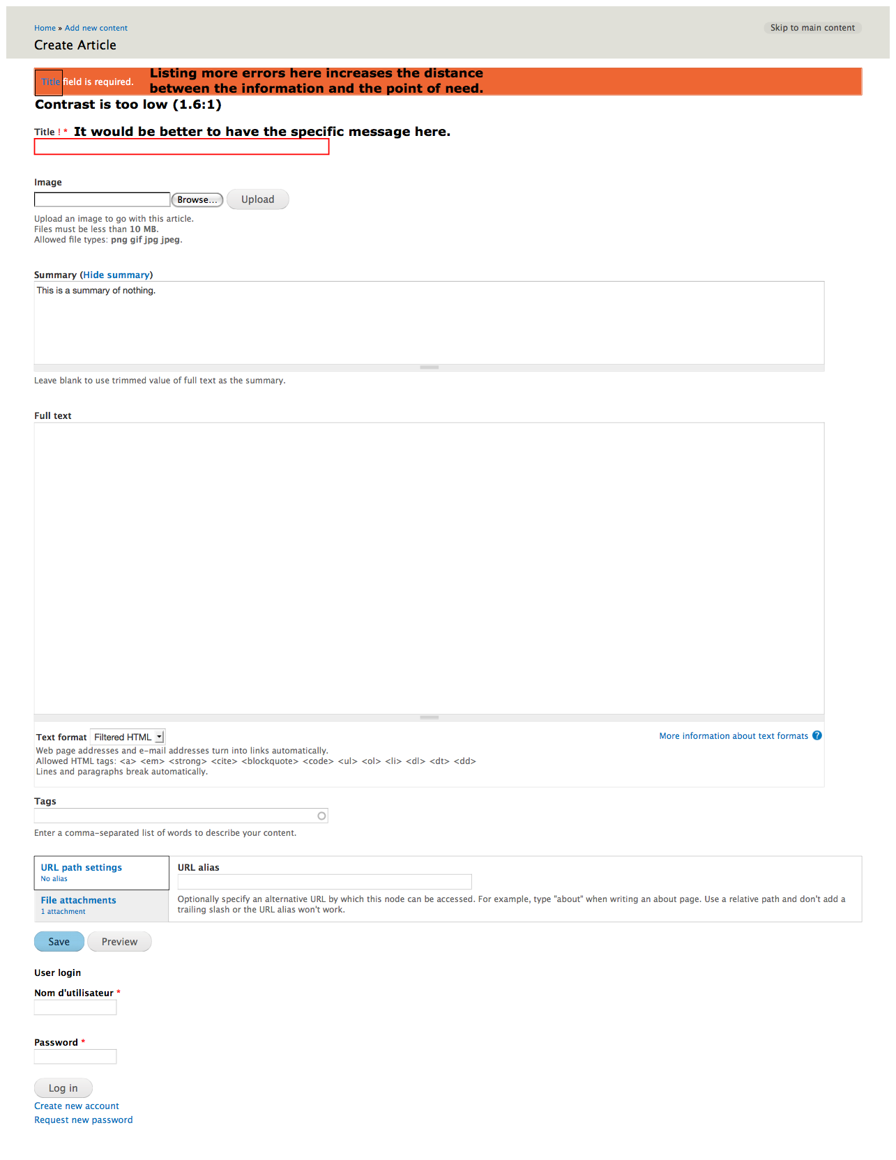
This is basic human-factors-based design. When the humans using the interface cannot easily observe the whole screen — perhaps because they're having to rely on a screen reader; perhaps because they're having to rely on a screen magnifier; perhaps because they're having to fix their Drupal site from their smart phone — this fundamental of good design becomes a pillar of accessibility.
Instructions at the top alone are good enough for most of us. But they're not good enough for those of us who most need the Web to gain access to commerce, culture, and everyday communication.
@Brandon, I would suggest that we make the link to the error with something more obvious than an exclamation point. I've seen too many users never notice such a flag, let alone realize what it meant. "What to fix" would be concise in English; "How to fix" might also work. "Help me!" is another possibility. Of course, those words would have to link to the full explanation of how to fix the problem.
I'll look back at this more carefully when I actually have some time and see if I can come up with suggestions that are more helpful.
Comment #101
cliffFixing the title. Minor, but important point: It isn't that color is used that is the problem. The problem is that color is the only indication.
Comment #102
mgiffordJust keeping up with head.
Patch in #91 is a very flexible solution. Might just be the compromise between usability & accessibility that we need.
Comment #104
cliffOkay, reviewing the latest patch for usability and accessibility: As shown in the screenshot below, we could improve upon the design, but the general idea is good. The improvements needed are:
This way, at the top of the page, the user will find out which fields need attention. As they focus on each field, they will have the full error message right there. This is of particular benefit to people using screen readers, people using screen magnifiers, and people with cognitive disabilities.
As for other screenshots of patches being implemented:
As for screenshots that show how other online forms present error messages:
Drupal can — and should — work better than any of those other examples. The patches are remarkably close to the way it should be for the sake of both usability and accessibility.
Comment #105
cliffOops — I didn't mean to change status, but I did mean to remove the issue tags for accessibility and usability.
Comment #106
bowersox commentedI'm realizing that the fact that we all disagree is a good reason to make it theme-able which this patch does. We'll never all agree, but at least we'll each be able to theme it as desired for our own site.
@Cliff: #1) Regarding shortening the error messages at the top, we would only want to do that if the full error text is visible on screen next to the fields. If the field error message is a tool-tip or requires a click, I would be worried that truncating the top error message would mean some users couldn't find the error at all. I'm guessing 90% of the time users get errors, they get 1 error. Maybe 5% of the time they get 2 errors, and 5% of the time they get 3 or more errors. So if we go with the tool-tip or click approach, I don't think we should truncate the errors at the top. Whereas if we go with your suggestion (#3) of putting the full error next to the field, then we could also shorten the errors at the top as you suggest.
@Cliff: #2) Regarding the issue of the blue links on red background, we could add trivial CSS to make links within the error box white instead of blue. It might be better aesthetically (less jarring) and more readable. Do you like that solution?
Thanks for all the input and feedback, everyone!
Comment #107
mgiffordI think this will get past the bots. It doesn't include a change in the blue links noted in #106. No problem with it, but just wanted to focus on the bot for this patch and wait to hear back from @Cliff
Comment #108
bowersox commentedPlease review this updated approach (thanks to @webchick for strategy advice on IRC).
This patch does the following:
error-markeron that error text to allow anyone to style it to be visible, if they prefer.Screenshots attached show examples:
In a future patch, I hope to make all the error messages at the top of the form contain links to the relevant field. This will require a change to form_set_error() API so let's keep this separate for now. In addition, we may find some visual indicator we agree on in the future, but for now let's get this basic foundation into Drupal 7.
Do you prefer having the error text fully visible as in prior patches? If so, here is the easy CSS you can add to your theme or module:
(You could also use
.block .error-markerto keep these errors invisible inside blocks to avoid the ugliness in the screenshot in #80.)Comment #109
mgiffordThis looks like a good compromise. I'm setting this back to RTBC as I think the outstanding issues have been dealt with.
I'd still prefer to have the text visible, but since the error will be customizable by theme_form_error_marker() that can be extended in individual themes.
Comment #110
dries commentedPersonally, I'd be OK to go with a similar approach to the ones in #89. It takes some getting used to but they look more usable and more accessible to me -- and it is more convenient than a list at the top.
Comment #111
webchickSo if we go with something #89-ish, we need to avoid the following conditions:
Error messages showing up in form blocks and getting totally mangled together:
Redundant error messages showing up on each field of an 'expanded' form element:

Brandon, could you summarize (probably again, sorry about that :\) the challenges you ran into with the existing form error API that make this really hard to do? Maybe we can brainstorm a way around it.
One thought is just to put a line break between the error and the label, like http://drupal.org/files/issues/cnib-errors.gif But I agree with Cliff that these messages should go above the field in question, not below it. The fact that this is CNIB doing this makes me wonder if by being above the field, screen readers aren't given enough context? Is there a way to embed some HTML in a field's
<label>element, for example, or..?Comment #112
bowersox commentedThe alternative approach 'a la #89' would mean:
Step 1 could be accomplished by removing the drupal_set_message() call from form_set_error() and instead waiting until the end of validation to create one error summary message. In form_set_error() we would need to save the
$element['#id']in order to create a link. To do that I believe we'd need to add an argument and change the $form static variable data structure. The tricky part of implementing this, however, is that some form elements might have an error even though they don't have a name or an ID. For example, the password_confirm container (as in the second screenshot in #111) does not have a #title, nor does it have an ID anchor to link to, because the child elements have all that. Are there other tricky examples in core or contrib?Step 2 could be accomplished basically the way the patch in #82 does. Adding a newline as suggested would help minimize some of the ugliness in #111. The tricky part of implementing this step, however, is the redundancy problem with parent element errors displaying repeatedly on the children (as in the 2nd screenshot in #111). As @DamZ pointed out in #78, we may need to make form_get_error() smarter so we can set and get errors on specific elements without all children inheriting the errors.
@Dries and @webchick, does this sound like the approach you were thinking?
Comment #113
Bojhan commentedI am finding it hard to understand this issue, what are the screenshots/rationale of the direction we want?
Comment #114
mgiffordI believe that @brandonojc is suggesting we go with something that looks more like the NFB uses here -> http://drupal.org/files/issues/nfb-errors.gif
Condensed summary at the top with links down to individual required fields.
A themable red error message below the title of each form element.
We'd also want to have errors in the sidebar blocks be invisible and have the confirmation password be invisible.
I'll have a lot more confidence about inconsistent form behavior when we see this in core:
#558928: Form element labeling is inconsistent, inflexible and bad for accessibility
Comment #115
bowersox commented@Dries: Can you give some feedback on the approach in #112?
We only have 3 days left. If we don't manage to agree to the kind of approach Dries mentioned, I hope we can at least go back to the idea from #108 that we make no visible change but make it themeable.
Comment #116
Bojhan commentedPatch from #108 is RTBC, we have discussed this issue lengthy here and in #drupal. It looks good and attacks the accessibility issue that is at hand.
The improvement outlined in #89 means that the ascetics of every single form error (in core) will need to be themed and carefully designed - basically because its not looking good. Although I admire @Dries his devotion to make this more usable and more accessible in one try - I do not see us improving the usability here. The idea is by improving this in the theme, we provide a good default look to go from. Sadly that is not the case, therefor lets go with #108 and take D8 to work on all the ascetic changes required to also show this in Garland.
The defaults of Drupal should promote good aesthetics.
Comment #117
mgiffordSeems like the best approach at this time. Thanks for setting this to RTBC! We'll be able to experiment with better error messages in contributed themes and try to find a best practice to implement in D8!
Comment #118
cliffSorry to have disappeared from discussions. I'm glad to see that we've hit a good place for this issue. To answer @brandonojc from #106:
You folks have done a great job improving the accessibility of Drupal. I just wish I had had the time to help more.
Comment #121
arhak commentedLinebreak between labels and field?
What about inline theming?
Preceding the field with its error message?
Wouldn't be clear enough to hear the fieldname and its error right next to it?
Wouldn't it break form's layout to have message "before" the fields?
Wouldn't it break form's layout to have visible the long explanation near fields?
Username: Error: Invalid username. |_______________|
Password: Error: This field is required. |_______________|
FooPath: Error: The selected directory does not exists or has no write permission. Visit the handbook pages about how to sort this configuration issue. |_______________|
Password: Error: This field is required. |_______________|
Error: This field is required. Password: |_______________|
Password: |_______________| Error: This field is required.
Comment #122
arhak commentedWhat about prevous work done about it?
Did someone evaluate them?
http://drupal.org/project/inline_messages
http://drupal.org/project/inline_errors
Comment #123
arhak commentedhttp://drupal.org/project/popup_msg
BTW: none of the mentioned modules have a notable demand/usage
Comment #124
mgifford@arhak - I don't think that any of those modules had been evaluated in my experience of this issue. I can't answer your questions at this time.
I will try to re-roll the patch and apply it in a sandbox where you can take a look at it. Definitely want to look at use cases and it may also be useful to ask the module maintainers about their thoughts on this issue.
Comment #125
mgiffordOk, I've re-rolled the patch and hope to get a green light on the code.
@arhak do you want to take a look at our sandbox?
I have left issues with the projects you mentioned to point them to this thread. Thanks again for pointing them out!
Comment #126
mgiffordThis needs more testing, but the patch at #125 works the same way as the one in #108. It's just in chasing the CVS that the code that was RTBC'd needed to be changed to keep up.
I would like someone else to look over this but it should be ready to RTBC with another set of eyes.
Comment #127
dru29 commentedhttps://health.google.com/health/ref/Color+blindness
Most color blindness is due to a genetic problem. (See: X-linked recessive) About 1 in 10 men have some form of color blindness. Very few women are color blind.
Comment #128
bowersox commentedI agree that this patch is good. I reviewed the code and tested and it looks good to go. It is an up-to-date re-roll that performs the same as #108. That was the tactic that was the most agreeable to the most people after lengthy debate.
P.S. Remember when testing this patch to Clear All Caches and empty your browser cache so everything works.
Comment #129
catch#125: 447816-form-error-indicator-v16.patch queued for re-testing.
Comment #131
mgifford#125: 447816-form-error-indicator-v16.patch queued for re-testing.
Comment #133
mgiffordrerolling patch
Comment #134
catchPatch looks good, was RTBC pretty much since November with the same approach, putting back.
Comment #135
catchnearly.
Comment #136
dries commentedwebchick seems to have been rather involved in this patch so I'm going to leave this one up to her.
Comment #137
catch#133: 447816-form-error-indicator-v17.patch queued for re-testing.
Comment #138
catchIt's a shame the bot doesn't retest by itself any more.
Comment #139
bowersox commentedIs there anything I should be doing? This has been RTBC for a while, and now it looks like the tests are all still passing.
Comment #140
dries commented#133: 447816-form-error-indicator-v17.patch queued for re-testing.
Comment #141
dries commentedPer #136, still leaving this one up to webchick, unless she wants me to have a look.
Comment #142
sunI'm not comfortable with these changes. The mess visible in screenshots attached to #111 seems to turn into reality with this patch. I think we should re-iterate Bojhan's questions.
Aside from that:
1) This effectively is error handling in a theme function. Error handling should have happened already, so why the additional complexity here?
2) "This field is required." is overly lengthy. Why not simply to the point: "Required." ?
(and elsewhere) Why these changes? Looks wrong to me.
Powered by Dreditor.
Comment #143
mgifford@sun - I don't think the issues in #111 are still relevant. I just tried to replicate it with the patch in 133 and they didn't present a problem.
I believe that logic in the theme_form_error_marker() is there because it isn't available in theme_form_element_label(). Where would you like it to be set? This is an attempt to impose a compromise so that we can theme the field validation errors. Not sure where else you would like to have this done.
The text is long, but this patch doesn't make it any longer. I do think it probably could be shortened, but don't think that a simple "Required" string provides enough detail.
Comment #144
Druid commented(This is in reply to #10. Why don't replies on issues get inserted after the referenced post, as they do with Forums?)
Good question. Is anything said about this in Web usability and accessibility guidelines?
For a given site, you would want to be consistent in whether you mark required fields or you mark optional fields. You don't want a mix on a given page, or even on different pages, as the sudden change in behavior would confuse users. Perhaps there could be a site-wide Drupal flag to "mark required" or "mark optional" fields? Unless guidelines strongly suggest one way or the other, it could be left up to the tastes of the site designer — if most fields will be required (probably the usual case), mark only optional fields; and vice-versa. Each field would then have to have an attribute of required or optional, so that the general flag could do the right thing. Also keep in mind that in some cases, you might have an optional field that, when filled in, causes other optional fields to become required! This would require Javascript processing to flip the required/optional state on those fields.
Comment #145
bowersox commented@sun,
Can you take a look at this? Below I've responded to each of the issues you posted in #142. I think we're good to go, but I want to make sure I'm not missing something.
I believe the logic for checking #required and #value is needed here. Because #value can be a single item or an array, we need to check for either case. Similar logic is used in other places such as _form_validate() to handle all the possibilities. I wouldn't think of this as error handling in a theme function, but rather theming an error message. In the case that the field failed validation because it was required but left empty, we want to theme the error message in a particular way. Please let me know if this makes sense or suggest some alternative code.
This is the text of the red error message (from drupal_set_message) at the top of the page. So it should say which field is required. Moreover, this patch does not change that message text. This patch merely converts the name of the field into a link that jumps down to that field.
@mgifford is correct in #143 that this patch actually does not cause the visual problems in #111. The description in #108 is a full synopsis of the final approach we chose which makes essentially no visual changes other than making the field name into a link. @Bojhan supported this concept and RTBC'd it in #116, and it had the support of @catch and others. It's basically been the same patch and same approach since November 2009.
Thanks for any feedback and advice. I want to help make Drupal more accessible, but I want to do it the right way. I appreciate your review and feedback.
Comment #146
bowersox commented@sun, can you give a review to the feedback in #145?
Comment #147
sunSorry, didn't catch the wrong indentation in my last preview here.
It would be a good idea to rephrase the summary into "Theme an invisible error marker for form elements."
1) I can only guess (and actually hope) that these conditions were copied from another function in form.inc. We need to append a
// @see source_function_name()
to this comment, so as to help in future maintenance.
2) Since this is a theme function that may be touched by themers, let's rewrite these conditions into a full if/else clause instead of using the ternary operator.
Still no explanation for why these changes are required. I guess they are not, so let's remove 'em.
40 critical left. Go review some!
Comment #148
bowersox commentedThanks, @sun. This is helpful feedback. All your suggestions look good to me. Tonight I'll set aside time to re-roll this.
Comment #149
bowersox commentedPlease review and test this updated patch.
The only changes are minor ones per @sun's suggestions in #147:
// @see _form_validate()comment in form.inc and rewrote the conditions into a full if/else clause rather than a ternary operator, as suggested.assertText()in modules/simpletest/tests/form.test. However, I kept the 2 uses ofassertText()in modules/field/tests/field.test because it is necessary in that test. Because that label HTML now includes a SPAN with element-invisible text, we want to use assertText() instead of assertRaw() so that we can simply do text matching on the text portion and have it ignore the HTML.I'd appreciate a review and test of this to confirm that it still works as desired and looks good. Maybe then we're ready to get back to RTBC. Thanks for all the feedback, folks.
Comment #151
sunNot entirely sure how, but we managed to trigger a fatal error in one test. Also:
1) Let's keep the entire condition on one line, please.
2) else { needs to be on an own line. See http://drupal.org/coding-standards
Powered by Dreditor.
Comment #152
mgifford#149: 447816-form-error-indicator-v18.patch queued for re-testing.
Comment #153
bowersox commentedPlease review and test this newer patch.
The only changes are to coding standards--I put the condition all on one line and the else starts its own line as suggested above.
It appears the failed test earlier was a temporary problem from something else in HEAD. Let me know if this looks good to go.
Comment #154
mgiffordThis patch applied nicely to for me & produced the expected results. I'm setting this back to RTBC.
Comment #155
bowersox commentedIs there anything I should be doing to move this along? It has been RTBC for 4 weeks so let me know if there's any way I can support this. I believe it's an important accessibility improvement for D7.
Comment #156
coderintherye commented+1 Would really like to see this issue implemented and thanks to everyone who worked on it.
Comment #157
Everett Zufelt commentedWith a few modifications this issue has been RTBC for many months.
+1 for a commit or further direction from @Dries / @WebChick
Comment #158
dries commentedThe word 'themeable marker' confused me. I think we should simply write 'error marker'. Even 'error marker' is vague, might be better to say 'error markup'. I'd write: "If the element has an error, append the error marker so that ... [complete]."
I think we should mention that this is output next to the actual element (versus at the top of the form). Not sure we provide enough context for people to understand where/when/why this function is used relative to other error reporting. Try forgetting everything you know about this patch, and reading the PHPdoc. You'll find it is not setting up people to get it.
Mmm, to me that suggests that form_get_error() should have a better return value in case there are no errors.
Can we add a code comment describing why we need these 3 classes? 'element-invisible' is understandable for those familiar with Drupal's accessibility patterns (not everyone knows), but 'error' vs 'error-marker' certainly need to be documented. (I haven't read up on the entire issue discussion and I have no idea why we need both. It leaves me wondering.)
This makes links in error messages almost impossible to read with the latest theme. I suggest picking a better color.
Comment #159
yched commentedLooks like the patch (not sure which one, but probably #153 since Dries reviewed it today) got committed along with #879910: text_field_prepare_translation() broken in http://drupal.org/cvs?commit=408732
Comment #160
dries commentedRolled back the patch that I accidentally committed.
Comment #161
bowersox commentedThanks, @Dries, for the helpful feedback. I can re-roll with added help text to address issues #1, 2, and 4.
Regarding #3, form_get_error() return values, I don't think we can change this at this point without altering the API. I'll examine this to see what is possible. If anyone else has a different understanding of how to accomplish this test better, please chime in.
Regarding #5, the color CSS here only applies to Seven. All the other themes already have good styles for links to appear within errors (within drupal_set_message text). I'll examine this and re-check Bartik too now.
Thanks again.
Comment #162
bowersox commentedPlease review and test this re-rolled patch.
Here's how this newer patch addresses @Dries' 5 comments from #158:
Please review and let me know if there are any other concerns. Maybe we can get back to RTBC.
-Brandon
Comment #163
bowersox commentedNeeds review. ;)
Comment #165
mgiffordThanks Brandon. I applied it here and it looks great - http://drupal7.dev.openconcept.ca/
I haven't played with the themable error, but when this gets in core it will help so much for those who want to give additional accessibility support associated with error messages.
I love patches where you can test them easily without having to login to see the results.
I'm ready to mark this RTBC again assuming the bot successfully runs through it's tests.
Comment #166
sunThis patch slightly conflicts with my patch in #742344: Allow forms to set custom validation error messages on required fields -- needs further analysis. Also questions whether we can't handle form error messages in a better way.
For now, only minor issues:
Can we rename !name to !title?
There should be a newline before @return.
Powered by Dreditor.
Comment #167
cliff@Dries, as for question 5 in #158, I believe the difficulty you're having reading the links in the error messages is due to the inadequate color contrast of the link color in Bartik. In other words, the link color approaches being inaccessible to you, and it fails WCAG 2.0.
That shade of blue (hex 66ABD5) actually has inadequate contrast to white — only 2.4:1 — so the problem needs to be addressed in Bartik. (The color pair that is difficult for you to see in this case has a contrast ratio of 2.2:1.)
Because links can be in small text as well as large, the link color should produce a contrast of at least 4.5:1 to its most similar potential background. If the link color is darkened to one of the darker blues in the header — say, about halfway between "brandon" and the top of the header — that would probably work.
Fixing that would be a separate issue, and we do need for core themes to produce accessible results, so I'll go ahead and file the issue later today, with more specifics about what it would take to fix it. (Gotta run an errand with the family right now.)
The other themes check out fine in this respect. For example, the contrast between Stark's link color and the background of the error message is 8.0:1.
Comment #168
bowersox commented@sun, thanks for the review. I can re-roll to address the 2 issues you pointed out. Handling form messages in a better way is something I'd like to plan for D8. Lots of this FAPI infrastructure could be strengthened.
I'll also take a look at your patch in #742344: Allow forms to set custom validation error messages on required fields to see if I can roll this in a way that won't conflict. Otherwise we can wait to get one committed before re-rolling the other.
Comment #169
Everett Zufelt commented@brandonojc
Since #742344: Allow forms to set custom validation error messages on required fields is a feature request, and this is a bug, I think that we should put the priority on fixing this issue. That being said, I am unfamiliar with the issues involved, and the potential conflict, so this may not be possible. But, this issue has been RTBC several times over the past 12 months, so it would be nice to get it into D7.
Comment #170
bowersox commentedPlease review the updated patch.
The only changes are the 2 minor changes suggested by @sun in #166:
There are no changes to functionality or user experience compared with the last patch that was RTBC.
Renaming to !title will minimize the conflicts this patch might have with #742344: Allow forms to set custom validation error messages on required fields. If that patch is committed first, I am glad to re-roll this by making about 2 lines of change in includes/form.inc. Both patches change the same line of code, but in a way that is very easy to combine.
Comment #172
bowersox commented#170: 447816-form-error-indicator-v22.patch queued for re-testing.
Comment #174
bowersox commentedIt looks to me like the test environment and HEAD are giving errors and this failed test is unrelated to this patch. Anyone have any insight?
Comment #175
bowersox commentedPlease review and test this new one.
A new test in modules/simpletest/tests/form.test needed to be updated. Otherwise this patch is the same as #170.
This is the same functionality that was RTBC for a long time, with two clean-ups suggested by @sun.
Comment #177
bowersox commentedCan someone provide advice on how to handle this test issue:
A set of tests in modules/simpletest/tests/common.test are generating debug warnings. You can read the debug warnings here. The problem is that these tests are rendering form elements without calling form_builder(), which sets the #parents value. Previously it would not be a problem that these elements have no #parents. However, our patch is calling form_get_error() when rendering a form field because the field may have an error indication. form_get_error() is designed to look for #parents so we get the warning "Undefined index: #parents".
Here is one of the tests in modules/simpletest/tests/common.test that is now causing this warning:
I can think of a few solutions:
Comment #178
mgifford#175: 447816-form-error-indicator-v23.patch queued for re-testing.
Comment #179
mgiffordThere is some fuzz, but the patch applies nicely.
We do really need to get theme_form_error_marker() into D7. It was first marked RTBC over a year ago.
Comment #181
bowersox commentedPlease review and test this re-rolled patch.
Here is the only change:
I went with the first option described in #177. Otherwise this patch has no different functionality than previously.
Comment #182
bowersox commentedCan anyone give this a review? The overall approach hasn't changed from the version that was RTBC for many moons.
Comment #183
mgiffordThis should be a pretty easy one to RTBC. I've got computer grief at the moment so can't look at this now.
Comment #184
arhak commentedcode style:
the new return statement introduced by brandonojc at #181 should be on its own line (between curly braces)
Comment #185
mgifford#181: 447816-form-error-indicator-v24.patch queued for re-testing.
Comment #186
mgiffordLooks like this is going to have to get re-rolled
patching file modules/simpletest/tests/form.test
Hunk #3 FAILED at 158.
1 out of 6 hunks FAILED -- saving rejects to file modules/simpletest/tests/form.test.rej
Comment #188
mgiffordOk, I hope this re-roll does it. Just keeping up with the CVS.
Comment #189
bowersox commented@arhak, thanks! This re-roll just puts the return statement on its own line in curly braces. Otherwise no change.
Comment #190
mgiffordArg.. I saw the curly braces note but forgot to include it.
Comment #191
bowersox commentedCan anyone else give this one a review?
Comment #193
coderintherye commentedWell who better than the original creator of this issue ;)
I can confirm that the patch applies cleanly to the latest HEAD pulled down today, and that it does what it is stated to do, namely giving us an accessible error message (one that doesn't rely solely on color and is beneficial to screen readers) when failing to login. It also shows no problems found when run through coder. Given I will mark this as RTBC. If anyone has any objections feel free to set back.
I hope to see this make it into the full Drupal 7 release, and highly appreciate all the work that went into this.
Comment #194
bowersox commented#189: 447816-form-error-indicator-v26.patch queued for re-testing.
Comment #195
EvanDonovan commented#189: 447816-form-error-indicator-v26.patch queued for re-testing.
Comment #196
sun1) Why !field_id and not @field_id? !title is correct, since value of #title always has to be escaped already.
2) Only accounts for #id, but #attributes][id can be manually set and overrides #id.
mmm, seems to be a good idea to wait for #742344: Allow forms to set custom validation error messages on required fields and to test for #required_is_empty here instead.
The !name to !title change has been rejected over in #742344: Allow forms to set custom validation error messages on required fields, so this also needs to be reverted here.
Powered by Dreditor.
Comment #197
coderintherye commented@sun Do issues raised in #742344 really need to block this? 742344 has been set to 8.x twice and then brought back to 7.x. As #56 in 742344 says, if issues there are going to be a significant blocker to the functionality provided here, can we please focus on this one. If that is agreeable, any thoughts on how we may account for the attributes id being overridden and forget the other points?
If not, can you address over there why you are still trying to add API changes? It seemed pretty clear from earlier posts in that thread that API changes would get rejected at this point for 7.
Comment #198
bowersox commentedHow do we address the "#attributes][id" issue? Is it something like this?:
Comment #199
bowersox commented@sun, can you advise on that last question?
Comment #200
EvanDonovan commentedThis is a pretty critical accessibility issue, and the patch was RTBC until sun's review. I'm going to bump this to critical as a last-ditch effort to get this fixed.
Comment #201
mgifford@EvanDonovan - do you have time to work some of @sun's suggestions into a new patch?
I don't know if we have a solution for the "#attributes][id]" issue, but we should be able to take care of the others without hearing back from @sun. Then maybe it can be marked RTBC again.
Comment #202
EvanDonovan commented@mgifford: Unfortunately, I don't know enough about FAPI to fix the "#attributes][id" issue, but I could do my best with the others.
Comment #203
coderintherye commentedSo, regarding sun's point #1, I see no reason not to change it to @, however I'm not sure of the entire flow before the text gets to that point.
As for #2, I'm a bit over my head with FAPI, but want to get the ball rolling, taking off what bradonojc mentioned, could we just do this (notice this has changed down to line 1254):
As for sun's other points, I think they are only relevant if a decision is made that #742344 needs to stop this issue, I'd argue no, for the before mentioned reasons, but some consensus would be good on whether or not effort should be focused here or there.
Comment #204
EvanDonovan commentedHere's a re-roll of the patch which addresses sun's concern 1, and which reverts the !name to !title change.
It also follows nowarninglabel's suggestion in #203 to address sun's concern 2, about $elements['#attributes']['id'].
I think that the other things from #742344: Allow forms to set custom validation error messages on required fields, while nice to have, should not hold up this patch.
Note: I did not test this patch, so we'll see if the testbot likes it.
Comment #205
EvanDonovan commentedSorry, that last patch had bogus characters in it. I should've checked before submitting.
This one should be good.
Comment #207
coderintherye commentedPatch is failing with "Required field with no value fails validation"
It's a bit hard to tell from the line number which line is actually causing that error, so not sure if it is the ! to @ change or the attributes change. Hopefully, someone who is a bit more versed in FAPI can lend a hand.
Comment #208
EvanDonovan commentedIt might also be the changes in the tests (changed them back at sun's request). I don't actually know the innards of FAPI either, but wanted to do my best to move this forward.
Comment #209
mgiffordThis patch applies nicely to me. This looks like simpletest grief to me.
We remved/added:
The field.test test is looking for:
So maybe we just need to modify that test to make the bot happy.
Comment #210
mgiffordOops, forgot to change the status.
Also, this is the only change to the patch:
Comment #211
coderintherye commentedPatch applies cleanly on a fresh checkout of dev, and am getting the expected behavior as before. Not really sure what all we need to make this RTBC, but I'm assuming it would be helpful to get sun back here for a review.
Comment #212
mgiffordIf someone marks it RTBC @sun will be back if not others.
We've done what we can. The bot approves.
Comment #213
EvanDonovan commentedWill do :)
Comment #214
sunPlease revert !title back to !name.
We can use the ternary operator and thus move the conditional assignment onto the @field_id line:
It looks like this early-return condition could be moved to the top of the function. In any case, non-trivial early-return conditions like this need an inline comment that explains why it is safe to skip the function's entire normal processing.
The non-trivial part here is that the link that has been squeezed into the error message in _form_validate() only applies to #required form elements. All other form validation errors are set individually by modules through form_set_error(), which directly outputs a message onto the screen.
In turn, this makes this patch a bit of a WTF, because only Form API's standard form validation errors for required form elements will contain a link to the error element - but I guess it's all that can be done for now.
All of these !name to !title test changes can be reverted. However, all of these strings are t()-strings, so they need to be identical with the actual string being used in _form_validate() [which contains a link now].
We're missing test code that actually verifies the added/changed functionality.
Powered by Dreditor.
Comment #215
sunTagging.
Comment #216
mgiffordThanks @sun! Good review.
@EvanDonovan are you able to roll up a new patch with these changes?
Comment #217
EvanDonovan commented@sun: Yes, thanks for the review. Very helpful.
@mgifford:
Sadly, I'm afraid not.
1) I don't have a lot of time this week, since I have a client project to work on.
2) I don't actually really understand what I'm doing here - the hardest part of @sun's review to implement is the last sentence: "We're missing test code that actually verifies the added/changed functionality."
For these reasons, it might be better for someone else to run with it. Any takers?
My understanding is it has to be done before Nov. 30, or it won't make it in. (Although possibly it could be added to 8.x after that branch opens, and then backported into a 7.x point release.)
Comment #218
Everett Zufelt commented@Catch explained to me on IRC that anything that includes API or string changes cannot be backported from 8.x to 7.x. So I cannot see this getting into 7.x if not completed by Nov. 30.
Comment #219
mgiffordI'm no good at adding tests I tried writing one here #736604-32: book module now without clearfix & better markup + accessibility love with no luck. And that was pretty simple.
On the test front, what do we need to test? Isn't it just the theme_form_error_marker() function?
@BrandonOJC do you have time to write up the tests?
Comment #220
tstoecklerIncorporated sun's review in #214.
No tests yet. Setting to 'needs review' for now, anyway.
Comment #221
arhak commented@#220 missing patch
forgot the attachment?
Comment #222
tstoecklerOops. Here we go.
Comment #224
coderintherye commentedSo considering the failures are the same ("No #default_value, #required, #empty_option field is required.") what is our current action item, is to rewrite the tests?
Comment #225
tstoecklerWell, in addition to writing new tests, we need to make the existing ones pass. I haven't looked into the issue enough to know from the top of my head, why #id is not being set, and what to do about it.
Shouldn't be that hard, though.
Maybe, we could also get a concrete action plan for what and how exactly to test. I have only recently entered the issue and would like to help, but figuring out the issue deeply enough to figure out tests by myself would be a bit of a mission, to be honest.
Comment #226
sun1) Not all t() strings in tests have been updated accordingly, which might be the cause for some test failures.
2) The t() string now contains HTML, so we need to use assertRaw() instead.
3) Can we shorten !field_id to just @id? It must be @id (not !id) btw.
(and others) Even though the lines will be long, it would make sense to keep the single-line syntax here, since all lines are doing the same... if you're not comfortable with that, then we should loop through assertRaw() and assertNoRaw() separately:
Powered by Dreditor.
Comment #227
mgifford@tstoeckler are you going to have time to incorporate @sun's changes to this patch on the weekend?
@sun as far as "We're missing test code that actually verifies the added/changed functionality." - I was looking to see if there was an example of a themable function that I could emulate in the existing suite of tests, but i couldn't find one.
The big change with this patch, is the ability to insert the theme_form_error_marker() function in so that it could be more easily over-riden by a module or theme.
As an example the Accessible Helper module would use this function to insert a more accessible validation error when that module is installed.
I'd think we'd want to test that one is able to get a different response to an error, but I don't know if themable functions have been widely integrated into simpletest. They should be as they are all over the place.
Anyways, I'd appreciate hearing back to see if we can't work to that larger challenge of producing meaningful test code to verify the enhanced functionality we're seeking with this patch.
Comment #228
tstoecklerI won't be able to get back to this until probably end of next week.
Comment #229
mgifford#222: color-field-validation_447816-220.patch queued for re-testing.
Comment #231
mgiffordOk, I took a stab at this again. There is so much that can be done to make SimpleTests easier for everyone. Anyways, got to stop grumbling. Ok, so most of the attention is on the function testSelect()
The #id notices were a bit strange. But I could debug them (and I think it was only this afternoon when I learned about this command to allow me to spit out the results of the tests -- I was so used to being able to just kill a php script with exit() and see the results of a variable, anyways, I digress).
So, it looked like $form['select']['#id'] (and similar arrays) wasn't being populated:
and yes, I was able to determine that this value wasn't populated so should produce a notice:
I re-wrote this on one line as @sun had recommended, but with the problem above with the #id's I'm not sure we're much further ahead. I can't see how any of these tests would work without a valid #id..
The failures are always happening on assertRaw(), all of the assertNoRaw()'s work fine, which would make sense as no_default, no_default_empty_option, no_default_empty_value, no_default_empty_value_one, & multiple_no_default_required are framed as things you might think would be mandatory. I suspect that grouping them in assertRaw & assertNoRaw tests & running them through a structured foreach would make it easier to understand what these things have in common. Right now it's pretty random.
Anyways, that's as much as I can do for a while. Hopefully someone else can take up the challenge tomorrow.
Comment #232
webchickSorry, but I don't think I can in good consciousness commit this this late.
a) It changes the UI pretty dramatically way way way past UI freeze.
b) It is only a solution for required fields; other errors on form fields do not have this behaviour, so creates inconsistent UX.
c) When I tested out the patch by leaving a node title empty and submitting the form, it jumps me to a place where I can't actually see the form because of toolbar module. Granted, this is a pre-existing bug and not the fault of this patch, but it pushes it directly into the face of basic content creators, and I can't commit patches that do that right before RC.
sun seems to think that there are FAPI changes that could be done in D8 that would make something like this much easier and more holistic to approach. I think that's the way to go here.
So I'm moving this to D8. Very sorry. :( But if there's something small we can do to enable Accessibility Helper module to experiment with this in contrib during the D7 contrib cycle, I'd be open to discussing it.
Comment #233
EvanDonovan commentedWebchick's feedback sounds like a "needs work" to me.
Comment #234
coderintherye commented@webchick is there a issue currently filed for what you saw in c?
Comment #235
quicksketchPer #1050616: Figure out backport workflow from Drupal 8 to Drupal 7, major and critical bugs are now preventing development in other areas of Drupal core. Unless this issue is actually a bug (data loss, functionality not working), we can mark this as a "major feature request" or a "normal bug", but not a "major bug".
Comment #236
tstoecklerActually this is definitely a bug report, that cannot be debated. What can be debated is the priority. This is definitely not critical, but I would personally qualify it as major, because it does not effect one form, but all forms with required form elements and it makes those unusable for e.g. blind users.
Comment #237
quicksketchtsoeckler: Okay, well unless this issue is actually crippling in some manner (which it's not), then it's normal. We don't want it to prevent development in other areas of Drupal core. See http://drupal.org/node/45111 for priority lists.
Comment #238
Everett Zufelt commentedAFAIK, both accessibility maintainers agree that this is a major bug. This is a serious WCAG 2.0 violation, and is important to improving the user experience (perceivability and usability) for a number of users.
Comment #239
webchickYeah, I agree with this classification. There are a number of other inappropriately classified major bugs out there, but I don't think this is one.
Comment #240
coderintherye commented@webchick: Going back to working on the patch, could you clarify on your point c in #232 if that is a separately filed bug or something we need to tackle here?
Comment #241
Bojhan commentedOke, so I haven't been involved in this issue for a while so let me know when I am off on this. Tim Plunkett pointed me to http://twitter.github.com/bootstrap/#forms. This has been an incredibly hard issue for me to understand and find a solution for.
This solution, minus the bounding red box is up to our aesthetic standards. Adding the errors on top in an element-invisisble, will allow screen readers to quickly navigate to a given error.
Does this tackle all of the issues? I am sure there is plenty of custom theming required to make this work in Seven and Bartik, but I believe setting a good standard there might make more sense than going down the path of finding the perfect solution for all themes.
Comment #242
Everett Zufelt commented@bojhan
Using element-invisible on links isn't an option, as we cannot hide focusable elements. Also, there are others, including those with learning disabilities, who can benefit from the summary of form errors at the top of the form.
I'd like to hear input from others as well.
Comment #243
Bojhan commented@Everett So I am a bit split on this issue, when duplication is the only solution. Could we have a summary? I will talk to mgifford tomorrow on how to solve this. I feel this is the biggest bug and one that we can fix.
Comment #244
owen barton commentedWhat about putting the summary of errors in a collapsible fieldset (in or directly below the "you have errors" message) - that should leave them accessible to screen readers, as well as provide improved guidance to other users who might benefit from this.
Comment #245
tstoecklerThat kind of can't be true, as we hide the "Skip to nav" links already. Could you elaborate what the difference would be here?
Comment #246
Everett Zufelt commented@tstoeckler
Sure, there are two classes in Core:
.element-invisible to hide content from all but screen-readers, and
.element-invisible.element-focusable to hide from all but screen-readers, but to show on focus.
Skip links use .element-invisible.element-focusable so that the link shows on focus. This is acceptable, but it would be better for accessibility if it was shown to all.
Hiding a focusable element causes a focus blackhole for keyboard only users, making it appear on focus is somewhat improved, but still causes a discoverability problem.
In this case, we cannot make the entire summary show on focus, it would only be the links, then read out of context. We actually did show an entire message on focus of a link for the Overlay message (option to disable), but that is an edge case that I am not fond of for the prior reason of discoverability.
On top of this all is that forgetting keyboard / screen-reader users for a moment, users with learning disabilities, or cognitive impairments benefit from the error summary.
Comment #247
tstoecklerAhh, thanks a lot!!
Comment #248
Bojhan commentedYes, so now I understand the problem correctly again, thanks! Do we have examples of how other systems that are workable on this front do this?
Additionally, it would be interesting to learn what this means for people with cognitive disabilities. I have always found that hard to comprehend, are there good resources on this?
Again duplication is our biggest challenge, if we can find a given solution than this issue is done.
Comment #250
Bojhan commentedTo me its clear this issue has reached an impasse, I have put quite some effort into researching this and discussing with others but I cannot find a reliable solution that puts the error text near the field. Given the importance of this issue and that it is a major, that has been around for two years I would love to move this forward.
Many solutions have been offered in this thread, and most of them have accessibility or design issues. The only outstanding issue is how to "show" the error message near the field. Below are some of the solutions we have explored:
I hope I have captured all of the current explored solutions. I propose that in order to move this issue forward we identify the minimal for this to be committed and potentially back-ported.
1) Commit the summary error message links and invisible error as shown in #108 to Drupal 8 and if possible backport to Drupal 7.
The decision we need to make is, can we provide a solution to the "error message near the field" in a reasonable timeframe - or should we go ahead with fixing the major part and possibly provide a minimal solution to error indication near the field?
The amount of majors is currently greatly influencing our ability to work on Drupal 8. Solving any of these long standing issues, would greatly benefit us.
Comment #251
Everett Zufelt commented@Bojhan
I can't speak for everyone involved in this issue, but after almost 2 years of it being virtually ignored by Core maintainers my guess is that most who were excited and worked hard in the past have lost their interest. I know that because of how this issue has been handled I am not interested in putting any more time into working on it, not without a solid commitment from a Core maintainer that it will be committed, and a list of clear requirements for that to happen.
Comment #252
Bojhan commented@Everett I will try to contact the core maintainers to give feedback. I understand it is frustrating to not know, what is going to happen with this issue.
As far I understand my 1) still stands, and the patch has simply seen too many iterations getting it perfect.
Comment #253
webchickThe patch no longer applies, but it applies well enough. The feedback I left back in #232 still stands: this patch doesn't actually solve the issue:
Support for required fields is well and good, but unless the approach chosen here works for all fields run through form_set_error(), we're just slapping lipstick on a pig. Providing universally accessible form errors will require underlying Form API changes, and therefore it'll most likely end up being a D8-only solution.
Beyond that, I generally trust the usability and accessibility teams to come up with an aesthetic approach that fulfills both of their goals and meets existing established standards and best practices elsewhere.
Comment #254
owen barton commentedI don't think the current issue here is the patch (although I agree the patch needs work), but rather the work involved in reaching a solution that meets both accessibility and usability needs - there is little point in continuing work on a patch until there is at least some level of agreement there. This is a case where the established standards and best practices for usability and accessibility may not necessarily line up (depending on where you look etc), so there is a clear need for compromise or at least someone to act as a tie breaker.
I am not sure what the solution is to the inline error placement, summarized in #241. It seems like we need to identify "best case" placement for the different kind of form elements/forms (textarea, login etc), and then work backwards from there and identify what FAPI and theme changes are needed (these probably warrant separate issues).
In terms of the duplication issue, I haven't heard any feedback from my suggestion in #244, rough mockup follows. - this would seem to hide the obvious visual duplication, whilst keeping the summary and anchor links available for users who need them (could be visually impaired users, or just folks filling in crazy long forms!).
Comment #255
Everett Zufelt commented@Owen
My first question would be if we can render a fapi element inside of drupal message, if so, then I would find that a reasonable compromise solution.
If not, then we would need to render after messages.
1. How would you suggest we do that?
2. If the Error message isn't the last in the list then the error summary and error message will be separate, is this a problem?
Comment #256
owen barton commentedI am not sure offhand to what extent this is possible currently, but I honestly don't think we should worry about that right now - lets assume it is and try and coalesce around a vision of what we want. We can then work backwards from there, and figure out what we can do in steps (starting with whatever is easy now, as Bojhan suggests). Probably we will find some parts may need deeper changes in core systems - we can make these if possible (this is D8 after all), and figure out a workable alternative if not.
Comment #257
Everett Zufelt commented@Owen
In concept I am comfortable with your suggestion.
Comment #258
owen barton commentedIncidentally, I just thought of another reason for this (as if accessibility and the summary/in-context usability weren't enough): JavaScript/AJAX form validation. Right now, these don't really have a "space" to put error messages, and they can't really put them at the top (because the user wouldn't see them if they were paged down) so the UX is likely very clunky - this would open the door for someone to write this and have the messages appear in a totally consistent way with normal (non-JS) form validation (with the help of a little jQuery cut-n-paste).
Comment #259
Bojhan commentedI am confused what your solution is? To be honest, if people want to do javascript/ajax form validation they should design their forms to fit this paradigm.
Comment #260
sunI can see how this is frustrating for people who've worked on this issue and the patches. But I have to agree with @webchick that we're not there yet.
Essentially, we have several different validation error occasions/permutations to cover:
Repetition of error messages at the top and on elements would be needless duplication and confusing here.
(very long screenshot)
(No screenshot for this.)
(No screenshot for this. But the following does not work for textareas as they consume the full width:)
If this was "my" issue, I'd actually try to re-start from scratch in a new issue, as we're slowly reaching 300 comments and it's not entirely clear anymore what the actual problems and challenges are (hence, re-starting with a complete summary that precisely states what has been discussed in the past, which scenarios to cover [more or less this comment], which solutions have been attempted [including tooltips], what the different web standards/specs state, arguments from accessibility, from usability, from design, what others are doing [joomla/wordpress/popular sites/...], etc.) -- that would be my recommendation.
Comment #261
owen barton commented@Bojhan - I am not proposing "a solution" (did I say that?) - can you be more specific what you are confused about? I suggested that we focus on the UI first, and not worry about the technical side until we have some agreement there - I agree with Sun that a new issue would probably help that conversation. I also suggested a possibility for the "duplication" issue (putting the error summary in a dropdown). I then pointed out that javascript/ajax form validation needs this - I don't think it has been mentioned in this issue, yet.
Comment #262
mgiffordThis is a good example of form validation http://www.actionforblindpeople.org.uk/other-pages/contact-us/
It's quite accessible & easy to see what you've missed even if you aren't using assistive technology.
Comment #263
Everett Zufelt commentedSee somewhat related #607752: Highlight vertical tabs when they have elements with errors
Comment #264
bowersox commentedI've started a Wiki page where we can bounce ideas around: http://groups.drupal.org/node/209513
I agree with @Owen Barton and @sun that we should work on a design first. Once we have consensus about moving ahead, we can start a new, clear and action-able issue.
Comment #265
yoroy commentedIt would be good to have some more people put in their thoughts at http://groups.drupal.org/node/209513
We seem to be heading towards a direction there, please chime in and we can continue work in a new issue. Thank you.
Comment #266
bowersox commentedA new issue has been opened: http://drupal.org/node/1493324
I'm setting this issue here to closed (duplicate) because the new issue replaces/deprecates this one.
Let's put our energy into the new issue and implement the design that improves accessibility and UX!
Comment #266.0
bowersox commentedadding link to visuals