
Closed (fixed)
Project:
Drupal core
Version:
8.0.x-dev
Component:
dblog.module
Priority:
Normal
Category:
Bug report
Assigned:
Unassigned
Issue tags:
Reporter:
Created:
16 Jul 2010 at 15:03 UTC
Updated:
29 Jul 2014 at 18:55 UTC
Jump to comment: Most recent, Most recent file

Comments
Comment #1
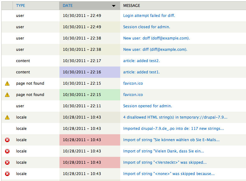
mgiffordI should have added this in the initial post.. But really. How does it make any sense for a page not found error to have it's date 07/16/2010 - 09:15 highlighted with a green background?
Major color themes are ok, warning & error. There's also some room for just an info color too. These need to be give priority over the even/odd or perhaps be done in conjunction with it, but even/odd shouldn't over-ride a color that is conveying meaning.
Comment #2
reglogge commentedMoving this to Drupal 8 and attaching a patch that does the following things:
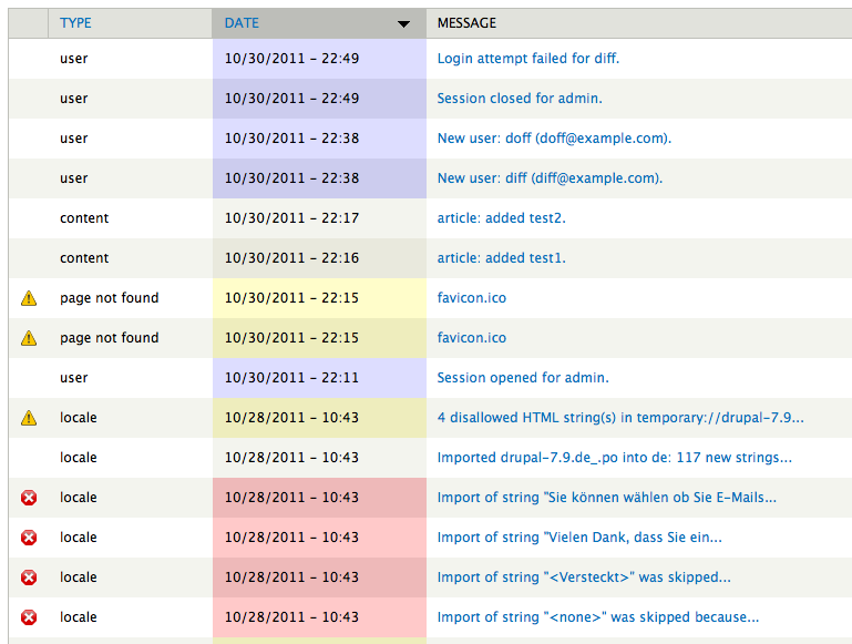
- give specific background-colors only to errors (red), warnings (yellow) and log entries indicating user interaction (blue)
- remove the IMHO highly misleading background-color green from 'Page not found' and 'Access denied' messages. These have the css-class 'dblog-warning' anyway and appear now in yellow as they should.
- ensure that both even and odd rows get the background colors
The colors are basically the same as in /admin/reports/status so that adds some consistency.
Watchdog page before:

Watchdog page after:

Comment #3
reglogge commentedI think that's because you can order the logs page by different columns. Only the currently selected column gets the color highlighting to avoid eye cancer.
Comment #4
mgiffordThanks @reglogge - sounds like it's a better approach!
We'll also have to be clear that the background color has enough contrast against the black. With the zebra striping in general this can make it more difficult.
Comment #5
reglogge commentedD'Oh. The color scheme from the patch works fine in Seven but not so well when Bartik is enabled as the admin theme. The reason: Bartik's zebra striping in tables starts with a darker background color (for odd rows) whereas Seven's starts with a lighter one.
I'm starting to wonder if this background-coloring of log messages shouldn't be handled by css in individual themes rather than here in core. This way themes could apply their own color schemes. The colors ind admin/reports/status come from Seven theme's own css, I just noticed.
Opinions?
Comment #6
mgiffordI think that core should provide the base & allow themes to override them. With the zebra striping there might need to be additional css with Bartik, but ideally it wouldn't need to be something that every theme decides. It might be necessary, but hopefully not. For more info on color contrast see:
http://drupal.org/node/464500
Comment #7
mgiffordadding tags
Comment #8
jacineI'd just like to say I hate theming this as well, and think it can be done better. So many themes do zebra striping on table rows and there is always a problem. Some themes totally ignore it because it's such a pain in the ass from a CSS standpoint.
PS - I am tempted to change this to the CSS component, but I believe it needs some design/UX discussion before getting to that point. When this is ready for CSS work can someone please update the component so we can follow/help? Thanks!
Comment #9
reglogge commentedThe color contrast test passes for all background-colors in this patch. I've used Contrast-A for checking.
Only when sorting by the user column, the backgrounds don't provide enough contrast for the blue link color. So they fail :-(
Comment #10
xjmI think this is Needs Work based on comments #5 through #9.
Also note that the Drupal 8.x patch will need to be rerolled, because the core directory structure for Drupal 8 has now changed. (For more information, see #22336: Move all core Drupal files under a /core folder to improve usability and upgrades). When the patch has been rerolled, please set the issue back to "Needs Review."
If you need help rerolling this patch, you can come to core office hours or ask in #drupal-gitsupport on IRC.
Comment #11
mgifford#2: dblog-css-856352-3.patch queued for re-testing.
Comment #13
mgiffordKeeping up with core.
Comment #14
reglogge commentedBack to 'Needs work' according to #10
Comment #15
droplet commentedI suggest remove all colors or only keeps these:
RED = Error
Yellow = Warning
what is the meaning of purple.
Comment #16
mgiffordIt's definitely an interesting colour about the purple. There are a bunch of meanings if you search for "meaning & purple".
But ya, the #DDF hex code just seems to be a complementary color for the red / green - #ffc9c9 / #cceecc
Of course there's a lighter/darker version of each for zebra striping.
I'm not sure why we don't have colours defined for all of these:
WATCHDOG_DEBUG => 'dblog-debug',
WATCHDOG_INFO => 'dblog-info',
WATCHDOG_NOTICE => 'dblog-notice',
WATCHDOG_WARNING => 'dblog-warning',
WATCHDOG_ERROR => 'dblog-error',
WATCHDOG_CRITICAL => 'dblog-critical',
WATCHDOG_ALERT => 'dblog-alert',
WATCHDOG_EMERGENCY => 'dblog-emerg',
They don't line up with the file in core/modules/dblog/dblog.css
dblog-user
dblog-error
dblog-warning
dblog-critical
dblog-alert
dblog-emerg
But ya, I do think we should probably spin that off as a separate issue and see if we can't get some folks who are good with colours to come up with colors that are perhaps more meaningful.
Comment #17
droplet commentedD8 against Stark theme
#15 for D8, should it remove all color ? and move down to D7 with these colors
#5 & #9, separate issue for other themes. ( I don't know why its only highlighting date column too)
and we can't use multiple classes on D7 (IE6)
Comment #18
reglogge commentedIt's only the column currently selected for ordering that gets the coloring, and the date column is selected by default.
On a more general note, I now think the coloring should be left out of dblog.css altogether. Let the individual themes decide whether they want to apply coloring to different types of log messages as a visual aid. This stems from the finding in #5 that Bartik uses a different 'striping' than Seven, so a general coloring that takes account of striping isn't possible from dblog.css alone. Either Bartik or Seven would need to override this.
I think it's also debatable if there should be icons indicating the levels of messages. Why not leave this decision to the theme either? That's what a theme is for, right?
Comment #19
mgifford@xjm & @reglogge - any thoughts on who could help move this patch along.
We need a new patch to consider options. Or maybe a new pattern.
Comment #20
mgifford#13: dblog-css-856352-4.patch queued for re-testing.
Comment #21
mgiffordSimple win win for everyone.
Comment #22
mgifford#13: dblog-css-856352-4.patch queued for re-testing.
Comment #23
mgifford#13: dblog-css-856352-4.patch queued for re-testing.
Comment #25
mgifford@droplet - I've left in the purple. I haven't stripped out anything for Stark.
@reglogge - I do think that a consistent base set of colors (that could be over-ridden by the theme) is useful. It's just so easy to scroll down and look for red. It could be that all Core & contrib themes use consistent, useful error messages, but until there's movement to do that.... Let's just keep them in.
Removing the icons is an accessibility issue. They need to be over-writable for sure, but information needs to be conveyed with more than color & text.
I've been trying to encourage interest in having someone else revise this patch for exactly a year. I think what's in here now is probably good enough for D8. Other ideas might need to wait till D9.
Comment #27
mgifford#25: dblog-css-856352-25.patch queued for re-testing.
Comment #28
Bojhan commentedSeems to look fine
Comment #29
webchickThe screenshots in #2 definitely make a lot more sense.
Committed and pushed to 8.x. Thanks!
Does this also need a backport to D7?
Comment #30
mgiffordIt would be an improvement for D7. Might be worth doing. I'm just happy it's in D8 at this point.