
 Come together with the global Drupal community in Rotterdam, 28 Sept – 1 Oct 2026. Sessions, contribution, connection, and Early Bird savings until 8 June.
Problem/Motivation
Theme screenshot alt-text and theme descriptions need improved text (and perhaps standardization) to provide more detailed explanations of the features supported by the theme (especially for non-sighted admins).
Proposed resolution
comment #50
This comment includes a patch that currently fails but has improved descriptions for the core themes and avoids marketing jargon.
Remaining tasks
The issue itself requests more than just improved desctriptions:
two things in the .info file
standardized alt text for the screenshot
tagging for the core themes such as uses the color module, responsive, fixed width, 3 column
In addition see
comment #31
"If we're thinking long term, here's my proposal of an ideal classification for the core themes. I see several issues coming out of this:
description: (existing property) Describes the purpose, stylistic characteristics, and design philosophy of a theme, in 2-3 sentences. I think that Jen's proposed text for Seven is the best example of this.
alt text: (new .info property) Alt text for the theme screenshot - describes what the screenshot looks like, as per Everett's original request.
tags: (new .info property) Tags would match up with a new taxonomy vocabulary for themes on Drupal.org. If you clicked on a particular tag, then a lightbox would show up with Drupal.org download links for themes that matched that tag (i.e., like how things work for installing themes in WordPress). This would mean that you could click single-column, monochromatic, recolorable, multi-column, fluid, fixed, etc. and see what other themes had that characteristic.
Preview button: Each theme would also have a preview button that you could click that would be somewhat similar to "Demonstrate block regions" by switching your site into the given theme, with a back link that would take you back to themes administration. This would, I think address Bojhan's concern that we want people to actually try out themes.
Obviously, this is an ambitious plan, but we have a whole release cycle to make it happen. If only 2 parts end up getting implemented though, I would have it be points 1 & 2, since that would be a relatively easy fix and would address the accessibility issue, while at the same time improving the theme descriptions.
Let me know your thoughts."
User interface changes
(see above)
API changes
n/a
Related Issues
n/a
Original report by Everett Zufelt
On /admin/appearance there is a list of all Core themes. Each theme provides a screen-shot, a name, and a description.
1. Every screen-shot has the alt text "Screen-shot for [theme-name] theme".
2. The theme descriptions are inconsistent in how they describe the themes.
3. None of the theme descriptions are close to being sufficient to inform a blind administrator about how the theme looks or how its regions are laid out.
| Comment | File | Size | Author |
|---|---|---|---|
| #75 | Screen Shot 2014-01-31 at 12.32.22 PM.png | 46.6 KB | mgifford |
| #74 | descriptive-text-for-stark-922696-74.patch | 729 bytes | lewisnyman |
| #66 | descriptive-text-for-themes-922696-66.patch | 1.88 KB | stpaultim |
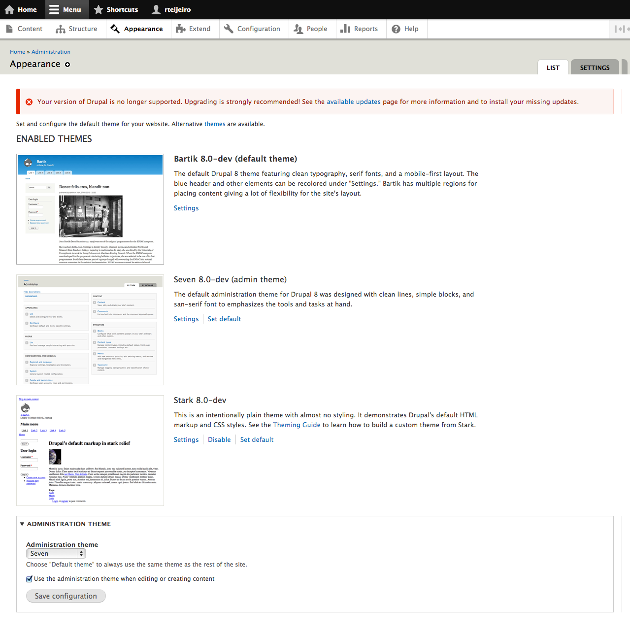
| #64 | appearance.png | 289.61 KB | rteijeiro |
| #61 | descriptive-text-for-themes-922696-61.patch | 1.91 KB | mgifford |

Comments
Comment #1
Jeff Burnz commented1) I think its too late the change this, if we wanted unique accurate screenshot descriptions we'd probably need to add that in the info file - D8 material.
2) Perhaps - but then again there is no formula for describing a theme - they are all different, unique, so I am not sure what your point is here.
3) I think they can be improved, but I think its very much to ask that they fully describe what the theme looks like, the region layout and their features (color module support). Not even sighted users can infer this information from the screenshots and would have to enable the theme to find out.
I do agree they can be improved.
Comment #2
bowersox commented@Everett, can you provide a sample of the level of detail that should be in the ALT text? If we apply this best practice to core themes we can encourage theme contributors to look at those examples.
Comment #3
Everett Zufelt commentedSo I mostly posted this as a stub, since it is actually a big issue that doesn't have a simple answer. The alt attribute aspect doesn't really bother me that much, since the description is available in close proximity (it should have come last in the list.
A flexible, recolorable theme with many regions.
A multi-column theme which can be configured to modify colors and switch between fixed and fluid width layouts.
This theme demonstrates Drupal's default HTML markup and CSS styles. To learn how to build your own theme and override Drupal's default code, see the Theming Guide.
So, I guess I would say that the above three theme descriptions are important, but don't, I imagine, really give a description of the screen-shots.
1. The alt for the screen-shots (or the descriptions them selves) should describe the screen-shots ("many regions", "multi-column" are useful pieces of information, but doesn't really tell a visually impaired developer what regions / columns have content in them by default or how they are configured by default).
2. Perhaps more detailed information about theme layouts (how regions are laid out for example) could be provided using a help page for the theme (obviously this would be for core themes only).
Comment #4
mgiffordI'm thinking this this might be a D8 issue. But I think there's some really interesting potential here for a .info file.
I'd love to have this kind of information to be able to sort/organize/differentiate between different themes.
It's really difficult to organize the themes for anyone, but it would be nice if you could sort them based on what's in the .info file. That could then be brought into the display (whether you're talking alt tags or descriptive text) and displayed in /admin/appearance
Comment #5
Jeff Burnz commentedI think we could get much better descriptions into D7, even though we're past string freeze the descriptions are pretty woeful, perhaps we can get Bojhan to come up with something better and at least try to get it in.
Comment #6
Bojhan commentedSo this is about improving the alt text or descriptions? I am also kind of siding for Drupal 8 on this one, as we want contributed themes to provide proper alt descriptions. One thing I can argue for keeping the actual descriptions short, is that we want people to enable it. Even from the screenshot its really hard to tell what the theme is about, only enabling will really give you this information.
Comment #7
Jeff Burnz commentedatl is D8, for sure, no issue there.
The theme descriptions we have at the moment basically suck and are even factually wrong!
Bartik:
A flexible, recolorable theme with many regions.
This is inaccurate - the word "flexible" implies it is fluid, which it is not (the word "flexible" is often interchanged with "fluid" or even "liquid" wrt to describing layout). "recolorable" is not even a word, "colorable" is. Many regions for what? This can be a lot better and more accurate.
Garland:
A multi-column theme which can be configured to modify colors and switch between fixed and fluid width layouts.
More accurately its a 3 column theme. Also we're switching vernacular here compared to Bartik wrt to the colorable feature. The grammar is woeful bordering on nonsensical.
Seven:
A simple one-column, tableless, fluid width administration theme.
"tableless" is redundant and soooo last year. To me this is the worst of the lot - why are we trying to "describe" Seven - its the default admin theme, we don't need to "sell it". Just say it like it is - Default Administration Theme.
Stark:
This theme demonstrates Drupal's default HTML markup and CSS styles. To learn how to build your own theme and override Drupal's default code, see the Theming Guide.
Excellent, and with a handy link to the theming guide, no changes here I think.
Comment #8
mgiffordOk, how do we provide meaningful descriptions. Well written, meaningful descriptions benefit everyone.
I've added some tags here.
Comment #9
Bojhan commentedCan anyone ask drieschick if this is still up for grabs in D7, because they are indeed wrong (not deadly wrong, but wrong nonetheless)
Comment #10
Jeff Burnz commentedAgree, since we're way past string freeze, I'll hop in IRC tonight and try to get some feedback, not a deal breaker but nice to have sort of thing.
Comment #11
EvanDonovan commentedSo should this bug report be bumped to D8, since we can't add a new property to the .info file for alt text on the screenshots at this stage?
As for the latter issue that came out of this, I would give descriptions something like the following:
Bartik: A recolorable, fixed-width theme of either two or three main columns, with a multi-column footer.
Garland: A recolorable, multi-column theme, which can be either fixed or fluid width.
Seven: A single-column, monochromatic theme, used for site administration.
Stark: A theme demonstrating Drupal's default HTML markup and CSS styles. To learn how to build your own theme and override Drupal's default code, see the Theming Guide.
(I changed Stark for the sake of consistency.)
I've noticed before that these descriptions were not the greatest. I think that improving them would set a good precedent for contrib.
I think a D8 todo would be to provide the ability to tag themes in the .info file with things like 3-column, fixed-width, fluid, recolorable, etc. This could possibly then be used in conjunction with the Plugin Manager to find new themes, as can be done in WordPress. That would be much more helpful than the textual descriptions.
Comment #12
sun.core commentedOverall conclusion seems to be that the screenshot attributes can be improved, but not without an API change.
Comment #13
mgiffordOk, so can we get comment 7 written up as a patch?
Comment #14
EvanDonovan commented@mgifford: Do you mean #7 or #11? I can write up #11 as a patch, since those kind of changes can still be made without an API change, and before string freeze. Agreed with @sun about the alt text, though, of course.
#7 doesn't actually have suggestions; it just says they are wrong.
Comment #15
mgifford#11 would be great.. I grabbed the wrong comment queue. Think I was working from formatting to identify the suggested changes more than anything..
Comment #16
Jeff Burnz commentedYep, lets get a patch for #11
Comment #17
EvanDonovan commentedOk, here's the patch for #11. I made a few minor changes to the wording I had previously proposed, but it is essentially the same.
I've retitled the issue to reflect its new focus on what can still get into D7 at this stage. For D8, we can either re-purpose this issue to add the alt text property to the theme .info file (could probably also do that in D7 contrib - Accessibility project?), or else branch off a new issue.
Comment #18
Everett Zufelt commented+1
Comment #19
mgiffordThis looks good to me. I've applied this and attached before/after screenshots. The descriptions are certainly more consistent. This is an improvement for everyone trying to figure out how the core themes differ.
Comment #20
Jeff Burnz commentedActually, for Bartik, to be more consistent and more accurate (because Bartik can be one column also), perhaps the description should be (follows the same order of features as Garland - color module, columns, type, special feature):
Powered by Dreditor.
Comment #21
EvanDonovan commentedA reasonable suggestion.
Here it is as a patch.
Comment #22
Everett Zufelt commentedMarking as RTBC.
A quick fix that brings more clarity and consistency to the descriptions of Core themes.
Comment #23
bowersox commentedI agree. Looks good. This is a simple, low-risk change.
Comment #24
webchickI'm fine with this patch, other than I want to run it past jen simmons first to make sure she's basically ok with the text change to Bartik. "A flexible, recolorable theme with many regions" is a bit more spiffy sounding than "A recolorable, multi-column, fixed-width theme, with a multi-column footer," even though the latter is more accurate.
I left her a message on IRC but if she doesn't get back in the next couple of days I'll go ahead and commit this anyway.
Comment #25
jensimmons commentedI think that emphasizing the technical specs of these themes, while not saying anything else, is kind of weird.
I don't even know what that means. Same with this:
In fact, do you even know which description is for which theme without looking? Most people don't know what "fluid", "fixed", "recolorable", or "multi-column" means.
I do agree that the old description on Bartik was bad. So sad. I remember not liking it when I wrote it, but not knowing what else to do. I did want to mimic the other descriptions.... and move on to whatever else I was doing that day. Now that I read this whole thread, I realize that we could change the whole flavor of these descriptions to be much more helpful and friendly. And help solve the problem caused by a the lack of alt-text-like description for the screenshots (without getting into a deep feature-like fix).
I think it's helpful to explain a bit of why someone would choose a theme.
Here's my best stab at this:
Bartik
This theme features clean typography, serif fonts, and modern use of CSS. It starts with a blue header, but can be recolored under "Settings." Bartik has multiple regions for placing content, including optional left and right sidebars, footer columns, and more. (Recolorable, multiple regions, fixed-width.)
Garland
With it's angular lines and use of sans-serif fonts, Garland features the ability to change between one, two or three columns; and to change the background & text colors. (Recolorable, multi-column, fixed or fluid-width.)
Seven
This theme is designed to be the administration theme for Drupal. With clean lines, simple blocks of color, and san-serif fonts, Seven emphasizes the tools and tasks at hand. (Single column, fluid width.)
Stark
This theme is very plain, and has almost no styling of it's own. It demonstrates Drupal's default HTML markup and CSS styles. You can create your own theme by using Stark as a starting place. To learn how, see the Theming Guide.
I'm going to go eat lunch, and come back fresh to this writing. Then I'll make a patch and screenshot.
Comment #26
Bojhan commentedSorry but this is not the direction we want to go. The descriptions in the last patch where fine + any additional Bartik elements that are really essential to convey. I think its wrong to assume these descriptions are to make a weighted evaluation on which one to choose (the why) - rather its about giving short concise info, to lead people into trying it out. Because that is what we really want, ideally we even want to get them in the mindset of trying to install new themes.
I can understand you might not agree with this strategy as you put forward, however I do not think its wise to change this so late in the release cycle without knowing what impact it will have on users. In terms of words that might cause confusion, words that might prevent them from trying out etcetera.
Comment #27
jensimmons commentedComment #28
EvanDonovan commentedTwo textual errors bump this down to "needs work":
As for the overall direction change, I'm not opposed to it in principle, although I think that these are a little verbose. I am not married to the descriptions that I wrote a few weeks ago, but I thought that they were definitely an improvement over the ones that are currently in core, which are a) inconsistent in style and b) actively misleading (as Jeff Burnz points out in #7).
Now on to more detailed stylistic remarks:
I think the original description of this theme was fine, since it is a demonstration theme, not one that we expect people to actually use in production.
This sentence is trying to talk about two different things at one: the design of the theme and its capabilities. Grammatically, I don't think that it's correct.
With that said, here is my (rough) proposal, if we do decide to go in a direction of providing more stylistic information, and guiding people's choice of themes a little more. I'll roll it into a patch if there is consensus that we want to go this direction.
Comment #29
Jeff Burnz commentedI think the point Bojhan is making has a lot of merit - we can't ever fully describe a theme without writing a short story, so why bother trying, just give them a quick, easy-to-scan description and let the user get on with the task of enabling the theme or clicking the settings link. I don't think users make a decision based on these descriptions - they're more interested in installing, enabling then playing with new themes.
Comment #30
webchickHm. I land on Jen's side in this argument.
The text in the previous patches is trying to convey technical information to implementers to help guide their decision. Problem is, this technical information would be much more appropriately be displayed as separate discrete fields here (also searchable/filterable on Drupal.org), rather than abusing the description for this purpose. We don't enter the description for modules as "Module implements hook_nodeapi(), hook_block(), and hook_cron() to provide ratings on content."
Jen's patch is making the description, well, descriptive. An end user is going to want to get an idea of the "feel" of a theme prior to turning it on, and I would think that this also holds true for blind users. Jen's text is far more descriptive of what their sighted end-users will actually see than the earlier patches.
Compare:
+description = A recolorable, multi-column, fixed-width theme, with a multi-column footer.
and
+description = A recolorable, multi-column theme, which can be either fixed or fluid width.
If you showed those to someone off the street and asked them to point to which screenshot they aligned with, do you think they could tell you?
Upon reflection though, I actually think we need to tackle this in D8. Both because then we might conceivably have theme properties broken out in the way that the first patches try to do, but also because what we're attempting to do here is enforce a new standard on theme descriptions which will affect contrib, over a year after we've been locked down from enforcing new standards on contrib. There are some minor inconsistencies in the descriptions' grammar that would be nice to resolve, but we're also past the point where we change strings around just because they'd be nicer.
I'd recommend continuing this discussion though, coming to consensus on what the new approach should be, and documenting it in the theme .info file section, to try a grassroots effort to spur this initiative in contrib in the meantime.
Comment #31
EvanDonovan commentedKind of disappointed that this is getting bumped, but I can see your point - there are larger issues that need to get fixed this release cycle.
If we're thinking long term, here's my proposal of an ideal classification for the core themes. I see several issues coming out of this:
Obviously, this is an ambitious plan, but we have a whole release cycle to make it happen. If only 2 parts end up getting implemented though, I would have it be points 1 & 2, since that would be a relatively easy fix and would address the accessibility issue, while at the same time improving the theme descriptions.
Let me know your thoughts.
Comment #32
Everett Zufelt commentedComment #33
mgifford#27: descriptive-text-for-themes-922696-27.patch queued for re-testing.
Comment #35
mgiffordUpdating patch against core. Removing garland. Adding responsive theme info for Bartik.
Comment #36
mgifford#35: descriptive-text-for-themes-922696-35.patch queued for re-testing.
Comment #37
mgifford#35: descriptive-text-for-themes-922696-35.patch queued for re-testing.
Comment #38
mgiffordtagging. This should be an easy fix.
Comment #39
devin carlson commentedThe patch in #35 sill applies and makes theme descriptions much more descriptive. I didn't find any obvious problems with the new descriptive language.
Comment #40
catchWe've been trying to remove and/or drastically shorten descriptions of just about everything around core. I can see the accessibility issue here but would also like to ensure we're not introducing a usability regression at the same time. Probably the balance is about OK but assigning to Bojhan for a final look.
Comment #41
Bojhan commentedThis does need more work, it is significantly over descriptive. Although Evan outlines certain guidelines, I dont see them being discussed. Whole blobs of text next to a screenshot, do not make it more likely to be selected, nor does it help to inform because it creates the "wall of text" effect that scares people away from reading it. The fact that this is almost a twitter line, should be a good thing :)
"This theme features clean typography, serif fonts, modern use of CSS, recolorable theme with many regions and a responsive, mobile-first layout. The blue header and other elements can be recolored under "Settings." Bartik has multiple regions for placing content, including optional left and right sidebars, footer columns and more."
Can we cut all the marketing crap, from this description? People are already on the themes, page - this is not where they download new themes, so we can keep it to being functional as already pointed out in #26, if we do wish to add more stylistic parts to the description lets discuss that - because as of now I don't think that direction is useful and the current stylistic description is far from concise or useful.
Comment #42
mgiffordI'd love to see some fresh ideas on describing the core themes. Why would someone use Bartik? How do we describe for a blind admin how Seven is different?
I'm fine with cutting out the marketing but would like to see more substantive material brought in.
Comment #43
mgiffordMaybe we should just do this in a wiki. Anyways, this is a little shorter I think.
Bartik
Seven
Stark
Comment #44
mgifford#43: descriptive-text-for-themes-922696-43.patch queued for re-testing.
Comment #46
mgiffordadjusting for yaml files.
Comment #48
mgifford#46: descriptive-text-for-themes-922696-46.patch queued for re-testing.
Comment #50
mgiffordWith the "''" rather than "\'" as per earlier examples.
Comment #51
mgifford#50: descriptive-text-for-themes-922696-50.patch queued for re-testing.
Comment #52
mparker17#50: descriptive-text-for-themes-922696-50.patch queued for re-testing.
Comment #55
chuchunaku commentedrainbreaw & chuchunaku are working on this issue.
Comment #56
chuchunaku commentedProblem/Motivation
Theme screenshot alt-text and theme descriptions need improved text (and perhaps standardization) to provide more detailed explanations of the features supported by the theme (especially for non-sighted admins).
Proposed resolution
comment #50
This comment includes a patch that currently fails but has improved descriptions for the core themes and avoids marketing jargon.
Remaining tasks
The issue itself requests more than just improved desctriptions:
two things in the .info file
standardized alt text for the screenshot
tagging for the core themes such as uses the color module, responsive, fixed width, 3 column
In addition see
comment #31
"If we're thinking long term, here's my proposal of an ideal classification for the core themes. I see several issues coming out of this:
description: (existing property) Describes the purpose, stylistic characteristics, and design philosophy of a theme, in 2-3 sentences. I think that Jen's proposed text for Seven is the best example of this.
alt text: (new .info property) Alt text for the theme screenshot - describes what the screenshot looks like, as per Everett's original request.
tags: (new .info property) Tags would match up with a new taxonomy vocabulary for themes on Drupal.org. If you clicked on a particular tag, then a lightbox would show up with Drupal.org download links for themes that matched that tag (i.e., like how things work for installing themes in WordPress). This would mean that you could click single-column, monochromatic, recolorable, multi-column, fluid, fixed, etc. and see what other themes had that characteristic.
Preview button: Each theme would also have a preview button that you could click that would be somewhat similar to "Demonstrate block regions" by switching your site into the given theme, with a back link that would take you back to themes administration. This would, I think address Bojhan's concern that we want people to actually try out themes.
Obviously, this is an ambitious plan, but we have a whole release cycle to make it happen. If only 2 parts end up getting implemented though, I would have it be points 1 & 2, since that would be a relatively easy fix and would address the accessibility issue, while at the same time improving the theme descriptions.
Let me know your thoughts."
User interface changes
(see above)
API changes
n/a
Related Issues
n/a
Original report by Everett Zufelt
On /admin/appearance there is a list of all Core themes. Each theme provides a screen-shot, a name, and a description.
1. Every screen-shot has the alt text "Screen-shot for [theme-name] theme".
2. The theme descriptions are inconsistent in how they describe the themes.
3. None of the theme descriptions are close to being sufficient to inform a blind administrator about how the theme looks or how its regions are laid out.
Comment #57
mgifford@ChuChuNaKu Was this part of the summary initiative? If so the issue should have been edited with your good summary and not added as a new comment.
Where are things with the work you were doing with @rainbreaw - was this done at DrupalCon in the sprints?
Anyone wan to roll a new patch?
Comment #58
chuchunaku commented@mgifford Sorry about that! I'm a bit new to this. I'ill know better next time. Yes, this was part of the DrupalCon Portland code sprints. @rainbreaw and I were doing summary updates for items listed in http://core.drupalofficehours.org/
Comment #59
mgiffordNo Problem. You just need to edit the original node (up at the top of this page), and insert your text there.
Comment #60
mgiffordUpdated summary from #56.
Comment #61
mgiffordre-roll
Comment #62
mgiffordgo bot go
Comment #63
mgifford#61: descriptive-text-for-themes-922696-61.patch queued for re-testing.
Comment #64
rteijeiro commentedPatch applies well and it seems to be right (see screenshot). It's a RTBC for me ;)
Comment #65
alexpottPatch no longer applies.
Comment #66
stpaultim commentedStraight reroll
Comment #67
mgiffordTested it and it looks good. Back to RTBC.
Comment #68
catchThe 'This is' is redundant, can start with 'An intentionally'.
Comment #69
rteijeiro commentedTagging.
Comment #70
yoroy commentedType in the description for Seven: sans-serif, not san-serif.
I think there is still too much selling the themes going on, where these are already installed so no need to do that. Especially Seven suffers from this. I think there’s another issue that updates the description for Seven actually.
Suggested rewrite for Bartik:
Clean typography with serif fonts in a mobile-first layout. The color scheme can be customized. Multiple regions for content provide a lot of layout flexibility.and Stark:
An intentionally plain theme with almost no styling to demonstrate default Drupal’s HTML and CSS. Learn how to build a custom theme from Stark in the <a href="http://drupal.org/theme-guide">Theming Guide</a>.Comment #71
lewisnymanRelated: #2093217: Update Seven's description.
Comment #72
Jeff Burnz commentedAgree with catch re Stark.
Seven, shouldn't this just say "The default admin theme for Drupal 8".
The Bartik description is a little hard to understand and I agree, why are we selling themes?
Keep it simple and to the point:
Responsive mobile first layout with multiple regions for layout flexibility. Customisable color schemes.These things tell me something about what the theme does/can do.
Be really weary of slightly idiomatic usage of words like "under", e.g. if I look "under Settings" I see a large white space and then the heading for "Seven...". If you are not broadly fluent in English this is an entirely reasonable assumption.
Comment #72.0
Jeff Burnz commentedUpdated issue summary.
Comment #73
mgiffordThis issue has kinda stalled. It should be pretty simple though as there are just 3 themes and we're talking about text (maybe with a link).
I think we can make it better than it is now without much work. We may not be able to make it perfect.
Comment #74
lewisnymanThere seems to be consensus around Stark. Here's a patch just for that. It would be nice to improve one if we can't do all at once.
Comment #75
mgiffordAgreed at getting that in and then look at the other two.
Comment #76
mgiffordWanted to say that there should be a follow-up to mention Stark (and possibly Bartik & Seven) on this page https://drupal.org/documentation/theme
If someone wants to know specifically about Stark there should be a clear link on that page to direct someone where to go to get more context on this theme.
Comment #77
catchCommitted/pushed to 8.x, thanks!
However I'm not sure what the status with the other themes is? Does this need follow-up issues created? What about style guide for contrib themes?
Comment #78
mgiffordThanks @catch.
We still need to settle on the wording for Seven & Bartik.
I think that could be done here or elsewhere if you prefer. I don't know that these are the best comparisons but wanted to highlight some of the options:
Bartik:
vs
Seven:
vs
Comment #79
catchNew issues would be good for that.
Comment #80
mgiffordDone. #2193691: New methods, standards for describing Seven themes admin page & #2193693: Improve theme description and screenshot alt-text for usability
So this becomes a meta issue now? Or do we just close this issue now.
Comment #81
lewisnymanI think we can close this one
Comment #83
chi commentedRepopening since the scope of the issue was not achieved.
See remaining tasks:
At the moment theme screenshots have the following alt text: "Screenshot for [THEME_NAME] theme".
Comment #84
chi commentedFor me personally the current alt text looks well. It describes what is shown on the image and nothing else. If we won't fix this issue we need to remove alt property (added in #2193691: New methods, standards for describing Seven themes admin page) from Seven info file.
Comment #99
quietone commentedThis issue was committed in 8.x and a follow up made to make the changes to Bartik. This issue was reopened to also change the alt-text for Stark and no further work was done.
In order to make progress here I think a scoping change is needed. It would be better to updated the description and alt-text for all the themes in one issue instead of one issue per theme. This will help keep the language the same throughout and make the task easier for reviewers and committers. With that in mind, I am closing this issue and will comment on the followup. #2193693: Improve theme description and screenshot alt-text for usability.