

 The 2026 Drupal Business Survey is open. Your response will help shape the future of the Drupal business ecosystem.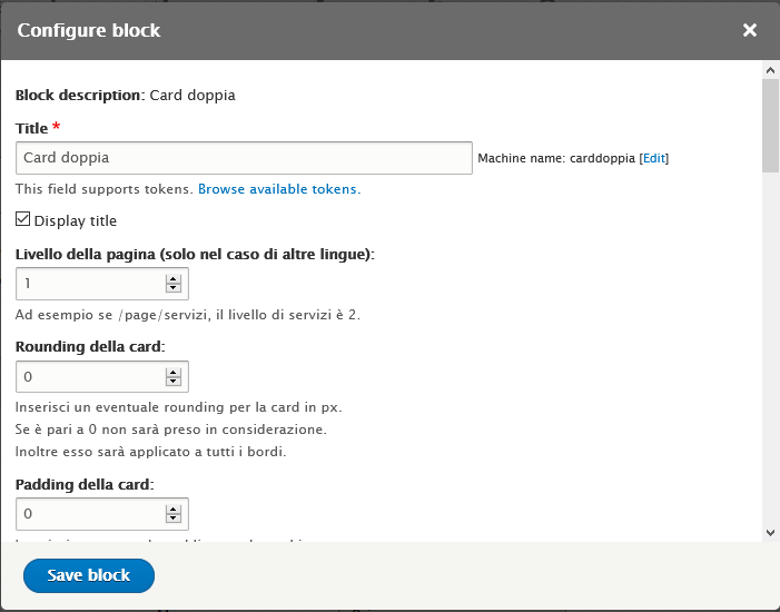
This project is not covered by Drupal’s security advisory policy.
Description
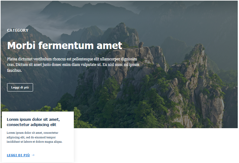
This module provides many Bootstrap Italia components as the custom block you can insert into your layout.
You can see the complete components list here (privided by Agid): Bootstrap Italia Componenti
In particular, the components that the module provide are:
- Two cards,
- Vertical tabs,
- Tab cards,
- Tabs,
- Special cards,
- Section cards,
- Section,
- Image cards,
- Hero,
- Icon cards,
- Simple cards,
- Big cards,
- Action cards;
For the component you want to add, you can specify the margin, padding, and other useful info.
Installation
You can install this module with the composer or downloading it and uploading into your file system under the path: /modules/contrib. After, you can enable it with drush, drupal console, or with Drupal administration page for modules.
Usage
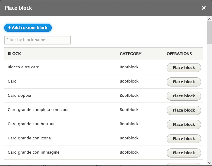
You can use the blocks provided by this module like any other block (custom or not) in Drupal. For example, using the button "place a block" into the Block Layout page, or using the Layout Builder.
Project information
 Minimally maintained
Maintainers monitor issues, but fast responses are not guaranteed.- Maintenance fixes only
Considered feature-complete by its maintainers. - Project categories: Developer tools
- Ecosystem: Bootstrap Italia
- Created by drp_distruptor on , updated
 This project is not covered by the security advisory policy.
Use at your own risk! It may have publicly disclosed vulnerabilities.

