
This project is not covered by Drupal’s security advisory policy.
Bootstrap Forms is a parent theme that is based upon the core 'stable' theme.
Bootstrap Library Installation
You will need to install the bootstrap-sass library into the /libraries folder of your drupal installation. You can download the library here.
Theme Installation
If you are using your own subtheme then be sure to set bootstrap_forms as the base theme e.g.
core: 8.x
base theme: bootstrap_forms
Alternatively I have provided an example subtheme that has the scss files setup to import bootstrap's scss files in the correct order allowing its variables to be overridden easily.
1. Copy over the starterkit from the`bootstrap_forms/starterkit/example` directory into your site's `themes` directory.
2. Rename the folder to a unique machine readable name. e.g. mysubtheme
3. Rename `./mysubtheme/example.starterkit.yml` to match your new theme name and change starterkit.yml to info.yml
Usage
All form elements can be controled via the attributes below, alternatively you can use the bootstrap_forms_ui module to control individual entities form element layouts.
Properties
Use the list below to jump to the required property definition.
#form_type, #title_grid, #element_grid, #title_tooltip, #suffix_tooltip, #prefix_tooltip, #element_columns, #form_type_wrapper, #form_group_wrapper, #form_field_wrapper, #element_inline
#form_type
Used by: All elements
Description: Specify the type of form to be used for the element see http://getbootstrap.com/css/#forms
Values: 'basic', 'horizontal', 'inline'
#title_grid / #element_grid
Used by: All elements
Description: Allows the developer full control to set the grid classes for a field's LABEL and a field's INPUT ELEMENT respectively as per http://getbootstrap.com/css/#grid
Usage Example:
   $form['example_textfield'] = array(
         '#title' => t('Example'),
         '#form_type' => 'horizontal',
         '#title_grid' => array(
             'columns' => array(
                 'md' => 3
             ),
         );
         '#element_grid' => array(
             'columns' => array(
                 'md' => 9
             ),
         );
   );
#title_grid['columns'] / #element_grid['columns']
Description: Specify the column class to apply to the title/element for each of bootstrap's breakpoints.
Values: Array
Possible keys: 'xs', 'sm', 'md', 'lg'
#title_grid['offset'] / #element_grid['offset']
Description: Specify the amount of columns to indent/offset the element for each of bootstrap's breakpoints.
Values: Array
Possible keys: 'xs', 'sm', 'md', 'lg'
#title_grid['push'] / #element_grid['push']
Description: Specify the ordering of the element for each of bootstrap's breakpoints.
Values: Array
Possible keys: 'xs', 'sm', 'md', 'lg'
#title_grid['pull'] / #element_grid['pull']
Description: Specify the ordering of the element for each of bootstrap's breakpoints.
Values: Array
Possible keys: 'xs', 'sm', 'md', 'lg'
#form_type_wrapper
Used by: All elements
Description: By default form elements have a wrapper element with a class denoting the type of form being rendered i.e. 'form-inline', 'form-horizontal' or 'form-basic'. This property allows this wrapper to be excluded from the markup completely.
Values: TRUE, FALSE
#form_group_wrapper
Used by: All elements
Description: By default form elements have a wrapper element with a class of .form-group this property allows you to exclude it if required.
Values: TRUE, FALSE
#form_field_wrapper
Used by: All elements
Description: By default form elements have a field wrapper that contains all of drupal's default filed classes, this property allows that wrapper to be excluded.
Values: TRUE, FALSE
#prefix_tooltip
Used by: All elements
Description: Prepend tooltip to the input element
Usage Example:
    $form['contact'] = array(
        '#title' => t('Contact name'),
        '#prefix_tooltip' => t('This is a prefix tooltip'),
    );

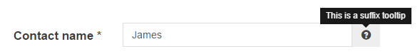
#suffix_tooltip
Used by: Textfield
Description: Append a tooltip to the input element
Usage Example:
    $form['contact'] = array(
        '#title' => t('Contact name'),
        '#suffix_tooltip' => t('This is a suffix tooltip'),
    );
#element_columns
Used by: checkboxes, radios
Description: Use to arrange checkboxes in multiple columns in horizontal form types.
Usage Example:
    $form['checkboxes'] = array(
        '#title' => t('Checkboxes'),
        '#form_type' => 'horizontal',
        '#title_grid' => array(
             'columns' => array(
                'md' => '4'
            ),
        ),
        '#element_grid' =>  array(
             'columns' => array(
                'md' => '8'
            ),
        ),
        '#element_columns' => 3,
    );

Project information
 4 sites report using this theme
- Created by rob holmes on , updated
 This project is not covered by the security advisory policy.
Use at your own risk! It may have publicly disclosed vulnerabilities.

