





This project is not covered by Drupal’s security advisory policy.
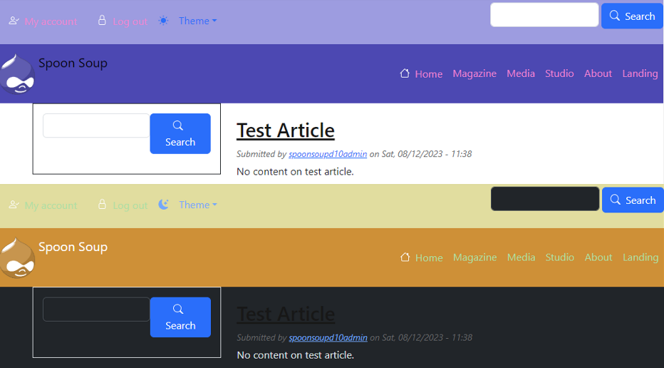
The Bootstrap Theme Toggler Module enables switching of color modes for a Bootstrap based theme using the bootstrap library ver. 5.3 or later. With ver. 5.3, bootstrap introduced support for light & dark color modes. This module is a Drupal block that implements a theme changing toggle drop-down button to integrate this feature into your site. Any theme using bootstrap >5.3 can use this module, however Bootstrap Barrio 5 Theme, its related Bootstrap 5 - SASS Starter Kit, or any derivates are recommended.
Those utilizing bootstrap 5 SASS themes can make use of full re-templating of the 'light' and 'dark' modes, as well as add additional custom modes.
The Toggler configuration provides full customization of the visible drop-down menu elements.
For full instructions on implementation and usage of this module please review the module's documentation.
Quick Start - for Use With Bootstrap Barrio 5 Theme
See Theme Toggler documentation for Bootstrap Barrio 5 theme for detailed instruction
- Download & install the Barrio Bootstrap 5 Theme.
- Copy bootstrap folder in `../web/vendor/twbs/`, in full, to your sites libraries folder at `..web/libraries/`.
- Set Barrio Bootstrap 5 as the default theme.
- From the Bootstrap Barrio settings panel, change the `Load Library` to `Local`.
- From the Barrio settings->components->navbar structure, set all color settings to 'default'.
- Download & enable the Bootstrap Theme Toggler module.
- Place Theme Toggler block onto your site in any region.
- Use the `bootstrap_theme_toggler/css/_component_overrides.css` to allow theme mode's to override any Barrio classed components.
Quick Start - for Use With Bootstrap Barrio 5 SASS Theme
See Theme Toggler documentation for SASS sub-theme for detailed instruction
- Download & install the Barrio Bootstrap 5 Theme & SASS Starter Kit
- Create SASS sub-theme using Start Kit script & install theme dependencies
- If using Drupal 10, update `sass_sub_theme.libraries.yml`, `global-styling` library to reference `js/popper.min.js`.
- Set SASS sub-theme as the default theme for site.
- Download & enable the Bootstrap Theme Toggler module.
- Add `bootstrap_theme_toggler/scss/themes.scss` file to the SASS theme's `import.scss` file.
- Update SASS sub-theme's `gulpfile.js` to add Theme Toggler's scss folder to watch list.
- Place Theme Toggler block onto site in any region.
- Modify light & dark mode theme palettes using `bootstrap_theme_toggler/scss/default_overrides.scss`.
- Create/edit custom color mode's for additional theme palettes.
Additional Requirements
This module is intended for use with themes that are compatible with color modes introduced with Bootstrap 5.3.
Required Libraries
- Bootstrap 5.3, or later
- Popper.js (or bootstrap bundled with popper)
Recommended Themes
Bootstrap Barrio 5 Theme
Bootstrap 5 - SASS Start Kit based sub-themes
Project information
- Ecosystem: Bootstrap Barrio Extras, Dark Mode Switch
 17 sites report using this module
- Created by mbaycura on , updated
 This project is not covered by the security advisory policy.
Use at your own risk! It may have publicly disclosed vulnerabilities.
Releases
Updated approach to handling of custom color modes for SASS themes

