
Problem/Motivation
I summarize the problem (and suggestion) in this video: http://screencast.com/t/YSQ5KnFTtP
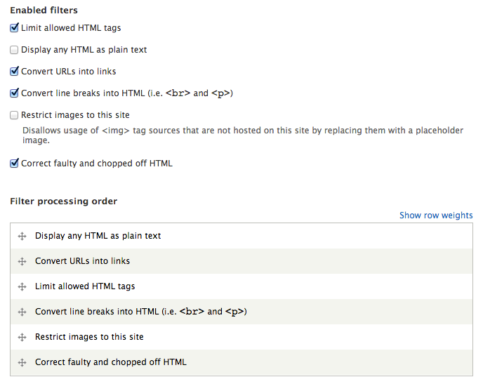
- Page help text describes filter processing order, but actual filter processing order is not visible yet (it's far down on the page).
- Enabling or removing filters does not make it clear that new options are being added or removed fromt the page (cut off by scroll bar again).
- Filter processing order is featured too prominently and too early on the page.
- With no filters enabled, we have an empty vertical tab set. This happens commonly when configuring a new format.
Proposed resolution/UI Changes
Move filter enabled list into the vertical tab set as the first tab. Move the filter order into the vertical tab set as the last tab. Move the description of the filter ordering to be the description of the filter order, instead of the top of the page.
Remaining tasks
This issue is intended as a precursor to #1833716: WYSIWYG: Introduce "Text editors" as part of filter format configuration, which ultimately would add WYSIWYG configuration to the format configuration page, so we need to optimize the settings on this page before we add more options. However this issue is not dependent upon it. The changes help with the UI even if we don't add the WYSIWYG editor settings on this page.
API changes
None.
| Comment | File | Size | Author |
|---|---|---|---|
| #24 | filter_ui_rearrangement-1834682-24.patch | 7.94 KB | quicksketch |
| #15 | filter-enabling.png | 68.77 KB | quicksketch |
| #1 | filter_ui_rearrangement.patch | 10.19 KB | quicksketch |


Comments
Comment #1
quicksketchHere's a patch that makes the suggested changes from the summary. It also improves the Vertical Tabs integration for the default filters included with Filter module to provide some relevant information.
Video: http://screencast.com/t/LpkUnDjhme
Comment #2
quicksketchComment #3
sunThis does not fly, because vertical tabs must not be used for the primary form controls.
Vertical tabs may only contain advanced options that the user may safely skip over and ignore entirely (assuming safe defaults).
All of that is not the case for configuring filters — they present the primary form controls and the user should not skip over any of the filter configuration, which includes which filters are enabled and in which order they are executed. This has security implications.
Comment #4
quicksketchThe first vertical tab is always shown. That's where a user selects their filters, so no problem there. The second tab that is added (filter order), also has reasonable defaults. For many users, manipulating the filter order *causes problems*, and they would be better off if they left them at the defaults.
The other options for filters are already in vertical tabs. If they are absolutely "not skippable", then they should not be in tabs either with this logic. However they also have reasonable defaults, so having them in tabs is okay.
I don't see the argument of this increasing dangers actually being valid. There are no controls that are hidden that do not provide defaults.
Comment #5
sunNo, only the filter settings are in tabs currently. And all filter implementations are asked to ship with sane default settings. That is why it is safe to put them into tabs.
This does not apply to the list of enabled filters, nor their processing order, at all. Because it is impossible to guarantee sane defaults there.
If it was safe to skip over enabled filters, then every newly created text format would be created without any filters. Is that safe? No, it is not.
The user interface pattern for vertical tabs is defined crystal clearly, and diverging from it only causes the pattern to break and cease to exist. We're not interested in doing that.
Comment #6
quicksketchHm, yeah I realize this is a different use-case than Vertical Tabs that we have elsewhere in Drupal. We don't have a pattern of "it's okay to put stuff in the first tab because it's not hidden". But at the same time, we also don't have a pattern of making vertical tabs appear/disappear based on another part of the form anywhere else in Drupal.
Our use of Vertical Tabs is largely based on a general agreement within Drupal, but still with quite a bit of ambiguity. I don't think it's exactly written down anywhere other than stating it occasionally in issues (like this one). Ironically, these two issues show up earliest in Google for me:
sun: #1834472-4: Use vertical tabs on WYSIWYG profile form
quicksketch: #1144806: Nodewords' use of Vertical Tabs on settings page actually hinders usability
And here are a couple off-site references:
http://patternry.com/p=vertical-module-tabs/
http://www.slideshare.net/Bojhan/drupal-7-interface-pattern/21
There isn't any clear definition of whether the first tab (which is not hidden) gets any special consideration anywhere that I've seen. Since it is not hidden, I assume users would give it the same attention as visually similar elements, such as a fieldset which is uncollapsed, while remaining vertical tabs have a similar weight as to collapsed fieldsets. Though obviously vertical tabs provide more information via their summaries and are faster to cycle through (one click to switch from A to B instead of two clicks to collapse A and expand B).
Regarding the hiding of filter order, I still believe that default ordering is going to be safer *most of the time* than if an average user fiddles with their order themselves. You're right that there's no guarantee that filter order will be correct given the number of filters out there, but modules try their best to provide an order than makes sense by default given the task they are trying to perform.
For the most part (correct me if I'm wrong here), the filter whose position matters most is the "Limit allowed HTML tags" (or other sanitization filters that take its place). What if we moved this filter from being a normal filter to a sort of general "security phase" that had its own group of subfilters that always ran in a predictable weight? All other filters positioned above or below the security phase would have their weights adjusted based on the position of the security phase. Let's say we give this phase a weight of 0 by default, and any filters placed above it would be given negative weights. Any filters below it would get positive ones. That allows modules to very specifically choose whether or not they're going to introduce dangerous markup that needs to be sanitized before output. Thus, we end up with a result that the filter weight becomes more reliable and can therefor be relegated to a less prominent location on the page. Again, keeping in mind that many admins have no idea what order of filters is dangerous or not, it seems like if we can provide them with reliable defaults that discouraging them from making changes could result in more secure Drupal configurations.
Another bonus of consolidating the "security phase" into a single position would be moving duplicative filters into combined configuration. For example "Limit allowed HTML tags" is largely an alternative to "Display any HTML as plain text". It could combined into an option on the HTML filter to just say "What should be done with not-allowed tags". Providing no tags would result in the same effect as "Display any HTML as plain text".
Mostly trying to think of options here... this page is such a UX disaster (see original video) there has to be some way to clean it up.
Comment #7
quicksketchAnother pattern where we have "Weight + Enabled state" at the same time is the "Display fields" tab on entities... This would actually meet the requirements of:
1) Providing order and enabled state in a small area.
2) Provide summaries of the configuration.
3) Not use vertical tabs.
However I find that UI to be a terrible experience. There's a reason why you don't see many sites or libraries out there including the "Expandable configuration within a reorder-able table" pattern. ;)
Comment #8
sunMany parts of this were discussed in the past already, especially in the original issue that introduced the current UI:
#558666: UX/security: Revamp text format/filter configuration
Comment #9
quicksketch@sun: Are you implying that the current form configuration is the best solution we have available, or that it's not worth changing? Clearly the single page of configuration is better than the 3 pages we had before, all with disconnected options and the "Configure" link going to the "Edit" tab in which you had to again click "Configure". That was just ridiculous. Despite the improvement from Drupal 6, I think we can make further improvements here.
Comment #10
sunNo, all I'm saying is, that issue contains a range of mockups and screenshots for alternative approaches that have been explored, which are seemingly similar to the "Display fields" UI you referred to in #7.
FWIW, from a security and user interface perspective, the approach of the Display fields UI would be acceptable — even though I certainly agree that it's not perfect either; but at the very least, it is more compact and would appear to be an improvement compared to status quo, while avoiding the flaws of (abusing) vertical tabs.
Comment #11
sunOh, and FWIW, I also digged out this: http://p1.drupalusability.org/pattern/vertical-tabs — which states:
EDIT: Finally found the official pattern manual page: http://drupal.org/node/1087100
Comment #12
quicksketchGreat, I'm glad to hear we've got the door open on options. I've got a half-dozen ideas on making filter-order more predictable, thus less dangerous. Assuming we could figure out a way to "be smarter than the user by default" (which I don't think is going to be difficult in this scenario), does putting filter order in a vertical tab seem acceptable?
I did a bunch more research into vertical tabs and how they're "supposed to be used", but the only other place that seems to discuss vertical tabs more than drupal.org is LukeW, who suggests that vertical tabs (or "finger tabs" as he calls them) are best used for situations where there are alternatives to each other. So the tabs are considered mutually exclusive options. That's clearly not how we're using them unfortunately, so I'm not sure if his analysis applies to us. He talks about finger tabs in this blog post and in his book. The book is copyrighted by this Flickr image summarizes the most important point that is relevant to us, which is using vertical tabs serves the important function of reducing the distance that the eyes have to travel to complete a section of the form. I think my patch here meets that same goal for at least individual filter configuration, though it probably causes a lot of eye movement as tabs are disappearing/appearing.
In no situation did I find that vertical tabs are intended to be used as "optional settings that may be skipped", and from the usability testing I watched in Baltimore, users who have not encountered a form previously tab through every vertical tab at least the first time they fill out form to see what options are present. I'm not sure where this idea originally came from and I don't think it's a bad rule to abide by in the interfaces we've created so far. However in this case I feel it provides a boost in usability. Provided we can find a way to make filter order safe by default, I don't think the original proposal should be taken off the table.
Comment #13
quicksketchNew issue to discuss making the filter order less dangerous by default: #1835188: Make configuration of text formats more secure by default
Comment #14
sunI do think that the vertical tabs proposal should be taken off the table, because it essentially is a step backwards to the user interface of D6 — it detaches and splits the status and order controls into two independent operations, but that is the exact opposite of how a site administrator is supposed to look at and verify the configured filters.
Comment #15
quicksketchThe status and order controls are already two independent operations:

Many site administrators have NO IDEA how to configure filter order. Assuming we can make filtering safe by default, putting the order in they way of administrators may cause more damage than good.
Comment #16
Wim LeersI agree that this UX needs to be improved drastically. I also agree that it makes sense to have a general "security phase" in the filtering system. @sun already pointed to an existing issue, I can point to an additional one: #807996: [meta] Input filters and text formats (specifically see #807996-19: [meta] Input filters and text formats).
Without taking into account the way Vertical Tabs are *intended* to be used (i.e. allowing the design pattern to be "abused" to some degree), I have to say that what @quicksketch proposes in #1 is a net win in terms of how the UX works.
I think it might make more sense to have the list of enabled filters *not* be in the Vertical Tabs, but just above them (as it is in D7), but *do* migrate the filter order into the Vertical Tabs. Then the primary action of that page is not living in the Vertical Tabs anymore, and the most prominent problem is addressed. Would that be acceptable, @sun?
Comment #17
Bojhan CreditAttribution: Bojhan commentedHaving read through this issue, I find it sad that finding the vertical tab pattern description took so long - clearly we suck at promoting handbooks.
The only thing I am concerned about is that @sun is advocating for not splitting the filter order and @quicksketch is, while I don't think that Enabled filters should be in a vertical tab. The order configuration most certainly should be, it is an advanced setting very few users will understand where to use it for and how to use it correctly.
By placing it in its own vertical tab, we now enable us to place a useful description close, focus the main form on enabling/disabling filters and bring the vertical tabs and the filter settings closer. It should not be considered a step backwards just because we decouple interactions, if that gives more clarity to the page - I have always found this interaction to be very magical and putting too much emphasis on the order, where no guidance is given.
However, I'd really like to see WYSIWYG configuration here - as putting that in, will hopefully be the reality in D8.
Comment #18
sunRight, and this is By Design™ — The order of how filters are applied is essential for a text format. It doesn't help me nor anyone else if we continue to dismiss the functional requirements. In a nutshell, if I were to take this to an extreme (but I'm not): This is about security, not about UX.
Comment #19
Bojhan CreditAttribution: Bojhan commented@sun I understand that fully, but you are wrongfully assuming that putting things right in the front of them. Will make it more secure.
Most people will not know how this order influences security, even with a book of text we cannot help that. People generally just skip confusing UI parts on the form - that does not help you with security. By placing it in a vertical tab, we actually decrease elements that influence the confusing part and making it more likely people will use it.
Visual clutter has a huge impact on how likely something is to be looked at. Placing it in a vertical tab allows us to create a more clear connection between enabling a filter and it showing up ion the order, it will help us centralize the help text (major win), and overall decrease the visual clutter. This should have a positive impact on the likeliness that people configure this correctly. We can make it the primary tab?
However that the order configuration is so fragile for security, sounds like a engineering bug. One that is almost impossible to solve, but still an engineering bug. Why don't we introduce more fail-safes, and error messaging to inform the user they made a possibly insecure filter order configuration? It seems like we make UX suffer, because we can't fix this technical challenge.
Again though, I'd like us to introduce WYSIWYG config, because that will give us a more real world idea.
Comment #20
sun@Bojhan: Please note that the Wysiwyg configuration aspect is not discussed here, but on #1833716: WYSIWYG: Introduce "Text editors" as part of filter format configuration
And yes, UX suffers because of an incredibly complex engineering problem space. Though the concrete engineering problem is not being discussed here, but on #1835188: Make configuration of text formats more secure by default (and further issues being referenced over there)
Comment #21
Gábor HojtsyCross-note: #1810386: Create workflow to setup multilingual for entity types, bundles and fields has the very same "checkboxes make things appear/disappear outside of the viewport" problem, but we did not find a good solution there either (more back and forth about vertical tabs there as well).
Comment #22
kattekrab CreditAttribution: kattekrab commentedreposting http://drupal.org/node/1833716#comment-6888186 as directed by Wim Leers.
I've just been playing with http://quicksketch.org/wysiwyg
I have one word. WOW.
As a USER - I love this. Juggling wysiwyg and filters and keeping track of all the different places I need to poke to iron out issues is one of the things I personally find most frustrating about Drupal - this demo seems to almost entirely eliminate that pain.
I can't speak to the technical implementation details at all, and I don't know how far the latest patches have deviated from the demo - but the demo is fabulous. The fact that it leaves the door open for aloha OR ckeditor is also a big plus in my view.
The ability to just drag buttons and dividers onto the toolbar is SO much easier than the monster list of check boxes.
Now I wonder... could the filter order processing and enabling tabs be combined?
Kind of like this?
Comment #23
quicksketchThis is a great suggestion @kattekrab. Although I personally believe that filter order is better if users do not see them (stated several times in the above comments), consolidating the filter state and the order into a single tab seems like it should reduce clicks and increase discoverability. This essentially would use the same pattern we have for other reorderable lists, such as taxonomy terms or menu items. However in those places, the order is for aesthetic purposes, rather than enacting changes in functionality. I'd be worried users would assume the same thing here, which may be why enabled state and order are separately currently.
So in summary: I think @kattekrab's approach is both positive and negative. If it's more preferable to @sun then I'm happy to compromise on it. If the approach is equally disliked or the entire consolidation is still frowned upon, I personally would keep them separate still.
Comment #24
quicksketchPossibly related to #1168246: Freedom For Fieldsets! Long Live The DETAILS., at some point this patch broke due to the new use of #type = 'details'. Here's a reroll. An update to my demo site (http://quicksketch.org/wysiwyg) should be up-to-date in the next hour or so, with all the latest core changes.
Comment #25
Wim Leers.
Comment #26
Wim LeersDo we still want this to happen? It's solely an UI change, so I think it could happen after July 1?
Marking as postponed for now.
Comment #27
quicksketchI'd still love to include this functionality. It significantly shortens the filter form and hides information that is peripheral to the task for which most users will be coming to this page. In the world of auto-configured filters based on your editor configuration, the filter settings become significantly less important. I think that moving the filter enable state near the filter settings also increases usability, since the user can see the settings appearing as they enable a filter.
Not sure if the current patch still applies, I'll let testbot have another go at it.
Comment #28
quicksketch#24: filter_ui_rearrangement-1834682-24.patch queued for re-testing.
Comment #30
Wim LeersI'd love UI simplification too, but I think it's clearly a lower priority than the CKEditor things that we're working on.
So: postponing until the CKEditor stuff is almost done.
If you agree, then please set back to postponed.
Comment #31
quicksketchThe additional editor configuration on the text format configuration page makes this issue more important than it had been previously. But the overall changes are independent from CKEditor and Editor issues. This is just about consolidating options provided exclusively by Filter module, so no need to postpone.
Comment #32
Wim LeersThis can be worked on now. quicksketch? Any other takers?
Comment #33
quicksketchI'll take another pass at updating this patch.
Comment #34
kattekrab CreditAttribution: kattekrab commentedDid this one miss the boat after freeze?
Comment #35
Wim LeersThis can still happen: it does not require API changes.
Comment #36
quicksketch