
 Support for Drupal 7 is ending on 5 January 2025—it’s time to migrate to Drupal 10! Learn about the many benefits of Drupal 10 and find migration tools in our resource center.
Problem/Motivation
Claro has designs for white layers and have the basic colors like color for links set. But we still don't have any design or accessibility work done for dark layers/regions like Tour, Settings Tray or even a future dark mode. As a result, we currently have important accessibility issues on that regions:

Steps to reproduce
@todo
Proposed resolution
Design a new set of color palette/s and layer definitions for Claro that work with dark regions. Some explorations done so far can be found in Claro's working Figma file, and a few screensohts:

Remaining tasks
- General design proposals
- General design review
- Research and list components and regions that will use this
- #3251280: Tour style update
- #3088531: Off-canvas dialog style update
- #3023301: Messages style update
- #3167349: Redesign Settings Tray
(Maybe this one can be a child issue of the previous off-canvas generic one?)
Other related issues:
User interface changes
All dark regions will need to be updated.
API changes
Release notes snippet
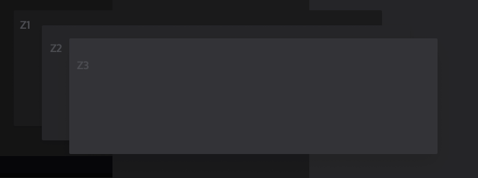
| Comment | File | Size | Author |
|---|---|---|---|
| #12 | claro_dark_mode.png | 121.66 KB | Dandolorion |
| layer-tests.png | 12.43 KB | ckrina | |
| tour-explorations.png | 131.79 KB | ckrina | |
| tour.png | 27.2 KB | ckrina |


Comments
Comment #2
ckrinaAdding #3251280: Tour style update as a child issue.
Comment #3
ckrinaAdding #3088531: Off-canvas dialog style update.
Comment #4
ckrinaComment #5
ckrinaRelated issue, since it's about the color scale naming conventions https://www.drupal.org/project/drupal/issues/3155531
Comment #6
ckrinaComment #7
ckrinaComment #10
xmacinfoIs the dark mode started somewhere?
Comment #12
Dandolorion CreditAttribution: Dandolorion as a volunteer and at Versantus commentedHi all,
This issue is a little confusing and cannot ascertain what the actual requirements are, so have produced something as a starting block in order to get some conversation going and issue moved forward.
I have reproduced a standard Claro screen example as a "Dark Mode". The idea here was to start building the basics for a dark mode colour palette and how it can all come together.
The concept I have produced takes into account the following:
1) Drupal branding
2) Accessibility
3) Readability
4) Eye strain factors
I have stayed away from using straight Black & White as the contrast can be quite jarring and gone for a soft white over a deep midnight blue. As stated, this is a proof of concept and a palette idea to start a conversation.
I have created a new Figma file as the one provided was quite messy to deal with. Meanwhile I can share a preview.
Claro Dark Mode
**For now, this is purely a draft and to get a conversation going**
Comment #13
xmacinfoI am currently using the Darcula Drupal admin theme (1.0.0) and I find it quite accessible.
But I prefer the color palette proposed for this issue. And I like very much the mockup made in #12.
I think the goal of this issue is to finalize the color palette and background layers. Some mockups can be created to give us an overall view.
Areas of concern:
Overall, switching from Claro light or Claro dark should use the same screen estate, same text size, etc.
And, of course, we won’t create a new dark theme based on Claro but instead support both light and dark in the same Claro theme files.
Any additional work, for example fixing a button accessibility code, should be done in a separate ticket.
Comment #14
Dandolorion CreditAttribution: Dandolorion as a volunteer and at Versantus commentedI can provide a palette breakdown if needed from the mockup. I have tested for contrast and lowest is 6.16:1 so good to go from a AA perspective.
I can draw up a base palette if that will help?
Comment #15
ckrinaThanks @Dandolorion! Reflecting here what was discussed in Slack(#admin-ui-design channel):
Edit: I'd skip Drupal branding as an influencing factor for the tone. The color we chose for Claro skipped that in purpose, trying to give another tone to the UI so it's perceived different from previous.