
This issue is separated from #472126: D7UX: Move buttons to right area, add content and meta selector so as to avoid putting the issue into a "giant, unreviewable patch" state. This patch changes the fieldsets on the "Meta" tab created in that issue to pseudo-collapsible fieldsets that give some information on the current state of the settings, and provides the user with an option to change the current settings. It does not fully represent the mockup created at http://d7ux.org/content - I tried to implement it as cleanly and simply as possible, without undo changes to the underlying code. I think that the interface I've created captures the essence of the idea presented at http://d7ux.org/content, but if the community feels I've left out an important component of the proposal, I would be happy to reroll a patch including it.
Disclaimer: I had to do some version control black magic to roll this patch, so I apologize if there are any mistakes in what is included or not in this patch.
| Comment | File | Size | Author |
|---|---|---|---|
| #5 | modified-fieldsets-02.patch | 4.74 KB | cwgordon7 |
| #2 | 491846-screenshot.png | 23.8 KB | cwgordon7 |
| modified-fieldsets-01.patch | 4.77 KB | cwgordon7 | |


Comments
Comment #1
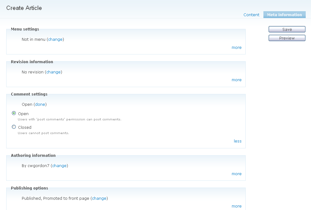
Gábor HojtsyIt would probably be useful to present a screenshot of this functionality, so we can easier see what happens (without the need to apply two patches at once).
Comment #2
cwgordon7 CreditAttribution: cwgordon7 commentedHere's a screenshot:
Comment #3
Dries CreditAttribution: Dries commentedTagging for later review.
Comment #4
moshe weitzman CreditAttribution: moshe weitzman commentedThis is a UX improvement? I'm not seeing that at all.
Comment #5
cwgordon7 CreditAttribution: cwgordon7 commentedRemoved a stray console.log() call.
Comment #7
cwgordon7 CreditAttribution: cwgordon7 commented...
Comment #8
Stefan Nagtegaal CreditAttribution: Stefan Nagtegaal commentedAnd we are introducing another way of presenting options to a user...
Is it the meaning that we are going to introduce as much possibilities to let a user change things in D7?
We are using vertical tabs to unclutter things, we talk about flooded harmonica's to unclutter things and we are redesigning pages to unclutter things. The current workflow is just plain wrong imo.
- It would be better if we first got Drupal UI right, use the right form elements for the right job and keep those consistent. There were several idea's in the past to do this using a special form function.
- Then look at all the pages and write down the major shared problems. Think and try to make one solution for the problems, which could be re-used over and over again.
Really, not presenting options isn't a usability improvement. The key to succes is to use the right form-elements for the options and keep things consistent around every page.
Comment #9
Frando CreditAttribution: Frando commentedIn which way should this have a better UX than vertical tabs? It uses more space for the same information, introduces redundant controls ("change" and "more" are the same, right?) and makes it much much harder to quickly skim the summaries to see what you might want to change (with vertical tabs, the summaries are close to each other while with this approach they're all over the page).
Comment #10
Dries CreditAttribution: Dries commented@Stefaan -- your feedback is not helpful because it is not constructive. I'd love to see a mockup of what the right form elements are. It is easy to say 'no', but it is a lot more difficult to propose something that is better.
@Frando, it is more scalable than vertical tabs. When you click "more", we can expose more complex settings than would be suitable in vertical tabs. With the current options in the example (i.e. the default options in core) that is not clear because they are pretty simple, but imagine some of the contributed module settings. Some modules add reasonably big form structures, workflows or listings (random example: sign-ups, events, etc). Ultimately, I think this provides more flexibility over vertical tabs and it is going to make it a lot easier to keep the node edit page clean. For example, I'd hate to see modules add fieldsets to the node edit page after we introduced vertical tabs -- mixing them could be really ugly and inconsistent.
Comment #12
Bojhan CreditAttribution: Bojhan commented@Dries I understand your comment, however we shouldn't focus to much on the concept of "write a patch". It's about trying to critize on design concepts so liesa is able to make more informed design decisions...
@Steef Let's not start a new D7UX Project, can you explain what the clutter it creates?
Obviously less should be close - like in the wireframes.
From the mockups I am trying to understand how we handle modules here. How do we? Do we have some examples of modules filling this thing in?
Comment #13
sunComment #14
xjm(Merging "node system" and "node.module" components for 8.x; disregard.)
Comment #20
dqdCan we close this issue? Or mark it as duplicate of another one? It seems we left this road and have a lot of other options build in now which work very well. It is a little bit confusing to find this issue on Google "open" for 8.5.x-dev, if that's the case.
But if I am mistaken on my assumption, can somebody of the "more involved" enligthen about the left overs, so that we can use it to create a little "what's left plan" based on this?
BTW: Found this issue by looking for D 8.x plans to get more alternative ways how to present entity edit forms on mobile devices for core or core admin themes. ;) If I'll find such one I will link it here later, since Google seems to like this issue here on top.