
 Come together with the global Drupal community in Rotterdam, 28 Sept – 1 Oct 2026. Sessions, contribution, connection, and Early Bird savings until 8 June.
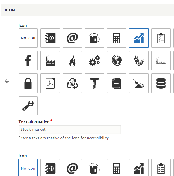
This module creates a bridge between other modules or themes in integrating external-referencing SVG icons defined in sprite sheets into Drupal.
This module provides a visual UI for end users to be able to select icons provided by extensions. This module provides no icons by itself.
Icons as Plugins
Icons are automatically discovered from the icon sheet at module_or_theme/dist/icons.svg and are recorded in Drupal as plugins. A simple example of a file:
<svg>
  <!--
    Recommended to store symbol elements in the defs tag as it is designed to
    store graphical objects that will be used at a later time.
  -->
  <defs>
    <!--
      The `viewBox` attribute should be included on symbols — this module uses
      the attribute to determine the aspect ratio of icons it discovers.
    -->
    <symbol id="triangle" viewBox="0 0 20 20">
      <path d="M0 20l10-20l10 20z"/>
    </symbol>
  </defs>

  <!--
    However this module does not make any considerations about where symbol
    elements are placed (for maximum compatibility with build processes).
  -->
  <symbol id="circle" viewBox="0 0 30 30">
    <circle cx="15" cy="15" r="15"/>
  </symbol>
</svg>
There is a convenience Drush command to clear the definitions cache for these:
$ drush cache-clear ex-icons
Theme element
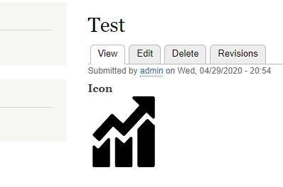
A theme function called ex_icon can be used as the #theme key to render any icon from the sprite sheet. Use #id key to specify the icon.
$render = [
  '#theme' => 'ex_icon',
  '#id' => 'arrow',
  '#attributes' => [
    'title' => t('Show more'),
    'width' => 25,
  ],
];
If a title attribute is set, then the SVG element will be given a role of img, otherwise it will be presentation. If only one dimension attribute is set and is a unitless number, then the other will be calculated automatically from the source icon's viewBox attribute. This is to size the SVG more closely to its content, otherwise the browser will default the SVG's dimensions to 300 × 150 pixels.
Twig function
Similar format as the theme element for use inline in twig templates. First argument is the icon ID and the second is a hash of any attributes (optional).
{{ ex_icon('shopping-cart', { height: 20 }) }}
Form element
An icon selection form element to allow picking of an icon graphically.
$form['icon'] = [
  '#type' => 'ex_icon_select',
  '#title' => $this->t('Accompanying icon'),
  '#default_value' => $this->getSetting('icon'),
];
Field API integration
| Type | Label | Description |
|---|---|---|
| Type | Icon | Stores an icon's ID as a string value. |
| Widget | Icon select | Uses the icon form select element to select icon value(s). |
| Formatter | Icon | Display an icon. Works with Icon as well as string field types. |
| Formatter | Link as icon | Display a link field as an icon instead of text. |
Ecosystem Integrations
Project information
 Minimally maintained
Maintainers monitor issues, but fast responses are not guaranteed.- Maintenance fixes only
Considered feature-complete by its maintainers. - Project categories: Site structure
 400 sites report using this module
- Created by wongjn on , updated
 Stable releases for this project are covered by the security advisory policy.
Look for the shield icon below.
Releases
8.x-1.8
released 2 June 2025
released 2 June 2025
Works with Drupal: ^9.3 || ^10 || ^11
Drupal 11 compatibility
Install:
Development version: 8.x-1.x-dev updated 2 Jun 2025 at 09:41 UTC

