
This project is not covered by Drupal’s security advisory policy.
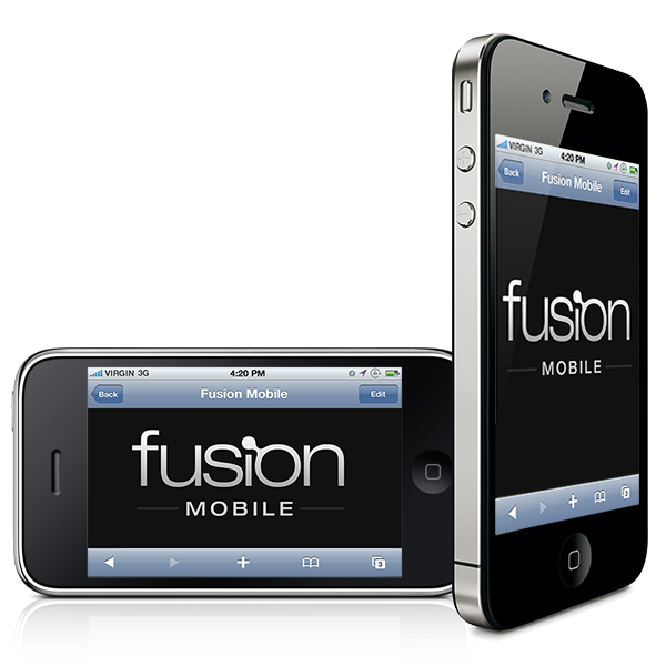
Fusion Mobile is a Fusion Core subtheme designed for creating a custom theme targeting mobile devices. By using a separate subtheme, you can control your theme settings and block layout/contents specifically for mobile devices.
Really important note: December 2011
Responsive layout support has now been committed to a Drupal 7 branch of Fusion. Individual layouts (e.g. tablet landscape vs smartphone) will be able to be toggled on/off on a per-subtheme basis, and most functionality of Fusion Mobile is already covered in this branch. Thus, this project for Drupal 7 will no longer be supported, instead recommending the responsive option in Fusion itself.
Features
- Simple region layout in a single column
- Fluid layout supports a variety of devices/orientations
- Works on devices down to a 300px wide screen
- Skinr/Fusion integration for (simplified) layout controls in Drupal's UI
- Built in support for touch icons (Apple and Android devices)
- Uses a region for primary menu so you can customize your menu on mobile
- Prevents images from overflowing screen width
- Includes helpful CSS skeleton for fast theming
- Supported by the awesome TopNotchThemes team :)
Installation
- Download Fusion from http://drupal.org/project/fusion
- Download Fusion Mobile from http://drupal.org/project/fusion_mobile
- Install the Skinr module: http://drupal.org/project/skinr
- Follow the instructions in the README to build your own Fusion Mobile theme
Mobile theme switching
We recommend the Mobile Tools module to switch to your mobile theme when a mobile device is detected: http://drupal.org/project/mobile_tools
Mobile Tools also provides integration with other modules to change your site's URL, node displays, settings, Panels, permissions and more when browsing with a mobile device.
Project information
 41 sites report using this theme
- Created by stephthegeek on , updated
 This project is not covered by the security advisory policy.
Use at your own risk! It may have publicly disclosed vulnerabilities.


