
Problem/Motivation
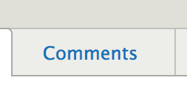
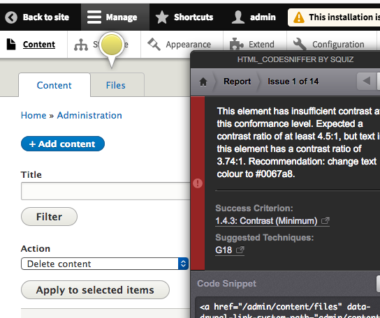
The inactive tabs in the Seven theme do not meet WCAG AA section 1.4.3 requirements for text contrast.
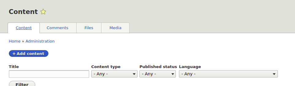
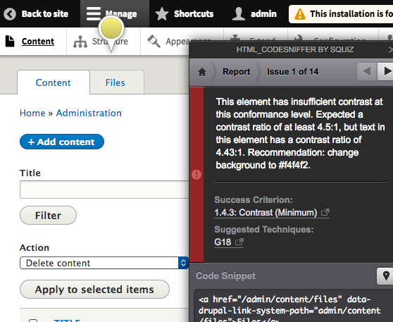
To reproduce,
1. Login to drupal 8
2. Navigate to /admin/content
3. Run DAP Chrome plugin or other WCAG compliance checker on page
4. See a message similar to the following.
"Minimum contrast of 4.21 with its background is not sufficient to meet WCAG AA requirements for text of size 13.008px and weight of 400."
See attached screenshots for details.
Proposed resolution
Review current colors and backgrounds for inactive tabs and determine a suitable change that is in line with the Seven theme styles that also passes WCAG AA.
Remaining tasks
User interface changes
Update Seven tabs styles to increase contrast for inactive tabs.
API changes
None
Data model changes
None
| Comment | File | Size | Author |
|---|---|---|---|
| #62 | Inactive tab contrast.png | 2.87 MB | roberttabigue |
| #57 | After--patch--pic.png | 22.73 KB | vikashsoni |
| #57 | Before--patch--pic.png | 21.05 KB | vikashsoni |
| #54 | 2930508-54.patch | 679 bytes | marcusvsouza |
| #54 | interdiff_2930508-51_2930508-54.txt | 441 bytes | marcusvsouza |
Issue fork drupal-2930508
 Show commands
Start within a Git clone of the project using the version control instructions.
Or, if you do not have SSH keys set up on git.drupalcode.org:


Comments
Comment #2
sdewitt CreditAttribution: sdewitt commentedComment #3
sdewitt CreditAttribution: sdewitt commentedComment #4
sdewitt CreditAttribution: sdewitt commentedUpdated summary
Comment #5
sdewitt CreditAttribution: sdewitt commentedChanged version to 8.5.x-dev
Comment #6
joelpittetComment #7
andrewmacpherson CreditAttribution: andrewmacpherson as a volunteer and at Annertech commentedComment #9
Wim LeersComment #10
markconroy CreditAttribution: markconroy as a volunteer and at Annertech commentedLooks like changing line 44 in tabs.css in Seven's theme will fix this.
Change from
background-color: rgba(242, 242, 240, 0.7);to
background-color: rgba(244, 244, 242, 0.7);Now, let's find someone who wants their first core commit!
Comment #11
andrewmacpherson CreditAttribution: andrewmacpherson as a volunteer and at Annertech commentedThanks Mark. What's the new ratio? Screenshots will help as well.
Is there a reason for these colors having an alpha value, instead of just being RGB? That makes it awkward to test the contrast.
Do the colours still have sufficient contrast in the hover, focus, active styles?
Comment #12
mlkdev CreditAttribution: mlkdev as a volunteer commentedAs I see the color contrast ratio with
background-color: rgba(244, 244, 242, 0.7)is only 4.21 (foreground color: #0074bd, background color: #edede9), but normal text requires a contrast ratio of 4:5:1.So I changed the value to
background-color: rgba(253, 253, 252, 0.7)for a contrast ratio of exactly 4:5:1 (foreground color: #0074bd, background color: #fdfdfc).I tested it with chrome audit and aXe, which seems to be a little more accurate than the chrome accessibility audit.
Comment #13
markconroy CreditAttribution: markconroy as a volunteer and at Annertech commentedHi @andrew,
tabs.css in the Seven theme (line 44) uses rgba, so I just did the same.
I got the exact value that I suggested from html_CodeSniffer, it suggested that colour, but thinking about it now, if we also have only .7 opacity, then I guess we'd need a slightly darker colour.
Applying the colours suggested by @mlkdev, I get contrast ratio errors:
Here's the current seven in active tab:
Here's what it looks like with @mlkdev's suggestion:

Comment #14
mlkstff CreditAttribution: mlkstff commentedI'm afraid either you posted the same screenshot twice or my suggestion wasn't applied in your test (it looks to dark on the screenshot). Tested your and my suggestion again with the HTML-Sniffer tool. Seems the HTML-Sniffer is ok with both color suggestions and different tools have fine differences in the results.
With the HTML-Sniffer I got with
rgba(244, 244, 242, 0.7)a color contrast ratio of 4.5:1 and with the valuergba(253, 253, 252, 0.7)a color contrast ratio of 4.87:1.Comment #15
quidkid CreditAttribution: quidkid commentedBefore: In order to use the WebAIM color contrast checker to take into account the .7 opacity, I took a screenshot and use the the eye dropper tool in Adobe Photoshop to get the background color.
Here are the results from the WebAIM:
Foreground: #0074BD
Background: #EDEDE9
4.23:1 => fail normal text
After: Using the RGBA from #12, I did the same and it passes!
Foreground: #0074BD
Background: #F5F5F2
4.54:1 => passes normal text
Comment #16
mpdonadio#15 was part of mentoring for DrupalCampNJ 2018 (please make sure @quidkid gets commit credit when this lands). Here are the screenshots (didn't want to get DREditor setup yet for embed helpers b/c the current problems with it).
Before:
After:
Assigning back to @andrewmacpherson for final review.
Comment #17
jds1Hi All!
I was having issues getting the patch in #12 to apply, then I also found that manually changing the values still caused contrast to fail. Here is a new patch with a different background color value.
Now, this totally passes AA but still fails AAA. Are we wanting to comply with AAA here too?
Thanks!
Best,
jds
Comment #18
andrewmacpherson CreditAttribution: andrewmacpherson as a volunteer and at Annertech commented@id-jds - thanks for looking at this.
What was wrong with the colour in #12, and how does #17 improve it? The report in #15 says the new ratio from #12 was 4.54:1. What ratio did you find? 4.54:1 is close to the threshold, so maybe there are rounding errors between different tools.
We're not aiming to satisfy level AAA here. The Drupal core accessibility gate aims for WCAG 2.0 level AA
Comment #19
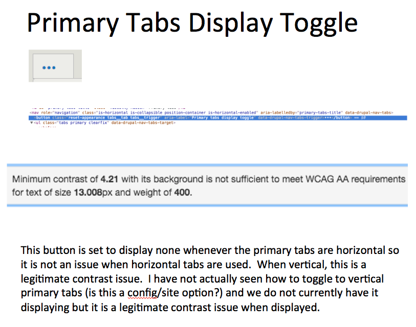
andrewmacpherson CreditAttribution: andrewmacpherson as a volunteer and at Annertech commentedAside: this would be a lot easier if it was just RGB. I'm not sure if there's a reason we have so many RGB-A values in Seven, but they're certainly more awkward to test.
Comment #20
jds1@andrewmacpherson – of course! I am happy to contribute. I double checked and the color from #12 is passing with 4.74:1 from WAVE Chrome extension. Though I would be happy to reroll #12 or #17 with an AA-compliant RGB value (without the A). Maybe a first step in transition to RGB values in Seven where appropriate?
Thank you!
Comment #21
andrewmacpherson CreditAttribution: andrewmacpherson as a volunteer and at Annertech commentedTagging as a good mentored bug for the NWDUG sprint this weekend.
Comment #22
Phil Wolstenholme CreditAttribution: Phil Wolstenholme commentedAssigning this ticket to myself as I'm going to have a look at it as part of the #Nwdug_may18 sprint
Comment #23
Phil Wolstenholme CreditAttribution: Phil Wolstenholme as a volunteer commentedHere's a patch with a new background colour of
rgba(254, 253, 250, 0.7). This gives a contrast ratio of 4.5:1, so it looks like a good value to use.The change makes the background lighter, but I think it's still visually distinct from an active tab:
Chrome's dev tools has a colour contrast tool which seems to take RGBA background values into account, which makes testing this issue a lot easier.
@andrewmacpherson and I verified this approach by making sure that the contrast ratio reported by Chrome's dev tools matched the ratio we got by using a colour picker. We used a colour picker to comparing the opaque link colour to the blended background colour shown on my screen. The final colour of the tab is equivalent to #F5F4EF and this passes with a link colour of #0074bd: http://contrast-ratio.com/#%230074bd-on-%23F5F4EF
I also noticed an issue with the contrast of a tab in its focus or hover state, but I've raised a new issue for that: #2972451: Seven's focused/hovered tabs do not meet WCAG AA 1.4.3 for contrast
Comment #24
andrewmacpherson CreditAttribution: andrewmacpherson as a volunteer and at Annertech commentedRTBC: I'm happy with this, we tested the colours together at the sprint. The new colour hits the required contrast ratio spot-on, and has minimal impact on the existing design.
Testing colour contrast is often a pain when transparent backgrounds are involved. The new Chrome colour tools DO seem to calculate the contrast based on the combined background colour of multiple elements with transparency. This is going to be easier in future :-)
@Phil Wolstenholme - thanks for filing the follow-up issue. It's good to fix the contrast for the non-interactive state first, in this issue. The interactive styles can be fixed in a follow-up, otherwise issues like this can drag on.
Comment #25
andrewmacpherson CreditAttribution: andrewmacpherson as a volunteer and at Annertech commentedComment #27
lauriiiThis does fix the color contrast between the text and the background, but this causes a new problem - after this change it is a lot more difficult to distinguish between active and inactive tabs. I'm not sure if there's an easy solution to fix this. Anyway pushing back to needs review for some further feedback from the accessibility maintainers.
Comment #28
andrewmacpherson CreditAttribution: andrewmacpherson as a volunteer and at Annertech commentedThe active vs. inactive tab distinction doesn't rely on colour. They are mainly distinguished by borders:
Even in greyscale, the tabs are clearly separated, and the active one can be identified. This screenshot comes from an achromatopsia (colour blindness) simulation tool:
Back to RTBC, I don't think #27 is an issue.
Comment #29
lauriiiI didn't see any difference in achromatopsia mode. This mainly affects the use case where you have the first tab selected because of the border is not quite so visible in that case.
Before:
After:
Feel free to move this back to RTBC if you still feel like this is not a problem.
Comment #34
ultrabob CreditAttribution: ultrabob commentedI'm trying to understand issue #29 raised by @laurii to see if this can be moved forward. Looking at the screenshot, I don't clearly understand the problem, and wonder if maybe this is the reason this hasn't moved in 2 years. Can someone clarify this?
Comment #35
acrollet CreditAttribution: acrollet at Agile Six Applications for Department of Veterans Affairs commentedHere is a screenshot of @laurii's comparison in achromatopsia mode:
I find the difference to be small, and the active tab still easy to distinguish. Based on this I'm moving this issue back to RTBC.
Comment #36
acrollet CreditAttribution: acrollet at Agile Six Applications for Department of Veterans Affairs commentedre-rolled against 9.1 dev.
Comment #38
acrollet CreditAttribution: acrollet at Agile Six Applications for Department of Veterans Affairs commentedRe-setting issue to Needs Review, re-test passed.
Comment #40
mgiffordLinking open issues from the CivicActions Accessibility - VPAT.
Comment #41
mgiffordtagging
Comment #42
markconroy CreditAttribution: markconroy as a volunteer and at Annertech commentedHow about we set an underline on the text of the active tab, so that way it is distinguished by more than just colour?
I'd also suggest, after 3 years, we get _one_ of the patches from this committed so that Seven will be in a better state than it currently is, and we create a follow-up for the achromatopsia issue (which I guess is not introduced by this fix, but rather is there already and should not be stopping us from incrementally making Seven better).
Comment #43
mgiffordI like it. We can enhance it later, but this sounds like a very workable solution @markconroy.
Comment #46
jenniferhoude CreditAttribution: jenniferhoude at CivicActions commentedUpdated patch #36 to include active tab have css underlined. See images Old tabs and New tabs. Created MR. Moving to review
Comment #47
jenniferhoude CreditAttribution: jenniferhoude at CivicActions commentedComment #48
KapilV CreditAttribution: KapilV as a volunteer and at Innoraft for Drupal Care, Drupal Association commentedFixed Custom Commands Failed.
Comment #50
guilhermevp CreditAttribution: guilhermevp at CI&T commentedUpdated patch to fix custom commands failure.
Comment #51
paulocsI don't get it if we are using the MR approach or patches in this issue...
Comment #52
marcusvsouza CreditAttribution: marcusvsouza at CI&T commentedI correct the custom erros in the patch of comment #50.
Comment #53
djsagar CreditAttribution: djsagar at OpenSense Labs commentedHi marcusvsouza,
I applied your patcth i just want to know why you added
text-decoration: underline;in li,background after applied your patch.
Please revert i'm happy if i learn.
Thanks!
Comment #54
marcusvsouza CreditAttribution: marcusvsouza at CI&T commentedMy mistake, follows the correct patch.
Comment #55
mgiffordThis is a contrast issue https://www.w3.org/WAI/WCAG21/quickref/?versions=2.0#qr-visual-audio-con...
Comment #56
mgiffordComment #57
vikashsoni CreditAttribution: vikashsoni as a volunteer and at Zyxware Technologies commentedApplied #54 working fine and applied successfully
Thanks for the patch
For ref sharing screenshots .....
Comment #59
DamienMcKennaAs a reminder, the "assigned" field is for indicating that you're currently working on something, it's not for indicating to the maintainers that you contributed to the solution and/or posted a patch. Then, when you've finished your work it's customary to set the field back to "unassigned" so that others can then do some additional work as necessary. Thank you.
Comment #61
longwaveThe Seven theme has been removed from Drupal 10 core. I confirmed that this issue only affects Seven and no other themes included with Drupal core, so I am moving this to the contributed Seven project.
Comment #62
roberttabigue CreditAttribution: roberttabigue at Promet Source commentedHi @marcusvsouza,
I can still reproduce the Contrast issue after applying patch #54 to the Seven contrib theme 1.0.0-alpha1 as a Default theme and with Drupal core version of 9.5.6.
Moving this to "Needs work" and please see the attached screenshot for reference.
Thanks.