
Create color or style selection widgets that provide a visual preview of the list of allowed values (instead of a list of color/style names).
Style Selector includes two custom field types (Color List and Style List) for fieldable entities, as well as a Form API element for use in custom forms.
🚀 Quick Start
Enable the included Style Selector Demo sub-module, then visit the settings form at Administration > Configuration > User interface > Style Selector for examples of what Style Selector can do and how it works.
Beautiful color pickers made easy
Simply add a Color List field to your entity and provide the CSS color values and labels. Configure the field widget to fine-tune the UI if needed, and use field formatter settings to specify how the color value is used—background or (foreground/text) color.
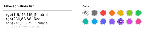
This example uses a small sub-set of Tailwind's text color styles. Use your favorite framework or roll your own.
Visual CSS class/style selectors
Configure Style Selector to identify one or more CSS libraries to make available in both the admin and public-facing themes. Then create Style List fields that allow users to choose classes from those libraries using widgets that preview the styles available for selection.
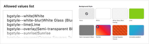
Here we're using the Tile widget style to provide a larger preview of background styles, but you can use any widget style that meets your needs.
Features
- Two field types—Color List and Style List—for use with nodes, blocks, paragraphs, etc.
- A Form API element for use your own forms.
- A CSS Style formatter that adds the chosen class(es) to the entity wrapper.
- A CSS Color formatter that sets an inline color style on the entity wrapper (
colororbackground-colorproperty configurable in the formatter settings.). - Additional classes can be configured in both the module and formatter settings.
- Customizable widgets provide a visual representation of the class/color options.
- Color fields support a wide range of color value formats—hexadecimal (stored as RGB/A), RGB/A, HSL/A, named colors, system colors, color keywords (transparent, currentColor).
- Tested with the most popular admin themes: Claro, Gin, Seven, and Adminimal.
- Extensive documentation.
Requirements/Limitations
⚠️ Asset libraries for CSS styles
If you're creating fields to select CSS styles, you should configure Style Selector to load one or more asset libraries to use your custom (usually minimal) CSS for its field widgets. Libraries can be defined in a theme or a custom module—both of which require access to the codebase.
If you're not a developer or can't modify your site's code, you could use something like the Library Manager module to define libraries in the administrative UI.
Setting up libraries is probably the most complicated part of using Style Selector for CSS styles. There's an extensive tutorial on the subject in the documentation.
NOTE: CSS color fields don't require a library, and be managed entirely via the Admin UI. 🙌
- CSS classes for use with Style Selector must be defined in a separate library (theme or module).
- CSS colors entered as hex values will be converted to and stored as RGB/A.
Credits and Thanks! 🙏
Style Selector started as a patch to ColorWidget, but quickly spiraled out of control grew into something more. Design and CSS inspiration came from the custom form elements in Bootstrap Styles and Gin Admin Theme. The logic for applying Style Selector classes/colors to entity wrappers was adapted from the excellent Entity Class Formatter.
| Attachment | Size |
|---|---|
| Animation that demonstrates Style Selector widgets | 972.05 KB |
Project information
- Project categories: Content display, Content editing experience, Developer tools
 314 sites report using this module
- Created by justcaldwell on , updated
 Stable releases for this project are covered by the security advisory policy.
Look for the shield icon below.

