
Experimental project
This is a sandbox project, which contains experimental code for developer use only.
Summary
This module provides an image display formatter that allows a selected region of an image to occupy space and maintain aspect ratio as if it were a smaller image, and allow the rest to expand outwards. This is particularly useful when dealing with responsive designs that incorporate large splash images, where on some pages the entire image should scale down and on some pages the image should crop as screen width decreases.
Possible Use Cases:
- You have a large area to fill with an image (such as a slide), and you want a selected region of the image to be displayed while the rest can expand/collapse as-needed.
- You have content maintainers who frequently want to change the background image of a region of your responsive design, and you don't want to get stuck coding special cases for every page update.
- You have copy writers that want some thumbnail images to "pop" out of their normal boundaries.
Usage
- Enable Imagefield Focus, and create an image field with a focus rectangle enabled on the entity of your choice.
- Assign said field's display formatter to "Overflowing Image".
- Assign a focus rectangle to an instance of said field.
How it works
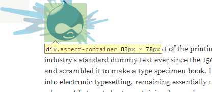
This field formatter encases an image in a div that automatically maintains it's aspect ratio (see Responsive Elements that retain their aspect ratio), and positions said image absolutely based on percent offset within said div. This allows the container div to behave in much the same way a normal image would in terms of page layout, and the image's position and scale to exist relative to that.
Project Status
This code works, and is in a ready state for developers to play with. Feedback regarding the usefulness of this module would be much appreciated!
Project information
- Created by uncommented on , updated
