Closed (fixed)
Project:
Bluecheese
Component:
User interface
Priority:
Major
Category:
Bug report
Assigned:
Reporter:
Created:
15 Sep 2010 at 22:56 UTC
Updated:
20 Jan 2011 at 17:31 UTC
Jump to comment: Most recent, Most recent file

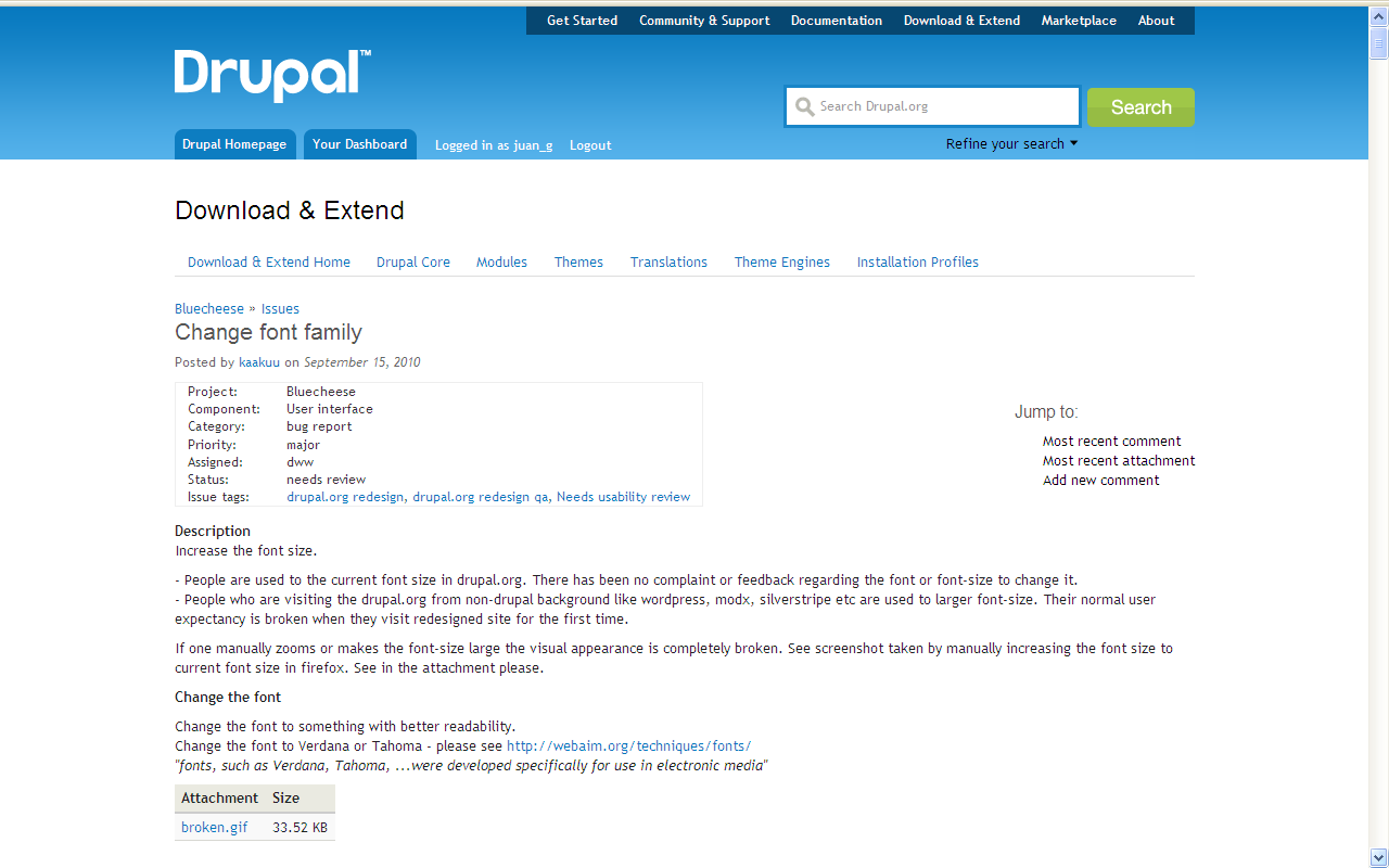
Increase the font size.
- People are used to the current font size in drupal.org. There has been no complaint or feedback regarding the font or font-size to change it.
- People who are visiting the drupal.org from non-drupal background like wordpress, modx, silverstripe etc are used to larger font-size. Their normal user expectancy is broken when they visit redesigned site for the first time.
If one manually zooms or makes the font-size large the visual appearance is completely broken. See screenshot taken by manually increasing the font size to current font size in firefox. See in the attachment please.
Change the font
Change the font to something with better readability.
Change the font to Verdana or Tahoma - please see http://webaim.org/techniques/fonts/
"fonts, such as Verdana, Tahoma, ...were developed specifically for use in electronic media"
| Comment | File | Size | Author |
|---|---|---|---|
| #112 | Opera.png | 132.94 KB | zet |
| #112 | Chrome.png | 131.77 KB | zet |
| #112 | Firefox.png | 210.74 KB | zet |
| #97 | 912936-Windows-BitstreamVeraSans-2.png | 64.04 KB | juan_g |
| #97 | 912936-Windows-Verdana-2.png | 62.89 KB | juan_g |

Comments
Comment #1
kaakuu commentedTagging
Comment #2
lisarex commentedAssigning to the Bluecheese project
Comment #3
drumm#509050: Reconsider base font size (PLEASE!)
Comment #4
michelleThis was marked duplicate of an issue that addresses the font size but doesn't address the font family. Per http://drupal.org/node/829944#comment-3561576 I am re-opening this one and narrowing the scope.
The font family in use on the beta site looks pretty bad on a PC since the first font in the line is a Mac font. From discussions in IRC, it looks better on a Mac but not all drupal.org users are going to be on a Mac. Even when ctrl-scrolling up a bit (the font size is still to small for me, despite the bump in the other issue), the text is very hard to read. Putting a font like Verdana that is easy to read at the top of the list would help a lot.
Michelle
Comment #5
sepeck commentedscreenshot of beta.drupal.olrg from IE8 - Windows server 2008
I would attach a screenshot of it from windows 7 with ie9beta but there was no noticable difference.
I have LCD monitors.
Comment #6
drummWhat I did was put in a few more names for Lucida in the font stack. My research shows that they are indeed similar, http://en.wikipedia.org/wiki/Lucida_Grande, and widely-available http://www.awayback.com/revised-font-stack/.
Comment #7
michelleOh, that's much better. Now if I I just need to ctrl-scroll up one click and it's readable. Thanks!
Michelle
Comment #8
gkatsanos commentedI think Lucida is just plain not nice-looking: It does not match the new Drupal Logo, and it is much less readable than Arial. (web users are used to Arial, it's much more common and familiar. Lucida just looks bizarre on the web.).
The fact that D.O. visitors are used to Lucida, doesn't mean we should stick with that for ages.
Are we trying to duplicate the previous D.O. version or are we redesigning?!
ps: someone even suggested Tahoma. Come one folks, seriously?
Comment #9
markboulton commentedI'd just like to clarify a couple of things:
- Verdana and Tahoma were both designed to be used on screen *primarily* at small sizes. They look dreadful when large.
- Lucida families are widely supported and are well hinted for screen. The reason for the choice was to make drupal.org more friendly whilst retaining legibility. This shouldn't be affected by increasing the font size. I'd rather that than introduce Arial, Verdana or Tahoma.
- Although ubiquitous, Arial is about as voiceless as you can get. It also has legibility issue when using large amounts of text on a wide measure. It's bland and characterless. We should avoid it for primary fonts in the stack
Comment #10
gkatsanos commentedOk Mark, I was just trying to defend the original prototype! (font just looks more familiar)
Comment #11
juan_g commentedI find the font used in the new design for the body text (small text like this) of news, posts, etc. narrower and less readable than the old font. According to Firebug for CSS and verified with direct comparison on OpenOffice, for Windows users it's Lucida Sans Unicode in the new design, and Bitstream Vera Sans (wide font, similar to Verdana) in the old design.
As I've commented in beta.drupal.org is ready to QA!, the problem seems to be that Lucida is good on Mac (Lucida Grande) but not good on Windows (Lucida Sans Unicode). Most designers are on Mac, and most users are on Windows.
Probably this is the reason popular sites like Facebook, etc. are not using Lucida Sans Unicode for Windows users.
Font-family in the old Drupal.org design:
Font-family in the new design:
From Wikipedia: Lucida Grande:
Facebook uses the following font-family:
The phpBB support forum uses:
For example, for my no more young sight, the most readable font for small text on Windows is Verdana, naturally. Bitstream Vera Sans, similar to Verdana and used in the old Drupal.org design, is also excellent.
Some related links:
Lucida on PC Ain't So Grande
Lucida Hybrid: The ‘Grande’ Alternative
Lucida Grande vs. Lucida Sans
Comment #12
michelleIt sounds like there's more discussion going on here, so maybe "fixed" was premature. With the redesign going live in a couple days, we may hear from more people once they start using it on a daily basis. I'm sure everyone is anxious to finally make this live and so this issue may not change before then but I hope we are still able to tweak things afterwards.
Michelle
Comment #13
alex ua commentedThis font is completely terrible for Windows users. I know there are a lot of Mac people in the community, so it's easy to dismiss complaints of usability, but I'm pretty sure we want to be inclusive of the 90% of computer users who aren't apple users. Please add something readable to the mix. Lucinda Grande does not come installed on Windows, and the Sans Unicode is horrendous. I'm seriously going to have to use firebug to manually change the font if I'm reading a long issue.
Comment #14
michelleYeah, I know I posted in #7 that it was much better, and it is because before I literally could not look at the site for even a minute without stabbing pains in my head. But it's still far from good on Windows. I have 20/20 vision and it looks blurry. Now that I've been having to look at it more because I'm actually using the site, I find more than a few minutes and my eyes are going cross-eyed. I can use it in short bursts but that's about it.
Michelle
Comment #15
juan_g commentedI think that, since Lucida Grande is good on Mac (see images), designers were maybe just trying to use a similar font on other OS like Windows where Lucida Grande is not usually installed.
However, more important than having a -theoretically- similar font (Lucida Sans Unicode), is to have a comfortably readable font, for people who need to read a lot, including code, etc. That is, even using different fonts on different operating systems.
To compare old and new readability, the old font family -"Bitstream Vera Sans",Verdana,Helvetica- is still being used at groups.drupal.org and api.drupal.org.
Comment #16
juan_g commentedSince we don't have a Mac at this place, I've been looking at image files (Mac screenshots showing Lucida Grande). At first sight, they look similar to what we see on Windows (Lucida Sans Unicode), until we look more carefully. It's surprising what subtle differences can do.
Reading text with the Mac version is more similar to read a paper book, it's a quality font, nice to the eyes. The Windows version is stressful and less comfortable, it looks less quality, at least at the small size used here. It seems clear that Lucida was first designed for Mac, before the Windows version.
I think there must be font-related technical differences between Mac and Windows, causing that the most popular/readable fonts designed for Mac (Lucida...) and the most popular/readable designed for Windows (Verdana...) are different.
Oh well, maybe we will get accustomed, especially those with very good and young sight...
Comment #17
alex ua commentedIn regards to Mark's comment in #9, why not just put Arial before Lucinda Sans Unicode, but after Lucinda Grande. Don't worry about what it does to the look of the site for PC users, we already aren't seeing what you think we are (if you're on a mac), so what's the difference? I'm not sure how being able to read something makes it "voiceless", but I guess I'm too busy squinting at my screen to consider 'voices' embedded within the font. Actually, if the font wasn't keeping me from getting to the actual voices I'm here to experience, I wouldn't have noticed the fonts at all- and that would be a perfectly fine.
Please, can someone do something about this? I'm not joking that I have to change the font in firebug to read the issues now, and that's about as unusable as I can imagine. (again, to reiterate, we're talking 90% of computer users who aren't being presented with a highly readable site)
Comment #18
juan_g commentedAlex UA:
However, there is a large proportion of youth in the Drupal community, therefore with very adaptable sight. Young people don't usually complain about readability, funny looking fonts, tiny sizes... I didn't ten years ago.
It's possible we are in a minority that is needing more time to hopefully adapt our eyes to this less clear text. And when we read groups.drupal.org -still with the old wide font- we can relax... 8-)
Comment #19
dwwI used http://browsershots.org to request screenshots on a bunch of browsers and OSes. Attached are some of the highlights. :/ It doesn't include Mac or FreeBSD yet, but here are some windows and linux gems (not exactly obscure browsers/platforms, either).
Clearly, just adding a bunch of other names for the missing font isn't helping. I'm not enough of a typography expert to recognize which fonts these are, but they sure are terrible. I think it makes a lot of sense putting Arial higher up in the list if it's going to avoid this disaster.
Comment #20
dwwFor comparison, here are some of the major browsers on various flavors of Linux
Comment #21
dwwHah, and not that we care, but I just noticed IE6 in the pile of screenshots. ;)
Comment #22
dwwAnd for final comparison, here are manual screenshots from my Mac
Comment #23
juan_g commenteddww wrote:
Yes, that looks better, easier to read.
Comment #24
alex ua commentedToo bad most of the world doesn't use Mac, or the redesign would look great to them! Oh well, at least the 90% of the Drupal developer community that uses Macs, which is probably why there's less complaining here at this point, rather than it being an age thing. I am feeling old at 33, but my site is the same ol' 20/20 it's always been...
Comment #25
alex ua commentedI'm moving this to the redesign queue for now, since being able to read the site seems like a redesign issue...
Comment #26
Adam S commentedI don't think drupal.org typography (it's not fair to just blame a font) is very accessible to people with dyslexia. http://www.w3.org/WAI/EO/Drafts/PWD-Use-Web/#dyslexia
Comment #27
michelleWow, that is so much better on a Mac. No wonder the designers thought this was ok. If we could get something that looks like that on Windows, I'd be happy. I still think it's too small but recognize that not everyone likes fonts as big as I do. At least that one is clear.
Michelle
Comment #28
yareckon commentedClearly no one has more than cursorily checked what this looks like on windows or Linux. Now that we know that the designers are right that it looks great on a Mac, can we have a better font stack for Windows and Linux?
Let's be clear, I am NOT in the "move Arial up" camp. It's very bland and more importantly, looks much smaller at the same point size, at least to me. Verdana and Bitstream Vera Sans (which is a wonderful open font, and very identified with drupal.org) would make windows and linux users much, much happier respectively.
So lets do:
"Lucida Grande",Verdana,"Bitstream Vera Sans",Arial,sans-serif
Let's walk through this:
"Lucida Grande",Verdana,"Bitstream Vera Sans",Arial,sans-serif
Macs get mac optimum font first. Then windows users get a nice screen font (linux users with MS core fonts installed also have Verdana). Then linux users without MS fonts get a great font. Then Arial the lowest common denominator (we hope no one gets to this point), then sans-serif fallback. Everyone gets a pony!
Who is with me?
Comment #29
yareckon commentedSwitching the order of middle two would also be just fine. Bitstream Vera Sans is marginally closer in feel to Lucida Grande, for them linux users that have it. So thats:
"Lucida Grande","Bitstream Vera Sans",Verdana,Arial,sans-serif
Comment #30
dwwIt's not clear if y'all understood the point of my screenshot festival. I'm trying to make it easier to fix the font on windows and linux by proving how bad the problem is. I'm all in favor of giving everyone a good font, and making Arial later in the stack if there are good alternatives to put higher.
Here's a patch for a hybrid approach:
It's basically what #29 proposes, but leaving in the
"Helvetica Neue", Helveticaahead of Arial (from the current typography.css) as we're falling back.This is available for review on http://beta.drupal.org (I cleared the site cache, but y'all might have to clear browser caches too, just to be sure).
Comment #31
yareckon commented#30 Wow. Looks great on linux.
A windows user will have to opine on that change for them. On a windows xp virtual machine, it looks very different with verdana. Good. Definitely better for those folks *without* cleartype turned on. Lucida Grand Unicode looks totally crap on windows without it, decent with it. I imagine the designers who test on windows xp test with cleartype on, and the browsershots service above for instance clearly doesn't have it on. Folks should test with both settings since it's literally a night and day difference.
copied from microsoft.com:
To use ClearType for screen fonts:
Click Start, click Control Panel, click Appearance and Themes, and then click Display.
On the Appearance tab, click Effects.
Click to select the Use the following method to smooth edges of screen fonts check box, and then click ClearType in the list.
Once more, I'm FOR the change to the patched version.
Comment #32
yareckon commentedDrat, the patch makes a slippage of one of the "develop with drupal" blocks on the homepage. The "This week" block drops down as too wide. Messing with the margins of those little floating tables 1.5 em -> 1.3 em breaks the grid (!) a bit and makes them look a wee bit crowded. Darn font spacing.
We'd have to go down to .79em on the body text ~12.6px to fix this for me on linux with Bitstream Vera Sans. On windows xp / Verdana, that would be .78em (~12.48px) to fix.
This patch definitely does a huge amount for readability in my book, but it is a move to two larger (wider) font families, so something's gonna have to give.
Comment #33
michelleThe beta site font looks great on Windows Vista. :) I don't have clear type on AFAIK.
Michelle
Comment #34
alex ua commentedA big +1 for #30- I can read the site again!
Comment #35
todd nienkerk commented#30 seems like a well-researched compromise.
I'm hesitant to add plain "Helvetica," though. I've seen some older versions of Windows do truly horrendous jobs rendering it. "Helvetica Neue" should be safe for the users who have it, though. I say we skip the Helvetica fallback and go straight to Arial for the poor souls who have no other option. :)
Comment #36
juan_g commenteddww :
Thank you very much, that font family includes fonts designed for readability on several operating systems. I've verified it's much easier to read on Windows. Also, it doesn't change the font for Mac, and yareckon has confirmed it looks great on Linux.
About the "This week" block, it can be fixed correcting just a margin-right and not the font size. It's now:
According to Firebug testing, 1.5em (19.5px) can be 1.485em (19.3px) for Bitstream Vera Sans, and 1.177em (15.3px) to also include Verdana.
Comment #37
dwwNote: I wasn't "adding" plain "Helvetica" -- that was already in there, I was just trying to maintain it.
Anyway, based on an IRC chat, here's a new patch (already up on beta) for the following:
There's strong objection to including Verdana at all, even as a fallback.
Any final objections?
Comment #38
juan_g commentedTodd Nienkerk:
A good alternative is Tahoma, included for example in the Facebook font-family and similar to the also small Arial, but designed for on-screen readability, like the wider font Verdana. This would make the following possibility:
I would really include Verdana like in the old Drupal.org, it's the only wide font for those without Lucida Grande or Bitstream Vera Sans.
Comment #39
heine commentedbeta is worse for me on Kubuntu + Chromium 6. Everything is smaller (and uglier). I don't have the typography chops to determine what font I'm looking at, but here's a screenshot.
Comment #40
heine commentedAnd here's what I see on live.
Comment #41
heine commentedTurns out that (k)Ubuntu 10.10 doesn't come with Bitstream Vera Sans, but has the DejaVu family in it's place. Not sure how widespread that one is.
Comment #42
heine commentedHere's a screenshot with 'font-family: 'Lucida Grande', 'Bitstream Vera Sans', 'DejaVu Sans', 'Helvetica Neue', Arial, sans-serif;'
Comment #43
sreynen commentedI hope this doesn't complicate matters further, but I wonder why no one has mentioned using @font-face to make preferred fonts work on platforms where they aren't commonly installed. Bitstream Vera Sans, for example, is freely licensed for such use, and available in a @font-face kit from FontSquirrel. That doesn't remove the need for fallbacks in the stack, of course, since not everyone is using a browser that supports @font-face. But it would move a ton of users up that stack to better fonts.
Comment #44
heine commentedAs dww was unsure if I had Zoomed (and I wasn't sure either), here's a new screenshot of beta with dejavusans on 100%.
Comment #45
juan_g commentedInstallation percentages for the fonts we are considering, according to The most common fonts - Full combined font survey results (16 October 2010):
Linux: DejaVu Sans (92.04%) is an extension of Bitstream Vera Sans (72.67%), with greater coverage of Unicode and more styles. They are wide fonts, similar to Verdana.
Mac: Lucida Grande (100.00%) is a large font covering Mac completely.
Windows: Verdana (99.71%) and Tahoma (99.90%) were designed together for on-screen readability on Windows. Verdana is a wide font, similar to DejaVu Sans and Bitstream Vera Sans. Tahoma and Arial (99.71%) are narrower. Tahoma is used as an alternative to Arial.
[Edit: Added Trebuchet MS, a well-known font later suggested; it's usually considered -like Tahoma- a readable alternative to Arial, also narrow and of similar size; as a fallback, Trebuchet MS would be preferable to Arial]
Comment #46
drummMy main worry about @font-face is international characters, I haven't heard how supported they are. The right column of http://drupal.org/press/drupal-6.0 demonstrates where we use a lot of character sets together. And download size. Otherwise, Drupal.org users tend to have modern browsers, and @font-face is worth properly exploring, but not now.
Otherwise, I generally like where this is going.
To put an end to OS speculation:
Comment #47
dwwBased on yet more feedback in IRC, it seemed like a fair number of folks were falling back to Arial, which is pretty harsh for them. So, here's yet another attempt:
Available on http://beta.drupal.org (site's CSS and page caches cleared, your browser cache might need clearing, though).
Pretty please is this RTBC? ;)
Comment #48
sepeck commentedtests fine on ie8 on windows 2008 server and windows 7
tests fine on windows xp with ie7
Overall, font appears sharper to my 'not to young, to old' eyes.
Other collected IRC comments
[16:06] dww: for me, the beta site seems to have a slightly narrower font, so things fit slightly better into lines than on the live d.o site.
[16:06] It's render the same way both in IE9, and FF4beta.
[16:08] jhodgdon: No, I don't. I see beta.d.o differently from how I see it on my Mac.
Comment #49
Adam S commentedI went ahead and turned on clear type as prescribed in #30. Here are two screen shots showing the difference. It's like night and day. Now I understand how that happened.
Comment #50
dwwAlso heard:
[4:08pm] \Pete: dww: Looks OK on my machine, but I'm at Lucida Sans in the stack before I get a match.
[4:09pm] \Pete: dww: Vista Ultimate 32, btw, in FF 3.6 and IE8
Comment #51
juan_g commentedWith Lucida Grande for Mac, DejaVu Sans for Linux, and Verdana for Windows, over 90% of users have a large/wide font, all excellent for readability of small text sizes like this. Bitstream Vera Sans can also be used by a minority of Windows users when available. Smaller/narrower fallback fonts could be Tahoma, Arial, sans-serif; Tahoma is more readable, but Arial covers some Linux users, etc. Given that Lucida Grande is on a 100% of Mac systems, Helvetica fonts don't seem necessary.
The previous data would suggest a font family similar to this example:
And about Verdana, among the fonts under consideration, is the only wide font for most Windows users, designed for excellent readability of small text. It's similar in size -only slightly wider- to the other large fonts (Lucida Grande, and DejaVu / Bitstream Vera). And, as already explained (#36), there is no need to change font size to fix the mentioned problem with a block (#32). Verdana was in the previous font family of drupal.org -"Bitstream Vera Sans", Verdana, Helvetica-, still used by groups.drupal.org and api.drupal.org.
Comment #52
juan_g commenteddww:
This means most Windows users will get Lucida Sans:
Lucida Grande 0%, Bitstream Vera Sans 17.80%, Lucida Sans 71.30%...
But Lucida Sans on Windows has similarly low quality display to Lucida Sans Unicode, so we are going back to the initial problem... The Lucida family was designed for Mac, not for readability on Windows.
What's the reason to not include Verdana for Windows users? Verdana is the only important font missing to solve most use cases (Windows).
I've installed Bitstream Vera Sans, so I don't have this problem, but most Windows users will have it, as I've seen testing fonts with Firebug.
Comment #53
dwwHere's a not terribly helpful contribution to the question of Verdana:
http://twitter.com/markboulton/statuses/27811681062
Frankly, the personal whims of Mark are less important to me than actual readability of the site. I'm also running out of time and energy to keep messing with this. OTOH, the momentum around fixing this and the team of people willing to test is high right now, so this is probably one of the best chances we have to get something reasonably sane for the widest pool of our users.
#51 + #52 sound persuasive to me, but I'm not a typography expert.
toddross and drumm said in IRC that "Trebuchet MS" was better than Tahoma, especially at this smaller font size, and http://www.codestyle.org/css/font-family/sampler-CombinedResultsFull.shtml indicates "Trebuchet MS" has nearly as universal availability on windows as Tahoma...
I got the sense from IRC that some of the positive feedback on #47 was that people (I specifically asked for non-mac users to test) were hitting "Lucida Sans". Of course, it's really hard to get definitive results with all the combinations of available fonts, clear-type settings, etc.
Maybe this?
I know Mark has a visceral hatred of Verdana, but if it looks better than Arial as a fallback, I really don't see the harm.
Comment #54
dwwOkay, proposal #53 is on beta for testing.
Comment #55
juan_g commentedIn my opinion, #53 is perfect for Mac and Windows, and good for Linux. It's even better than the first patch (#30), which was also excellent, since DejaVu Sans for Linux (from Heine's suggestion) and the Trebuchet MS fallback (from toddross and drumm) are now added.
Having "DejaVu Sans" just before "Bitstream Vera Sans" instead of after it, would make it also perfect for Linux; I think Heine is right about DejaVu. As said (#45), DejaVu Sans (92.04% on Linux) is an extension of Bitstream Vera Sans (72.67%), with greater coverage of Unicode and more styles.
On the Verdana controversy, readable fonts like Verdana for Windows, Lucida Grande for Mac, and DejaVu Sans for Linux are only necessary to fix the readability problem of normal/small text, not for titles, etc., where other fonts could be used without any of these usability problems, naturally.
Comment #56
drummIf you look at Lucida Grande on Mac, compared to Verdana on Windows, they are significantly different. Verdana is designed for quite small text, the proportions are distorted compared to other fonts.
There is another Microsoft core font for the web that deserves some consideration, Trebuchet MS. It has reasonable proportions and is certainly better than Arial. It is up on http://beta.drupal.org/. Please give it fair consideration.
Comment #57
juan_g commentedThe #56 test is now:
It replaces Verdana with Trebuchet MS (99.27% on Windows, 95.08% on Mac, 64.83% on Linux). Both are readable fonts for Windows. Verdana is wide, and Trebuchet MS is narrow, that is to say also good but small.
With this font family, Mac users see Lucida Grande (large font), Windows users see Trebuchet MS (small), and a great part of the Linux users see Trebuchet MS (small) and most of the rest DejaVu Sans (wide).
Large fonts (good and readable for small text) are: Lucida Grande, DejaVu Sans, Bitstream Vera Sans, Verdana.
Small fonts are: Trebuchet MS, Arial, and most other sans-serif.
If Verdana is used only for small text like this, not for titles, etc., I think it's as good as Bitstream Vera Sans; in fact it's similar in style, just a little bit larger. However, if unfortunately we are going to remove Verdana, I think there is no real replacement for it on Windows, and in that case the font family should have Trebuchet MS after DejaVu Sans and Bitstream Vera Sans:
In this way, Linux users see DejaVu Sans (wide font) instead of Trebuchet MS (small). And, while most Windows users still see Trebuchet MS (small), a lucky Windows minority see Bitstream Vera Sans (wide).
But a solution similar to #53, with Verdana, and Trebuchet MS just as fallback, would be much better in my opinion, because everyone sees a large or wide font designed for readability of small text: Lucida Grande on Mac, DejaVu Sans on Linux, Verdana on Windows:
Of course this is just my opinion. Trebuchet MS is small, not so good as Verdana for small text, but at least is a readable font on Windows, much better than others designed for different operating systems.
I have to go now. I think you are doing a very good work, and will find a reasonable solution, even if it's not perfect for everyone. Let's hear other opinions.
Comment #58
sepeck commentedChrome and IE8 from Windows.
Comment #59
yareckon commentedThanks for putting up with us dww :)
Personally, on Linux I would rather see either DejaVu Sans, Bitstream Vera Sans, or even Verdana before Trebuchet MS, which is an ok font, but has a very swoopy distinctive flavor (See the Headlines in the old drupal pushbutton theme).
I am torn because Trebuchet MS is small enough that we wouldn't have spacing problems.
So I agree with #57:
"Lucida Grande", "DejaVu Sans", "Bitstream Vera Sans", Verdana, "Trebuchet MS", Arial, sans-serif;
In my ideal world, I would also take the base body font size from .81down to .78em, to deal with the wider width of those middle three fonts, but not sure if folks are on board with considering that at all, and I haven't tested on Mac to see if that makes Lucida Grande too small..
I don't know what do do about Mark Boulton's distaste for Verdana. Doubt he even uses windows as his main OS?
Comment #60
michelleI'm -1 to dropping the font. We just had an issue to bump it up to where I can just barely use it without enlarging, now.
FWIW, this font here in the comment box on Firefox on Linix is just perfect. :) Sorry, have no clue how to take a screenshot.
Michelle
Comment #61
juan_g commentedJust added Trebuchet MS to the table of installation stats (#45). As said, that well-known font is usually considered -like Tahoma- a readable alternative to Arial, also narrow and of similar size. As a fallback, Trebuchet MS would be preferable to Arial.
Trying to please everyone ;) , searching for alternatives to Verdana for small text on Windows, for example at Microsoft's Core fonts for the web, I can't find any good excepting Bitstream Vera Sans (mainly Linux), which -it seems- only a minority of Windows users have.
I've seen an interesting post -(There Is Hardship) Beyond Arial & Verdana- from a graphic designer with a similar problem, because he is painfully trying to have something similar to Mac's Lucida Grande on Windows. He says:
Comment #62
verta commentedJust a comment from the gallery, beta on WinXP is better right now over the readability on d.o.
Thanks for listening to the readability issue, hope something gets pushed live soon, I use this site often and it's noticeably tiring right now. Has anyone discussed the body text color? If you make it a little darker, the contrast might help. It's not an art site, it's a technical documentation site. Shades of gray can make words prettier, but don't help make technical information clearer.
Comment #63
juan_g commentedyareckon:
I would also prefer this font family. However, there is no need to reduce the font size, with just a small fix for a block margin instead (see #36). On the other hand, Lucida Grande is a large font, like the four first fonts in that font family (last of #57). Trebuchet MS and Arial (fallbacks) are smaller.
For example, if I copy the previous paragraph to OpenOffice Writer, with this 10pt size, the text length related to Lucida Grande is the following:
Lucida Grande 100%
DejaVu Sans 103%
Bitstream Vera Sans 103%
Verdana 104%
Trebuchet MS 93%
Arial 90%
Michelle:
About the box to write comments, it's a large size (16px, about 12pt) so no problem. I agree, the difficulty is on readable fonts for this small text (13px, about 10pt).
verta:
Yes, even when not as good for small text as the wide Bitstream Vera Sans or Verdana (the fonts on the previous drupal.org, and current groups.drupal.org and api.drupal.org), the narrow Trebuchet MS (current beta.drupal.org) is more readable on Windows than Lucida Sans Unicode (current drupal.org).
Comment #64
michelleWill you please stop updating that same comment over and over. I wasn't going to say anything, but that's about the 5th time now that I've clicked on the "new post" only to find the same comment.
Michelle
Comment #65
juan_g commentedI'm sorry Michelle, I was adding more data from my research, testing, etc. It's complete now.
Comment #66
Joel MMCC commentedThis could actually be a subject for modern Web design in general.
It used to be that one could only count on users having a few generic fonts: Arial (or Helvetica), Times New Roman (or Times), Courier, and a Symbols font. Any other fonts you may have you could not count on your web users also having. Yes, most Windows users did have a basic set of Lucida fonts, but you couldn’t count on those for sure. Likewise, anyone with Microsoft Office had a few extra fonts such as Haettenschweiler (a thinner Impact) and Curlz MT and such, not to mention Tahoma, the font preferred for Office system use (e.g. the default font in an Excel spreadsheet or Access datasheet).
Another thing to consider was that a font family on the Web should include at least true Boldface, Italics/Oblique, and Boldfaced Italics variants (as opposed to faux versions of those done by “double-stamping” the font one pixel to the right for a faux-Boldfaced, or skewing it to the right for a faux-Italics/Oblique), which look, quite frankly, Really Bad (Hey, fellow Windows users! See how bad this looks!?). But many of these fonts lacked some or all of those variants. Comic Sans MS has a true Boldfaced but not a true Oblique let alone Italics, for instance, and ditto Tahoma. Curlz, Haettenschweiler, and even Impact, and, more relevant to this site, Lucida Sans Unicode (!), etc. lack anything other than the plain font.
The general advice was to not specify font names at all. Instead, use the HTML/CSS generic font-family names: “serif,” “sans-serif,” “monospace,” “cursive,” and “fantasy.” Let the OS and Web browser (and the user if s/he knows how) determine how those should map to installed system fonts.
Well, Microsoft decided to release a set of Core Web Fonts to increase font variety on the Web. These were installed along with Internet Explorer 4 and up for Windows, any Internet Explorer for the Mac OS, and licensed to Apple for inclusion in later versions of Mac OS Classic and Mac OS X. These included Arial Black, Arial Narrow, Comic Sans MS, Impact, Verdana, and Webdings. A later batch that was somewhat less widely available included Andale Mono (monospaced sans-serif), Georgia (serif with old-style “lowercase” digits — not suitable for tables of numbers, prices, phone numbers, etc.!), and Trebuchet MS (stylish yet legible sans-serif) as well.
You can pretty much count on the upper 90+% of users having those fonts available these days. Even most portable devices such as smartphones have them, or at least acceptable substitutes.
More recently still, Microsoft in Windows XP introduced ClearType™, a mechanism for using the separate Red, Green, and Blue cells of a flat-panel display (but not the RGB phosphor dots nor stripes of a CRT display, since those could not be counted on to line up properly with a 1:1 pixel-to-phosphor-grouping ratio) to perform “sub-pixel rendering,” an advanced form of anti-aliasing (ironically itself very similar to a technique used on the old Apple ][+ in Hi-Res graphics mode to double apparent horizontal text resolution). While any outline (TrueType or OpenType) font would automatically take some advantage of ClearType, for Windows Vista and Office 2007 they created a new set of fonts that were specially crafted to take full advantage of ClearType. They look much more readable on flat panel displays, and also include special advanced typography features such as ligatures and kerning that modern browsers can utilize if CSS enables them (“text-rendering: optimizeLegibility;”).
These fonts are often called the “C-fonts,” both because of ClearType and also because all but one of the font family names likewise begin with the letter “C”. These include: Calibri (the new Arial/Helvetica-like generic sans-serif), Cambria (the new Times New Roman-like generic serif), Consolas (the new Courier or Lucida Typewriter or Andale Mono-like monospaced font), Constantia (a more stylish serif font, with lower-case old-style digits — basically the new Georgia), Candara (a more stylish sans-serif, also with lower-case old-style digits, and a large x-height), and Corbel (plainer sans-serif with lower-case old-style digits, and a smaller x-height than Candara). There’s also Segoe UI, which is intended for system menus and such (thus the “UI” for “User Interface”) but is also a very clean slab-sans-serif font similar to a cross between Tahoma and Verdana. Windows 7 adds still more such fonts, including several sub-families of Segoe beyond just the UI version. All of these have all four necessary font-weight and font-style variants.
Bitstream has released some free ClearType-optimized fonts as well, and those have achieved some popularity and come with some Gnome distros of Linux. These are the Vera family: Bitstream Vera Sans, Bitstream Vera Sans Mono, and Bitstream Serif. These have been further enhanced as the free DejaVu font family, supporting more of Unicode and also including more styles such as Condensed. But you can’t really count on them being available, though they could be useful as a preferred font using more common fonts as fallbacks.
For modern web design, the CSS should be set up to include at least one “C” font, the nearest modern equivalent from Mac OS X, then older fallback fonts, and finally of course the standard HTML generic fallback font. For instance:
font-family: Calibri [or "Segoe UI"], "DejaVu Sans", "Bitstream Vera Sans", "Lucida Grande", Verdana, "Helvetica Neue", Helvetica, Arial, sans-serif;font-family: Cambria, "DejaVu Serif", "Bitstream Vera Serif", "Hoefler Text", "Times New Roman", Times, serif;font-family: Consolas, "DejaVu Sans Mono", "Bitstream Sans Mono", "Andale Mono", "Courier New", Courier, monospaced;Never include a font family such as Lucida Sans Unicode or Arial Unicode MS or Tahoma (or [*gag!*] Comic Sans MS) that lacks any of the four basic font-weight/style variants, unless you know that it will never need to display such variants (e.g. a font used only for a navigation menu that would never, never, never have any italicized text in it — to see why, just read this on a Windows system! It’s really ugly!).
While I do include Helvetica Neue, Helvetica, and Arial in the recommended “sans-serif” font list, I really don’t like those fonts for another reason: plain sans-serif fonts such as those usually provide no easily visible distinction between upper-case “i” and lower-case “L”, especially at smaller font sizes. So, if I say, “John Doe, Ill”, am I saying that John Doe is the third with that name in his family, or that he’s from Illinois or not feeling very well? Especially when discussing programming code as is so often done here, the inability to distinguish those characters could have actual really bad consequences! Corbel also has the same problem at smaller font sizes. At least Verdana puts slab serifs on the upper-case “i” and Trebuchet MS puts a curve-to-the-right bottom serif on the lower-case “L”. Lucida Sans Unicode at least does make the lower-case “l” noticeably taller than the upper-case “I” (as do Calibri and Candara), at least at the point size used here, but that probably could not be counted on at smaller sizes.
Comment #67
juan_g commentedScreenshots of this issue with readable fonts for Windows that we are discussing now: Bitstream Vera Sans, Verdana, Trebuchet MS.
Comment #68
juan_g commentedAnd screenshots of the Drupal.org homepage with the same readable fonts on Windows, including the quick margin fix for the "This week" block with no need to reduce font size (comment #36).
Comment #69
juan_g commentedThe following is a summary of the previous, tested and proposed font families for normal/small text on Drupal.org. The fonts that most users see for each operating system are detailed according to installation statistics (#45), with approximate percentages modified by font family order.
1. Font-family of the previous drupal.org design, and currently on groups.drupal.org and api.drupal.org:
2. Font-family of the new design, currently on drupal.org. It originated this issue because the Lucida family is indeed excellent on Mac but lacks readability for long small text on Linux and Windows:
3. First patch on this issue applied to beta.drupal.org (#30), which was welcomed by all testers because of very good readability on all operating systems (Linux, Mac, and Windows):
4. Then, there was a design controversy about Verdana (font designed for the best on-screen readability of small text on Windows), because it looks different from Lucida Grande. Verdana was removed from beta (#37):
5. Testers complained about viewing the small Arial on Windows and Linux. There was another unsuccessful test with a less installed member of the Lucida family on Windows (#47):
6. After that, a new patch on beta (#53) added Verdana for Windows and DejaVu Sans for Linux. It was similar to the very welcomed by testers first #30 patch:
7. The current try for the difficult task of finding an alternative to Verdana for small text on Windows (#56). This test, with the readable but small Trebuchet MS, is the one on beta.drupal.org now:
8 & 9. The latest two proposals (#57), with or without Verdana (preferably with), so that Linux users see DejaVu Sans, and Windows users see Verdana for normal/small text, or in other case at least part of them the also very readable Bitstream Vera Sans. The last font-family (9), with Verdana and DejaVu Sans (extended version of Bitstream Vera Sans) is very similar to the welcomed tests #30 and #53:
So, at the end, which one for normal/small text on Drupal.org? Thoughts?
Comment #70
verta commented... because it looks different from Lucida Grande. Verdana was removed from beta (#37).
This, to me is not a good reason to drop a font. Viewers on one platform don't really care if a site looks different on another platform. I generally assume that it probably will look different, and if it's READABLE on both, it's a win.
I missed the discussion that resulted in dropping it, but I'm in the "Verdana (preferably with)" camp. Trebuchet MT is too "tight" - the letter width is what makes it hard to read.
The screenshots are really helpful, you can blink test and see right away what the differences are, thank you.
Comment #71
dwwBased on the screenshots in #67 + #68, I have to say Verdana looks more readable to me than Trebuchet MS, at least in practice. In theory, Verdana might be a "bad" font, but no one's actually provided any solid justification for this assertion. The closest we get is from Mark in #9:
That's fine. We're talking about the body font that's primarily small on drupal.org. All the headers are already set to use a different font-stack:
Based on juan_g's extensive research and screenshots, and all the other comments in here, I'm now fully in support of going with this:
Comment #72
dwwIn IRC drumm pointed out that retaining "Trebuchet MS" is rather pointless, since anyone who's going to have that is already going to have Verdana. So, I committed this:
Merged into production, deployed live, and cleared the site cache.
Fixed at last! ;) Thanks for everyone's patience and dedication in here.
Comment #73
tr commentedWow. It's so much better now (Ubuntu/Firefox). Thanks.
Comment #74
michelleThanks! I can't wait to boot up my main computer tonight and have a look. It doesn't look any different to me on this linux netbook but it wasn't too bad on here to begin with so that's ok.
Michelle
Comment #75
verta commentedInteresting, it's better in IE than Firefox on XP. Since I have the addon to use the IE rendering engine in a tab, I think this will work great.
Comment #76
yareckon commentedYay! Immediate awesome! Noticed when I hit the front page.
Comment #77
juan_g commentedThank you!, the website is comfortably readable now, even with this small size. Lucida is truly beautiful on Mac, but unfortunately for small text on Linux and Windows it was like reading through the fog, maybe for my years. Now that this work issue is fixed without having to buy a Mac, I've noticed at last how nice the new Drupal.org design looks, indeed. So, congratulations to the community and to the graphic designers as well. Good work all. :)
Comment #78
juan_g commentedSome feedback from beta.drupal.org is ready to QA!:
;)
Comment #79
brightboldI realize I'm hitting this thread late. As a Windows user I agree that Lucida Sans Unicode, with its faux bolding and italics, was hard to read, but as a designer I'm devastated that we've gone back to Verdana.
I believe that the assertion in #52
is outdated. It appears that Microsoft released a revised Lucida Sans through Windows Update, dramatically improving the type hinting. So if you put Lucida Sans back in the font stack, the bold and italics will be far superior to what Windows users were seeing with Unicode.
If there are other reasons for eliminating Lucida on Windows, can we at least add something to the font stack to throw people on Windows who care about good typography a bone? Segoe UI has a similar look and good screen readability — that would significantly improve the look of the site for Vista and Windows 7 visitors. That only covers 57% of the Windows base (according to Codestyle), but there's no reason to punish us all! So I'd suggest:
"Lucida Grande", "Segoe UI", "DejaVu Sans", "Bitstream Vera Sans", Verdana, Arial, sans-serif;I don't want to sacrifice readability/usability on the altar of design, but I think there's a happy medium. Can we please revisit?
Comment #80
brightboldScreenshot of d.o. in Segoe UI
Comment #81
juan_g commentedWe have tested Lucida Sans, and it's possible there are two bad/good quality versions of the font, I don't know. For example, when the new design went live, users were viewing, approximately according to font stats and font family order:
Both Linux and Windows users were unhappy. Part of the Linux users with Arial, and part of them with probably the bad version of Lucida Sans.
Later, because of the Verdana aesthetics controversy, Lucida Sans was tested again:
There were mixed reviews. Most Linux users viewing Bitstream Vera Sans, so happy. Some Windows users reporting an improvement over Lucida Sans Unicode, but it's not clear if it was Bitstream Vera Sans like in my case, or the good version of Lucida Sans. Then, I also tested Lucida Sans with Firebug and with OpenOffice Writer, and it was as bad as Lucida Sans Unicode for small text like this. Maybe I have the bad Lucida Sand version on Windows XP.
Therefore, if we go with Lucida Sans, it seems part of the users will be ok, and part of them will have tired eyes. The current situation is better, with almost everyone happy. And, after all, only Windows users without Bitstream Vera Sans are seeing Verdana now:
About Segoe UI, we can see on your screenshot (I don't have it installed on Windows XP) that it's a good font, included since Windows Vista.
Segoe UI has a possible problem if ClearType is disabled, but anyway I think it's enabled by default on Vista, so this is a minor point. From Wikipedia:
The only real problem that I see about Segoe UI is that it has the same size (narrow) of Trebuchet MS, and testers here preferred wider fonts for small text. I think Segoe UI looks better than Trebuchet MS, but it's still a bit small.
I don't know, is there any good font similar in size to the wide Bitstream Vera Sans or Verdana, with installation percentages on Windows at least similar to Segoe UI?
Comment #82
brightboldTrue, I hadn't thought about Linux users with Lucida Sans, who wouldn't have gotten an improved version through Microsoft Update. And while Lucida Sans has native bold and italics, which look a lot more graceful than the faux ones cobbled together for Lucida Sans Unicode, the italics in particular look really tight (lowercase "n"s and "h"s are kerned too tightly to the next letter), so I can see people finding those hard to read.
It's really a shame that Microsoft made their "C" fonts so incredibly tiny, because otherwise I think Candara would fit the bill here. But until we can tune the size separately for each font in the stack, those fonts are useless because they're so much smaller than the other fonts in a stack. So I have to differ with @Joel MMCC's assertion that the "C" fonts belong in every font stack (maybe he still has young eyes!) I think those fonts aren't practical on most sites, and especially here, where people are already complaining about readability and small type.
To me (even with my no-longer-young eyes), Segoe UI is really readable on the site, and looks a lot better than any of the other Windows options. If other people think it's too narrow then I'm just depressed, because I can't find anything for Windows that's wide and not also old and tired.
I do want to point out, though, that I don't think we need to be limited to fonts with “installation percentages on Windows at least similar to Segoe UI.” If we find a fabulous font, loved by Winders but with only a 30% installation base, you've still improved the site for those 30%. Just as the site improved for you when you hit Bitstream Vera Sans in the font stack, even though, as you point out only 18% of Windows users have that installed.
I'd love to see Segoe UI tested, but we may be past that point, in which case I will just crawl back in my typophile hole and suffer, or hack the d.o. stylesheet locally, or throw my laptop out the window and get a Mac. :)
Comment #83
juan_g commentedBrightBold:
Yes, I was thinking the same the other day. Not sure why the new ClearType Font Collection has so small fonts. Maybe a Unicode thing to have space for larger asian characters?; just a theory. I then looked for any way to have per-font sizes in a font family, but it seems a current CSS limitation.
Yes, it's a Windows issue. I think we all agree Lucida Grande is readable, good sized, and beautiful on Mac, but we were dealing with what it's currently available for each operating system, which it's not much for Windows.
For me, Segoe UI (on 57.49% of Windows systems) could be good in a font family for short texts like blocks or sidebar menus, and for larger sizes in the case of long text. However, for long small text it's a little narrow, like Trebuchet MS and other alternatives to Arial. Of course, this is just my opinion. If others think differently, they will say it.
About good percentages to choose a font, I was writing in a general way and didn't explain it, sorry. Surely there are different views because this is open source, community work, but I think it would be worthy to change the font family if it really makes an improvement for even a minority of users, like say 10%. On the other hand, adding rare fonts for a few 1% groups would be exaggerated, naturally.
I can see your concern as a designer is about beauty. Let's hope technology will improve until having the same possibilities available on screen as in print. I've also seen a variety of other different concerns among designers, that I'm going to comment now, in reply to dww.
dww:
I was also curious about this, why some graphic designers dislike that font, while others praise it for specific uses. So, I've just read some articles (Time, etc.), and it seems that a phrase can summarize what they say (apart from the love for beautiful fonts like in the case of BrightBold):
Well, "it's overused" because it's really difficult to find very readable fonts for small sizes on Windows, apart from Verdana and the less installed Bitstream Vera Sans. Of course, there is a great variety of beautiful fonts for larger sizes and for print.
"It was designed for small sizes on the Web", and this is the specific use here.
"It's way too associated with Microsoft", but -even when Verdana is also widely available on Linux and Mac- practically only Microsoft users see Verdana for small text on Drupal.org with the current font family. That is, Linux users see DejaVu Sans or Bitstream Vera Sans, Mac users see Lucida Grande, and Windows users see Verdana or Bitstream Vera Sans. And they all lived happily ever after... ;)
Comment #84
volocuga commentedToo many words. Why not just change the font to Verdana or Arial? Now, in Windows, it looks really ugly, impossible to read
Here is not art-gallery, it should look like php.net or so.
Comment #85
Thoor commentedAs vologuga wrote ... please just change it! Right now i really hate to look for informations on Drupal.org because of the used "unlucky" Font Familiy! As many other Windows Users wrote ... in the actual way it isn't good readable.
I am using WIN XP with FF.
Comment #86
heine commented@volocuga, it is common courtesy to 1) read the issue before replying and 2) not denigrate in a rather flippant manner the work of conscientious contributors working on this important issue.
The current font-family chain for body text (see 72) is 'Lucida Grande', 'DejaVu Sans', 'Bitstream Vera Sans', Verdana, Arial, sans-serif. So, if you are on Windows and do not have DejaVu Sans or Bitstream Vera Sans installed, you do get Verdana or Arial.
What exactly looks 'really ugly, impossible to read'? What font is displayed? Does a shift-refresh help?
Comment #87
Thoor commentedAs an explanation to my comment #85 here is a screenshot with the actual used font and what it could look like with Verdana on top of the "Font-Family" list in the css file.
Comment #88
michelleI'm on Windows Vista and the font doesn't look like what's in that screenshot to me. Even at the small size, it's readable now. If my eyes are tired, one ctrl-scroll up and it's perfect.
Michelle
Comment #89
verta commentedI'm submitting what I am seeing, using XP Pro SP2 and Firefox, both the native and in the IE engine (IE Tab addon).
IE is so much more readable.
It strikes me that while good coding is an art, this is not a visual art site and the portfolio is not the primary product here. Readability needs to trump design minutia. I have read, and I think I understand, and I am certain that I appreciate all the font history and analysis here. I just know I won't spend much time on a site that gives me eye strain.
Edit: I'm afraid the compression is softening the difference between these shots.
Comment #90
yareckon commentedLooks to me like you may have cleartype off, accounting for the look of text in firefox, while IE seems to be activating cleartype or similar smoothing somehow despite your systemwide settings. IE does look nicer, but both look fairly readable for me in your screenshots.
Not sure what your prescription is for improvement?
Comment #91
juan_g commentedThoor, according to your screenshot, you are seeing a font very similar to Verdana, Bitstream Vera Sans, or less probably its version DejaVu Sans, which looks the same. So, if you have Bitstream Vera Sans installed, you are seeing exactly the same font of the old drupal org (font-family: "Bitstream Vera Sans",Verdana,Helvetica), and of the current groups.drupal.org. Verta is also seeing Bitstream Vera Sans, like me.
I think what happens is that you and Volocuga, like many people, didn't like Lucida Sans Unicode, the Windows font of the new design, and didn't look carefully today. If you read this issue, it has been fixed this past Friday, and you are already seeing the old drupal.org font of all these past years. The only difference is text lines as wide as the browser window, maybe a little long lines for this small font size.
Comment #92
Thoor commentedJuan_g ...
I tried now the Drupal.org Site with Chrome, with FF 3.6.11 and with IE 8! In Chrome and FF the font looks like my former uploaded screenshot. In IE 8 the site is good readable.
But I prefer Chrome or FF :-( And I also had a look on my system and the available fonts ... You are right! "DejaVu Sans" is really installed and it is, what I see in my Browser, because when I remove it in Firebug to:
font-family:"Lucida Grande","Bitstream Vera Sans",Verdana,Arial,sans-serif;
the Site looks also OK in FF.
So maybe "DejaVu Sans" font should be removed in the Theme? Guess Drupal.org can`t expect to install new fonts to get the site readable?
Comment #93
juan_g commentedDejaVu Sans is an extension of Bitstream Vera Sans, which looks the same for English normal characters (I have both installed on Windows). It just has more Unicode characters and some other additions. DejaVu Sans is an useful font for many Linux users.
Comment #94
Thoor commentedOK then ... My Solution is pretty easy! I just kicked all installed "DejaVu" Fonts from my System ... and Hello! Drupal.org is readable again with FF and CHROME!
I could do this, because I really never used those fonts ... but should this really be the recommended solution ???
Comment #95
verta commentedI appreciate the insight and advice.
I do have ClearType on, turning it off makes everything everywhere harder to read.
If I Firebug the "DejaVu Sans" out of the font list it does get more readable, dropping to Verdana, I suppose. Funny (@Thoor) - I actually considered uninstalling the font also, kudos for Just Doing It. Can't think that's going to be a recommended solution - expecting viewers to do anything to their OS or browser to view a site is not a reasonable design path. The ones who know how to increase the font size are rare enough.
The points in #83 speak strongly to me.
It is MS-hating fashion to 'dislike Verdana?' All that sticks in my mind about it is that it was designed to look good on a screen. Isn't that what we all want? How can "overused" and "associated with Microsoft" possibly mean anything to a normal (non designer) site viewer reading body text? Those terms mean something if you're designing a logo or using a large point size in a headline or banner, not if you're trying to get people to read long blocks of technical content.
There are two modules I know of to make images from fonts, signwriter and textimage.
http://drupal.org/project/signwriter
http://drupal.org/project/textimage
These look like nice ways to make sure the font you love is on everyone's screen by making those elements into image files that can be cached.
Comment #96
juan_g commentedThere is a DejaVu Sans screenshot attached here. That font is almost equal to Bitstream Vera Sans. Both are quite similar to Verdana. Those with Bitstream Vera Sans installed were seeing the same font before the new design. If not installed, they were seeing Verdana, which it's slightly wider, but not much different.
Comment #97
juan_g commentedUpdated screenshots of Bitstream Vera Sans and Verdana, for easier comparison with DejaVu Sans.
Comment #98
brightboldHa ha. I guess I am the opposite of everyone else. I went out and downloaded DejaVu Sans because, while it doesn't look as good as Lucida, at least I don't have to look at Verdana any more. To each ones own!
Comment #99
juan_g commentedOK, although I think those current fonts for Windows users are similar, let's bikeshed a bit to try to half-fix Verdana liking/disliking troubles. :) In theory, few Windows users have DejaVu fonts, but they are distributed with OpenOffice, the alternative to Microsoft Office that many open source users install, including surely many Drupal users.
I hadn't thought about that possibility but, from the feedback here, it looks like some people (without Bitstream Vera Sans but with DejaVu Sans installed) were seeing Verdana before on drupal.org, and are seeing DejaVu Sans now, and they prefer the former, wider font.
So, lets review the stats about what fonts drupal.org users see, as always according to font stats and font family order.
Font-family of drupal.org before the new design, and still currently on groups.drupal.org and api.drupal.org:
Current font-family on drupal.org for normal/small text, after removing the problematic Lucida versions for Linux and Windows:
It's possible the current Windows stats are different, but we don't know the DejaVu Sans percentage for drupal.org.
A possible solution for those that miss Verdana from the old drupal.org would be to move DejaVu Sans two positions in order to have Bitstream Vera Sans and Verdana again at the start of the list for Linux and Windows users, like in the old font family. That is, just after Lucida Grande, a Mac-only font. DejaVu Sans as a fallback would help some Linux users to avoid seeing the narrow Arial for long small-sized text.
It would be:
I think there would be no basis for more objections, since Linux and Windows users would have the same font family for normal/small text of good old drupal.org (Bitstream Vera Sans, Verdana), just with a better Linux fallback (wide DejaVu Sans instead of narrow Helvetica). And Mac users keep the beautiful Lucida Grande in any case, while graphical designers on Windows could install Bitstream Vera Sans to override old overused Verdana. ;)
Well, just a possibility.
Comment #100
tr commentedJust wanted to say juan_g++
Thanks for your hard work and patience on this issue.
Comment #101
brightboldMy understanding is that the DejaVu family was created to look like Bitstream Vera but have a larger character set. Would we be doing a disservice to people translating drupal.org into other languages if Bitstream Vera were moved before DejaVu in the stack? (I don't know the answer to this, just asking the question.)
Comment #102
juan_g commented@TR: Well, thanks to all the people who participated in testing and in the search for solutions, on IRC, issues... ;)
@BrightBold: Groups.drupal.org still has Bitstream Vera Sans as the first font, with working groups in Japanese, Chinese, etc. It's possible that DejaVu Sans is including rarer characters. Anyhow, Drupal.org is different and currently uses only English as international language.
A few notes on remaining font questions:
Back from DejaVu Sans to Verdana on Windows?
A fix for this specific user request would be #99, but it appears there is not much demand for it right now because people have fixed it locally by uninstalling DejaVu Sans, although there are still some drupal.org members missing Verdana (see recent comments on A Tour of the Redesigned Drupal.org). If later more requested, I think that fix (simply reordering DejaVu Sans in the font family) could be applied without problem, since in practice it just means the return to the old drupal.org font family for most Linux and Windows users, very readable for small text.
Lucida Grande on Windows
Lucida Grande is practically a Mac-only font. However, some users are possibly seeing it on Windows, because this font was distributed with old versions of the Safari browser. I don't know why that distribution was stopped, perhaps because of the reduced rendering quality of that Mac font on Windows. Lucida Grande for Windows can be downloaded and tested, but it's only recommendable -and already included- for use on Mac. See for example: Safari Gave Me Blurred Vision, or Lucida on PC Ain’t So Grande. And also: Font smoothing, anti-aliasing, and sub-pixel rendering, on Apple and Microsoft's different technologies to display fonts.
Do-it-yourself fixes
Apart from adding or removing fonts like DejaVu Sans or Bitstream Vera Sans (C:\WINDOWS\Fonts folder on Windows XP), there is a Firefox technique people are using for local fixes, at Verdana in Drupal.org, and Darker font color -- and justification for gray.
Future font families
There is a variety of readable fonts (see for instance Best fonts for on-screen use), but some proposed like Arial, Helvetica, Tahoma, Trebuchet MS, and Segoe UI, are suitable for at least 12pt size -about 16px-, while the best readable fonts for 10pt -about 13px like this small text size- are Bitstream Vera Sans, Verdana, and DejaVu Sans (see Correct Font Sizes for Arial and Verdana). There are new Microsoft Vista fonts even smaller than the Arial-sized group. However, when The Little Known font-size-adjust CSS3 Property will be more available on browsers, we will be able to have fonts of different sizes together in the same font family, while the preferred font's x-height (the size of its lowercase letters) will be preserved for the fallback fonts. We just need to wait a few years for this. ;)
Comment #103
Joel MMCC commentedActually, my eyes know what ½ a century looks like, and are nowhere near as good as they used to be. I even use reading glasses occasionally these days.
Yes, Calibri is somewhat small, but it’s not the only “C” sans-serif font. Also, its ClearType tuning means that the font is rendered at effectively about double the horizontal resolution / pixel density of a non-tuned font such as Verdana when viewed on an LCD or other flat-panel monitor at native hardware resolution (where screen-pixelmap pixels and physical display hardware pixels match up exactly), which makes it much more fully formed and shaped even at smaller sizes. Thus, on the displays that the considerable majority of Windows users are using these days, these fonts may be small, but they’re even more legibile than a somewhat larger non-tuned font would be.
That said, Segoe UI is also a ClearType-tuned font even though its name doesn’t begin with the letter “C” — I was including it when I said “‘C’ fonts.” Frankly, I think it would be the best all-round choice. Its x-height isn’t as small as Calibri. This is the font I most recommend as the preferred font (towards the left of the list, just after Lucida Grande if not before, and ahead of DejaVu Sans) for modern Windows users. It comes with Windows Vista and 7 (and up), and gets installed along with Office 2007 and 2010 (and up) even for XP users. Most people are using LCD monitors these days, and so can fully benefit. Segoe UI’s boldface really stands out (strangely enough, Calibri’s boldface is often narrower than the same text in Calibri normal!), making it useful both for body text and headers.
Consolas definitely needs to be the preferred font for monospaced uses (e.g. the <code> tag). Fall back to Monaco (for Mac users), DejaVu Sans Mono, Bitstream Vera Sans Mono, Lucida Sans Typewriter, Andale Mono, Courier New, Courier, and monospace, in that order. Again, Consolas is smaller than most of the others, but the ClearType-tuning makes up for that.
I don’t recommend Candara or Corbel (despite being a bit larger than Calibri) because of the old-style lower-case digits (ditto Constantia or the older Georgia). That’s okay in body text (and is even preferred for style when numbers are mixed with plain upper-and-lower-case body text [e.g. “We sold 186,000 copies since August!”]), but not for things like project issue numbers, prices, etc.
Edited to add:
In addition to Vista and up, or Office 2007 and up, a Windows XP system would have these fonts if either the free PowerPoint 2007 (or 2010) Viewer were ever installed, or if the Office 2007/2010 Compatibility Pack for Office 2003 and earlier were ever installed.
The same would apply to pre-Windows XP users as well (how many are still using Win2k, a full decade after its launch?), but those lack ClearType, and so those fonts would probably not look so good for them.
Also, please don’t judge these fonts until you’ve seen them on an updated ClearType (Vista or Win7) system using a modern Gecko 1.9+ or WebKit web browser (FF 3 or later, Google Chrome, etc.) that supports SVG-CSS “text-rendering: optimizeLegibility” and on a website that has this property specified for *, html, or body. The DejaVu family also benefits from this. The ligatures and kerning make all the difference. Note that the default for Gecko (FF) is to use optimizeSpeed if the font size is 20 pixels or smaller, so optimizeLegibility has to be actually specified in the CSS to take full advantage of it.
Gecko 2 (FF4) ignores optimizeSpeed, and always uses optimizeLegibility even if optimizeSpeed is specified in the CSS.
That said, Lucida Grande on Mac OS X is probably still the best all-round sans-serif font for Web use, but only when used on Mac OS X. It used to get installed with Safari for Windows, but because ClearType and Mac OS X’s own sub-pixel rendering algorithm differ philosophically (see the link already posted above), it looks quite different (worse) on Windows. For this reason, I would recommend putting Segoe UI firstand Lucida Grande second — Mac OS X systems aren’t likely to have Segoe UI (yet) unless they have Office for Mac 2008 or later installed, and thus it would get skipped and Lucida Grande would take precedence.
Comment #104
dww@Joel MMCC, juan_g and others who regularly edit your own comments: People who follow issues via email never see any of your edits. So, if you fix a broken link or a typo, that's one thing. However, if you're going to add 5 more paragraphs of text please just add a new comment. You gain nothing by editing the existing comment, and here's what you lose: no one sees it in email, it *still* updates the tracker pages for people following the issue, it's harder to find the edits when you're scanning the issue on the web, etc, etc, etc. Thanks.
Comment #105
Joel MMCC commentedThanks for the tip, dww. I’m still somewhat new here. For those tracking via Email or RSS or whatever, here are the five paragraphs that I added to my Post #103:
To juan_g:
The thing to keep in mind is that DejaVu is an improved version of Bitstream Vera (for all variants). For this reason, DejaVu should always appear immediately to the left of Bitstream Vera so that DejaVu would be chosen on systems which have both installed.
For the most part, the letter shapes are pretty darn near identical in the same variant (e.g. DejaVu Sans vs. Bitstream Vera Sans), but DejaVu supports a much larger UniCode glyphs palette and also more ligatures and kerning (when used with optimizeLegibility) — now you know why DejaVuSans.ttf (v2.30) at 608kB is almost an order of magnitude larger than Vera.ttf (v1.10) at only 65kB.
To be precise: DejaVu Sans v2.30 contains 5,466 glyphs and 2,578 standard kerning pairs vs. only 268 glyps and 1,940 standard kerning pairs for Bitstream Vera Sans v1.10. In comparison, CALIBRI.TTF v1.02 is 345kB and contains 1,121 glyphs and 14,148 (!) standard kerning pairs.
Any article from any source that lists “Tahoma” (or any other font lacking all four of the four basic weight+style variants) as being a good text font for websites (or any other body text purpose, as opposed to things like spreadsheets and datasheets and maybe user interface work where italics are rarely needed) automatically disqualifies itself as being in any way authoritative on this subject, just as if the article had recommended “Comic Sans MS.”
Comment #106
Thoor commentedThese are all nice discussions about fonts and webdesign, but some of you forgot about the most important point for websites : The USABILITY!
My Opinion is, that no Webdesigner or Theme Programmer should expect users to change their OS by adding or deleting system fonts for the ability to watch a website in a readable way!
WIN XP ist still the most used OS for Windows ( In July 2010 MS said, that 74% of "working computers" still run on XP ) ... and especially a great number of Drupal Users surely will use Open Office and get then the fonts, that cause the problems. And for this group of Users the site of Drupal.org is not usable anymore, as it was before!
And another good point is, that no one will expect a super designed website on drupal.org we expect informations here, to work with and on drupal! And therefore a verdana or tahoma font would just be fine. Me and surely the most Drupal Users will work with Drupal, not play!
Just my Thoughts ...
Comment #107
brightbold@Thoor -
I totally agree with you that usability should be paramount, and also that it's unreasonable to expect anyone other than hardcore Drupalistas to modify their installed fonts just to improve d.o.
(I say this while admitting that I actually did that - after realizing I was in the minority of Windows users who preferred Lucida, I found an old copy of Safari Windows that included Lucida Grande and installed it on my computer, just so I'd like the looks of drupal.org better!)
However, I have to disagree with this statement:
I think we have been working hard to expand the Drupal community to include designers and to create something (Drupal 7) that is appealing to a wide variety of people beyond the developers who were the earliest Drupal adopters. In order for those efforts to be successful, we need a nice looking website, even if there's a portion of the community who doesn't care in the least what drupal.org looks like. So I think it's important that people are weighing in in this thread on both the usability and the aesthetic appeal of the type. We shouldn't sacrifice usability for appearance, but nor should we ignore design.
Comment #108
Sborsody commentedI want to bring your attention to #949418: Consider making h3 heading darker or bolder.. I believe that changing the font families has impact on the styling of headings (for readability) that has not been considered yet.
Comment #109
juan_g commented@Sborsody: This issue, "Change font family", has affected only fonts for small text like this, with the current font-family:
Headings like H3, etc. still have the following:
Comment #110
Sborsody commentedThanks. I noticed that later. I'm not sure if there was an intent to not also change the headings font. So I'm viewing this site now with Arial headings and DejaVu Sans on FF3.6 on Vista. Arial looks skinnier compared to DejaVu Sans and the kerning is tighter. Added to that, h3 is normal font weight and a gray color. So on pages that have a lot of h3, the h3 headings disappear into the text. (Look at the other issue.) Maybe Helvetica Neue is thicker than Arial and stands out better against Lucida Grande than Arial does against DejaVu Sans. I don't know at this point. All I can say is that h3 gets really muddled.
Ironically, Smashing Magazine posted an article yesterday about combining typefaces. The h3 problem falls under, "Contrast Font Weights": http://www.smashingmagazine.com/2010/11/04/best-practices-of-combining-t...
Comment #111
sepeck commented@Thoor and the rest - Windows visitor breakdown for this site
1. Windows XP 46.43%
2. Windows 7 39.40%
3. Windows Vista 12.63%
The 74% Windows XP average number doesn't match for this site. This is not surprising as this is a tech oriented site. I fully expect that sometime in Q1 of next year Windows 7 will surpass Windows XP on this site.
And because someone will ask.
1. Windows 67.24%
2. Macintosh 18.69%
3. Linux 12.33%
This is merely to provide information so that people aren't using generic assumptions when we have actual data.
Comment #112
zet commentedI don't have time to read all posts above right now, but I just want to report that at this moment firefox is the only browser that looks good and shows a nice font on drupal.org. Opera and Chrome, that I use most of the time, appear with very ugly distorted font, some kind of washed, low-quality. Sorry for my bad english.
Comment #113
michelleWeird. I'm using Opera on Windows Vista and it doesn't look like that screenshot.
Michelle
Comment #114
juan_g commented@zet: Your screenshots show the same font for the three browsers. It's Bitstream Vera Sans, or DejaVu Sans (a version of the other font, which looks practically the same). Your Firefox screenshot (the good one) is what I see on the three browsers, with ClearType enabled. The other two screenshots are what I see -on all browsers as well- if I disable ClearType and use just the not so good standard font smoothing.
Not sure but, if you are also on Windows, maybe your ClearType is disabled and for some configuration or Firefox add-on you see the font correctly on Firefox. In summary, if ClearType is disabled, try enabling it.
(By the way, talking about Firefox add-ons, on a screenshot you seem to be using one for Evernote; that's a especially interesting note-taking app, similar to OneNote -or MobileNoter on iPhone/iPad-; I'm now deciding between them, but that's off-topic, naturally).
Comment #115
juan_g commentedI've just seen there is a related about:config boolean setting (true/false) on Firefox:
gfx.font_rendering.cleartype.always_use_for_contentBut this isn't usually necessary, being better to just enable ClearType for all Windows, not only on Firefox.
Comment #116
nchase commented@Michelle. same here. Perhaps its the kind of os. On XP with Opera 10.63 the font is blury.
Comment #117
sepeck commented@snicers - this is where it gets situational and more challenging. Monitor type, clear type installed, other software that has fonts that may overwrite Microsoft's built in fonts, Opera configuration, in addition to the OS question.
Comment #118
zet commented@juan_g Thank you so much, Juan. Your advice solved my problem. I guess I played with cleartype options when I enabled/disabled some XP options for better performance. But as this was some time ago, I think I wouldn't have figured this out by myself now.
Anyway, It has to be known that Drupal.org is the only site that I saw it's blurry and was very uncofortable to read its content on Opera or Chrome. (And I use a crt monitor )
For others that may have the same problem, here is how How to Enable ClearType
To use ClearType for screen fonts:
Click Start, click Control Panel, click Appearance and Themes, and then click Display.
On the Appearance tab, click Effects.
Click to select the Use the following method to smooth edges of screen fonts check box, and then click ClearType in the list.
( http://support.microsoft.com/kb/306527 )
Offtopic:
And yes Juan, Evernote is just great. Actually I used it for the screenshots above too. Very fast and easy. Way better than OneNote(simpler and more complex in the mean time :) ). But that for the PC. I don't know abot the mobile versions. MobileNoter I don't know it either.
But Evernote is a "must have" for everyone.
Comment #119
Joel MMCC commentedZet, if you still use a CRT monitor, you should disable ClearType and use only the old-style Font Smoothing (anti-aliasing). ClearType requires a flat-panel monitor set to native resolution, where each pixel of the display card’s raster pixelmap translates to exactly one pixel group (LCD cells, phosphor dots or stripes, whatever) of the monitor. This is Not Possible with a CRT, period.
Because of this, ClearType-tuned fonts such as the C-fonts will look worse on your system than they would on an LCD or other flat-panel technology display with ClearType enabled and properly tuned.
ClearType works by treating the Red, Green, and Blue sub-pixels of each pixel as if they were separate pixels, effectively tripling the horizontal resolution. It does this by precisely adjusting the color of the anti-aliased pixels.
For instance, a diagonal stroke (e.g. of the letter “N” in a narrow or condensed font), when zoomed in, would normally look like this if exactly three pixels wide and at an angle where moving down three pixels or scan lines means moving over one pixel, without any sort of font smoothing:
███▔▔
███▔▔
███▔▔
▔███▔
▔███▔
▔███▔
▔▔███
▔▔███
▔▔███
Normal font-smoothing uses intermediate shades between the foreground and background colors (e.g. shades of gray in the case of black text on a white background, or vice-versa) to provide a smoother transition between pixels, fooling the human eye into perceiving more resolution than actually exists. The above stroke might look like this:
███▔▔
▓██░▔
▒██▒▔
░██▓▔
▔███▔
▔▓██░
▔▒██▒
▔░██▓
▔▔███
The resolution hasn’t actually increased. We just don’t notice the “jaggies” as much, because the shades of gray make them less obvious.
ClearType and similar algorithms depend on Red, Green, and Blue sub-pixels lining up exactly with their raster source pixels. Each pixel of an LCD monitor at native resolution thus is like “RGB” — three sub-pixels. We can “fake” being able to address them individually by altering the colors of the pixels.
For instance, one or more White pixel(s) followed by three Black pixels then another (or more) White pixel (s) would look like the first line in the above samples. But if, on the second line down, we change the White pixel to Cyan (Green + Blue), the Red sub-pixel is turned off but the Blue and Green remain on. It’s adjacent to a Black pixel, so that colored pixel doesn’t actually show up as a color to our eyes. Instead, it merely looks like the black line is shortened by ⅓ of a pixel on its left end. If we then add a Red pixel just to the right of it, the line appears its original three-pixel width, but now it’s offset by ⅓ of a pixel to the right. In effect, we shifted the line over a mere third of a pixel! Using a Blue pixel on the left and a Yellow (Red + Green) shifts the line by ⅔ of a pixel instead.
Yet this trick fails if the pixels of the displayed raster image don’t match up exactly with the pixels of the display device (monitor) itself. We’d just see blurry colored edges instead.
By combining this sub-pixel shifting trick with the shades-of-gray anti-aliasing by using shades of colors instead, we can combine the two techniques, which is what ClearType actually does.
Since LCDs are much more popular these days (especially what with notebooks, laptops, netbooks, tablets / touchscreen pads, smartphones, etc., not to mention the monitors themselves dropping in price drastically over the past several years) and CRTs less popular (bulky, wasteful of energy, less geometrically precise of an image), CRT users are in a shrinking minority. I personally don’t think that we should make the display worse for the growing majority just to make it better for a shrinking minority.
Comment #120
Anonymous (not verified) commentedWhat has happened is that the redesign has added an extra barrier for new people coming to Drupal. Isn't the goal to increase adoption of the platform not scare people away?
I never thought I would miss the old design! Sure, it was ugly but it wasn't broken as far usability is concerned.
Headlines are a great place for fonts with character but when it comes to content, readablity is paramount.
Arial and Helvetica are very very readable. I am sorry that they are "boring" because they are so common. Pickle milkshake anyone? Vanilla?
I use both WinXp and Win7. Interesting that 67% of people visiting the site are on Windows http://drupal.org/node/912936#comment-3672188 .I always thought I was the only person on drupal.org not using a Mac!
Comment #121
Joel MMCC commentedAny font that doesn’t provide a clearly visual distinction between an uppercase “i” (“I”) and a lowercase “L” (“l”) may be readable, but can result in confusion that may be critical when talking about computer languages, contributed project names, etc.
All of the fonts in my suggested list provide such a distinction, except for the standard fallback of “sans-serif” which allows the browser to choose any sans-serif font available on the OS, and usually defaults to Arial (most modern browsers expose an “Options” window or other configuration system that allows the user to choose the serif, sans-serif, and monospaced fallback fonts as they see fit). Using a standard fallback font at the end of the font-family list is pretty much mandatory for proper CSS.
Comment #122
Anonymous (not verified) commentedFor the font stack: "Lucida Grande","DejaVu Sans","Bitstream Vera Sans",Verdana,Arial,sans-serif, used in the body content, my problem is DejaVu Sans.
All three of the machines I use (running WinXP and Win7) have severe readability issues on the new Drupal.org. The problem is DejaVu Sans.
My solution, on this machine, was to just uninstall DejaVu Sans. Now I get Verdana as a fallback. The new official font of Ikea, no complaints here.
Any chance of changing the font-stack and removing DejaVu Sans altogether?
Comment #124
Joel MMCC commentedNewSpark, are you using a CRT monitor on these machines, or flat-panel (LCD, most likely — note that a flat-front CRT is still a CRT for the purposes of this topic!)?
Which Font Smoothing method (None, Standard, or ClearType™) do you have set up on which machines and OSes?
Comment #125
Anonymous (not verified) commentedAll three machines are LCD with Cleartype enabled on either Windows XP or Windows7.
The culprit was DejaVu Sans. I deleted it - ugly font anyhow.
I stopped complaining because I fixed it for myself with userContent.css in Firefox. You can see my settings in a related thread here:
http://drupal.org/node/946116#comment-3746390
Comment #126
soulfroysMy modifications in drupal.org (http://drupal.org/node/946004#comment-3600270):