
Breakpoints management for responsive web design.
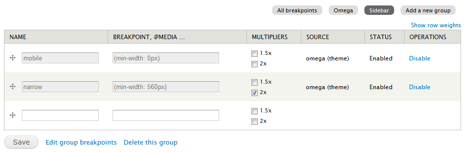
Breakpoints defined by a theme
A theme can define multipliers and breakpoints in the theme.info file like
breakpoints[mobile] = (min-width: 0px)
breakpoints[narrow] = (min-width: 560px)
breakpoints[wide] = (min-width: 851px)
breakpoints[tv] = only screen and (min-width: 3456px)

multipliers[mobile][] = 1.5x
multipliers[mobile][] = 2x
Once this module or the theme is enabled, the settings are read from the info file and stored into the database.
Custom breakpoints
A user can create custom breakpoints using full media queries to define them.
Breakpoint groups
Breakpoints can be grouped together, for each theme that defines breakpoints there's automatically a new group created.
A user can define extra groups.
Multipliers
If you want to support retina displays, you can enable multipliers so the modules know you want to use a breakpoint for both regular display and retina display.
Why groups? So other modules like Picture can act on the separate groups to handle the output.
Modules using breakpoints
Supporting organizations:
Project information
- Project categories: Site structure
 9,084 sites report using this module
- Created by attiks on , updated
 Stable releases for this project are covered by the security advisory policy.
There are currently no supported stable releases.


