


This module adds predefined selectable styles to CKEditor 5's link dialog.
This module only supports CKEditor5.
Features
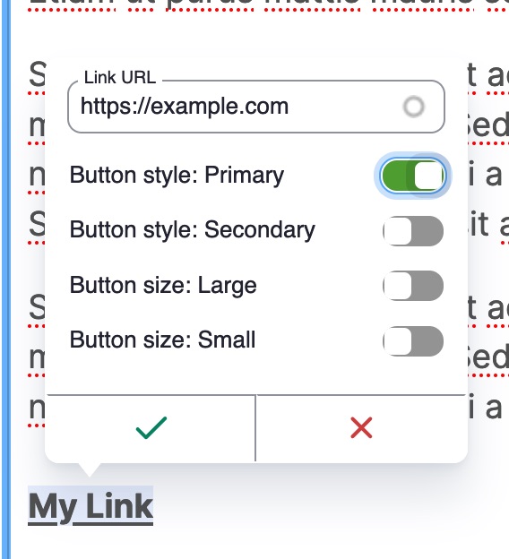
- Link styles can be selected as the editor adds or edits a link, avoiding multiple steps.
- Allows site builder to define predefined classes that can be added to links.
- Multiple link styles can be enabled at once
- Work alongside other modules that interact with CKEditor's link plugin, like linkit and editor_advanced_link.
- Avoids the use of styles dropdown. See note below.
Installation & Configuration
- Install & enable the module
- Open Administration > Configuration > Content authoring >Text formats and editors (admin/config/content/formats)
- Edit a text format's settings, like Full HTML
- Drag the "Link" toolbar button to the toolbar if not already there
- Add link styles to the "Link styles" tab using the same format as the Styles configuration,
a.classA.classB|Label. For example:a.btn|Button - Save.
Example Configuration
Some example configurations for some common CSS frameworks. Not all button styles need to be included in your configuration. Only include the link styles you want to make available to content editors.
Example configuration for Bootstrap buttons
a.btn.btn-primary|Button style: Primary
a.btn.btn-secondary|Button style: Secondary
a.btn.btn-success|Button style: Success
a.btn.btn-danger|Button style: Danger
a.btn.btn-warning|Button style: Warning
a.btn.btn-info|Button style: Info
a.btn.btn-light|Button style: Light
a.btn.btn-dark|Button style: Dark
a.btn.btn-lg|Button size: Large
a.btn.btn-sm|Button size: Small
Example configuration for Bootstrap links
a.link-primary|Primary link
a.link-secondary|Secondary link
a.link-success|Success link
a.link-danger|Danger link
a.link-warning|Warning link
a.link-info|Info link
a.link-light|Light link
a.link-dark|Dark link
Example configuration for Zurb Foundation buttons
a.button.primary|Button color: Primary
a.button.secondary|Button color: Secondary
a.button.success|Button color: Success
a.button.alert|Button color: Alert
a.button.warning|Button color: Warning
a.button.tiny|Button size: Tiny
a.button.small|Button size: Small
a.button.large|Button size: Large
a.button.expanded|Button style: Expanded
a.button.hollow|Button style: Hollow
a.button.clear|Button style: Clear
a.button.disabled|Button style: Disabled
Other Notes
By using CKEditor 5 Link plugin's decorator config, this module overcomes usability issues when trying to use the styles dropdown to apply classes to links.
See https://github.com/ckeditor/ckeditor5/issues/11709, https://www.drupal.org/project/drupal/issues/3326261#comment-14987257, and https://www.drupal.org/project/drupal/issues/3334617
Supporting organizations:
Initial Development
Project information
 Seeking co-maintainer(s)
Maintainers are looking for help reviewing issues.- Project categories: Content editing experience
 6,291 sites report using this module
- Created by chrissnyder on , updated
 Stable releases for this project are covered by the security advisory policy.
Look for the shield icon below.

