
By woop_light on
The Hopkins Company, an architectural firm specializing in high-scale residential design and operating for over 40 years, wanted to redesign its website. The site needed to reflect good, professional stylistic taste. The site would organize and showcase to current and prospective clients a library of over 2,100 photographs and almost 170 articles.
Why Drupal was chosen:
We chose Drupal because it perfectly matched our needs for www.hopkinsco.com: a reliable framework for managing content, excellent image gallery integration, fast performance with Boost, and a vibrant community.
Describe the project (goals, requirements and outcome):
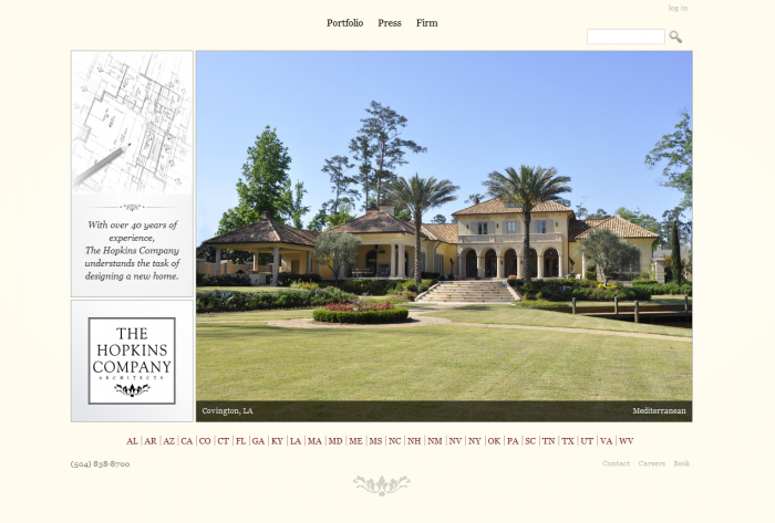
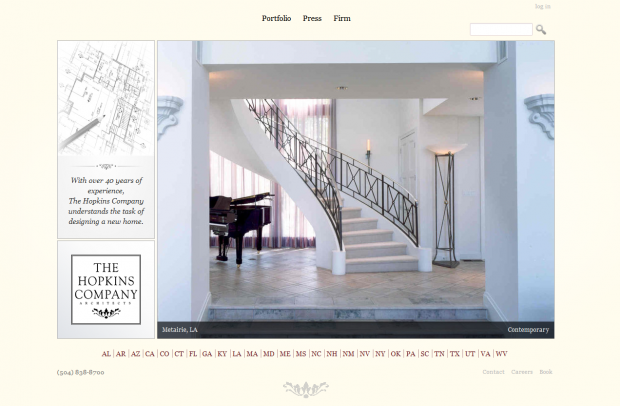
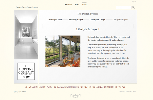
Our theming goal was a simple, professional look that minimized scrolling.
Functionally, we wanted to be able to quickly deliver our library of beautiful architectural photos without overwhelming the user. Therefore throughout the design process we made an effort to minimize the number of clicks and the number of main navigation items (our goal was to cap it at three).
For conceiving the theme, we used Balsamiq (we went ahead and bought it for $79, but there are ways to use it in limited capacity for free). We arrived at a three-panel layout: a left-sidebar, which is stacked on top of the square logo, plus a main content area. A couple of our main goals were to have the website be very image-centric and to minimize scrolling. I can't recommend using Balsamiq enough. It allowed us to fully agree on a layout with the client before even beginning to theme, which helped us avoid backtracking in that area.
To design the theme we modified the Framework theme. We didn't choose Framework for any special reason other than its professional look, intuitive design, the fact that all of its CSS could be found in one stylesheet (convenient for our purposes), and that it used Eric Meyer's CSS reset.
To get the specific design we wanted for our site we used a number of theming techniques: Display Suite, template overrides, jQuery workarounds and, of course, Views (making good use of Mustardseed's "rewrite the output of this field" technique).
Functionally, we aimed to have robust, intuitive galleries and we wanted the user to know where he was on the site at any given moment. I'll discuss how this was achieved in the modules section below.
The outcome has been terrific. Using IrfanView and the Multiupload Imagefield Widget, we were able to rename, compress, size, and upload over 2,100 high quality photographs in a short amount of time. Then, in less than two days we uploaded 167 articles. The photos are now on display in organized galleries throughout the site while the articles are viewable in attractive overlays. And thanks to Boost, pages load incredibly fast even though we're using GoDaddy shared hosting.
Total success.
Technical specifications
Key modules/theme/distribution used:
Why these modules/theme/distribution were chosen:
Views
Views is required to query the database and was essential for organizing and displaying content.
Boost
Because our users would be browsing our architecture website mostly to enjoy viewing the architectural photos, we knew it was essential that everything loaded quickly. People leave if they have to wait between page loads, even if the wait is only a couple of seconds. Boost speeds up load times by caching static HTML pages for anonymous users (some have measured remarkable increases in performance).
Because our site frequently fetches photographs, the site wouldn't have been possible in its current form without Boost. It would have been far too slow.
Colorbox, Lightbox, & Galleria
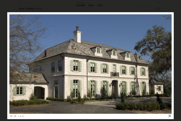
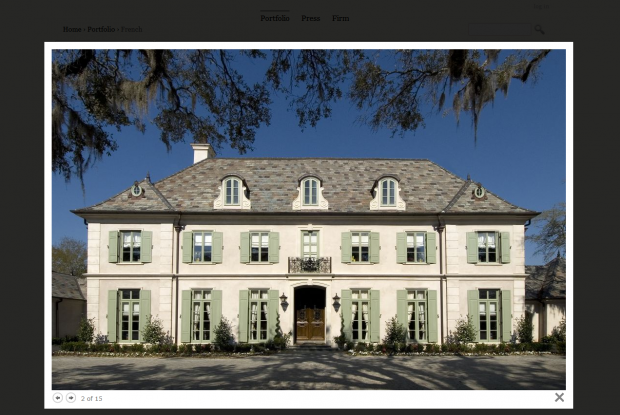
Our fixed 3-panel theme physically restricted our main content area. This meant that we would want to serve our project images and press articles in an overlay (otherwise the presentation would be too small). We initially chose Lightbox but then switched to Colorbox. Colorbox preloads the images, which is a performance boost in our case, and more importantly, using Colorbox we were able to call the project photos from the View (i.e., without actually navigating to the node's page). Here is an example. This method provides for a better user experience because the user can browse projects of a similar style without being hit by new page loads.
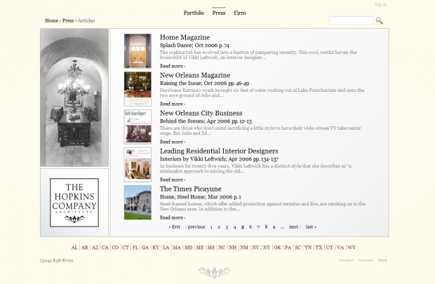
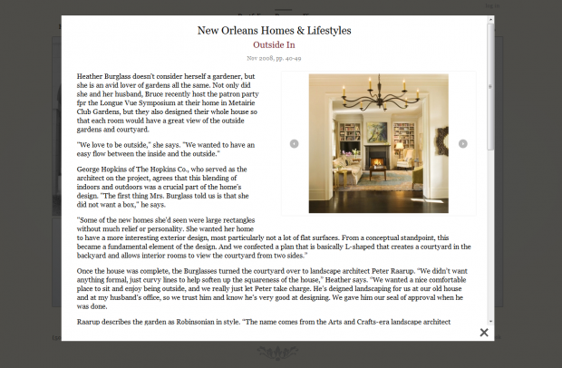
We used Lightbox2 to present press articles. For each article we embedded a customized Galleria theme for the accompanying images.
Display Suite & Display Suite Search
Display Suite is a wonderful tool that enhances the designer's ability to control the output of a standard node. We also enjoyed using Display Suite Search as it allowed us to group content for a better search experience (for example). A special thanks to swentel for his help.
Easy Breadcrumb
Easy Breadcrumb is a wonderfully simple module that generates breadcrumbs based on the current page's URL construction (requires Pathauto and Clean URLs).
Multiupload Imagefield Widget
Multiupload Imagefield Widget probably saved us weeks worth of work. With Multiupload Imagefield Widget we could upload 50 large images at a time. If something was wrong (e.g. an image failed to load), we could delete and retry without breaking a sweat.
Framework (theme)
A good starting point for building our theme.
Team members:
Sectors:
Real Estate
Small business

Comments
Nice. the phone number down
Nice.
the phone number down the page must be of another type, i presume.
_
What do you mean in type of phone number? Do you mean the used font should be changed or the structure of it? I think its right :)
im a noob so take what i have to say in stride
This is a nice site with great, powerful images that project a top notch firm.
Two things that subtract from the experience for me are the links to all the licenses at the bottom of each page and the constant moving of the nav buttons in the gallery. A single page with the links to the licenses would suffice for those who feel they need to investigate further. As for the gallery, im not sure how much control you have over the location of the the buttons, all i know is that having to track the "next" button down takes time away from viewing the stellar images.
awesome site
Great points
@antonny: The leveling of the numbers in the phone number may look surprising, but it's in fact the same font as the rest of the site. I actually kind of like the way it looks.
@packmac2: I very much appreciate the feedback and couldn't agree more. I met with the client today and got feedback from the staff, and the two main navigational critiques they made were the exact two that you just named. Also the Google Analytics bear out the problem with the license navigation, as we can see people dropping off after clicking the licenses. I may mention your comments as well tomorrow -- so thanks again.
As for the Colorbox navigation with the moving arrows, after today it's clear that it's an issue that I should iron out. As it turns out, you can simply click to photo to move to the next photo. But because that's not obvious, and the arrows in the bottom left naturally lead to users trying to click them -- then getting annoyed because they keep moving -- it's a problem that must be fixed. Given how the HTML and CSS for Colorbox is generated, it's tricky to do something such as centering the navigation along the bottom of the Colorbox. My next thought was to try to have a Nice Message that simply told the user that he/she could click the photo to move to the next one. Appreciate any suggestions that come to mind.
woop
a very functional site
i study about making image gallery like your site but could not. could you say how can make a gallery like your site,
when tick first image, show the following category images like colonial, contemporary, ...
and when tick a category image show the related images in an album
example your site,
when i tick front page image (http://www.hopkinsco.com/)
show category images (http://www.hopkinsco.com/portfolio),
and when tick category images show related images (http://www.hopkinsco.com/portfolio/colonial)
how can do it with galleria and views or how can do this structure with a different way ?
URL aliases and the Portfolio section
@erata
Front page
The front page exists separately. It's a views slideshow for which I designated a separate content type.
Portfolio section
This is admittedly tricky. The portfolio section uses a combination of Taxonomy, Views, and Clean URLs. Much of the solution centers around properly configuring the URL aliases.
-- Configuring the Views and URLs --
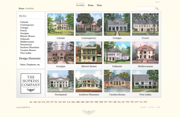
1. The first step is to set up a the taxonomy terms. In our case, the taxonomy is "Portfolio" and the terms are the styles (Colonial, Contemporary, etc.).
2. Then create a view that displays all of the taxonomy terms and give it the URL alias of the taxonomy name -- in this case, "portfolio". Thus if the user goes to www.hopkinsco.com/portfolio, they'll see a list of the portfolio terms (in this case, styles).
3. On the URL aliases page, the pattern for Portfolio should be [term:vocabulary]/[term:name]. Then activate the taxonomy view (the view exists by default and has a path of taxonomy/term/%). Because of your new URL aliases settings, anyone going to a taxonomy term page will see a clean URL reflecting the structure we want: portfolio/[style].
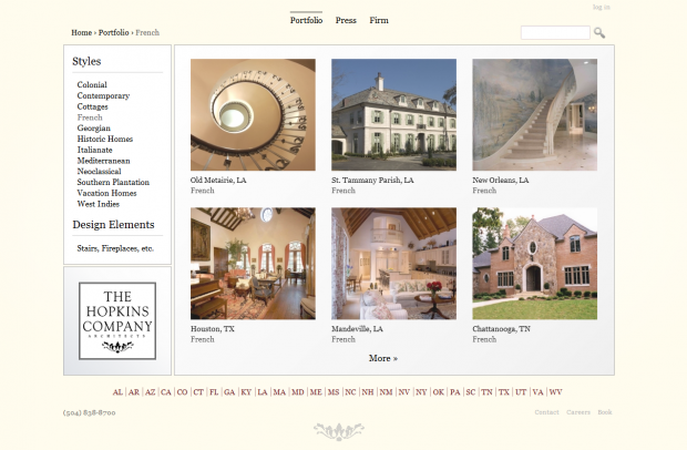
-- Presenting the individual projects and galleries --
This is the trickiest part. Under ordinary circumstances, someone visiting, say, www.hopkinsco.com/portfolio/colonial would see a listing of teasers for Colonial style projects. When the user would click a teaser, he/she would then go to a new page, presumably something like www.hopkinsco.com/portfolio/colonial/johnson-project. That new page would then have a list (or slideshow) of photos for the Johnson project. However, for our site we thought it better to have the slideshow as an overlay. The basic idea behind what I did is that the taxonomy view (#3 in the above section) presents a list of "full content" nodes. In my case they appear like teasers. Then I used template overrides to make it so that when the user clicks the image, the script calls on Colorbox to present the photos that belong to that project. This requires a PHP loop in your template override, if that makes sense. I think I got help from some corner of the Internet, so some googling might do the trick. Perhaps there are better ways to accomplish the same effect -- and I'd be interested in hearing them -- but this worked well for our purposes, especially given that browser preloads the photos.
The sidebar is simply a view of the taxonomy terms.
Hope this helps.
views+taxonomy for album based subgallery
hi woop_light, i try to make a gallery like yours but couldn't yet. in tutorial http://jamestombs.co.uk/2011-05-26/create-album-based-image-gallery-drup... say how can make gallery with views but grouping galleries with a taxonomy not exist yet there. in your solution you have made them all. could you open your solution about views and taxonomy integration. i haven't made this integration part yet. making gallery okay, but making album based gallery not yet.
i read a lot of solution say that taxonomy is the best solution for making gallery. but i can't success using taxonomy and views together. at http://www.hopkinsco.com/portfolio, we click taxonomy image and it goes subgallery.
- have you add an image field taxonomy for this or so?
when i click taxonomy image how can i go related galleries (views entegration)?
in brief, i mix (specially i don't know views much). can you open your solution a little much (taxonomy and views integration part )
thanks your reply
combine two views
hi, i tried to make a category based image gallery like you made but i could not succeed it. firstly, i create a views which shows categories like http://www.hopkinsco.com/portfolio. then i create a content type (Gallery). With eva module i add a field the gallery content type. In this views field i show the first image as thumbnail and when anyone click it it goes to other ones opening colorbox like http://jamestombs.co.uk/2011-05-26/create-album-based-image-gallery-drup.... but it does not run properly. i can show first image but i could not open the others one with colorbox.
could you give some advices about combining two views (page views and content type views(eva field)).
thanks.
thanks for post
@woop_light
thanks for your post.
i try to make it with help your post.
i hope it solve my problem.
hover image and opacity
hi, i wonder something too. how can you make hover image and opacity in http://www.hopkinsco.com/portfolio/colonial. is it in views or field-name css properties?
thanks for reply.
If I recall correctly, that's
If I recall correctly, that's just using jQuery hover effects (targeting the CSS elements).
thanks
thanks @woop_light for reply.