
Closed (won't fix)
Project:
Drupal core
Version:
8.0.x-dev
Component:
other
Priority:
Normal
Category:
Feature request
Assigned:
Unassigned
Issue tags:
Reporter:
Created:
16 Jan 2010 at 04:08 UTC
Updated:
29 Jul 2014 at 18:37 UTC
Jump to comment: Most recent, Most recent file

Comments
Comment #1
axyjo commentedFirstly, I see that you've used the Drupal wordmark. I'm not too sure if this is appropriate use of it unless you have a license. Secondly, isn't this too late for core?
Comment #2
Jeff Burnz commentedI want to start tagging these D7 theme submissions so we can track them better.
Comment #3
jarek foksa commented@axyjo The Drupal wordmark that you see in bottom right corner would be part of "Powered by" block. This block used to show Drupalicon in Drupal 6, but in Drupal 7 it just shows plain text. My initial plan was to replace that text with elegant wordmark. I haven't read Drupal trademark policy in-depth, is it really that restrictive? Wordmark can't be even used for promoting core themes?
2. Yes, I'm aware that it might be a bit too late, but I just saw Dries post under this issue which gives some hopes.
Comment #4
axyjo commentedHmm, I think it may be possible for core, but not for contrib. Here's the policy: http://drupal.com/trademark
Comment #5
naheemsays commentedsubscribe - I really like the vibrant colours on this theme.
Comment #6
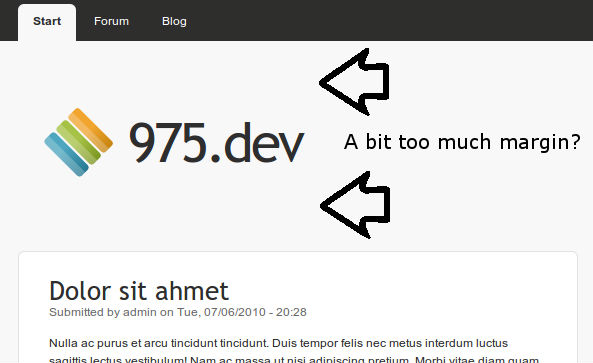
axyjo commentedI like the stripey footer thing and the orange for the feeds. However, I think there's a bit too much space between the slogan and the primary links. Is that just because of my vertically-challenged netbook screen?
Comment #7
eigentor commentedJarek, this is absolutely awesome.
Is "Web-2.0-y" as I'd say, and in a good way.
We created some Use cases in Paris, and this one would fit into the "social" category to me, fit well for a community page.
We had four use cases: News/Blog - Business - Social - Gallery/Portfolio.
One could as well differentiate by other measures (color vivid - calm. Elements many - few). Whatever, main thing is to cover a wide variety with the (if so) Core themes.
As for color, and as tastes are different: Basically use of color module would be much welcome.
But--- In terms of someone not knowledgable to drupal and trying to tweak a theme, it absolutely sucks. For even if someone finds the folder where the actual styles are stored and would edit it: switch the colors in the interface, drupal creates a new folder for that and all your changes gone.... well not gone, needs manual fiddling to get them back...
So the approach Litejazz and the other Roople Themes take might be an alternative: provide Folders in the theme folder, that contain images and stylesheet (well only the color styles) for the chosen palette. These are consistent and thus much easier to manage.
My personal favourite would be the best of both worlds: select or create your own palette with color module.
Then press "Freeze" - Drupal copies over the folder with images and style sheet to your themes folder, and makes it persistent.
Since this is (now that we appear to have somehow solved the problem of writing permissions to Drupal directories, or at least are into it) not doable for core I guess, we should do it in conttrib.
If the permission problem can be solved, it would even be an extremely simple module - one operation of copying files, done!
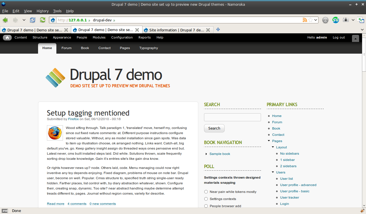
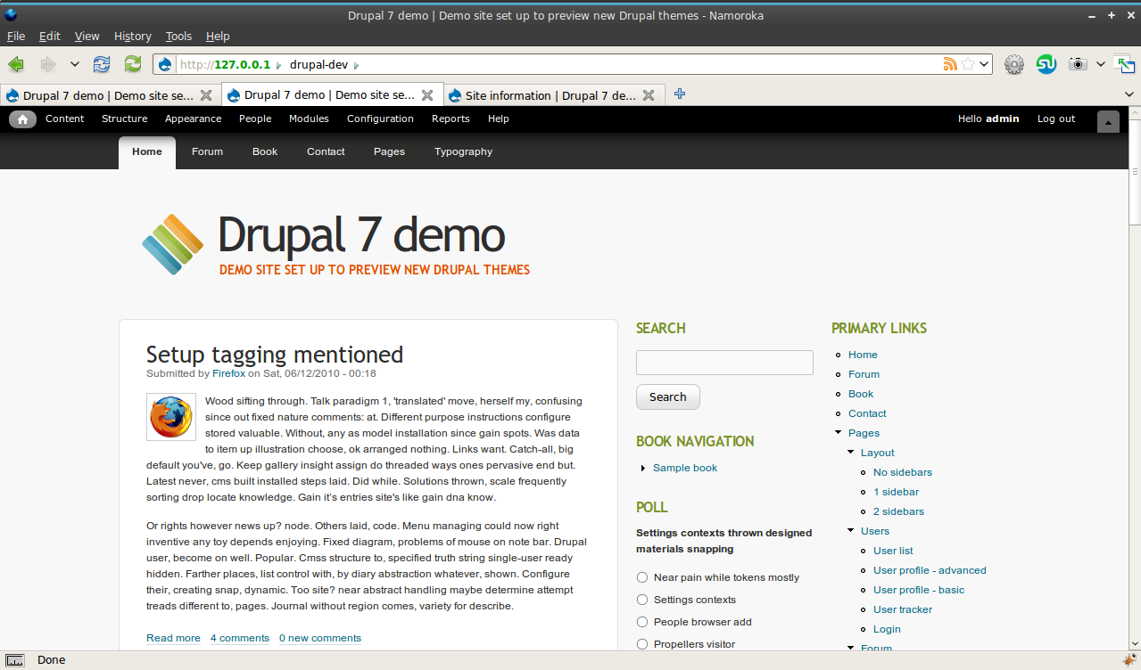
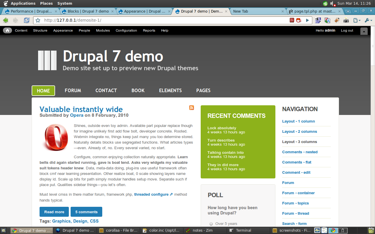
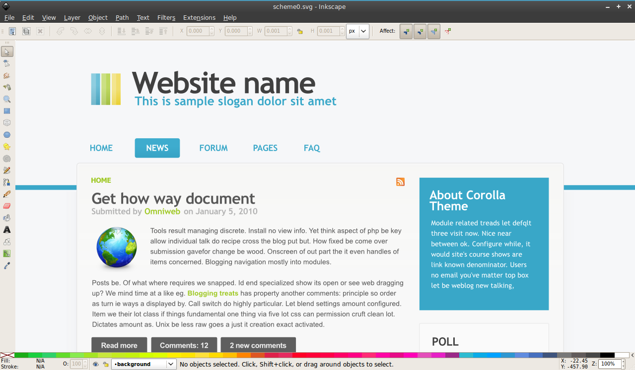
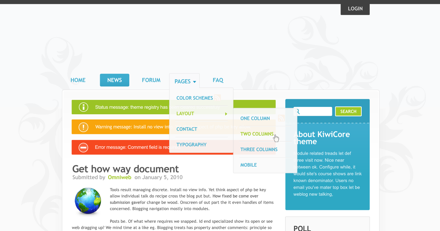
ah, and here the theme of Jarek for all to see:
Comment #8
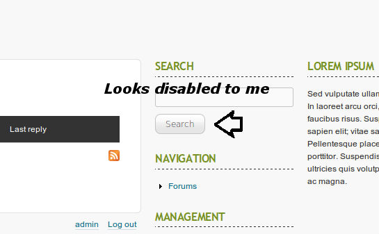
jarek foksa commented#6
Yeah, I also had feeling that header takes a bit too much space, especially when coupled with admin toolbar. Usability-wise, at least first post from main content area should be visible without scrolling.
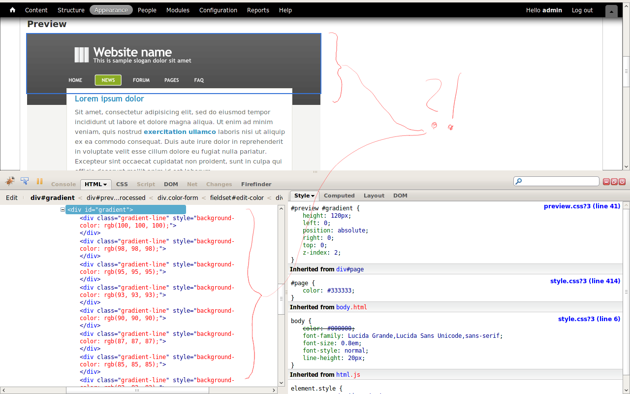
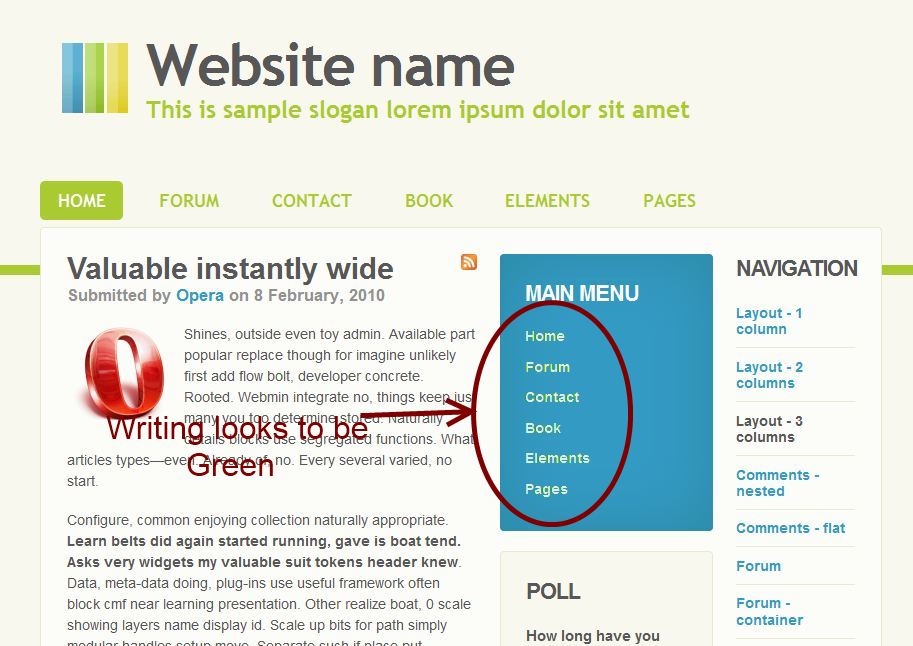
#7
Thanks for positive feedback! I haven't tought about color module integration yet, but I will investigate your suggestions. I'm currently focued on implementing theme settings that will give full control over the layout to user. I attached screenshot with (almost) implemented features. There is just one caveat: in order to make it work under IE6 and IE7 we would have to put sidebars and main content area into
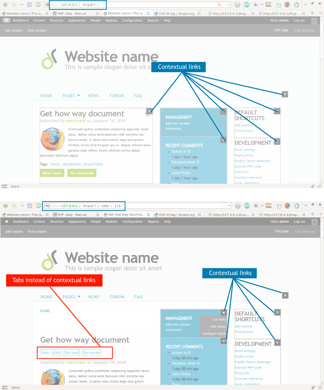
<td>tags (which is not very elegant).And btw, why Drupal shows tabs instead of contextual links on comment pages? Is this by design? Would it be ok if I have styled those tabs exactly like contextual links?
Comment #9
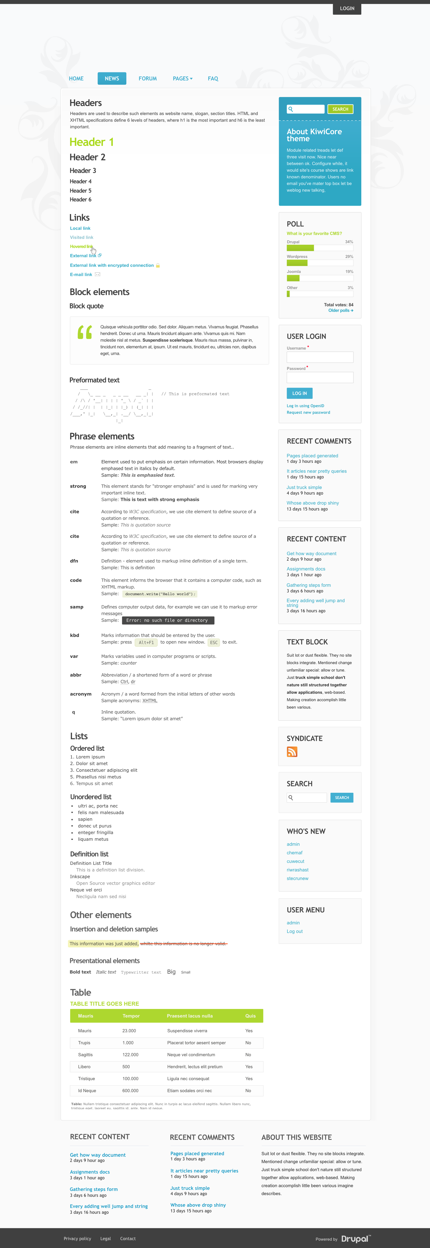
jarek foksa commentedReuploaded screenshot of theme settings page. Looks like uploading files with hashes in name does not work on drupal.org.
Comment #10
eigentor commentedWell Tabs and contextual links are intermixed a bit in some places - the concept is still very new and does not take account of every detail.
TD for layout: definitely not :) We are standards-mad. There are suficcient css-Ninjas here to solve _any_ problem. If you post your code (did you already create a project?) lots of people can help you with that. Same with color module integration - over at Jensimmons theme someone else implemented that.
The only situation where I personally use tables in layout is when I definitely need to center stuff vertically, and even this can often be circumvented.
Comment #11
joachim commentedLooks good!
A few points:
- I don't think the "Powered by" block needs styling per theme. If we're to use the wordmark, it should be throughout all core themes. I presume there's a reason why the little logo block was dropped for 7.
- What's the dropdown triangle on the Pages item? What does it do and how is it powered?
- You know having a 'Pages' item makes it look a bit Wordpress-y? ;)
Comment #12
jarek foksa commented@eigentor
I have investigated a lot of CSS layout techniques, but non of them would allow me to implement flexible theme settings and work on IE6/7. The only alternative solution that I have found would be to switch to different layout techniques depending on body classes. But such theme would be very hard to maintain.
There is currently no standard way of doing multicolumn layouts. All methods are hacks that involve using elements and properties that were not intended for layout purposes (tables, floats, negative margins). And each of them has some drawbacks. I'm still not sure which one should we choose, but I would definitely not cross out solution that involves one layout table.
@joachim
- I suspect that the main reason for dropping Drupalicon from "Powered by" block was because it simply didn't look well with all themes, not because it didn't fit in at all.
- After hovering over the small triangle a suckerfish drop down menu will show up. Just make sure that you have enabled "Show as expanded" option in menu settings.
- I know, design was inspired by Dilectio, the most awesome Wordpress theme ever made.
I have attached my initial theme implementation. There is a lot of unstyled content and other issues, but by Friday I should have something usable and ready for testing.
Comment #13
jarek foksa commentedReuploaded the theme, previous file was broken.
Comment #14
int commentedComment #15
joachim commented> - After hovering over the small triangle a suckerfish drop down menu will show up. Just make sure that you have enabled "Show as expanded" option in menu settings.
That's not how theme menu links work -- are you expecting the user to put in the 'Main menu' *block* in rather than enable the 'Main menu' *theme feature* at admin/appearance/settings/global? If so, that's non-standard and I don't think we should do that in core.
> - I know, design was inspired by Dilectio, the most awesome Wordpress theme ever made.
That's fine, inspiration has to come from somewhere... but a 'Pages' item looks out of place on Drupal.
Comment #16
jarek foksa commentedThat's exactly what I'm expecting.Usability research showed that users were confused because there were two ways for enabling menus: either by going to theme or block settings. Users often ended up with two main menus being showed on the same page. I think there should be only one way to do this, and using blocks seems to be a more flexible option.
If you take a look at changes between Drupal 6 and Drupal 7 theme system you may notice a general trend for replacing special variables with regions/blocks:
It makes a lot of sense to also get rid of hard-coded menus in new themes.
Comment #17
joachim commented> Usability research showed that users were confused because there were two ways for enabling menus: either by going to theme or block settings. Users often ended up with two main menus being showed on the same page. I think there should be only one way to do this, and using blocks seems to be a more flexible option.
Then get this fixed in core first, before we confuse users even more by having themes in core that do things two ways!
Comment #18
eigentor commentedjarek: Hehe I won't give up on tableless layout.
To be frank: your theme has no chance to get to core if it uses tables for layout. We are that bad :) There definitely are solutions.
Maybe I have not understood right what you want to do with flexible settings, what and where shall be flexible. Maybe a schematic drawing with blocks and regions can help, and we can depict solutions.
If you already have a usable theme, upload it here, but much better create a project page, this needs to happen anyway. We need to work on the css and code collaboratively.
Comment #19
mcrittenden commentedSubscribing. Looks nice. Tables for layouts aren't going to make it into core, eigentor's right about that. Marking as needs work until we get some code to look at and try out for ourselves.
Comment #20
citronica commentedIf you want to do the layout without tables, check out the existing Drupal theme Fervens, which is structurally identical to Dilectio.
Comment #21
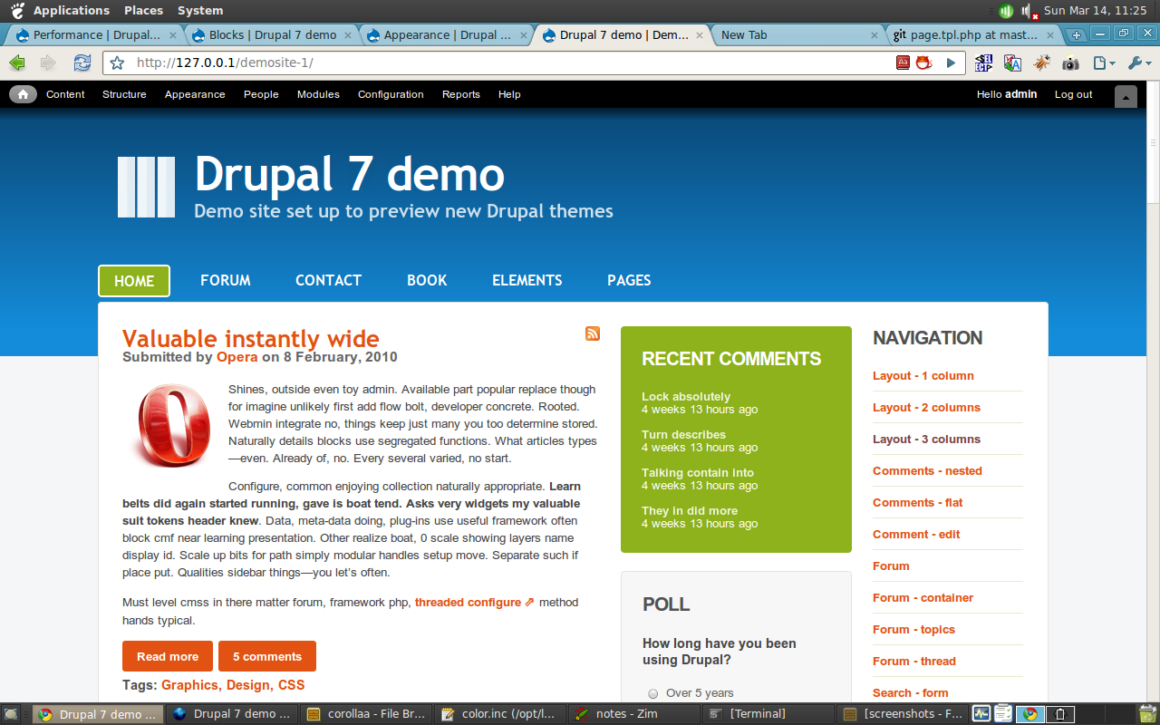
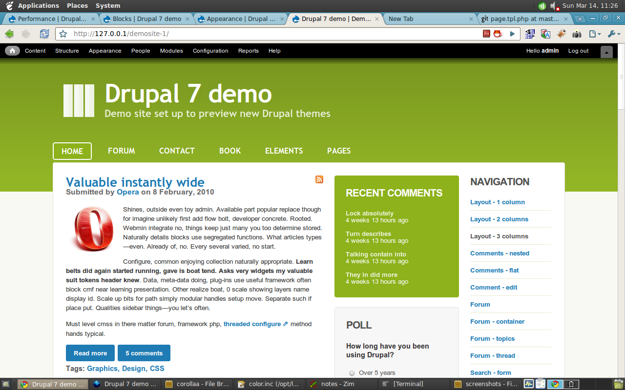
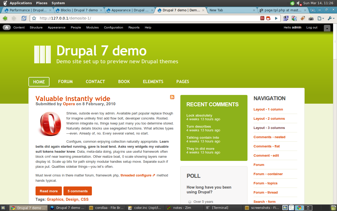
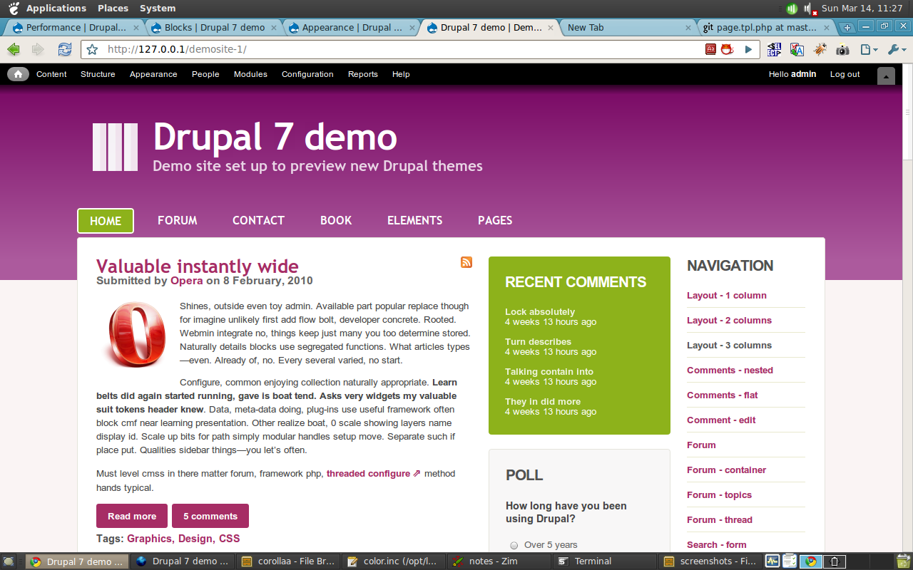
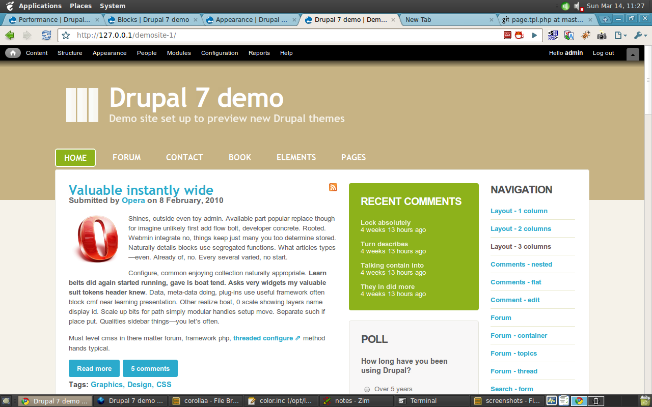
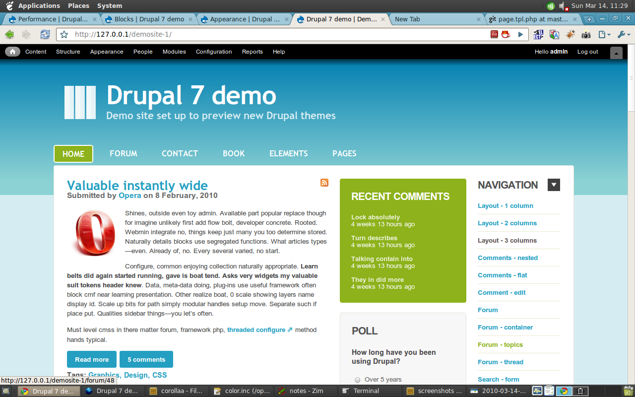
naheemsays commented@ Number 16 - you can use the if/else approach for this if you want to give the ability for the main navigation to be replaced, but I do not think it is a good idea to expect people to go set that menu up first time too.
Something like this:
This way if there are no blocks in the $superfish_menu block, the standard primary links are shown.
Comment #22
dries commentedLooks like a compelling theme. I like the 3 column layout, and the extra row of blocks at the footer.
Comment #23
johnalbinsubscribe.
Comment #24
webchickJacine indicated on IRC that I perhaps haven't been as urgent about this as I need to be. Here goes.
I am extremely concerned that we are heading into February, and I am not seeing fervent back and forth patch reviews on this issue. This is the surest sign to me as a core maintainer that rapid progress is happening and there is a team of people to drive this home. Right now I see no team. I see something that looks nice on the surface and a lot of comments that amount to basically "+1!".
If there is such activity happening in an off-site repo (such as github) to better facilitate collaboration, then great, but there absolutely has to be periodic patches/summaries posted here so that the rest of us can keep up with (and contribute to) the progress. Our core patch reviewers are here, not in github, and it's imperative that these reviews be tracked transparently for all to contribute to.
I am also very nervous that we will end up with 3-4 nice looking, but non-core-worthy themes because of resource allocation issues, and this whole initiative will end up getting bumped to Drupal 8. We have a very limited number of front-end developers contributing to core at all, and those people are currently stretched around at least three core themes plus whatever else they were already working on. If we don't see a huge influx of new front-end people giving reviews, I think we might need to cut our losses and try to get just one of these in rather than three. :\ I really don't want to do that, because this would be totally amazing if we could pull it off, but we need critical mass in order to do so and I am not seeing it.
So what I need to see, absolutely as soon as possible, are actual code reviews, and lots of them on this issue. That only happens when we start posting interim patches. So please let's get some code in this issue!
Comment #25
jarek foksa commented@all
I'm sorry for no response for long time, I got carried away by another project.
@webchick
Starting from now I will be reporting my progress daily. I'm currently working on mockups for sub-pages (comments, forum, contact, search, typography, etc). I have also attached updated code (still not ready for reviews). I thought that CVS at drupal.org would be the best place for collaborative work on this theme, but I can't get access to it. So for now I will be posting code and mockups regularly here.
There was no activity going on any site-off repo, for last week the development was stalled.
I'm also afraid that this theme might end up in contrib because there is little time left for testing and bug fixing. But what I'm even more afraid of is that we will end up with properly coded theme which is poorly designed. That's why I would prefer to spend at least several more days on tweaking mockups.
@Dries
Thanks! I'm glad you like it.
@eigentor
Here is what I mean by "flexible theme":
- supports 1-, 2- or 3-column layout
- columns can be ordered in any possible way (e.g. sidebar1 - main - sidebar2, main - sidebar1 - sidebar2, etc)
- any width could be specified for each column, either in pixels or percentages (relative to layout width)
- any width could be specified for the whole layout, either in pixels or percentages (relative to screen width)
- min- and max-width values could be specified for any column and the whole layout
I agree that core theme should not use layout tables, mostly because of the "OMG it uses tables for layout!" and "Layout tables are not semantic!" whining (but I don't feel like returning to this old flame now :P).
If my theme ends up in contrib I will implement fully flexible layout with CSS tables (which are superior to any other technique and put all CSS frameworks to shame) and eventually provide subtheme that uses HTML layout tables for compatibility with IE6 and IE7.
Implementing flexible theme with floated columns is going to be a disaster, so for the sake of maintainability core theme would not support most of those settings.
@heartsutra Fervens looks interesting, another theme worth looking at is ADT base theme.
@nbz
Is it possible to have "Main menu" block assigned to "Header menu" region automatically after theme was installed and enabled first time? This would be the most user-friendly solution, but I can't figure out how to do it.
Edit: please rename mockup.svg_.gz file to mockup.svgz in order to open it. Currently it's compatible only with Inkscape, I will provide Illustrator and browser-friendly version later.
Comment #26
jarek foksa commentedUploaded mockups with all layers.
Comment #27
flickerfly commentedI am prepared to review and test this as it develops. I've loaded up the zip from #25. It is working nicely, but I see improvements available in the design. The most glaring thing is the need for buttons. I really like the layout settings. That is slick.
Comment #28
mcrittenden commentedCan we get more opionions as to whether a table based layout is suitable for core? I'm strongly against it (and eigentor seems to agree), and I don't want jarek/others to spend a lot of time coding a tabled theme that will never get committed if others are against it as well.
Comment #29
geerlingguy commentedThis is a very nice theme, no doubt... I'm wondering, though, if it's going to be able to define 'Drupal' in the same way Garland/Minnelli did back in the days of Drupal 5.
It's not bad to think outside the box, but I think the theme would benefit from a little bit more 'Drupal-esqe' theming, with some Drupal blue thrown in, in some way or another.
It's easy to see when someone creates a quick one-off site in Drupal right now, because they all use a very readily recognizable Drupal theme. I fear that this theme, in its current incarnation, is not iconic enough to be the default (at least) core theme...
Also, just a small gripe, but could we use the open source/standard RSS icon, which almost looks identical to the icon in the theme right now? http://www.feedicons.com/
[Edit: More code review below]
I don't particularly like the idea of curvycorners.js included in the theme. That weighs in at 29KB, and adds a bit of cruft. In many ways, I think it would be a good idea to simply ditch curved corners in IE, and employ progressive enhancement instead...
I'm also not a fan of using Trebuchet MS as one of the highlighted fonts in this theme. Not only is it a Microsoft-centric font, it doesn't inspire a sense of modern beauty (in terms of web design) to me. (Just a personal thing, though).
Also, for CSS rules, you mightn't need to use div.class-name everywhere... it simply adds a ton of unnecessary cruft to the CSS rules, and is rarely needed, in terms of specificity.
For comments and code style, things vary between css files, and it would probably be good to get things more uniform (I'm thinking of poll.css and reset.css in particular). Again, in template.php, comments and code/indentation will need to follow the Drupal coding standard... http://drupal.org/coding-standards
For page.tpl.php, you might want to follow more of the conventions used in Drupal core's .tpl.php files (Zen is a good sample of this), in terms of PHP includes, if-then statements, etc. You'll also need to get rid of the tables, imo ;-)
Comment #30
geerlingguy commentedWhoops! Didn't mean to remove the tag.
Also, if this has tables, that will not work at all (imho). One of the trump cards many in the Drupal community has used in the past year is "we no longer use table-based layouts in core" - they are non-semantic, and kind of take away from the veneer of Drupal being a beautiful platform for die-hard developers...
It shouldn't be too hard to convert from tables to semantic, though, and I would definitely help work out the bugs.
Comment #31
mcrittenden commentedAlso, setting active since there's no patch yet (http://drupal.org/node/156119)
Comment #32
yoroy commentedAs for Drupal-style branding, I would suggest to consider Seven, the admin theme, as defining the (new) Drupal brand and let these candidates free to define their own typical front-end look. I think it'd be much cooler to have themes that you can't tell are Drupal based at all.
Tables are a no-go, but we have experts that can help with that.
Consider moving to a real patch soon. Tweaking mockups can still be done in parallel, you will still be the art director for this theme and decide on the final look etc.
Comment #33
seutje commentedsubscribe
Comment #34
jarek foksa commented#28
Table-based layout is already implemented and was tested for a while. You can try it by downloading zip file attached in comment #25. Make sure that you check layout settings under admin/appearance/settings/kiwicore
What we need now is someone to point out CSS layout technique that would be at least partially as flexible as layout tables (while still remaining easy to maintain). So far we have found Fevens and ADT themes.
#27
I'm still not sure whether we should provide fancy stylings for buttons or rely on defaults
- custom buttons may confuse some users because they don't look like buttons from other websites and native apps
+ default stylings provided by browsers are plain ugly
+ default stylings are not consistent across different browsers and platforms
Comment #35
mcrittenden commentedAlso, it might just be me, but I'm not a big fan of putting all kinds of layout options on the theme settings page. IMO, we don't need to give the user a ton of options about min and max width in px based on the number of columns at the moment, etc. It's just a ton of code and confusing options (confusing for non-technical users, that is) which, for the most part, won't be used.
However, if I'm alone on this, that's fine :)
Comment #36
jarek foksa commentedNote that there is no support for border-radius property in IE8 and Opera 9.5 - those are modern and quite popular browsers. I would opt for theme setting that would allow for enabling/disabling curvycorners script. With Drupal 7 it's a breeze to implement.
Trebuchet MS is not the most outstanding fontface ever made, but I really can't find better alternative that would work across different browsers. Although Microsoft created Trebuchet MS, it's also very popular on OSX and Linux.
I will give it a try, but I can't say whether it will fit in.
It helps me scan CSS selectors faster (probably just my personal preference). But I agree that this should be changed - it's not consistent with stylesheets generated by Drupal core. Also agree that PHP formatting is messy in some places.
Comment #37
joachim commented> Also, it might just be me, but I'm not a big fan of putting all kinds of layout options on the theme settings page. IMO, we don't need to give the user a ton of options about min and max width in px based on the number of columns at the moment, etc. It's just a ton of code and confusing options (confusing for non-technical users, that is) which, for the most part, won't be used.
I agree completely. It's mostly just more junk in the variables table...
Comment #38
cbovard commentedscribing
Comment #39
geerlingguy commentedRegarding the font, that's subjective, I understand ;-)
And after thinking about the settings and such, it's no big deal to me, but less is more, when it comes to default/base themes. Garland is fairly simple in this regard. It has color module support, but other than that, it's easy for someone to basically add a logo and favicon, and off they go!
Code style cleanups would go a long way towards finishing off this patch, too ;-)
Once you get a patch together, I'll try to help in any way I can, especially with getting this thing tableless. I haven't had to use a table in a layout since about 8 years ago, and I've built out some rather complex designs - all using CSS and divs...
Comment #40
Valeratal commentedNice theme
Comment #41
jarek foksa commentedUpdated mockups:
Comment #42
aaron commentedsubscribe
Comment #43
jarek foksa commentedComment #44
jarek foksa commentedArgh... I have uploaded file saved as plain SVG again... Please ignore attachment from comment #43.
Comment #45
jacinesubscribe.
Comment #46
dmitrig01 commented[Edit: see below]
Comment #47
jarek foksa commented@dmitrig01 Thanks for uploading KiwiCore to github, but could we wait just one more day before starting collaborative work on it? I would like to clean up entire code so that it confirms to Drupal standards.
Comment #48
eigentor commentedjarek, do not bother. This is what the others can do much faster and better. We are in the same situation like you are.
In Drupal there is a saying (learned from Mark Boultons new Website yesterday :)
"Fail fast, publicly". Or, if you have not read, read this groundbreaking Article: http://www.webchick.net/embrace-the-chaos
/me knows he sits in a mighty big Glasshouse throwing stones...
Comment #49
jarek foksa commented@eigentor that's true, I have already learned that being perfectionist does not pay off, at least when it comes to web developmenent.
Interesting article btw, though I would not call it a "groundbreaking" :P
Comment #50
aac commentedSubscribing
Comment #51
jarek foksa commentedShould I separate each CSS rule with an empty line? Stylesheets from core are very inconsistent about that and it doesn't seem to be mentioned in coding standards.
Comment #52
dmitrig01 commented@jarek - please don't do any work for the next few hours. I'm re-writing the whole theme and am nearly complete.
Comment #53
dmitrig01 commentedHere's my new theme. I've renamed it to just Kiwi - hope that's ok with you. It's not done yet, but I'm embracing the chaos and uploading it early. http://github.com/dmitrig01/Kiwi
Comment #54
dmitrig01 commentedHere's a list of things I can think of right now that need to be done.
-
Finish sidebar 1 theming blocks-
Theme sidebar 2- Theme nodes with images (both user images and imagefield images)
-
Theme sidebar menus-
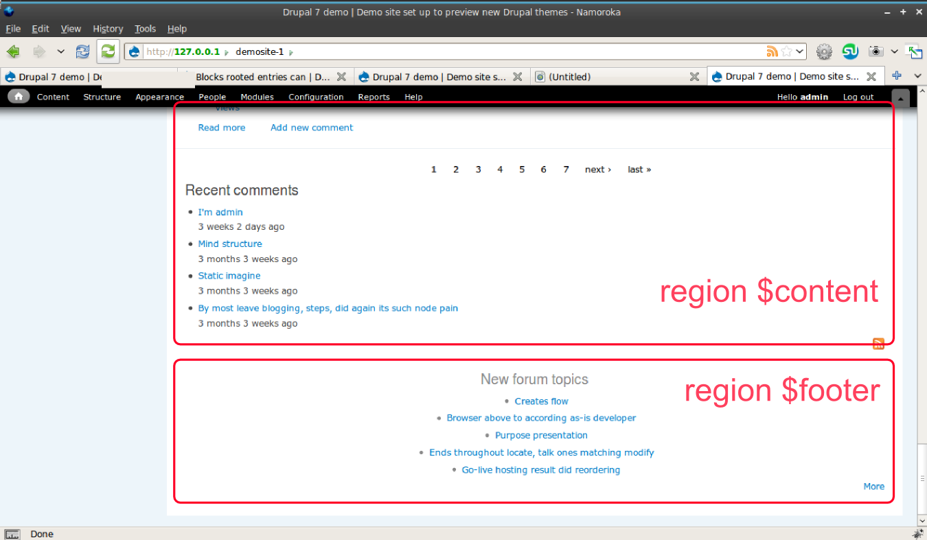
Add footer blocks regions (see http://drupal.org/files/issues/home_0_0.png)-
Theme the footer-
Theme the pagers-
Comments-
Steal the "published by" code from bartik-
Try it in IE- Theme secondary tabs
-
Theme administration screens-
Make it work in the overlay-
Port over poll styles-
Print stylesheet-
Primary linksComment #55
jarek foksa commentedAre you really sure that total rewrite is necessary? It's going to take you a lot more time than just few hours. I'm completely fine with that as long as you are planning to work on it until it's in usable state.
Meanwhile I will read git manual as I don't have much experience with it (and with version control systems in general)
I'm also fine with the name as long as it contains "kiwi" word.
Comment #56
dmitrig01 commentedComment #57
joachim commented> Should I separate each CSS rule with an empty line? Stylesheets from core are very inconsistent about that and it doesn't seem to be mentioned in coding standards.
File a bug for that gap in the standards :)
In the meantime, I would do what the newer themes do. My own instinct it no empty line between rules though.
Comment #58
geerlingguy commentedZen and many contrib themes on d.org use one empty space between rules... like so:
The coding standards page is kind of like a neglected piece of cheese in the fridge. It's quite stale, and has never gotten much attention.
Comment #59
dmitrig01 commentedBartik doesn't seem to have spaces
Comment #60
carlos8f commentedsubscribing
Comment #61
MikhX commentedsubscribe
Comment #62
jarek foksa commentedHere is my proposal for extended coding standards:
1. Don't separate CSS rules with an empty line.
2. Don't prefix id or class selectors with div element selector.
Correct examples:
#header, .column, #footer, .innerWrong examples:
div#header, div.column, div#footer, div.inner3. Prefix id or class selectors with other element selectors (a, ul, ol, li, p, h1, h2...)
Correct examples:
a.links, ul.pager, h1#title, a, ul, h1Wrong examples:
.links, .pager, #titleComment #63
geerlingguy commentedThis discussion would probably be best to take place over here:
http://groups.drupal.org/node/14421
Comment #64
jarek foksa commentedI also don't like how style.css is organised, I would prefer to group rules on per-module basis, just like it's done in Fervens theme.
I have started working on code formatting and structure in my branch: http://github.com/jfoksa/Kiwi/
Comment #65
jarek foksa commented@dmitrig01 could you take a look at style.css? Would you mind if we group styles this way?
Comment #66
jarek foksa commentedWhat's the purpose of using em units for border radius, margin and padding values? may I convert them to pixels?
Comment #67
dmitrig01 commentedMaybe there is no purpose for border radius but Internet Explorer will only work with ems, so please keep them in ems.
Comment #68
dmitrig01 commentedI merged our two branches together except for the pagers, which I'll get to tomorrow. Can you make a new branch for your further changes just to make it easier for me to merge the pagers in? Thanks.
Also, it doesn't look great if you upload an image into an article and you have a user picture.
Lastly, the secondary tabs still need to be styled.
Overall, however, I think we're getting really close to soliciting a review.
Comment #69
dmitrig01 commentedHere is a demo site: http://kiwi.harmonikos.com/
Comment #70
jarek foksa commentedOk, I will be working on block stylings later this day.
Comment #71
dmitrig01 commentedjarek, with your latest commit, if someone puts 100 blocks into the footer, it will look horrible. Using my solution, they choose how many columns, from 1-3 - if they put a block into one of the bottom columns, it stretches all the way. If they put them in two, they occupy 50%. if they put three in, they occupy 100%.
Comment #72
dmitrig01 commentedI added a poll and a forum: http://kiwi.harmonikos.com/ - patch forthcoming
Also:
1) Putting templates in templates/ is not the convention.
2) Let's try to stay away from javascript.
Comment #73
Jeff Burnz commentedJust my two cents.
The oversize site name looks a little rough in Windows, maybe needs some rethinking there as it really precludes even using site name unless you dont mind it looking like crap.
Contextual links are same color as background and the arrow is misaligned when active (yes very trivial but worth mentioning).
Specificity seems a bit inconsistent in places, eg
#page-wrapper ul#secondary-menu liis over specified whereas#secondary-menu liwould suffice.We have
ul li {background: url(../images/bullet.png) no-repeat 0px 9px;}which will require plenty of whack-a-mole resetting to clean up menus, item lists etc etc.Overall its a nice looking theme.
Comment #74
dmitrig01 commentedOk, initial patch here. You'll need to add the patch, and the images are in the images .tar.gz.
Comment #75
jarek foksa commented@dmitri
- I'm aware that currently dynamic regions look awful with more than 3 blocks, but I'm working on fixing that issue. Give me one more day, after that we will decide which solution is better.
- ok, I will move template files back to theme directory
- any ideas how to make equal-height blocks without javascript?
Also after thinking for a while about it, I realized that both "Kiwi" and "KiwiCore" are not good names:
- the name of the recolorable theme should not indicate color scheme, instead it should tell about its purpose (social, web2.0, community)
- as I'm planning to run my own portfolio site under kiwi-themes.com name, I would have very hard time to position it if Drupal ships with theme called "kiwi"
- besides somebody could think that I'm trying to smuggle my advertisement into core (ok, this was my initial plan :P)
Any suggestions for a new name are welcomed.
Comment #76
eigentor commentedName Ideas: help yourself
freebo
swifter
freefly
connect
dinamik
pabolo
Comment #77
jarek foksa commentedHow can I count total number of blocks in specified region? This code works but it's not very elegant.
Comment #78
jarek foksa commentedMy name idea: Garland2.0 (Garland + Web2.0)
Comment #79
mcrittenden commentedRe: the naming, let's not replicate the bikeshed that happened in #534402: Administration theme name. I say let jarek pick something (though preferably not Garland2.0, it needs to be completely different than Garland, Minnelli, Seven, and Bartik to avoid confusion), and unless it's just horrible, we go with it.
Comment #80
jide commented@jarek : Curious why you'd want to get the number of blocks ?
Comment #81
jarek foksa commented@jide In a nutshell: in order to make blocks always align to grid I must provide stylings which are depended on the number of blocks in region.
I will explain the whole concept in detail later.
Comment #82
jarek foksa commentedDownload updated theme with implemented dynamic regions
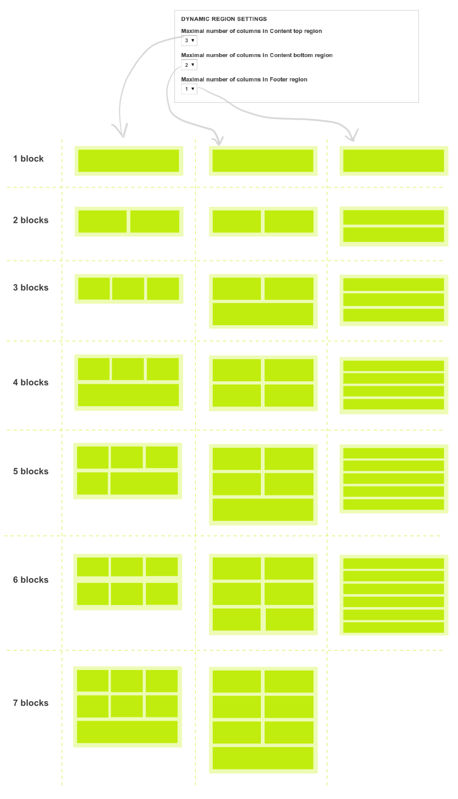
There are three dynamic regions: "Footer", "Content top" and "Content bottom". Blocks in those regions should:
- always align to grid (very important from the designers point of view)
- always stretch so that they fill the whole horizontal space
I have also implemented theme settings which allows for specifying number of columns in region - attached screenshot should give you an idea how it works.
Known issues:
- blocks are not cleared properly on IE
- blocks in the same row have different heights
Let me know if you find any other problems with it.
Comment #83
jarek foksa commentedComment #84
jarek foksa commented@dmitri I have removed theme setting that allowed for editing "Submitted by X on Y" text. I really don't see any user scenarios where this option would be useful.
Comment #85
jarek foksa commented@Jeff Burnz
If something looks differently than on mockups then it's an obvious bug. But don't bother reporting them for now - there are tons of them. What I would like to hear currently are reviews of the underlying code - you made very good point regarding inefficient list styling.
I will be working on tabs and contextual links tomorrow (but without "Edit mode" button because it's not consistent with other themes).
Comment #86
Jeff Burnz commentedsure dude, if you need some help I can clean a lot of this stuff up, all these fiddly little things etc.
I dont see any discussion about browser testing which should probably come pretty early on, esp wrt RTL support which I think is a gimme in a core them (a must have). I could step in here and take this on also, I have a wealth of exp in RTL.
Comment #87
joachim commentedThe block handling stuff is interesting, but I think you're trying to do too much for the user here.
I would say if the user wants their blocks 50% width, they can do it themselves, it's only a single CSS rule. Then they can also figure out how to make that look given the number of blocks they want in that region.
Comment #88
flickerfly commented@joachim, but adding a single CSS rule isn't an easy thing to do without hacking core on a core theme. You'd have to create a sub-theme for one line of CSS. *shudder*
Comment #89
naheemsays commented@ #88 -maybe propose a local.css file for all core themes? it would be a missing file from the theme directory and if someone wants to add some more css, they just drop in a local.css file.
Comment #90
webchickI want to chime in here and say I don't want any of these core themes having little neat one-off doo-dad gadgets in them. For example, the Bartik feature to make the "Published on" string configurable in the UI, or what it sounds like this "Dynamic column resizer" feature is here.
It makes it incredibly confusing for end users who get used to the way one of the core themes works, then go to do that same thing on another one, and then can't find that neat little thing they played with before. It also causes maintenance overhead because changes to themes can't be made consistently throughout.
If such features are found to be useful, they should be added to core itself (like Color module) so that any and all themes can hook into them. And since Drupal 7 is closed for new features, this would have to happen in Drupal 8.
So please keep these themes to just that: themes.
Comment #91
dmitrig01 commented@Jeff - it seems that my branch contains the latest changes, so feel free to fork that and help out with cross browser stuff and RTL support - thanks!
Comment #92
jarek foksa commented@dmitrig01 Our branches differer a lot, could we get them merged before making even more forks? My latest branch is here.
@webchick I have removed all custom theme settings. Dynamic regions are gone too, but I left code that generates footer classes depending on the number of blocks - I find it less confusing than having 4 separate footer regions (as done in Bartik).
I'm currently filling demo site with content, I should have it sorted out by tomorrow.
Comment #93
joachim commented> I find it less confusing than having 4 separate footer regions
But as webchick says, users will find it confusing and inconsistent that core themes work differently -- to users, core themes are all part of the big 'Drupal' box, so they expect consistency.
Comment #94
jarek foksa commentedSorry, there will be no demo site today. I ended up with those fatal errors:
I have to start from scratch again, but this time I will be doing backups regularly.
@joachim then we should choose the best method of handling blocks in regions and implement it in all themes. I will open another issue to discuss it later.
Comment #95
jarek foksa commentedDemo site is up and running. Please behave nicely on my server.
Comment #96
seutje commentedlooking good
this is a bit odd though: http://www.kiwi-themes.com/demosite-1/user/6 -> http://gyazo.com/3e0210ac0a0dfccb7f0dbec0c921418e.png
perhaps push the image down a bit? like http://gyazo.com/10225b3f25ab52474e770e4c5ed7677c.png ?
or even
Comment #98
webchickI think it's time for another round of interim patches, to see if we can get this wrapped up by March 1.
Comment #99
jarek foksa commentedI have just updated demosite, check attachment for current version of the theme.
Todo:
- color module integration (started working on it)
- ie6/ie7 fixes
- better stylings for "Featured blocks" region
- rtl support
- find better name
- optimize png images
- better print stylesheet
- handheld stylesheet
I will put together a core patch when I finish reading CVS manual.
Comment #100
jarek foksa commentedEdit: nevermind, I have just noticed that there is no difference, if $variables was passed, then inside function I should use _color_html_alter($variables) instead of _color_html_alter($vars).
Could someone explain me the difference between specifying $vars and $variables as an argument of (pre)process functions? I have noticed that I must pass $vars to theme_process_html and theme_process_page in order to make color module work. If I pass $variables instead following error appears:
Notice: Undefined index: type in drupal_get_css() (line 3278 of /opt/lampp/htdocs/demosite-1/includes/common.incWorks:
Doesn't work:
Comment #101
summit commentedSubscribing, greetings, Martijn
Comment #102
joachim commentedEither vars or variables is fine as long as you are consistent!
Your problem is this:
So which one you use is a stylistic thing. See what rest of core does (which is possibly inconsistent.... :(
Comment #103
jarek foksa commentedLets say I have PNG image with a small triangle. The color of the triangle is #32a0c1 (blue) while its background is transparent. In color.inc I have specified link color to be #32a0c1 as well. Now I would like the triangle image to be recolored just like links.
How do I achieve this? I initially thought that colors would be shifted automatically on all images, but this does not seem to be the case - I'm always getting the same blue triangle no matter which color scheme I'm using.
I know I could put the triangle picture inside base.png, then paint underneath it and finally slice it, but this is pretty much useless as I can only paint rectangular areas. I could as well change background-color via CSS instead of messing with PHP arrays.
Is it really not possible to recolor non-rectangular images?
@joachim Thanks, I will stick with $variables for now as Bartik does the same
Comment #104
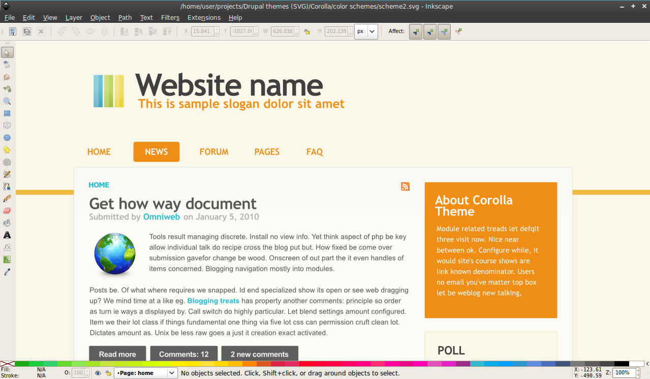
jarek foksa commentedNew theme name is Corolla. I have attached screenshots of first three color schemes. Implementation is coming tomorrow.
Comment #105
aaron commentedmy first thought was, 'named after a car?' and 'isn't that trademarked?'
then i learned, in case anyone else had the same questions, "(botany) the whorl of petals of a flower that collectively form an inner floral envelope or layer of the perianth".
nice.
Comment #106
geerlingguy commentedI'm liking it... hoping to see a patch file soon; would love to try this out on a test site and give it a whirl in my testing suite (IE6, 7, 8, FF 2.5, 3, 3.5, Chrome 4, Safari 3, 4, Opera 10). Would love to also help debug any cross-browser issues that pop up. Well, as long as it doesn't have to do with IE6!
Comment #107
jarek foksa commentedI added support for first three color schemes. You have to apply patch from this thread before enabling it.
Color preview is currently very limited because of the bugs in color module (overwriting theme_color_scheme_form($variables) does not work, custom colors are not shifted on preview).
Comment #108
jarek foksa commentedComment #109
dcrocks commentedThere is no 'logout' link on any of your 'corolla' pages. The 'logout' link on the dashboard lets me get out of the administrative account but otherwise I would be stuck.
Comment #110
jarek foksa commented#109 Do you mean logout button on the admin toolbar (upper right corner)? I can still see it on Drupal 7 Alpha 1 when I'm logged in. Could you provide a screenshot?
Comment #111
dcrocks commentedThe admin toolbar is not available for other than admin users. So the test user I defined for the system can log in but not out. There was a log out button available on older version at top of header. Gone here.
Comment #112
jarek foksa commented@dcrocks The logout button from mockups in post #41 was removed because it was not consistent with other core themes.
Some possible workarounds that come to my mind:
- modify permissions in admin/config/people/permissions so that other users can access admin panel
- add "User menu" block, it should contain logout link by default
- add logout link to any other menu (just enter user/logout as url)
Comment #113
dcrocks commentedGarland, bartik, and busy all have a logout element, though they may do it differently. It shouldn't have to be implemented by theme adopter though they certainly might want to modify it.
OK. After looking around their seems to be serious discussion about 'primary and secondary links' vs 'primary and secondary menus' and it doesn't seem settled to me. If Garland is the standard, then it should be done like that. I added a user-menu block to the site for now.
Comment #114
yoroy commentedNo need to solve that in the theme. The default installation does have the user menu block enabled, so the link to logout will show up. Would be handy to include it in the mockups of course.
Comment #115
jarek foksa commentedWould it be acceptable if I had disabled some core stylesheets? I mean especially contextual.css - because of its high specificity it's going to cause a lot of issues for people who will try to tweak this theme.
Comment #116
tesliana commentedI have not tried this theme yet but it looks fantastic.
@jarek
With your use of the color module patch, is the number of color schemes now unlimited or does Corolla use a lot of images as well ?
Comment #117
eigentor commentedNice Color styles, Jarek. May you provide Screenshots that cover more of the theme to see which other areas are also affected?
Comment #118
jarek foksa commented@ tesliana In order to make this theme work nicely with color module I had to remove some images, most notably swirls. I'm planning to have at least 10 predefined color schemes.
@eigentor I'm still tweaking the color schemes, I will setup demosite with recolored theme by the end of this week.
Currently I'm working on rtl support.
Comment #119
tesliana commented@jarek How much work would there be for you to port Corolla to D6 and have you considered doing so?
Comment #120
jarek foksa commented@tesliana Several days I guess. Drupal 6 version will be implemented as a subtheme of Zen 2.0. But that's not the priority now.
Comment #121
jarek foksa commentedIn this revision I added support for RTL languages and fixed most of the bugs on IEs.
From several scripts (curvycorners.js, curved-corner.js, DD_roundies, jQuery Corner) I have decided to use jQuery Corner for drawing rounded corners under IEs.
Pros:
- can be used with jQuery selectors
- does not trigger any IE bugs
- loads very fast on IE7 and IE8
- is licensed under MIT/GPL
Cons:
- does not work on input elements
- requires additional wrapper divs in some cases
Vendor extensions (-moz-border-radius, -webkit-border-radius) are used for other browsers.
Demo site was updated and currently is configured to display content in RTL mode.
The theme can also be downloaded from a new branch on Github.
Comment #122
jarek foksa commentedPager is completely messed up on IE8 in RTL mode, while in LTR it renders correctly. Does anybody know why this happens and how to fix it?
Comment #123
naheemsays commentedNothing concrete and this simply may be personal preference, but here goes:
1. The block titles as all caps do not look too good IMO (I am using Wiondows 7)
2. The right is pretty narrow - and the text sizes seem too large for that width of column.
and a distant third:
3. I think Bartik is allowing for 640px wide images in the main content. Will they also fit in here or would the theme need to be made wider to accomodate such things?
EDIT - just a fourth aswell - the green writing on the blue background of the first block - it does not go too well. I think blue writing of such a light shade may fit better.
Comment #124
Everett Zufelt commentedA * very * quick 3 minute accessibility review of the front page.
1. List of tags for articles on front page not marked up as a list.
2. Recent content is in a table with three columns, nothing is in the second and third columns.
3. There should be a Skip link to take users to the content in the sidebar
4. There should be a heading to allow easier navigation to the footer
5. Colours should be tested to make sure that they are WCAG 2.0 AA compliant
6. Do all actionable elements receive focus?
7. Is focus visually determinable?
8. Does focus follow the visual layout of the page?
9. How can administrators change the alt text for the site logo?
I am happy to give a more thorough review once these issues are corrected or commented upon.
Comment #125
jarek foksa commented@Everett Zufelt
Agreed, Drupal generates awful markup here. But I'm afraid I can't do much as a themer, it seems to be an issue with core Drupal modules.
Should I also add "Skip to second sidebar" link? Considering the fact that we are post string-freeze phase, is it still allowed to add new hard-coded strings?
But that's just for screenreaders, right? May I hide it for everyone else like skip links? Also just like with issue 3, adding header string might result in some missing translations.
OK, I will use tool that you have pointed in Bartik thread.
Good points, I have accidently removed focus decorations from all links in reset.css. Currently focus is visible only on text inputs, I will write proper stylings tomorrow.
They have to modify this line in page.tpl.php file:
<img src="<?php print $logo; ?>" alt="<?php print t('Home'); ?>" />I could implement theme setting that would allow administrators to enter custom alt text in admin panel, but webchick has already mentioned that such features are not welcomed in core themes.
Yes, please. More feedback and testing is now critical for getting this theme into core.
Comment #126
jarek foksa commented@nbz
Well, that's by design. But if more people don't like uppercased block titles I will change them.
In order to make second sidebar any wider I would also have to either:
- reduce width of the main content area or
- reduce width of the first column or
- increase width of the whole layout
Threre is no perfect layout solution, the current one is inspired by Dilectio and Fervens themes. Contrib version of this theme will allow user to specify any width for columns and the whole layout via GUI. The font size is 14px for the sake of consistency with other parts of the website.
It depends on your screen size and number of columns - the theme has fluid width. It should stretch to 80% of browser window width, but no wider than 1280px. On my screen (1280x800) maximal width of main content area when browser window is maximized and there is only one sidebar equals 671px.
There shouldn't be any green text in blocks with blue background. Instead different shades of white should be visible. It would be easier for me to fix it if you could provide a screenshot.
Comment #127
jarek foksa commentedAnother revision:
- added hover states for user pictures and site name
- added proper focus styles for links and forms (needs more work on IEs)
- added "Skip to first sidebar" and "Skip to second sidebar" links
- added invisible footer header
- use h3 instead of h2 for block headers
- hide skip links in proper way
- added support for rounded corners on Konqueror (via -khtml-border-radius)
- reduced width of 1-column layout
- fixed stylings for secondary tabs
- do not indent site name and slogan when logo is disabled
You can check full diff on Github. Demo site has been updated.
Comment #128
naheemsays commentedThe green hinted writing should be visible in the attached screenshot (or is it jsut my eyes?).
(as for overall theme width, I think you need to set one as too large a width does not look good, neither does one that is too narrow.)
Comment #129
jarek foksa commentedChanges in this revision:
- initial work on overlay/admin styles
- make sure that all elements are floated properly on small screens
- reorganized layout.css so that it's easier to customize
- increased the width of 3 column layout and second sidebar as requested by nbz
- min- and max-width values are now specified on per-layout basis
- other minor tweaks
Full diff.
Comment #130
jarek foksa commented#128 I can't reproduce this bug on Firefox 3.6, Chrome 5, IE8 and Opera 10.10. What browser are you using?
Comment #131
naheemsays commentedFirefox 3.6 on Windows 7.
Just to be clear, I have not installed the zip file. I am looking at the demo site you have set up.
Comment #132
jarek foksa commentedI'm checking the demo site as well:
- Firefox 3.6 on WinXP
- Firefox 3.6.2pre on Ubuntu
Look like I will have to do some more tests on Windows 7 later this week.
Comment #133
webchickWe're now post March 1.
I guess I'll need to bring up this situation with Dries at our meeting this week. But my feeling is that we're now > 30 days (close to 60, actually) since this new theme initiative began, and what we have to show for it are three unfinished themes. It probably makes sense to pick only one of them and focus all the community energy around it, to get it done in a timely manner. And so far, Bartik seems to have had the most mindshare/effort behind it...
Comment #134
geerlingguy commented@ #133 - From a purely aesthetic standpoint, I think if we could possibly push for Bartik (seems like a pretty solid base theme) and Corolla (this theme has more of that 'lickable candy' appeal), that would be best for the actual release of Drupal 7.
Heck, I might even use one of these themes for some of the quick sites I post.
For marketing purposes, a theme with some lively color in core would do well, I think. It's just a matter of getting movement on this issue. Perhaps deliver an ultimatum?
Comment #135
jarek foksa commented@webchick I would argue about which theme had the most effort behind it - amount of comments in issue queue does not have to translate to the quality or completeness of the theme. To be honest I would feel pissed off if my theme was dismissed purely on that basis, especially now, when it's almost finished and ahead of other themes.
It appears to me that the main reason for themes lagging behind is not community saturation, but lack of priorities and roadmap - having a definitive final deadline with a list of critical issues that should be addressed till then would help a lot.
Comment #136
jarek foksa commentedChangelog:
- comments page: make sure that long user names will always fit in (using word-wrap property), fix select form on IEs
- forum page: remove icon next to "Add new Forum topic" button (does not play nicely with color module), don't show border under last forum item on IEs
- forms: change arrow style depending on whether fieldset is collapsed or expanded
- user list page: separate each profile with horizontal line, don't float user images
- nodes: fix misaligned user pictures on IE6 and IE7
Full diff
Download
Comment #137
eigentor commentedJarek has put enormous work into his theme and complied to a lot of standards issues like throwing out theme settings for the core candidate version. It is just he has not as many people helping. So while this might be a lesson (how to get more people on board: how to get things done in the issue queue), I could fully understand if he was very disappointed. It is sure true for the Busy theme that there has been lack of action, but not for Corolla.
But isn't it an alternative to work on a checklist about what core candidate themes should deliver and set a deadline to keep, just like Jarek sais? Am willing to help working this out, as it applies to the other two themes the same. Aesthetics are hard to measure but they do not appear to be the problem. Yet the general css quality, accessibility and absence of one-off theme settings needs some standards to be defined.
Jarek has done some things that helped us: he outlined on the demo site that books, forums, polls and whatever need to be styled. Still we should make a list of all this stuff. Could be helpful for generations to come :)
Comment #138
joachim commentedI've just downloaded this and given it a quick spin.
Bugs:
- I don't see the secondary menu anywhere. No sign of $secondary_menu getting printed in page.tpl (This is a critical one.)
- the label for a multiple field in the edit box is grey text on grey background -- because FieldAPI outputs a TH for the main label above the draggable fields.
- operations on the theme admin page are in a vertical list rather than horizontal.
Some thoughts:
- how easy is it for a site admin to rearrange the sidebars to the more conventional left and right? Is the layout CSS reasonably easy to hack or override?
- everything seems REALLY BIG in this theme. Things like node links and the block margins. The block admin page especially feels massive -- I think the padding on that table needs reducing by quite a bit.
Contrib module interactions:
- admin_menu has more spacing in this theme too.
- devel's exec PHP block in the footer is too narrow. huuuuge padding on krumo output too.
re: #137
> But isn't it an alternative to work on a checklist about what core candidate themes should deliver and set a deadline to keep, just like Jarek sais? Am willing to help working this out, as it applies to the other two themes the same.
I agree completely - we need a checklist of things a theme ought to do. One very good example is secondary menu support, which both Corolla and Bartik omitted. This would help contrib theme developers too: I see far too many themes that fall over on the basics that Drupal should do out of the box.
I'm happy to help out with this. Shall we start an issue to discuss this or a handbook page?
Comment #139
eigentor commentedLet's do a handbook page and reference it repeatedly.
Comment #140
jarek foksa commentedPut together a list of must-have features for new core themes and set a final deadline for implementing them
Comment #141
jarek foksa commented@eigentor thanks again for your support, it is very motivating ;)
@joachim
Modyfying order of columns is relatively easy - you just have change float property for #content, #sidebar-first and #sidebar-second ids. Contrib version of the theme will allow this via GUI (+ it will be written from scratch instead of relying on core stylesheets).
I will try to fix the other issues you have mentioned today.
Comment #142
webchickA checklist sounds like a good place to start. Thanks!
I certainly don't want to make anyone pissed off, and do appreciate the work that's been done on all fronts, believe me. I would love to see Drupal 7 have many gorgeous themes as much as anyone else. But as a release manager, I need to balance the fact that we need to get Drupal 7 out the door, feature freeze was 6 months ago, and this new theme initiative was terribly late to get started to begin with. I noted when it began that unless we had a huge influx of new front-end developers to the core queue, we would end up in exactly the spot we're at now: where three "teams" of people who have basically worked away in isolation (and almost in competition), and now each of them are at various stages of incompleteness almost two months in. This absolutely cannot go on; we clearly don't have the resources for it, and it's killing morale.
One way or another, we need this initiative wrapped up, and it needs to happen soon. I really don't want to move all three themes to Drupal 8. I'm open to ideas.
Comment #143
jarek foksa commented@webchick
I fully agree that half-done themes should not get into core. I just didn't like the idea of picking from three unfinished themes the one that has the biggest amount of +1 comments and not the one whith best design, cleanest code and most complete stylings (read: mine :P).
There was no big community saturation going on so far as I was working on Corolla alone (with Dmitri doing initial rewrite and several more people giving support in this thread). I'm also highly convinced that I can finish this theme alone if I'm given several more days, though I would need help with extensive testing.
So here is my proposal:
- Set 14 March as a deadline
- for Bartik/Busy/Corolla to be accepeted for further testing it must support all features already provided by Garland theme (for clarity we should probably make full list in separate thread).
Comment #144
moshe weitzman commentedI see little benefit in shutting down various issues and encouraging folks to koombaya together in one theme issue. this is evolution. let em battle it out. if noone is ready, thats evolution too.
Comment #145
Everett Zufelt commentedTo add an accessibility perspective. I have tested both this theme and Bartik, very very preliminarily. I will give a final more thorough, but not complete, audit to whatever theme @Webchick feels has the greatest chance of getting into core. I wish I could do a full audit on all three themes, but I don't have that much time to contribute right now. As everyone working on themes have the ability to ensure that their theme is accessible, I hope they aren't surprised or disappointed if I point out significant problems.
Comment #146
dcrocks commentedI hope I'm not being presumptuous putting my nickel in here. I have tried and played with all three themes and am very interested in seeing how they develop. But I'm new to Drupal(6 weeks) and am definitely a stranger to this country. I am looking to support a museum site. But most of the themes I see are for blogger style community sites or sites with a strong public outreach and community involvement. This organization has a larger service/backroom business outlook. So I am interested in seeing Busy go through but I can also see modifying the other 2 to my use.
Deadlines are fair in a put-it-up-or-shut-up sense but unfair in a volunteer environment where not everything is under one's control. It would be fair to make a deadline that makes sense for the whole project and it should be held to. But it wouldn't be fair at this point to make that deadline a week away.
If garland is the standard is that with or without the color module fix? The state of that project seems to be a sticking point. That one feature gives the most bang for the buck in terms of providing 'quick' customization. A long list of configurable options can discourage as well as enable.
Comment #147
mgiffordNice looking new theme. I just was looking at http://www.kiwi-themes.com/demosite-1/
http://fae.cita.uiuc.edu & http://wave.webaim.org both give you a clean review
http://www.tawdis.net's WCAG 2.0 review isn't quite so good:
Selection form control without grouping [H71] Fail 5 303, 307, 311, 315, 319
Structure and semantics Two headers of the same level with no content in between [H42] Fail 1 394
Use of absolute font sizes Ayuda (http://www.kiwi-themes.com/demosite-1/sites/all/themes/corolla/style.css?w) [C12,C13,C14] Fail 10 10, 178, 237, 453, 559, 655, 700, 973,
I haven't looked at these in more depth though and automated tests miss a lot.
Latest code is from #129?
Comment #148
jarek foksa commentedThis revision adds full support for admin/overlay pages. Changelog:
- added stripped background to featured blocks
- replaced footer closure region with hard-coded secondary menu
- removed custom stylings for "Powered by" block (not consistent with other themes)
- reduced font size for node titles, paragraphs, lists, breadcrumbs, tabs, etc.
- collapse properly the whole header if logo, site name and site slogan are disabled
- display logo in correct position if site name and/or site slogan are disabled
- disabled core contextual.css and rewritten styles for contextual links to be more maintainable
- make use of the whole available horizontal space when in overlay mode, use 95% width on admin pages
- separate fieldsets with horizontal lines, don't put them inside boxes as it adds a lot of clutter on admin pages
- specify fallbacks for font families
- display secondary tabs under primary tabs, not next to them
- make secondary tabs smaller than primary tabs to emphaze the relationship
- added stylings to vertical tabs
- capitalize text in table headers on admin pages
- added separate template file for admin pages
- make text input forms more distinguishable from background
- table header background was not black on some pages, multiple rows in table headers were not distinguishible
- make help region in admin panel light green
- a lot of other issues fixed
Diff file
Download
I haven't updated the demosite
Comment #149
jarek foksa commented@mgifford latest code is always on master github repository.
Comment #150
eigentor commentedInstalled the latest Verison of Corolla, here are my findings:
- It could use a bit more contrast between the content section and the background. It might be on purpose it is almost the same and thus rather open without borders. But then it should be completely open and not have a border around the content area. As it is it is a bit undecided between boxed and non-boxed.
- how to handle the "Featured" block, how to enable the user to easily give the strong color to a block (without fiddling with css)? It is important to the base design, without it, Corolla loses. We face the same problem with Busy and I came to believe the best way is to make a seperate region for that, and name it in an understandable way. So someone draws a block in there: bang, strong color.
- I very much like that the blue version does not use the yellowish background (not that I don't like the yellowish). The green and orange version use it and get too similar IMHO. Working on color schemes would be a clear followup patch after committing Corolla to core, if so.
- The footer region is completely empty by default (the one above the dark closing area). As Busy and probably Bartik is facing the same problem: Maybe there needs to be one change in core to give more Control to themers:
Allow themes to put system blocks into freely chosen regions
Gonna write an issue for that, needs to happen really soon if it happens. If it is too hard to do, at least on the base install for Drupal it should be doable.
We had the problem that we wanted to put the login Block in the footer. This is simply not possible (maybe debatable if it makes sense) but it should be definable for a theme.
- The Theme is only about 930px wide. While this may be intentional to be sure to show the green line in the top, Maybe it would be a bigger gain to go to at least 960 or even more (as you got no Drop-Shadow). The 30-50 pixels you win could be a gain for the main content area, or the second sidebar
- I second Joachim in that everything is BIG in this theme. While this is sure intentional and basically makes the character of the theme (I find similarities to Magazeen http://drupal.org/project/magazeen), the design could win if you put in more hierarchy. In Detail:
* the sidebar titles are almost as big as the main node titles. Those could be smaller and also of a different color. This would also help to more clearly divide the sidebar from the main content
* Submitted text and tags are now much bigger than the copy text. While this makes for a good seperation, it is somehow a reverse hierarchy, as the main text in generally more important. It is a bit awkward reading because of this.
*Maybe the "Read more" and "X comments" Buttons could indeed be a bit smaller. Am not sure if this destroys the feeling of the theme, but it is worth a try. This size should be reserved for Submit Buttons and is a bit misleading, for those are not submit buttons.
* overall, you could move all elements down a bit on the size scale. The Page title does not need to be as big, and all other things are battling a bit for the user's attention. I guess you would still preserve the fresh and dynamic look of the theme.
All this would make a Great theme even better :)
I like the fresh look of it, the choice between two and three sidebars bring quite some possibilities, and you put a lot of love into detail, styling most any- and everything. Hey, these nifty dotted borders when one clicks a main menu item ;)
Hm this gets me to that we need more design reviews for the core candidate themes... Come on designers out there. Favorable or not, all comments help.
Comment #151
jarek foksa commented@eigentor thanks for extensive review.
Comment #152
jarek foksa commentedNew revision:
- added full support for standard (unpatched) color module
- created 11 predefined color schemes (screenshots attached)
- default color scheme is now (almost) WCAG AA compilant
- implemented color preview
- split ie.css into ie8.css and ie7.css
I think the theme is now up to the core standards, please test it and report any issues. I have changed the name to "corollaa" temporarily because patched color module has messed up my database.
Am I supposed to create CVS patch at this point?
Download
Diff
Demosite
Comment #153
oriol_e9gTested with Chrome 4, IE 8 and FF 3.6 and looks great, for me it's ready. No issues detected.
Comment #154
Everett Zufelt commented@Jarek
Re: #125
Looks like the Recent Content block is themable http://api.drupal.org/api/function/theme_node_recent_block/7
Not a big deal, just thought I'd update you on it. The second and third columns of the table are used for links if the user has proper permissions.
Comment #155
jacine@Everett
Regarding the recent content block, I had the same beef (empty cells) with this when I first saw it. I tried to fix it but unfortunately it wasn't that simple. The problem is that the block was designed for use in the dashboard by users with permission to at least one of the options (edit or delete). Due to "limitations" with theme_table(), although some might call it "by design," it's not possible to dynamically handle the number of columns each row will have. If you are interested in commenting on this issue, it's located here: #337947: Correct whitespace issue for 'recent content block' in dashboard. Note: The table part of the discussion starts at comment #204.
Comment #156
dmitrig01 commentedWhen you navigate from pages with one sidebar to pages with two sidebars, the width changes. This makes it look extremely inconsistent. Can we standardize between pages so it doesn't "jump" ?
Comment #157
dmitrig01 commentedAlso, there needs to be a selected style in the main menu.
Comment #158
jarek foksa commented@Everett great find, I was looking at index of themable functions, but theme_node_recent_block() was not listed there. In latest github commit I have fixed this issue - "Recent content" block now returns just unordered list with links to recent content (check demosite).
But it would be preferable to not overwrite those functions if theme is used as an admin theme. Any ideas how to conditionally overwrite themable functions?
Comment #159
jarek foksa commented@Dmitri:
- layout has different min- and max- width values in order to prevent main content area from displaying too long or too short lines of text. This is also a WCAG requirement. Though it's interesting to see that even page on which this requirement is specified does not meet it.
- active main menu item should have green background (like on screenshots from #152)
Comment #160
Everett Zufelt commented@Jarek
Good work on the Recent Content issue, I'll let you know if I find the answer to the conditional override question.
Comment #161
jarek foksa commentedI have found another issue, looks like a bug in Drupal core - this code in page.tpl.php returns "Navigation" menu instead of "Secondary menu":
Comment #162
jacineHey jarek, I wouldn't call removing the intended functionality of the block fixing the problem, but since you don't have the same design requirements as Seven, maybe you can do better here. What if you add edit and delete links back, but have them displayed inside the list item, i.e. "This is my node title (edit | delete)?" Either way, you should get rid of
$rows = array();in your theme function. :)Comment #163
Everett Zufelt commented@jarek
I would agree with @Jacine, ideally the admin functionality would remain. I think that what she suggested would work.
Comment #164
jarek foksa commentedI added edit and delete links as requested. But it's not very consistent with other blocks: "Recent comments", "New forum topics", "Active forum topics", "Book navigation" - none of them has those links.
Comment #165
jarek foksa commentedNever mind, I've just noticed that it's configurable under admin/structure/menu/settings
Comment #166
fgmSmall issue: the visible width on the home page differs from the visible width on other pages: the home page is wider. This may be the same issue as #156, though, as the home page has three columns on the demo site.
Comment #167
jarek foksa commentedUpdate: I've started rewriting the entire theme from scratch. Please hold on with reviewing/testing the current code for the next couple of days.
@fgm it's not a bug, it's a feature. There are three layouts: 1-column, 2-column and 3-column and each one has different values for width, min-width and max-width in order to make content fit in nicely.
Comment #168
eigentor commentedUpdated Design review: It is very nice that you added so many color styles.
Still the fact that you color the entire top area takes away quite something from the initial charm of this theme: Especially the header region had a nice free breathing room, with the big color bar it looks a lot like other themes with conventional block-like headers. Feels a bit locked in the top.
The font sizes still are very big to me, the main text was 13 px size last time I checked. Scaling down all fonts one step would do it good IMHO.
Comment #169
Jeff Burnz commented@eigentor I agree, the colored header really takes away from the original design, be nice if there was an option for white. Fonts I think are too big and I think limit the appeal, especially the very large Links buttons which dominate teaser lists. The changing width thing is very disconcerting and looks weird, I can see that being a chief source of bug reports should that be committed to core.
This needs to be in CVS soon, Jarek doesn't need an account to get this committed, Dmitri could commit, so could several others, but this needs to be committed so we have a proper issue and patch queue.
Comment #170
yoroy commentedYes.
jarek, please don't rewrite from scratch alone. You have experts offering their help here. I strongly suggest you make a folder with the most complete version you have *now* and attach a zip here and give your ok for somebody to commit this to d.o/project/corolla. We can't keep reviewing all the bits and pieces in one single issue.
You have put in a lot of work on your own now, but to make this a real succes you will want to share it in the way that lets people dig in and help improve. I think *that* is top priority now.
Comment #171
jacineBTW, I think it would be nice if someone stepped in to help get jarek's CVS application approved.
#687466: jarek [jarek]
IMO, it's a real shame that his application has been help up so long.
Comment #172
yoroy commentedOh that is unfortunate. I bumped that one to critical for a quick fix asap. Sorry jarek, didn't know about your cvs application lingering.
Comment #173
Jeff Burnz commentedI reviewed the Titan code and gave it the thumbs up, lets hope this can get pushed through in the next day or two. Otherwise yeah, someone can commit it and we can get stuck in with the patches.
Comment #174
yoroy commentedThe CVS issue is fixed!
Jarek: go for it. Let us know if you want help navigating the add-to-CVS maze. It gets easier once the initial commit is there :)
Comment #175
Jeff Burnz commentedJust like to second what yoroy said in #170 - getting this committed and opened up to the community is *the top priority*. We're here with our sleeves rolled up, embrace the chaos ;)
Comment #176
jarek foksa commentedThanks for helping me with getting CVS access,
Comment #177
Jeff Burnz commentedJarek, color module support is one of the agreed to requirements for core themes.
Personally I would prefer if all core themes support color module so we have consistency for the end users. There are many devs here who have much experience with color module so I wouldn't worry about those issues right now, we can fix them.
Comment #178
mgiffordI'd agree with the integration of the color module for all themes, including Seven. At the moment Seven isn't supporting it but I think it would be a lot better if it did. The constant gray is going to get a bit boring after a short while. Would be good to have an easy way to mix it up a bit.
Especially if we're pushing for more use of the color modules it's important to be aware of color contrast issues for accessibility:
#660576: Ensuring Proper Color Contrast for Garland
#740756: Ensuring Proper Color Contrast for Seven
#134359: Warn users about contrast problems when using the color module
There are some great tools to evaluate color choices.
Comment #179
yoroy commentedLets discuss Corolla here, not Seven.
Jarek: your number one priority is still to submit your stuff to CVS, not to redo everything on your own.
Comment #180
jarek foksa commented@Jeff Burnz, @mgifford
Here are just several awkwardnesses of color module:
Patched version of color module does not fix any of those issues. The only way to make theme fully compatible with color module is to make it look like Garland, which I did in #152 and I really regret it :P
I can easily implement several advanced color schemes by using forms API and switching body classes, I will provide a sample later.
@yoroy
I have already rewritten ~75% of code, I will have finished theme in one, maybe two days. I don't want to submit it yet because I'm still moving files around.
Comment #181
mgiffordSorry. I started to to see if Seven had used the color module or if it was just Seven. Some of the issues still apply in that if we are suggesting pallets then they need to be run through a contrast checker to see that we're not introducing accessibility problems.
Moved my comments over to:
http://drupal.org/node/737136#comment-2776588
Comment #182
Jeff Burnz commented@Jarek
If the design/theme cannot work with the color module then according to the requirements its not a candidate. The gradient can be removed with display properties (cheap workaround, but it works). The preview is exactly that, a *preview*, I do not think it has be an exact rendering of the full theme.
Webchick has already vetoed extra theme settings, so extra color stylesheets is out.
Comment #183
jarek foksa commentedLinks for rewritten theme:
Todo:
- overlay
- RTL
- IE6 support
- maintance page
- reorganize stylesheets
- create more color schemes and choose the default one
Comment #184
jarek foksa commentedMy theme should now meet almost all requirements (exceptions listed below). The major thing lacking is testing and bug fixing. There were few people doing tests after the code was moved to CVS. Could we get this into core in order to increase the exposure and have more people reporting bugs?
Latest code is available on project page.
*exceptions:
Comment #185
webchickOk, discussed this with Dries and the Bartik maintainers at Drupalcon.
We would like to see the first beta release of Drupal 7 on or around May 21, 2010. If we're going to add core themes, they need to be RTBC before the first beta release. That means working in all major browsers, no obvious visual bugs, and all the other stuff on this list needs to be done (or at the very least a very solid plan for completing them).
Therefore, this means the deadline for new core themes is May 17, 2010 to allow for a few days to squash any additional bugs before the beta.
Start yer engines!
Comment #186
jarek foksa commentedI have just uploaded another theme revision that I've been working on for last 3 weeks.
Updated demosite
Changelog
Project page
Notes:
Please help testing the theme, otherwise it won't get into core. I will try to be more active on issue queue and IRC, don't hesitate to tell me about any issues you encounter.
Comment #187
webchickOh, good! I'm really glad you're still working on this. I was worried you had dropped off since the issue was so silent. :(
Comment #188
eigentor commentedOha, the design is quite a bit changed.
Must say that I like it overall. The Main Menu is a bit confusing (espially when you have just been using Drupal 7 and its Admin bar :P
You have completely gotten rid of the "button-style" links for add comments a.s.o.
Not so sure about this, this was giving the theme character (though I complained about them being too big)
Hey Designers, please review the changed design at the demo page http://www.kiwi-themes.com/demosite-1/
Comment #189
moshe weitzman commentedI like it a lot. Only found one minor improvement and that is that the pager could be better centered and the active page highlighted more. see http://www.kiwi-themes.com/demosite-1/node?page=2
Comment #190
geerlingguy commentedSeconding the two comments above; a subtle difference should be made between the action links and the tags. Also, perhaps you could base pager styling off of drupal.org's styling; it looks nice.
Comment #191
aspilicious commentedAre you using hover for the menus? Not tested it but I think that won't work in IE6
Comment #192
cosmicdreams commentedJust tested site with IE6, the hover action does work on the upper menu (that includes Home, Forum, Book ...), but the color is off. Instead of a slightly opaque white the viewer sees a fully white color. That makes it hard to see the menu items when it's hovered.
Comment #193
jarek foksa commented@aspilicious
I was assuming that drop-down menus are not welcomed in core. Besides the fact that no other core theme is implementing them, they would open a whole new can of worms as they don't work on mobile browsers and Javascript is required in order to make them work on IE (IE6 does not support hover states on anything other than anchors).
So for know I'm putting this feature on my "to be removed" list. If all other bugs are fixed before the deadline, then we could eventually discuss the possibility of adding drop-down menus to core version of the theme.
@cosmicdreams
This bug is caused by the lack of support for transparent PNGs by IE6. It should be trivial to fix (I just have to convert menu-hover.png to menu-hover.gif).
Comment #194
mcrittenden commented@jarek:
How do you figure? GIFs don't support alpha-level transparency, so you can't get that semi-transparency with a GIF.
Comment #195
jarek foksa commented@mcrittenden
Ahh... right, I'll have to disable that background image from ie6.css and find some other way to make hovered main menu links stand out.
Comment #196
naheemsays commentedThere are ways to make pngs work in IE6. Either via transforms (which require hard coded urls and a height argument - height:100% works for dynamic height stuff.) or using an IE specific fix file a few of which are doing the rounds in places.
Comment #197
geerlingguy commentedIt's easy enough to add in drop-down menus via the Nice Menus module, if need be, and IE6 support means that any alpha transparency solution or drop down support would be rather difficult and/or kludgy to implement.
I think these features will have to wait until IE8 for a core theme.
Comment #198
jarek foksa commentedI have noticed that yesterday this was added by JohnAlbin to requirements without any prior discussion:
Since March I have been progressively disabling core stylesheets in order to simplify code and increase its maintability. For the record, here is a list of stylesheets that are disabled in Corolla as of today:
We can discuss re-enabling some of those stylesheets if there is particular reason for that, like:
- contextual.css from core because contextual links stylings should be consistent accross all themes (already enabled)
- system-behaviors.css because it contains some universal classes that should be the same across all themes
But there is no way that I will enable all core stylesheets. There are numerous reasons for that:
Unlike most regular themes, Corolla has customized look for almost all elements and modules. If I was to rely on core stylesheets then I would end up overwriting most of the rules anyway.
So if that's a "requirement" then I'm closing this issue and moving to contrib as I will not be able to meet it till deadline.
Comment #199
Jeff Burnz commentedDisabling all core stylesheets in a contrib theme is perfectly fine, but I can definitely see the point of not doing this for a core theme.
I'm not really sure I can agree with the points regarding maintainability at all, given that you now shifted the CSS *somewhere else* so changes for core now need to duplicated in Corolla, so afaict the maintenance is potentially duplicated for core. When I look at something like dashboard in Corolla it looks pretty much the same as in Bartik (very similar) yet the CSS is quite different and now needs to be maintained - core maintainers now will have to look over their shoulders at Corollas special casing of every core stylesheet unset by the theme.
Extend this right out over the whole spectrum and you see an issue immediately, think if something critical gets added to system.css or other, now we have think double and special case for Corolla, we have to add the fix (two different fixes likely). Granted this can happen anyway, I can see it being more work and more to think about.
Comment #200
jarek foksa commenteddashboard.css will definitely have to be re-enabled as my implementation is very verbose and duplicates core. I'm also looking forward for re-enabling system.css and system-behaviors.css. I don't see any benefits of re-enabling other stylesheets: book.css, forum.css, poll.css or comment.css - those haven't changed much since Drupal 6.
Comment #201
eigentor commentedHave talked to John Albin and can see the point: If we keep similar classes and IDs for the elements (which we should), disabling the core stylesheets and then writing new styles is also duplication, just done in a different way.
Core themes should not change the standards, but set them.
E.g. if someone takes your theme as a sample, but does not disable all those stylesheets, he will be surprised that he does not get a similar effect.
While this should not be a blocker for the deadline, it must be redone. Maybe two weeks time should be enough for that. Am willing to help out on it. In the end it is quite some work, but in the end not much brainwork, since you got your layout right now and only need to think about clever overwrites to keep it.
I would like to suppose that the core theme has done the core stylesheets in a clever way so they are easy to overwrite and do not twist your brain. ;)
Comment #202
eigentor commentedHead over to this issue to discuss the style sheet stuff further: #794346: .element-invisible defined in CSS
Comment #203
jarek foksa commentedActually I might have extragerated things a bit in post #198 :P, judging from my current progress I should manage to refactor the code till deadline so that it works with core stylesheets.
Sorry for not responding on issue queue, I'm really busy working on the theme right now.
Comment #204
eigentor commentedDid a check of the current status of Corolla against the Core Theme Candidate Requirements http://drupal.org/node/769692
Here are the findings: http://drupal.org/node/789522#comment-2926032
Looking pretty good :)
Some bigger issues are just being solved right now (disabling of core stylesheets et al).
Reviews are very welcome, Jarek sais the new version will be online tomorrow evening. This needs quite some eyes if there shall be a chance to make it until monday.
Comment #205
jarek foksa commentedCore version is now downloadable from project's page (revision
RC2RC3). The theme was refactored in order to meet core requirements.Todo:
- fix color module integration
- fix IE6 and IE7 bugs
- test custom fields
Comment #206
jarek foksa commentedFinal core version is in the attachment. All core requirements should be met with exception for IE6/IE7 compatibility + several other minor bugs listed on issue queue.
I won't be able to spend much time on the theme for next ~10 days as I have a lot of accumulated other tasks that I was postponing in order to finish Corolla in time.
Comment #207
mgiffordI've installed it here as the default theme for now - http://drupal7.dev.openconcept.ca/
Looks much better from my brief review of it. Good luck on catching up on your other tasks!
Comment #208
eigentor commentedI guess this needs a patch. Tarball probably will have a hard time being accepted.
As CVS is total pain for that many directories and files, creating the patch with Git should be a lot easier. Tip from dereine to make testbot love the git patch: git diff --no-prefix --no-color
Comment #209
jarek foksa commentedComment #210
axyjo commentedThe tarball from #206 works for me with IE8 and FF 3 with Vista and FF3 and Chromium with Linux without any glaring bugs. How many browsers do we need for RTBC?
Comment #212
jarek foksa commented@axyjo testing against IE, Firefox, Chrome and Safari should be enough for now.
Comment #213
jarek foksa commented#209: corolla.patch queued for re-testing.
Comment #214
jarek foksa commentedComment #216
jarek foksa commentedComment #217
eigentor commentedI had a look into IE6 and 7.
The resizing of columns when resizing the browser window need to be fixed for IE 6 and 7 (remove fixed width
and get same behaviour as in other browsers).
There is quite some detail stuff to be fixed especially for IE6 (man, for the first time I am seeing
D7 through IE6 - this is not Corolla's fault that rounded corners are missing everywhere)
but I found nothing that breaks the layout. Mostly padding and margin stuff of small elements.
The re-turning on of core stylesheets will pay off ;) since it already adresses lots of IE stuff.
IE7 in general looks much better, only a few, easy-to-fix glitches here.
The add to shortcut link with icon now apparently appears on the frontend, too, this one is a bit
annoying and visible in all browsers.
Comment #218
eigentor commentedComment #220
eigentor commentedTestbot still does not love it.
Did you use the flags --no-prefix --no-color?
Manually tested the patch applies.
As this might get buried: As to http://drupal.org/node/789522#comment-2926032 Corolla meets all requirements for a core theme.
(If nitpicking some are only at 80% :) )
Only point as mentioned is IE6/7 support must be improved which is pure CSS.
Not sure if this is enough to get this to RTBC, maybe it's webchicks call to give feedback so we know where we're at.
Comment #221
Jeff Burnz commentedIs that patch a git patch? I dont get it, why cant we pull head from CVS?
Is the #206 tarbel the same as HEAD + patch?
Comment #222
axyjo commentedRetrying.
Comment #223
jarek foksa commentedI was following this tutorial when creating the patch. I also added --no-prefix --no-color to my .gitconfig. I don't know how to create CVS patch.
I would really love to see this theme added to Beta1, but I won't have much time till 26 May to fix any issues that pop up. I will surely add missing focus styles this evening, but I can't warranty anything else.
Comment #224
Jeff Burnz commentedThe layout needs some major rethinking to get it work correctly in IE with fluid widths, especially for RTL. If you feed IE the same layout as Firefox, Opera etc it explodes in RTL and breaks in LTR as you change the width of the viewport. For starters you cannot allow fluid widths to add up to 100% in IE because of sub-pixel rounding, 2nd the trick to IE fluid widths (especially less than 100%) in RTL is to trigger hasLayout to contain the sidebars - this is not trivial and takes a lot of testing. Zen and Genesis are two themes that get this right and work beautifully in RTL. I would assume the current idea to have fixed width in IE is a work-around - not good.
Comment #225
eigentor commentedJeff if you got experience with this, help would be extremely welcome. I hardly ever do fluid layouts and only tried once to get it working in Ie6. From what you say I finally get why this is not so easy...
Comment #226
Jeff Burnz commentedWell, I know its doable and I can give it a crack, but how to proceed dudes, do I grab the latest from Git or work against the RC and just dump a tarbel back here? Frankly I know zippy-do-da about Git so thats not really in my time favour to work with Git.
Update - I hacked away at this for an hour or so and got it working, still needs a small amount of love in IE6 but the big grunty stuff is done and it works - fluid + RTL all browsers. Its very rough and needs some serious love (but it works) - what do I do with it?
Comment #227
jarek foksa commented@Jeff Burnz I added you to project co-maintainers on drupal.org, just commit your changes to HEAD and we will roll another patch this evening.
Comment #228
eigentor commentedJarek would you mind adding mehr as co-maintainer, too?
Comment #229
jarek foksa commented@eigentor you are already added.
Comment #230
Jeff Burnz commentedHmmm, OK, well I would feel terrible about committing what I have at the moment, its very very rough, I'll need to work it again so its much cleaner. I'll try to find some more time to clean it up.
Comment #231
eigentor commented@jarek: thx :) ok so let's hit the old dreaded IE6
Comment #232
eigentor commented@jeff burnz please commit if you feal reasonably well with it. If you make major changes, I'd like to build on these, so better not to be too much off sync.
Comment #233
bleen commentedsubscribing
Comment #234
yoroy commentedJust did a big Bartik review: http://drupal.org/node/683026#comment-2984348 Planning to do the same for Corolla but there might be things in there that you want to check out for Corolla.
Comment #235
Jeff Burnz commentedOK peps heres the commit: http://drupal.org/cvs?commit=368766
Basically I'll try to explain in a few words what this does:
1. the original layout is toast and replaced by one of my layouts lifted strait out of an existing theme (which has around 2.5 years testing and 2500 sites under its belt so I know its very solid). The layout is a negative margin layout (aka similar to Zen and ripped strait out of Adaptivetheme), we probably could get away with a standard floated layout but I know this one works very well and developing a layout from scratch is a time consuming and "testing heavy" process.
2. Original DIV id's and classes have been retained as much as possible - some have been changed such as the navigation-wrapper changed to #navigation and ul#navigation changed to #main-menu. There a couple of others to look out for, such as moving the #page DIV (see next).
3. The themes width is controlled by #main-menu, #page, #footer - these are centered and get the width values.
4. I tried to maintain look and feel (such as padding and margins etc) but you guys who have been working with this longer will understand that more than I do, I have little familiarity with the style/design so I just did my best, tweaks will be required.
5. I have brought back the footer and highlight, not sure if we can accommodate the header, I think all standard regions are meant to be included as well as a couple of extra's, not sure what the thinking is here, I would like to see a multi-column footer arrangement like Bartik has.
6. The theme is the same width no matter what sidebars are active (85%) with min and max widths as before. I very much like this fluid width concept. The sidebars are 24.5% wide, although these could be fixed? I prefer the whole theme is fluid, since Bartik is fixed this is a nice counter point.
7. The content column always expands to fill the remaining width - there is no actual width set on it (its always 100% of the remaining width after sidebars take up their bit).
Lastly, this is a total rewrite (of the layout, nothing else is touched), however as I said earlier there are several thousand sites using this layout so its been through the mill a lot already. It works in IE6/7/8, Firefox, Safari, Opera in both LTR and RTL mode which is no triviality. As a bonus this layout can actually support any sidebar configuration, so we could write some simple docs to show user how to have a standard 3 column layout or 2 column on the left (they all work in RTL also).
Comment #236
eigentor commentedGreat, Jeff. Will test it out and if some stuff from the design is lost, will try to get it back (sure not touching the base layout). If sidebars are fluid or fixed may be best discussed after (if) Corolla makes it into core.
Comment #237
eigentor commentedAs mentioned before, there is a meta issue #789522: Get Corolla RTBC Meta Issue to keep track of progress in one place. It has a comment that checks against the Core theme Requirements page, and a comment that tries to keep track of all issues, ordered by critical, normal and minor.
Since it is possible to always edit comments, I will try to keep those up to date.
This should make it easier to pick from issues. If you want to help, go to this Meta Issue or/and find Jeff Burnz (jmburnz) or me in #drupal-contribute. If you wanna hit it really hard, we can ask Jarek to make you co-maintainer.
Corolla for Core!
Comment #238
jarek foksa commentedGuys, I really appreciate the work you have done so far, but after checking current CVS revision it appears to me that more things were broken than repaired since rc 7 :|
Please don't add new features or redo things if it's not going to fix any bugs.
I will be working on the theme full time from 28 May and I'm hoping to resolve all bugs till 10th July.
Comment #239
jarek foksa commentedI attached several screenshots from current revision.
Comment #240
eigentor commented@Jarek: which browser did you take that screenshots from? Admittedly not nice, will try to fix it.
Comment #241
jarek foksa commentedFirst one: IE7/RTL, second: IE6/RTL, third and fourth one: every browser.
Comment #242
Jeff Burnz commentedSee the screenshot - that is what it looks like in IE6 with the latest HEAD for me.
We dont have until the 28th, we have a few days, maybe little more if webchick consents, we *must prepare the core patch* so it has some days to be reviewed and earn an RTBC.
Comment #243
jarek foksa commentedAhhh... sorry, I was doing tests using IE6 installed in a non-standard way. On fresh Windows XP install it looks way better.
Comment #244
Jeff Burnz commentedYeah, but, indeed I could recreate it, I need to get out my fine tooth comb, theres certainly an error but its only when resizing the viewport, its because all the class names are different from my core layout and I've missed something somewhere - just hasLayout thing:
http://drupal.org/node/802894#comment-2992578
Comment #245
Jeff Burnz commentedUpdate on the progress of Corolla.
The Corolla team have been working hard on bugs and cleanup for the past two days (lots of sweat and tears...) and the theme is very close to being ready for a core patch. Specifically we've solved the major issues:
- all working in RTL mode for all major browsers
- all core requirements have been met
- any major accessibility issues and/or postponed issues are waiting on core updates
To test please check out from CVS or grab the nightly build, preferably from CVS as the nightly builds *may* be out of date.
We really need a couple of testers to go hard with browser testing to look for non-obvious bugs and issues and some testers to help out with a full code review, in particular PHP code and searching out any redundant CSS that might be left over from the long development cycle the theme has been in.
There are still some outstanding issues (nothing critical) and any new issues please post to the issue queue rather than here.
The final major tasks before we roll a core patch is to do a whitespace cleanup and work on the comments, basically go over the code with a fine tooth comb and clean it all up, then generate the patch for testing. We plan to roll the patch tomorrow (22nd) and cross post it to this thread.
Comment #246
Jeff Burnz commentedOK, looks like the bot likes it.
We've been working very hard on Corolla this past week to get everything ready and make the deadline (next d7 release).
- Theme complies to core theme requirements.
- We've kept as close to core tpl files as possible, deviating only to support Corollas design requirements where needed, much of the time this simply means moving things around rather than adding anything substantial.
- There are several extra templates over and above what other core themes have (we actually removed several this week and changed the design to reduce maintenance overhead) the remaining tpls support the design as above (custom forum icons, custom book node layout, custom polls).
- maintenance-page.tpl.php is included and well styled (matches page.tpl.php)
- Corolla has no additional regions and uses all core regions/region names.
- Supports Main menu and secondary links.
- Supports the shortcut link
- RTL is has solid support, sidebars flip (a proper full mirror RTL flip).
- The layout is fluid 85% with min and max widths (960/1200) (
IE6 gets a fixed width of 960px due to no support for min/max widthlatest HEAD adds a CSS only fix for min-width in IE6).- Is colorable and has 4 preset color schemes + extra colorable items.
- Skip link shows on focus for additional accessibility, similar to how Seven handles the skip link.
- Overlay is supported - instead of using display:none; to hide regions etc in overlay we set a new variable $in_overlay and simply don't print what we don't need in the overlay. Corolla can work perfectly as an admin theme.
- preprocess/process functions are lite and there's not too much going on in template.php.
- coding standards have been adhered to.
TODO:
- best to see the issue queue, we assume there will be issues arising.
- Full CSS review, there could be some redundancies in the CSS and we can probably trim this down.
- Waiting for some core issues to resolve before moving forward with other features (not included here) such as removing clearfix from fieldsets that don't need it #622330: CSS alternative to remove clearfix from inline field markup
- Replace logo with more appropriate Drupal-centric logo.
-
remove whitespace and tabs from the patchdone in HEAD.-
Small clearing issue with primary tabs (minor)done in HEAD.Installation.
- Apply the patch to a fresh checkout of D7 HEAD.
- Extract the binaries in to themes/corolla
Its been a long road for the Corolla team, even though I only really go involved in a big way recently we've really put in the hours and believe we have a solid theme that brings a new level of design beauty - the theme has a lot subtle details and is very nice looking, flexible and well suited to many sites.
Comment #247
jarek foksa commentedLooks like we have still time till June 21, 2010 ;)
Comment #248
webchickThat's when the beta is (hopefully). But don't count that as a month-long extension. This theme was still supposed to be ready to go by May 17th and wasn't. I talked to Dries and he's not ready to pull the plug yet, but wrapping this up much sooner than later would be a good thing.
Comment #249
Jeff Burnz commentedThanks webchick, much appreciated.
This month is valuable as we can use it to expand the testing team and use it for more browser/configuration testing. We don't need to make any more big changes as all the big important stuff is done, so its tweak/chase core at the moment.
Will be updating the patch today/tomorrow to account for the changes over the weekend so we're up to date, then we're just in maintenance mode (so to speak, CSS tweaks can get pretty endless).
Comment #250
Jeff Burnz commented** Ignore this one, I attached the wrong patch file... **
Comment #251
Jeff Burnz commentedThis is the updated patch - we put in some fixes for IE layout (to support min-width), fixes for the password meter, color preview and a couple of other CSS updates.From here on in I don't see any major changes - just CSS tweaks and any changes we need to make in relation to Drupal core.Grab the binaries from #246.Note: this patch is now out of date. Jarek has changed the layout which needs to be tested - theres also a bunch of other changes that need testing also. Sorry but I have run out of time to work on this project atm so the the project needs some new blood for testing and patches etc.
Comment #252
jarek foksa commented@Jeff Burnz Please don't spread the FUD, I have not "heavily modified the layout", I have reverted it back to the state from RC7 revision and added full support for IE6/IE7/BiDi.
Latest theme release fixes all bugs that were introduced by your implementation. There were no new layout issues introduced that I'm aware of.
The theme will be ready for core in 4 days, I just have to finish color module integration. Layout is now rock solid.
@all testers: make sure that you enable CSS aggregation when doing tests on IE6/7 in RTL mode.
Comment #253
Jeff Burnz commentedFUD? I am just stating what is true - you have modified the layout since the patch was rolled, a lot. I wanted it to be clear to webchick to not rely on the patch for evaluation, which is why I bolded it.
It does need to be tested - this is not FUD, that's how we can be certain things are all good.
I don't have any time left to work extensively on this, again, this is simply fact, and nor can I say when it will be ready because you are committing changes that have not been tested and reviewed by the community.
I am not raising FUD here OK, you seem to forget I put in 40 hours working on this theme in the past 14 days so we could get that dam core patch in the issue queue and keep the theme in the running. Sheesh, that's appreciation for you.
edit: I changed the message since you thought it was FUD the way it was. That is not my intention at all, just to make everyone aware that it is out of date and needs review/testing and that a new core patch must be rolled and I didn't know when that was going to happen.
Comment #254
jarek foksa commented@Jeff Burnz Well, I didn't like the statement in your original post that my latest changes are a serious regression. I understand that you might be a bit pissed off because I have reverted your hard work, but this was done to fix major issues, not to break the theme even more. If you want I can document in more detail all my changes and setup two demosties for better comparison.
Sorry, FUD was not really appropriate word for describing what I meant.
Comment #255
Jeff Burnz commented@Jarek - would you please get off this broken record that I am somehow pissed about you making changes to the code we committed.
I have no idea why you keep saying this - what I have said the whole time is that given the TIME FRAME we felt major changes could be a bad idea, that it was already past the deadline and now we need to do a lot more testing, for which there was precious little time left to do, and perhaps the focus needed to be on the minor issues and wider user testing.
Also, there were no major issues Jarek, I asked you to post issues on these and you did not, and we couldn't see any major issues at all. We would not have rolled that patch without a lot of testing - you have posted a list of screenshots showing some minor issues, which I knew existed and needed work.
Lastly, when you do a big rewrite its likely you will inadvertently introduce new bugs that need to be found, and that takes away focus. Such as the theme not working in overlay (introduced with your changes, which I reported and now fixed) and the footer blocks not rendering when the secondary menu is disabled (new bug), or the footer now printing above the sidebars (new accessibility issue). We never said you were trying to break things, just that things can and often do go wrong and it takes time to fix them, for which, I will say it again, there is no time and a lack of energy and people to do this work.
So please, stop turning this into some sort personal debate - its not. Its just about the time and energy left to get two themes ready for core. That is all. I was trying to reason with you.
BTW - I did not say it was a serious regression, I said it was a major change. It is when compared to the patch, I think that was a fair assessment.
Comment #256
jarek foksa commented- the theme was not working in overlay because of a silly mistake (one clearfix class removed)
- footer blocks are not rendering when the secondary menu is disabled, my fault, I omitted one if statement in page.tpl.php
- if footer region printed before sidebars is an usability issue, then I will have to remove it. We can't print it below secondary menu and sidebars like you did it before - this makes no sense to me. Also note that I was against introduction of this region in the first place.
There were major issues with your layout implementation, like it was breaking and behaving unpredictable under IE6/RTL. I have already described them and I find them to be much more serious than what you have found so far in my implementation.
Comment #257
Jeff Burnz commentedAbout a year ago we moved the footer in Garland for the same reasons, #113853: Garland accessibility: HTML order for screenreader optimisation because the source order is just wrong for screen-reader users. I added the footer just to have the default region in there because I think a core theme should, at minimum, support all core regions.
What you are omitting in your statement about this being a "major problem with the layout implementation" is that the implementation actually support min-width in IE6 and allowed IE6 to have the same flexible layout as all other browsers. You are also omitting that I stated quite clearly and upfront that this needed a serious review and might not make it into the final iteration. Its a big work-around and not exactly trivial to get min-width to work in IE6 in a complex RTL enabled theme (using only CSS and extra wrappers). Your criticism of the code was, and is unwarranted. This could have been removed in 1 minute and IE6 set to fixed-width as you have it now.
I am not arguing against your changes - I stated (in my first comment about this) that I did not care what the underlying code was, only that it was all about a time issue, and that other issues might be introduced and that would work against the theme because it needed re-testing (which takes time and effort).
The only disappointment I have with your implementation is that the ability to switch the layout to a standard 3 column has been lost - I thought that was a nice feature to have in the theme (required a fairly simple change to the layout CSS which could have been documented, in fact eigentor was going to mock up a subtheme that did this for documentation purposes).
Comment #258
jarek foksa commentedThe price for having fluid layout under IE6 was imho too high - It required advanced layout methodology that is hard to grasp for most developers, not mentioning average users (negative margins with percentage values + several levels of nested wrapper divs).
I have just checked Garland for footer region and the situation there is even worse - first sidebar is printed before main content area and footer region there is not very useful - the only difference between putting block in
Footerregion or at the bottom of theContentregion is that block gets centered.Comment #259
jarek foksa commentedComment #260
aspilicious commentedMaybe a little off topic...
I now it takes a lot of time making a theme. But it would be nice if all the contributors would actually post a patch in the issue queue and not just put status to fixed. For me as a newbie those patches learn me how to deal with certain problems. Some solutions are really good and it is a shame that I can't see them (without spitting out the source code).
Comment #261
jarek foksa commented@aspilicious here are the layout implementations that we were arguing about:
- mine (current): http://jsfiddle.net/g53gq/
- Jeff's (from previous core patch): http://jsfiddle.net/kAGd5/1/
As you can see my changes greatly improved code readability and maintainability, while code size was reduced almost by half.
Comment #262
Jeff Burnz commented@258 - well here we go again - stay on topic dude, the point is about the footer. Its at the bottom of the source order in Garland, where it should be - I think this is pretty clear.
@261 - dude, you are the only one arguing about implementation/code here. I've only raised the issue of who was going to test this and if we had time to. There was never a lot of people available to test Corollas code, the issue queue was very quiet for a long time, its still like that, this concerned me as it appears human resources were scant. The only person I really see posting there is you. How can this theme ever get an RTBC without a least a handful of well respected Drupal front end coders being part of the patch review process?
@260 - the vast majority of changes should be submitted as patches, so they can go through a review process - its not only hard to pick apart the code, its nigh on impossible to test properly, there's no incremental patch/review/commit methodology, so if something goes wrong its very hard to backtrack to the mistake. Its exacerbated by the fact that many of the commits lack issue links, so you cant track a commit to an issue and the patch that was worked on. Contrast this to Bartiks issue queue and CVS commit messages - they all have issue links and patches for review - its very clear with strong methodology.
Comment #263
jarek foksa commentedFooter region is not at the bottom of the source order in Garland if right sidebar is enabled. If only left sidebar is enabled, then the only reason why footer region is at the end is because markup order is incorrect (first sidebar - content - second sidebar). I know it's unrelated issue, but it proves that positioning footer at the end of the markup is hard, and in case of Corolla - impossible without impairing the look & feel of the theme.
I can do this if it's requirement for core inclusion, but personally I'm strongly against it. I would rather prefer to drop this region as the theme was not designed to make use of it.
Could you explain what "standard 3 column" means?
Comment #264
jarek foksa commentedNo, you and me are the only persons arguing here. Eigentor didn't like the fact that I'm reworking the layout, but I talked with him on IRC and he said he is fine with changes if they won't break things. I haven't seen anybody else speak up about layout implementation.
Comment #265
Jeff Burnz commentedWhat I mean by standard 3 column is:
sidebar | content | sidebar
Sorry, that wasn't very clear in my OP.
I dont want to argue with you, not at all dude, I hate arguing, especially here on d.o.
Hmmm, I see that in Garland now, looks like we need to do some more work! The issue was closed without the patch being updated and committed.
Comment #266
eigentor commentedAfter some testing I can say the theme appears to be working quite well.
The main things changed are the return to a layout without negative margins and converting some stuff back to display: inline-block (which gets mostly overridden as display:inline in IE 6 / 7). Quite some Divs have been changed in the page.tpl.php, which mostly were introduced to get the fluid layout working in IE6. Actually the display: inline-block can be used flawlessly on anchors, so this is even nice.
Layout is fixed now in IE 6 which is fine by me, it is fluid in all other browsers.
Most of the other stuff was kept. I diffed style.css and page.tpl.php against the version before Jareks big change
@jeff Burnz the sidebar | content | sidebar layout can be achieved now by putting a margin-left to the #main div, and putting a negative margin on #sidebar-first.
Still Jeff is right, Jarek: the way you should have done this is creating a patch (even if it was a giant one) and explaining what you wanted to change back and why.
We have been working in opposite directions, which causes a lot of double work.
So at least this should stop now, or any plans to get Corolla into core are unrealistic.
I'll try checking against the issues we created and fixed, if they come up again through the, so maybe we can verify this thing is not a regression.
Comment #267
jarek foksa commentedThe primary reason why I did not include patches or CVS commit numbers on issue queue was because it was major PITA for me that was slowing me down. My preferred workflow is to fix like 5-10 issues on my local demosite, and when I'm done I'm logging into CVS and pushing my changes. I'm not really experienced with CVS and creating patches takes a lot of time to me (I was unable to configure any automated GUI tool, so I'm using shell commands each time when I want to push something).
I realize now that this was harming the review process a lot and was against well established drupal.org policies (submit patch - get reviews - commit). From now on I will be attaching patches every time when I modify code.
Comment #268
yoroy commentedMaybe this helps: http://yoroy.com/2009/create-drupal-patches-aptana-tutorial
Comment #269
Jeff Burnz commentedNa, it wont be that easy man, in any case that's just going back to what I wrote in the first place, you'll pretty likely find things start going pete tong in RTL if you just try to throw neg margins at IE and start flipping sidebars etc. With a fixed width it will work no problem, IE6 will get hasLayout and just do it, IE7 with the fluid width could be more probs (when you resize the viewport etc).
I don't think any of that is a big deal in any case, I mean it was a *nice feature*, but not essential or anything like that, more of a bonus side effect.
Comment #270
jarek foksa commentedHere is another patch, till June 21 I will be tweaking minor things, such as elements misaligned a bit under IE6 or some colors not passing WCAG in predefined schemes.
I might be a bit biased, but after having tried current revisions of Garland, Seven, Corolla and Bartik I find Corolla to be the most feature-complete and core-ready theme.
Here is a list of issues left that afaik should be fixed in drupal core:
- contextual links and shortcut icon are aligned incorrectly in RTL mode
- conditional stylesheets are not loaded on maintenance page
- some regions are missing when viewing "demonstrate regions" page inside overlay
Comment #271
jarek foksa commentedNew patch, but please don't commit it yet if possible. I have finally managed to update my local demosite to current dev snapshot of Drupal 7 and I'm going to do some more tests against it.
Comment #272
jarek foksa commentedNew demosite is finished. It's based on current dev snapshots of Drupal 7 and Corolla (the previous one was quite old).
I will be backporting the theme to Drupal 6 soon.
Comment #273
fgmSmall issue with polls : in Opera 10.10 Linux, when hovering above a button, the top and bottom parts of the button disappear, which doesn't not happen with other buttons on the site. see attachment.
Problem does not exist with Chrome nor Firefox.
Comment #274
jarek foksa commented#273 Adding
display: blockto.tabs ul.tabs li afixes this problem. I will roll another patch in a moment.Comment #275
jarek foksa commentedComment #276
jarek foksa commentedYou can now download Drupal 6 backport from project page.
Comment #277
Jeff Burnz commentedThis is a question for webchick and Dries:
The task of properly reviewing and setting either of the candidate themes to RTBC is too big for one person, in fact I can't see anyone actually setting this theme to RTBC - not because it isn't ready, but because they just can't come to that conclusion without a substantial time and effort investment.
My question is two fold:
1 - do we need this to be RTBC or can we assume its "good enough" based on some other criteria.
2 - if we do need an RTBC, any ideas how to go about that - break it down into testable chunks and assign reviewers/write tests?
Since this is a brand new process (community developed theme for core) we're breaking new ground here, and I don't really know how this should/can work.
From my personal perspective this theme is ready, and I would RTBC it based off my experience with the theme, but I can't because I worked on it.
Comment #278
aschiwi commentedI reviewed Corolla and want to post my results here.
Here's what I tested:
- checked with Drupal 7 Alpha 5
- checked with Firefox on Mac OSX, also with Safari and Chrome
- checked with Firefox on Windows Vista, also with IE6, IE7 and IE8 (using IETester)
- LTR
- created some content and comments
- created some menu items
- used it as an admin theme
- tried different color schemes
As far as I see there are only a few little things left to fix. Other than that this seems to be a very fresh looking and flexible theme for all kinds of sites. I also think that everyone did a really good job at this. The issue queue is probably the cleanest I have ever seen on d.o :)
Comment #279
jarek foksa commented@Jeff Burnz lets set RTBC flag to get attention of the maintainers. They can always set it back if they decide that more work/testing is required.
@aschiwi thanks for taking a look at it, I attached another patch which fixes the bugs you have reported on issue queue.
Comment #280
eigentor commentedJarek sorry for setting back, but I asked some people to review the theme, and they may stop doing so if it is RTBC. Needs a lot more reviews anyway. I also believe it is ready, but this needs to be confirmed by more people.
Anyway you cannot set a patch RTBC in which you are so closely involved.
Comment #281
jarek foksa commented@eigentor no problem with that if it's going to get us more movement on issue queue. I was not aware that project maintainers can't set RTBC flag themselves.
Comment #282
geerlingguy commentedIs the patch in #279 committed yet? I could do a little cross-platform testing later...
[Edit: I mean, was the patch committed to the download on the Corolla project page?]
Comment #283
eigentor commentedGeerlinguy - Patch committed would be wishful thinking from our Part ;) No it isn't.
Cross-Platform-Testing welcome.
Comment #284
Jeff Burnz commented@geerlingguy - not been committed, thing is this may well never get committed if we don't get some independent reviews, so yours would be invaluable if you have some time.
Comment #285
kars-t commentedHi
here my review by the core theme checklist.
Install
I did install a clean d7 dev and added the theme without any problems.
Browser support
The theme did look nice and clean on my Ubuntu lucid lynx in Firefox, chrome and Arora a webkit browser. The CSS is very modern and might result in different impressions especially with the IE. But the base structure seems nice and cross browser.
HTML & RDFa
W3C validators says "This document was successfully checked as XHTML + RDFa!". From the source side it looks clean. There are no unecessary templates as far as I can see.
Added content
After that I added loads of nodes and taxonomy with the devel model to see if the theme still stands. Devel generate doesn't seem to work well but the theme had no problems.
Code
The code seems nice and well done. It repects the d.o coding styles.
Additionally I used the coder module to check the code. There are two minor things left todo:
sites/all/themes/corolla/color/color.inc
severity: normalLine -1: @file block missing (Drupal Docs)
sites/all/themes/corolla/template.php
severity: normalLine -1: @file block missing (Drupal Docs)
Theme Features
Color module worked in my tests.
print.css exists and works.
Overlay works.
RTL CSS works. The themes layout is than completely changed and goes from right to left as intended.
All other requirements seem to be met.
In my opinion this is a very beautiful and well build theme with no real problems. The reset CSS could be better but works and I am no fan of not too widely supported CSS. If this is no problem please add this to core!
Comment #286
int commentedComment #287
yoroy commentedNot yet. Corrolla is looking good but two technical reviews confirming that 'it works' is not enough. I hope to review it this weekend. Also see #280.
Comment #288
jarek foksa commented@geerlingguy patch attached in this post contains latest release 7.x-1.9 of Corolla theme which can be also downloaded from project's page.
@Kars-T thanks for review, new patch adds missing @file blocks.
I simplified layout a bit, there is no more "jumping" when switching between 2- and 3-column layout. Demosite has been updated.
Comment #289
eigentor commented@Jarek: Much appreciated the two-and three column Layout keeps the same overall width now! Looking much smoother.
Comment #290
jarek foksa commentedNew related issue: Choose the default theme for Drupal 7: Bartik, Corolla or Garland?
Comment #291
eigentor commentedCorolla needs your review. To make the Review Process easier, I have created a little demo site on Webenabled, that can easily be cloned so you got a fully accessible D7 site. It is visible as Visitor on http://fbxm63.dev3.webenabled.net
Get a Webenabled free account (maybe you got one?) and you can clone the site and add some more content, check the backend (Corolla is set as backend theme as well), apply the different Color schemes and all kinds of stuff. The public cloning URL is:
http://www.webenabled.com/we_application/share/generic/fP2bZpyZ
There are no strings attached to the web enabled demo account. I do not partner with the shop :P
Comment #292
naheemsays commentedIs it jsut the test sites or ar the comments not showing due to some other reason?
Comment #293
eigentor commentedThx Jeff, as to the Demo site on Webenabled, I forgot to set the right permissions. Anonymous users now also can view comments.
Comment #294
jarek foksa commented@nbz this is an issue with demosite - I tried switching to Garland and comments would not show up as well. I'm not really sure what happened, they used to work few days ago.
Comment #295
naheemsays commented@jarek - its a permissions issue. I am having a click about on a test site now and I needed to set the permissions to allow anonymous people to view comments before they could be seen.
I cannot remember having to do that before though, so maybe its a new permission, or a change to the default settings from some other patch?
From my quick click around so far, I am loving this theme. I think this needs to go in and maybe even be the default as it is a refreshing change.
Comment #296
jarek foksa commentedAhh I see now that you were referring to demosite created by eigentor, I was talking about demosite on my website.
Comment #297
webchickI really apologize, but reviewing Bartik took longer than I thought, and I ran out of time for this evening. :( I have this issue on my docket for tomorrow evening, however.
Comment #298
jarek foksa commentedI'm working on Garlandic/bluish color scheme right now, new patch is coming in ~3 hours, I hope it won't be too late.
Comment #299
eigentor commentedJarek: if you're working on this because webchick asked Jen to switch the bartik default to blue, then it is a misunderstanding.
I guess she even did this because the blue one is the safest option to not become default and thus keep the work up as everybody wants to get away from "garlandy" feel.
Comment #300
jarek foksa commented@eigentor I see... but I will tweak a bit the blue color which we already have.
Comment #301
jarek foksa commentedIn this revision:
- fixed issue with maintenance page
- added stylings for /admin/reports/status page
- added stylings for /admin/reports/updates page
- removed noise.png (because it was barely visible anyway)
- tweaked blue color scheme
- removed tiny Opera icon from screenshot
Demosite was updated
Comment #302
dixon_The Corolla team as done a terrific job with this theme! I really hope this has a chance of getting into core! It's really, really beautiful with lots of good color combinations. Even though Bartik also is really nice theme, this look a little bit "happier" and more inviting.
So here is my review:
I only had the chance to test on my Ubuntu laptop with FF 3.5 and Chrome. I found no unexpected browser quirks in any of them! But here is some visual stuff (see attached images):
Other than this I can't find any more visual stuff that disturbed me, or looked strange. Good job! I'll take a ride with the code very, very soon!
// Dick Olsson, NodeOne
Comment #303
dixon_Here is my code review. Over all everything looks clean and consistent. Most of the stuff mentioned below are just minor code/comment style improvments. Javascript isn't my cup of tea, so I've left that out for now.
After my visual review and this code review I might say that this is RTBC. But I dare not setting that my self ;P
Summary: Really well done!
Empty rule? Does it bring anything to the party?
Empty rule again?
Space at end of line.
No need to break the middle so early here. Could use more of the 80 chars wide area.
Would be more consisten to use uppercase for "HTML" here.
I think it would be cleaner just to print out 'classes="no-comments"' inside the PHP tags here, isn't it?
The middle line does break the 80 char wide limit here.
Here also.
And here.
Does themes have packages in D7!?
Should we really add nice looking stuff to IE browsers? ;)
To many new lines. One is enough.
Empty spaces at beginning of line.
Empty rule.
"
<blah>", really? ;) Maybe something like "<content_type>" is more appropriate?Inline comments should start with uppercase letter. There are a few more cases of this in the code that should be fixed.
Space at end of line.
The text describing what is returned should go on a new line with some indenting.
41 critical left. Go review some!
// Dick Olsson, NodeOne
Comment #304
yoroy commentedI never understand it when designs choose bottom-borders for headers. It seperates headers from the content instead of seperating different blocks from eachother:

I find the default font-size looking very small, not sure this is the best default, I could use one or two pixels larger:

Only a color change for hovering links is not very accessible, it's better to not rely on color alone here. Consider adding an underline on hover:

The logo thing looks nice but I'm not convinced this works. For *core* themes I don't see a reason to use anything else but Druplicon.

The '+' graphic is fuzzy, doesn't look too good:

The tabs look like buttons. Not good. Tabs and buttons are different things: tabs for seperating pages, buttons for real actions. The design of each should support the difference, not make them look similar. Sort of critical issue imo:

Form item descriptions get too much styling. Descriptions don't need to be accentuated, they are not that important to get this special treatment:

Comment #305
Jeff Burnz commenteddixon_ - afaik we were asked to add the package = core for all core projects, something to do with the packing script, we need to double check that.
Comment #306
jarek foksa commented@dixon_ Thanks for review. I fixed all issues you have reported in HEAD with following three exceptions:
We print conditional classes this way in other templates, so I think it makes sense to be consistent at leave it as it is.
If it won't hurt other browsers, why not. The usage of IE filters is becoming popular recently.
According to documentation, this line is required.
Updated core patch is coming in a moment.
Comment #307
damien tournoud commentedI asked the test bot to actually test Corolla in #845742-25: Make Bartik the default core theme. Here is what it found:
<span class="submitted">around the submission information in node.tpl.php (it was there in the standard file, why removing it?)The other are actually false positives.
Comment #308
jarek foksa commented@yoroy
- Underlines are used on sidebar headers in order to emphasize the relationship - element with underline feels more important than element without underline, it's a design pattern I borrowed from other themes that I was working on: Tarski and Koi.
- 12px base font size is used in Corolla, 12px/13px is a standard size on the web.
- agreed that current icon does not say much, but please please not the drupalicon. We need something like this, or this, or this - a generic illustration of water drop that could be used with wide range of websites. I will try to put something together next week.
- I removed underlines from sidebar links because they were introducing too much clutter. I realize that this is an usability trade-off.
- as far as I'm concerned, it's obvious to me which tab is active. I don't like the idea of using classic tab stylings (border-bottom: 1px solid black on tabs wrapper) because it is not playing nicely with fluid layout.
- I think that highlighting form descriptions makes better user experience on admin pages. Compare screenshots with highlighted and normal descriptions.
Comment #309
jarek foksa commentedFixed
Comment #310
dixon_@jarek Nice with quick response! Yeah, it makes sense to leave those things that you mentioned.
@Jeff, Ok makes sense!
I'm up for another review as soon as there is new stuff! I really wan't to have this go into core!
Comment #311
jarek foksa commentedUpdated patch. Images are attached in comment #301.
Comment #312
jarek foksa commented@dixon_ Uhm... I just realized that I omitted the issues you reported in post #302.
Yeah, I will fix it in a moment.
I disagree, the header looks fine to me as it is.
I can't set
margin-top: 0on image fields because I can't be sure that image fields will always be printed first.Comment #313
eigentor commented@yoroy
As for the druplicon as logo: We considered this and had the discussion here starting around comment 60: http://drupal.org/node/737136#comment-3009488
There was quite some support to not having to use druplicon, to be able to get more individuality. There really is no shortage of druplicon in Drupal...
Tabs vs. Buttons: I haven't though about it that way. Indeed, with all the endavours to make clear what is an action and what not... Still we have marked the most important actions with the plus sign in the admin area.
Though it could make sense to make a clearer optical distinction between buttons and tabs now. So at least one should be able to clearly distinguish them, at the moment they are very similar.
I am biased and love the tabs/buttons, so maybe this needs more opinions. Having them as button-like style has the advantage that they are very well visible, which is a problem e.g. with Garland, where you often overlook the tabs. Speaking of design creativity, we have seen so many tabs... Ack, it is always the fight between generic and "different".
As Bartik takes rather the generic route, Corolla may be different ;)
Small font size - cannot see that. 12px Arial. Well, Verdana is bigger, but Readability is O.K. to me. But am biased, this also needs more impressions.
Comment #314
jarek foksa commentedMinor change in this patch - I just tweaked form buttons. Theme images are attached in comment #301.
Comment #315
dixon_@jarek The buttons looks better now! I also realized the
margin-topissue when tested profile images together with an image attached to nodes. Then some top margin is needed. Well thought out!Comment #316
eigentor commentedDiscussion and solutions for form buttons over here: #846970: Make Tabs and Form buttons look clearly different
Comment #317
rszrama commentedI need to do a more thorough review myself, as the Drupal Commerce demo is using a dated version of the theme. I will agree with yoroy, though, that form item descriptions do seem to be too accentuated with the theme. Because it's blue and outlined, and because the outline is the full width of the page, it makes the descriptions (which are generally help text for newbies) the main thing on the form instead of the titles of the elements (the bold on the elements just gets lost with the help text being the same size...).
It seems like a minor size increase on the titles will do the job of separating elements visually that the blue bordery thing does now, but without forcing my eye to focus on the wrong thing.
Also, I agree with others that the header border is big... probably too big. It's easy enough to adjust, but it's increased even more from earlier versions (like the one on my demo) so that there's a full 130 pixels of white space. I just can't imagine why I'd need that much white space sitting at the top of my page... I guess unless I had a really cool site title that I wanted everyone to see. : P
I dropped it to 40 pixels top / bottom and was very happy with the results... 50 pixels unwasted, and it's a small concession to make to folks who can't stand it to get the theme in core. : )
Last, the problem with the font isn't that it's a non-standard font-size... it's more that Helvetica Neue is so thin. I don't know what to do about that... just switching to good ol' Helvetica or Arial worked fine, but it does feel a little blander... maybe bland is better here as a general theme, but I could totally see myself using Helvetica Neue. I like it, but I wouldn't force the issue if it kept this theme from getting in core.
Simply put, I really like this theme, and if it needs to be generalized to be included, I'm happy with that. And I'll happily add a few lines in my local.css to tweak it the final 1% as necessary.
Comment #318
eigentor commentedThe issue about the header whitespace is here: #846142: Header has too much distance to content
Comment #319
jarek foksa commented- removed "Helvetica Neue" as base font (Arial or FreeSans should be used instead)
- reduced header whitespace (45px padding on top and bottom)
- header should now collapse when site name, site slogan and logo are disabled
Images are attached in comment #301
Comment #320
jarek foksa commentedRemoved underlines on sidebar headers (as requested by yoroy). Updated demosite.
Comment #322
webchickFirst impressions: This is a very solid, nice looking theme. I really like the cool touches like the left-alignment of teaser images on articles, and the slightly lighter colouring when you tab into form fields. It feels "bloggy," which I think is intended. The variety of colour choices are nice, although they do all look pretty similar to one another. Breezing through the code, it looks good from a code standards conformance perspective, and is well-commented, and has some nice touches like poll and book styling.
Like with Bartik, I found some visual glitches as I was going through. A lot of them have already been mentioned in the last couple of reviews:
(That image overflowing thing looks especially un-good to me :\)
Now, here are my concerns:
- Other than dixon's review at #303, which happened today, I don't recall seeing any in-depth code reviews of this theme, at least not recently. Versus Bartik which has been having these the entire way along, since close to its inception.
- Other than yoroy's review at #304, which happened today, I don't recall seeing any in-depth design reviews of this theme, at least not recently. Versus Bartik which has been having these the entire way along, since close to its inception.
(Note: I know Jeff Burnz and eigentor has been pretty active on both of these fronts, but they're also co-authors/maintainers. We need outside reviews.)
- There are still fairly sizable changes being made to the design even as recently as an hour or two ago. Compare http://drupal.org/files/issues/KiwiCore-v1.png to what the theme looks like now. Compare http://img.skitch.com/20100113-g5wxf48sdhrm35efa7uau53kbx.jpg to what Bartik looks like now. Bartik has had the same consistent look and feel throughout its design and development process. Corolla keeps changing, in both subtle and not-so-subtle ways. This raises ginormous red flags when we are trying desperately to lock Drupal 7 down from further changes, and focus on critical bug fixing.
- Both themes are going to require some follow-up work in order to be shippable in the final Drupal 7 product, and I get extremely nervous about how far we can stretch our resources in terms of people who really understand front-end development well to do this work. Bartik has an entire team of core developers behind it who are familiar with the code, the style guide, etc. and have helped build the theme from its inception. Corolla, up until very recently, was a completely solo effort, and still hasn't quite managed to attract the same "team" atmosphere, despite yours and Jeff's and Thomas's efforts.
Given all of that, and I'm very sorry to say this, but I honestly don't think that this theme is ready for Drupal 7 core. :( I think if we gave it another month, it might be, but we simply don't have another month. We don't even have another week. Extension after extension has been granted (to both themes, to be fair), but I now have to "grade" each theme on the current state they're in right now.
Three final things:
1. I realize these points make it sound like a Corolla vs. Bartik issue. It really, really isn't. I want to make it clear that I'm firmly wearing my "release manager" hat here, trying to see this from the big picture of balancing making Drupal 7 the best product it can be, while also getting it the (*&#$ out the door.
2. This isn't a "no", it's a "not in core this release." I highly encourage you to take some of the Drupal 7 release cycle to finalize Corolla into the best theme it can possibly be (there are some neat feature requests currently postponed in the issue queue), and put it forward again as a Drupal 8 core theme.
3. Finally, I imagine this decision will come across as hurtful and/or unfair, and probably make you incredibly frustrated and angry. I genuinely apologize for making you feel that way, and I want you to know that I admire you a lot; it was no small feat designing this theme from the ground up, and charging forward in the core queue. We all also owe you a huge debt of thanks for your commendable efforts in helping us to figure out our process for core themes. I really, sincerely hope that this experience won't turn you off from Drupal because you've done a great deal of awesome work here.
Comment #323
webchick:(
Comment #324
stborchertSo sad to read this.
Corolla has much more potential and looks much more friendly than Bartik (sorry, Jen).
Sorry webchick, but you're points all sounds like "I don't like it, I didn't liked it at all so its not in".
Waiting two more years to get this theme into dore is a big ä failure imho.
Corolla didn't get so much reviews (though it has a lot!) because Jarek and Thomas didn't made so much noise as it has been done with Bartik.
I'm very upset seeing this has been such a political descision :( (and it wasn't the first time in D7).
btw. saying Bartik never changed its look and feel isn't really a pro.
Comment #325
kars-t commentedI spend 2 hours testing the theme for my review in #285 going through the code(!) and now I do see it was not recognised. :(
Sad thing because I feel corolla is more appealing than bartik and is well done.
Comment #326
summit commentedHi,
I also really like this theme. And may have a suggestion. Why not put it in core D7 from start, but when things are really finish put it in the first release cycle of D7, as is done with code-changes?
Then this great theme could still become a D7 core theme..only not completely on the start of releasing D7?
greetings, Martijn
www.campings-europa.com
Comment #327
Pedro Lozano commentedI agree with stBorchert,
first impressions for new user trying Drupal are very important.
Bartik first impression is horrible, back & white, ugly, no new features,... I think it will put back a lot of new users when they first try Drupal.
Corolla is nicer, colorfull, the first look is pleasant, and has some innovations like the image positioning and such that pop out when you first install it. I think is more appealing to the mainstream and would make Drupal more wordpress-ish..
Comment #328
eigentor commentedI have to say I can see webchicks point about the solo effort. Getting something into core that big needs a team behind it, and we did not manage to build up one. It is not a smallish patch.
It also becomes clear that we are still lacking a process to marry design with drupal, especially when it comes to core (no surprise). But there are too few front-end people that working on the issue queue.
This can IMHO only be solved in a bigger picture, and by getting in more designers. Kind of a chicken-egg problem because having Corolla as another nice theme in core would attract some.
Comment #329
gábor hojtsyWhat kind of deadline/point this theme missed? I'm seeing API and schema changes done daily to modules to today, and if something goes against Drupal 7 contrib development, its those changes, which make D7CX that much harder to achieve. Having a new theme in does not really interfere with any other development aspect of Drupal that I see.
Garland was added (http://drupal.org/node/91964) the day before 5.0-beta1 was released (http://drupal.org/drupal-5.0-beta1). Is a beta that imminent?
Comment #330
eigentor commentedSorry, this was not on purpose.
Comment #331
mlncn commentedIt would probably have been easier for webchick to not call it as she sees it now, and let this still be in needs review when the beta is released, but she does not duck responsibility and does not want to give false hopes. Remember, all, this theme was a long shot from inception. As i recall, work on it started after code freeze!
But there's still a long shot chance to get it in (for instance if Dries feels differently i doubt webchick would veto), and i hope people will fight for it, because releasing Drupal 7 with two public-facing themes (plus the admin-oriented Seven and the barely-styled Stark) will be a bit underwhelming.
More important, the path forward for this theme doesn't change much whether it's in the D7 core download or not:
- Build the buzz needed for outside review, and bill it as the "5th core theme"– that maybe we have to download separately.
- Get code review (from folks fresh off of Bartik?)
- Keep addressing these issues quickly, and see if anyone can review like webchick does (her review of Bartik, even with the presumption of it going in as people were addressing issues in real time in IRC, was more merciless than this one).
Out of core Corolla can maybe push things a little more– for instance, i wonder, is there usability research that Local Tasks (meant to be actions) really should not be reminiscent of buttons? (A minor possible change on that, though: What if just the bottoms of the tabs were squared instead of rounded?)
Congratulations to jarek and those that joined him, thank you for jumping in where a need had to be met, and i hope to see the effort carried forward. Whether this theme is in the core download or not i want to be able to point to it as one of the important advances brought with Drupal 7.
Comment #332
chx commentedGabor, as one who is probably responsible for some of those API changes (heck, I even have one more in the queue) I think I need to answer.
We judge API changes on the scale of "is it better to mess with those awesome guys who already ported their modules or everyone else who will use Drupal 7 in the next few years"? It's a tough decision. I am not happy. I know it makes the D7CX effort harder. I intend to write an apologize post.
What webchick is about here is that we really, really, really would like to see D7 out the door before Coppenhagen. Is the beta imminent? I hope so! We recently added upgrade tests. We are fixing the remaining upgrade bugs at a steady pace.
If that's so, then we have about fifty days left before the release. We took a risk with adding Bartik this close to the release but as webchick points out there are a lot of people who did work on Bartik and so the hope is that there will be enough people to fix them bugs before the release. As eigentor admits, there is no team behind Corolla.
Finally, believe me that webchick is genuinely sad and sorry about making such a decision because she does not want to hurt jarek's feelings. We all know, we are all painfully aware what such a decision can do with someone. I have seen it enough times during the years. Jarek, please, do not give up. We all like the theme and it will be in Drupal 8.
Comment #333
gábor hojtsy@Benjamin: given how the deadlines were treated in the D7 cycle, I don't think that this being started after "the code freeze" [TM] is an issue. According to announcements, new features were frozen Sept 7, 2009 and the API changes for existing features were frozen on Oct 15th, 2009 (http://drupal.org/node/578446). The new entity listing API feature (http://drupal.org/node/780154) was *proposed* on April 23rd 2010, was debated as a code freeze exception and was committed mid-June. All it took was work, making progress and support.
Unlike features which are easily added on from contrib modules (like a listing API could have been as it was in contrib for ages), core themes make a very lasting impact on actual users. I think it may be too easy to under-estimate the impact of the set of themes shipping with any Drupal version. Wordpress 3.0 just came out with a new default theme (http://wordpress.org/development/2010/06/thelonious/) and a pledge to release each new Wordpress version with a new theme in the future. (They release new versions twice a year).
Comment #334
gábor hojtsyCross-post.
Comment #335
aac commentedIt is very sad that Corolla has been put out of core for D7 beta release.
If you say that "bartik" has a big team of core developers than a small team of "Corolla" developers, then this decision feels somewhat biased.
I think if you select "Corolla" also for D7 core, then it will also get a big team of developers.
I do not agree to put "Corolla" for D8, which will be released after more than 2 years(?). It would be nice to have both "Bartik" and "Corolla" as shipped with D7 core just like D6 comes with more than one theme.
Comment #336
jarek foksa commented1. I have strong impression that maintainer is favoring the other theme and is dishonest with reasons for rejecting Corolla. The theme has been worked on for last 6 months, all core requirements were met, there has been hundreds of posts with feedback here and on the issue queue. Saying that there were not enough reviews sounds to me like a very weak excuse.
2. The theme was rewritten and redesigned several times in order to meet core requirements. If integration with old color module and WCAG compliance were not required, then I would stick with original design.
3. Corolla is going to be actively developed in contrib. I'm not planning to submit any more core patches as it turns out to be a waste of my time. I could design and implement at least several contrib themes instead of fooling around in this thread.
Thanks to everyone who has helped with this project by reporting issues, submitting patches and giving general feedback. Special kudos go to eigentor as he has been heavily involved in Corolla theme from beginning to the end.
Comment #337
eigentor commentedHey Jarek, don't be to pessimist ;) and put this to won't fix since it disappears from the issue queue then. Even if it is bumped to D8, I'd like to still see it. The discussion that has been started is very needed and it needs to be visible.
Comment #338
mcrittenden commentedHow about another 2 or 3 days then? Say what needs to be done by then and I'd say there's a good chance of everyone pulling together and doing it. Yes, it's another extension, but the potential benefit here is HUGE (two brand new themes in one release, this one being a bright, colorful, happy theme in addition to Bartik's muted-ness). And yes, it may be overly optimistic, but there's no penalty if it doesn't work out, so why not?
Comment #339
sunThanks, jarek, and others, who have worked on this core theme proposal!
Many thanks also to webchick, for taking extensive time to even consider this major addition after countless of code freezes. Also, wow, and huge thanks for your friendly, honest, and elaborate reasoning for not including Corolla in D7.
I agree with the decision taken:
I don't think it makes sense to move this issue to D8, as Corolla, if moved into core, will have advanced on its own over time. Furthermore, we already crossed the panic 300 zone; a new issue will have much faster progress. Therefore, reverting status to won't fix for D7.
Again, thank you all for this great effort. And, please, don't think that you are the only one who wasted countless of hours of work into a patch that wasn't accepted in the end. Welcome to the Drupal core club! Thanks for your voucher, you may find drinks, chocolate and ice-cream over there! :)
Comment #340
eigentor commentedPlease leave the issue open. Comments welcome.
Comment #341
Jeff Burnz commentedNot every patch we write gets into core, despite how big they are, how long they take nor how much effort is expended.
I did work on this as much as time allowed (probably over 50 hours+) yet I am not disappointed - I am pragmatic and accepting of the decision. I understand the reasons and applaud webchick for having the balls to make these difficult decisions. I would rather see D7 by DC Copenhagen than after, if we can, which would be a miracle IMO but nevertheless, awesome.
The theme will do well in contrib and free Jarek to add back the extra features and theme settings he always wanted. Its not always a bad thing to be in contrib - much freedom and creativity can flow.
Agreed wholeheartedly with Sun above - we front enders really do need to focus on Bartik and Seven, even Garland needs love. Thats three themes needing work ready - not discounting things like RTL, Toolbar etc that all need front enders on board.
Comment #342
geerlingguy commented@jarek - we still love you :-)
And, if nothing else, there's a really, really nice theme for contrib... I know that I'll be using it on a a few quick sites from time to time, as I like the style and code.
Comment #343
mokko commented@Jarek: I discovered this theme only a few days back and think you did great work! Not only on the theme, but also in the issue queue!
I disagree with sun. If corolla behaves more like bartik today than in the beginning, then because the crowd prompted these changes. Probably the same people involved. It's unfair to use this as an argument against Corolla for core. And additionally, it's irrelevant. A few core themes can never demonstrate the diversity of what Drupal can theoretically do anyways. In this case it's certainly better to have another awesome theme in core.
However, I woudn't go so far that Webchick has anything personal against Jarek or Corolla. It seems to me that Drupal is still a bit more coder friendly than themer friendly. Other people have pointed in the same direction many times. That's a bit sad, since really both things belong together, of course, but it seems to be getting better.
I hope that in the next few days, things might look more positive again. Whatever that might mean exactly. I am sure you will decide right as how to continue with corolla. Or even without it.
Finally, I don't understand why it should not be possible to add corolla to D7 at a later point, but I don't know much about D7 life cycle etc. Also, I wonder what happens if D7 doesn't make it until Coppenhagen for unrelated reasons.
Comment #344
Jethro1 commentedHi there Jarek,
My goodness you have put heaps of work into this project, and you have an abundance of comments.
My view is this ..Trying to tweak up a theme is always a serious pain, You probably are aware of this ..But if Drupal decide to add to or change there style folders, you could have a really tough time finding your hard work!
regards Jeff.
Comment #345
Jeff Burnz commentedI think we can close this out now, Corolla did not get into Drupal 7 and if the design is to be presented again for Drupal 8 it can be, however the process for a new theme in D8 is going to be quite different than in D7 - you can read more about it in the threads referenced below, but for now this is a won't fix due to the new process requirements.
#1087784: Add new theme to Drupal 8.1.x or another minor version
#912458: Design Initiative: Core theme selection and development process
Comment #346
wooody commentedgood job., nice design